
The 12 Best Book Covers of May
The Sun is Shining
Another month of books, another month of book covers. Here are my favorites from May—which, like the month that was, seem to be invested in renewing our relationship with the sun.
 Andy Clark, The Experience Machine: How Our Minds Predict and Shape Reality; cover design by Lisa Naftolin (Pantheon Books, May 2)
A simple concept, well-executed. (My love for trompe l’oeil book covers will never die.)
 Mieko Kanai, tr. Polly Barton, Mild Vertigo; cover design by Janet Hansen (New Directions, May 2)
Just so delightfully weird, and perfectly staged (just the one sleeve full of flowers—chef’s kiss emoji, as the kids definitely no longer say).
 Nikolaj Schultz, Land Sickness; cover design by Steve Leard, cover illustration by Anne Katrine Brinch Iversen (Polity, May 15)
This is just a lovely and odd bit of art (it gets stranger the longer you look at it) showcased by a book cover that doesn’t look like every other book cover. Refreshing.
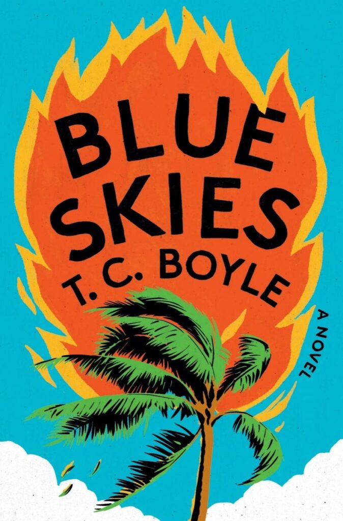 T.C. Boyle, Blue Skies; cover design by David Litman, art direction by Steve Attardo (Liveright, May 16)
The juxtaposition of title and image is doing a ton of work here. Plus, is this just the cheeriest tree on fire you’ve ever seen? I think so.
 Michael Magee, Close to Home; cover design by Na Kim (FSG, May 16)
The power of the right image, the right crop, and the right perspective.
 Emma Cline, The Guest; cover design by Oliver Munday (Random House, May 16)
A nice companion to the cover for The Girls, but an alluring one all on its own: the underwater feel, the oodles of blank green space, the reaching hand, the vintage font. Another cover that doesn’t look like all the others.
 Jenny Fran Davis, Dykette; cover art by John Wilde (Henry Holt, May 16)
As it turns out, the painting that forms the focal point of this incredible cover was instrumental in its writing (and in the author’s life). Also, as TLC might say, it is crazy, sexy, and cool.
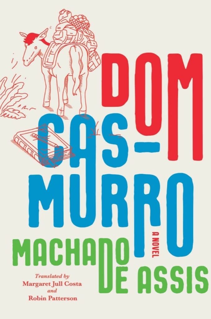 Machado De Assis, tr. Margaret Jull Costa and Robin Patterson, Dom Casmurro; cover design by Steve Attardo (Liveright, May 23)
I just love the playful, bright block-print style text treatment Attardo uses here, particularly the shared “D” in the author’s name. It’s all perfectly balanced and well-conceived—and makes an old classic look like a new classic.
 Javier Marías, tr. Margaret Jull Costa, Tomás Nevinson; cover design by Perry De La Vega (Knopf, May 23)
Something about the dual cut-out shadow and the delicate color story (the subtle difference in hue between the main yellow and the author’s name creating depth) is really working for me here.
 Elliot Ackerman, Halcyon; cover design by John Gall (Knopf, May 23)
Classic John Gall: take something recognizable, normal, everyday, and then—twist it.
 Theodore McCombs, Uranians: Stories; cover design by Jeanette Tran and Rodrigo Corral (Astra House, May 30)
The layers of wonk-ified perspective make this an absolute joy to look at. (Or as McCombs himself put it, “it’s sumptuous, it’s deranged, it’s high-concept and very gay.” All good things.)
 Rita Chang-Eppig, Deep as the Sky, Red as the Sea; cover illustration by Yuko Shimizu (Bloomsbury, May 30)
Energy! Drama! Hand-lettering! It’s the perfect highbrow pirate book cover.
Emily Temple
Emily Temple is the managing editor at Lit Hub. Her first novel, The Lightness, was published by William Morrow/HarperCollins in June 2020. You can buy it here.


