The 12 Best Book Covers of July
Treat Yourself
Another month of books, another month of book covers. Another month of pandemic, another month of staying inside. Another month of anxiety, another month of taking delight where we can find it. And so, to that end, here are my favorite book covers from the past few weeks, which it seems we’re calling July—some beautiful, some menacing (and several both); some experimental, some soothing. As always, if I missed your favorite, add it on to the list in the comments. At a time like this, you can’t have too many.
 Sarah Gerard, True Love; cover design by Joanne O’Neill (Harper, July 7)
This cover manages to be weird, menacing, and well . . . pretty. At the risk of showing my age, the color story reminds me of those Trapper Keepers I so desperately coveted—but with a twist. I love it.
 Lee Conell, The Party Upstairs; cover design by Stephanie Ross (Penguin Press, July 7)
A cover that rewards close attention—or at least, it took me a little while to see what was really going on here: a cardboard dollhouse. Once your eyes adjust, it’s pretty brilliant.
 Lacy Crawford, Notes on a Silencing; cover design by Lucy Kim (Little, Brown, July 7)
There’s nothing so technically incredible about this cover: it’s just a photograph with a typographical treatment overlaid, like so many others. And yet, something about the proportions draw me in; I find it coercive in the best way, which is just what you want from your book covers.
 Andrew Martin, Cool for America (FSG, July 7)
The self-referential typewriter font. The droll slice of suburban (or beach house?) surrealism. I love it when a book cover is actually funny and good-looking at the same time.
 Zach St. George, The Journeys of Trees; cover design by Yang Kim; art direction by Ingsu Liu (W.W. Norton, July 14)
It’s all about the perspective—and the texture.
 Carlos Fonesca, tr. Megan McDowell, Natural History; cover design by Pablo Delcan (FSG, July 14)
I think I would like this cover a lot even if it did not remind me of one of my all-time favorites—Tom McCarthy’s C, of course. The manila folder trompe l’oeil is a nice touch.
 Odie Lindsay, Some Go Home; cover design by Sarahmay Wilkinson (W.W. Norton, July 21)
The colors are juicy, the figure is intriguing (a lighter emblazoned with a strawberry?), and I’m always a sucker for small, tight text on book covers. All in all, a delicious one.
 Gabriella Burnham, It Is Wood, It Is Stone; cover design by Michael Morris (One World, July 28)
Here’s another cover with a great color story, though this time it’s in service of a baroque explosion of vintage flowers around two compelling figures: one peeking at the audience, one with a blindfold. It manages to be both beautiful and slightly scary, a combination that makes me want to read the book.
 Alex Landragin, Crossings (St. Martin’s, July 28)
This cover reminds me of those circular maps that you have to align to take you to the sunken treasure, which is absolutely the reason that I read. Add the 18th century lover’s eye at the center and I am more than sold.
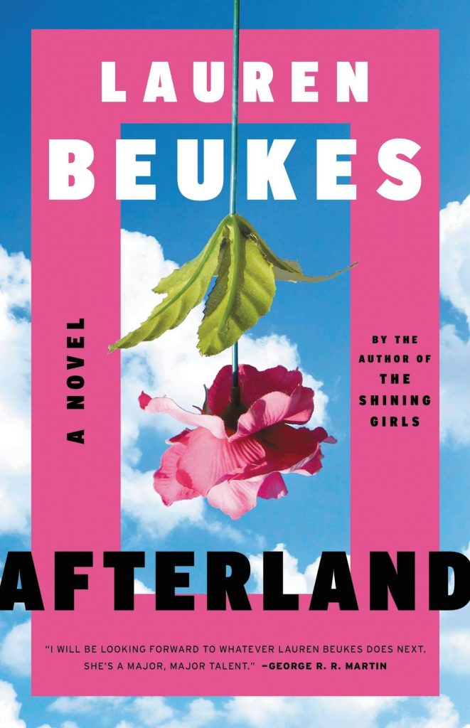 Lauren Beukes, Afterland (Mulholland, July 28)
A cover that feels lush and secretive; it’s not clear exactly what’s going on here, but it makes you want to find out.
 Laura van den Berg, I Hold a Wolf By the Ears; cover design by Na Kim (FSG, July 28)
Uncanny, odd, beautiful despite itself, and unlike any other book cover you’ve seen before: it has to be designed by Na Kim.
 Fernando Pessoa, tr. Margaret Jull Costa and Patricio Ferrari, The Complete Works of Alberto Caeiro; cover design by Peter Mendelsund (New Directions, July 28)
Come on. You gotta love it. And it makes a nice companion piece to your other gorgeous Pessoa.
Emily Temple
Emily Temple is the managing editor at Lit Hub. Her first novel, The Lightness, was published by William Morrow/HarperCollins in June 2020. You can buy it here.


