The 12 Best Book Covers
of January
To Brighten Up the Cold
While 2022 may have started with a whimper when it comes to the things that really matter—voting rights, filibuster reform, vaccines for children under 5, a robust and timely government pandemic response—it also started with some pretty nice-looking books. This month, my favorite book covers are awash in color, sparkle, humor, and surrealism, none of which may solve the problems of the world, but all of which might make your bookshelf a little brighter.
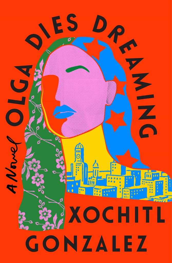 Xochitl Gonzalez, Olga Dies Dreaming; cover design by Lauren Peters-Collaer (Flatiron, January 4)
I love the unusual sense of a collage created through block printing, but the real excitement comes in the delicate balance of shapes and weights here: that high curved title! The offsetting drape of hair! The strong font and the “A Novel” on the “wrong” side! It’s a cover you want to keep looking at, just to make sure you haven’t missed anything.
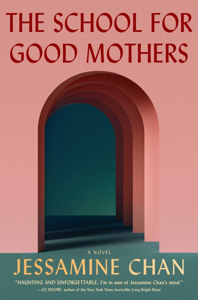 Jessamine Chan, The School for Good Mothers; cover design by Grace Han (Simon & Schuster, January 4)
In some ways, this might be an advertisement for any product aimed at millennials—which feels just right for this novel about modern motherhood and how easily structures can tip into dystopia. The visual metaphor is also not lost on me, but is very nicely understated.
 Mark Prins, The Latinist; cover design by Jaya Miceli (W.W. Norton, January 4)
The image choice works very well here, but what elevates the whole thing is the base texture and the overpainting, which imbue it with a spooky, underwater, and (in conjunction with the handwritten text) an almost Norman McLaren-ish tone.
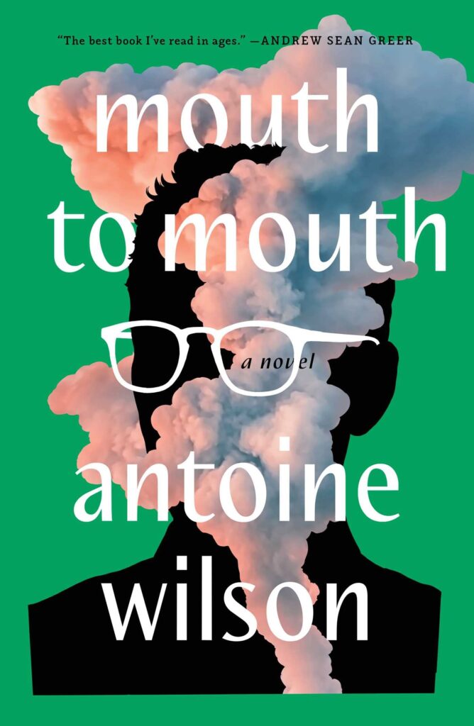 Antoine Wilson, Mouth to Mouth; cover design by Jim Tierney (Avid Reader Press, January 11)
The glasses-as-font-embellishment here is working very well. Plus, you have to love that green, especially paired as it is with the sumptuous pink and blue smoke—this is a cover that makes you want to open the book.
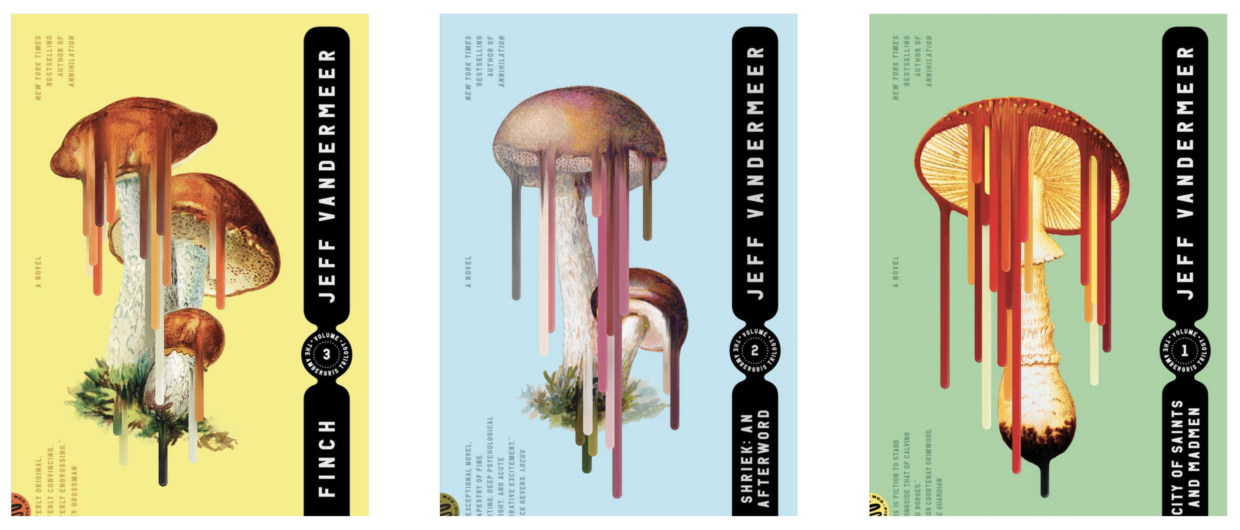 Jeff VanderMeer, The Ambergris trilogy paperback reissues; cover design by Tyler Comrie (Picador, January 11)
Mushrooms are already weird; it’s very fun to see them further weirded here, especially in such modern colorways.
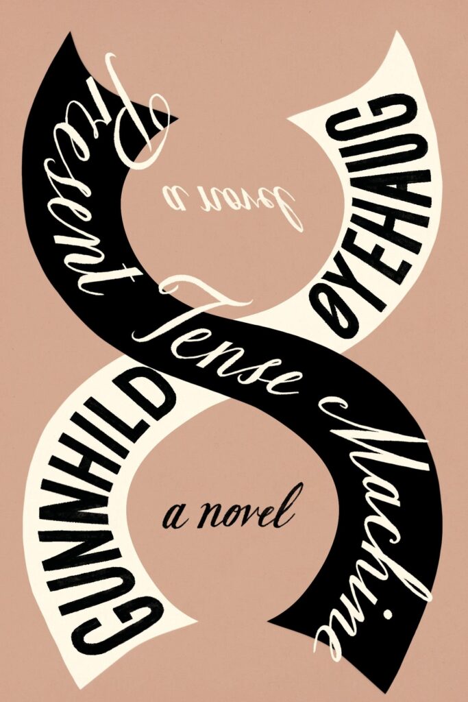 Gunnhild Øyehaug, tr. Kari Dickson, Present Tense Machine; cover design by Na Kim (FSG, January 11)
A very elegant type-forward cover that manages to be understated and energetic at once. I particularly love the reflection of “a novel” and the dual (dueling?) fonts.
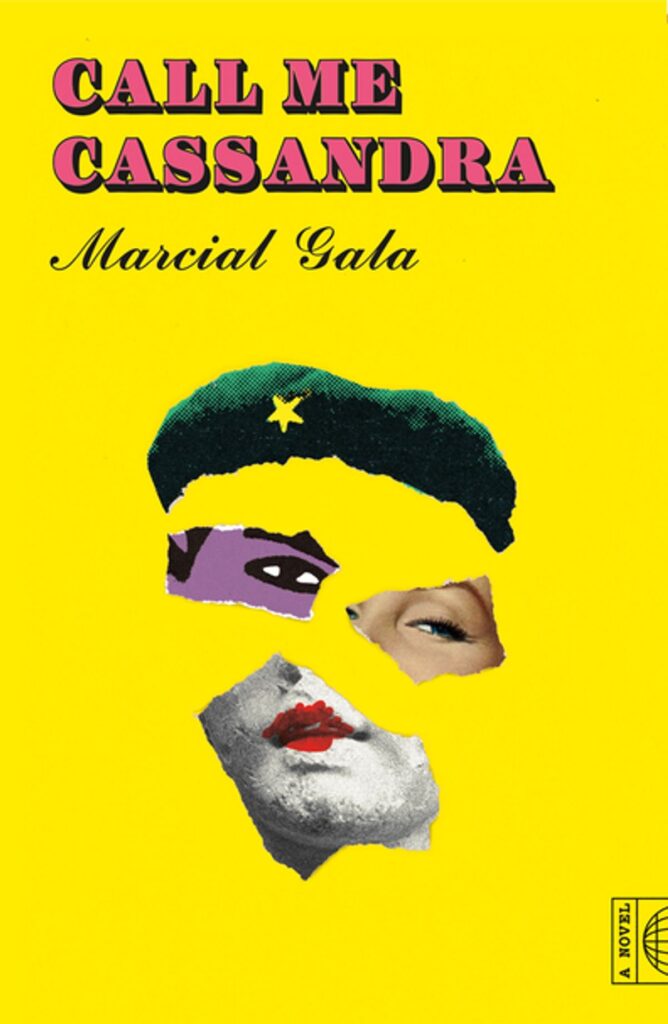 Marcial Gala, tr. Anna Kushner, Call Me Cassandra; cover design by Thomas Colligan (FSG, January 11)
We have two Cassandra-related covers this month (see below); both are bright and weird-face-forward. I love the deconstructed collage technique of this one, not to mention those colored-in lips—I also appreciate the restraint it must have taken not to keep on adding.
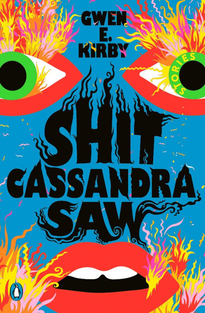 Gwen E. Kirby, Shit Cassandra Saw; cover design by Lydia Ortiz (Penguin Books, January 11)
Pure energy and chaos and color, like all of Lydia Ortiz’s work—I love it.
 David Sanchez, All Day Is a Long Time; cover design by Kelly Winton (Mariner, January 18)
Maybe it’s just because it’s going to get down to -2˚ this week, but this pink saturated vintage California realness is really speaking to me.
 Kendra James, Admissions; cover design by Sarah Congdon (Grand Central, January 18)
As someone who remembers those colored circular stickers very well, I can’t help but smile whenever I look at this cover—and think about all the faces one might want to blot out of one’s old school photos.
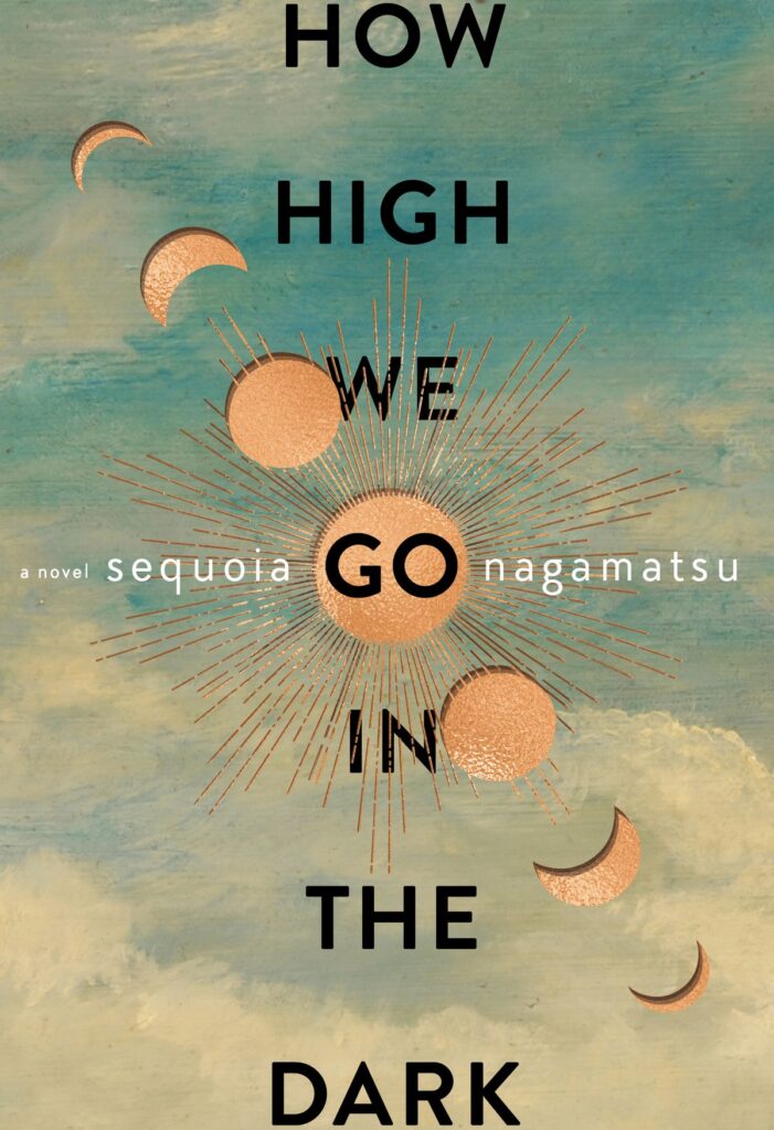 Sequoia Nagamatsu, How High We Go in the Dark; cover design by Will Staehle (William Morrow, January 18)
Long titles can be a challenge on book covers, but I very much like the solution here—not just the stacked title, but the contrasting (horizontal, lowercase, white!) author’s name, which, along with the cutout moon progressions, creates a kind of starburst against a starburst. All of this against the old-fashioned cloud painting creates a very appealing package indeed.
 Weike Wang, Joan Is Okay (Random House, January 18)
I love a good text-based book cover, especially when it manages to evoke mood and concept as well as a more representative one. The primary colors of the block-print text treatment against the not-quite primary yellow field creates a bit of visual interest, but the cleverest part is that errant A, which goes a long way to disabuse us of the notion that Joan is, in fact, okay.
Emily Temple
Emily Temple is the managing editor at Lit Hub. Her first novel, The Lightness, was published by William Morrow/HarperCollins in June 2020. You can buy it here.