The 12 Best Book Covers
of August
Or, Fun with Text and Cutouts
Another month of books, another month of book covers. This month, yellow and black were king (not for nothing: save the bees), and I saw a lot of interesting text treatments, from trompe l’oeil crumples to playing card-style mirroring to gold foil seals. But the main thing that all these book covers have in common is that they’re striking, and appealing, which means they’re doing their job. Below, you’ll find a list of my favorites from the month; as ever, if I’ve missed yours, link us to in the comments. I never say no to more beauty.
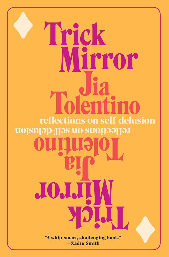 Jia Tolentino, Trick Mirror; design by Sharanya Durvasula (Random House, August 6)
It’s amazing how little is actually needed to evoke a playing card here—just the border, the two diamonds, the mirroring. I usually don’t like literal representations of title elements in covers, but this mixes just the right amount of playfulness with high art, to brilliant effect. Plus, I heard that color is the new millennial pink—and if it’s not, considering how the internet feels about Tolentino, I have a feeling it soon will be.
 Jess Row, White Flights; design by Oliver Munday (Graywolf, August 6)
Simple, clever, and um, intensely evocative of Unknown Pleasures—what else could you really want from a book cover?
 Javier Marías, Berta Isla; design by Kelly Blair (Knopf, August 6)
The color story is insanely good. But even better is this mysterious obscuration of the figure, which so elegantly blurs the viewpoint of the person holding the book.
 Donald Hoffman, The Case Against Reality; design by Sarahmay Wilkinson (Norton, August 13)
A cool, sharp book cover that invites you to keep on looking.
 Yoko Ogawa, tr. Stephen Snyder, The Memory Police; design by Tyler Comrie (Pantheon, August 13)
This would be an attractive and functional cover with just the halftone portrait and the authoritarian seal (I mean, the title and author are presented as a gold foil seal—how good is that), but the added overlay of fragments of sketch elevates the whole thing—and makes it perfect for a novel about forgetting.
 Kimberly King Parsons, Black Light; design by Mark Abrams (Vintage, August 13)
Another, very different overlay system: I love the bold text cutout against the 80s-style portrait—it looks as if someone printed the title and author on the school copier and used it to make a very cool poster for the school dance.
 Téa Obreht, Inland; design by Jaya Miceli, art by Tamara Ruiz (Random House, August 13)
The text treatment says Important Literary Novel and the impressionistic, almost cutout sky says Beautiful Language and Epic Storytelling, and both are correct.
 Susan Steinberg, Machine; design by Kimberly Glyder (Graywolf, August 20)
Here the text rests on trompe d’oeil paint swipes instead of trompe d’oeil paper cutouts, which works perfectly with this experimental, irregularly fragmented novel. Which isn’t even to comment on that shifted perspective—a common image titled just enough to render it unfamiliar and therefore striking.
 Rion Amilcar Scott, The World Doesn’t Require You; design by Laywan Kwan, art direction by Steve Attardo (Norton, August 20)
A gorgeous painting with a strong typeface: this is one of those super-successful covers that makes me want to immediately pick up the book.
 Ayse Papatya Bucak, The Trojan War Museum: and Other Stories; design by Alex Merto, art direction by Ingsu Liu (Norton, August 20)
A very good use of the classics.
 Mary-Kay Wilmers, Human Relations & Other Difficulties; design and art by Peter Campbell (FSG, August 27)
I love this one, and not least because they snuck a penis on a book cover.
 Nell Zink, Doxology; design by Allison Saltzman (Ecco, August 27)
On its face, this is the weirdest text treatment of this very exciting month of text: each letter of the title is its own crumpled note, unfolded and laid over this lovely painting. It’s irreverent and appealing—not unlike like Zink’s writing itself. The UK cover is great too.
Emily Temple
Emily Temple is the managing editor at Lit Hub. Her first novel, The Lightness, was published by William Morrow/HarperCollins in June 2020. You can buy it here.
