The 12 Best Book Covers of August
Flames, etc.
Summer is still hot. Things are on fire. Are these the dog days? Who can really say anymore. Maybe these are the days of the wolf. Or the potbellied pig. Or the days of awaking from uneasy dreams to find that you’ve been transformed into a gigantic vermin. Anyway. Where was I? Summer is still hot, and so are the book covers; take a peek at a few of my favorites from this month below, and feel free to add on any I’ve missed here in the comments. And yes, thank you for wondering—I am fine.
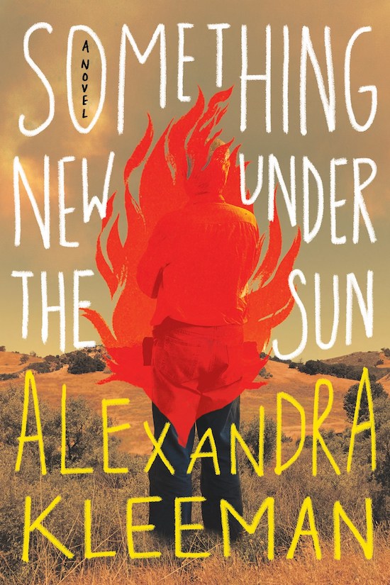 Alexandra Kleeman, Something New Under The Sun; cover design by Donna Cheng (Hogarth, August 3)
The big flame in the middle of a book cover is definitely striking but not unheard of—there’s another novel this month, The Husbands, that features a big red plume, and let’s not forget this cover, from 2019—but this is probably the best version I’ve seen. For me, it’s down to the text treatment—how it fills up the space around the center, using color to balance the landscape, and flame itself, which is slightly translucent and slightly off-center. It’s all very uneasy, and odd, and cool—much like this book.
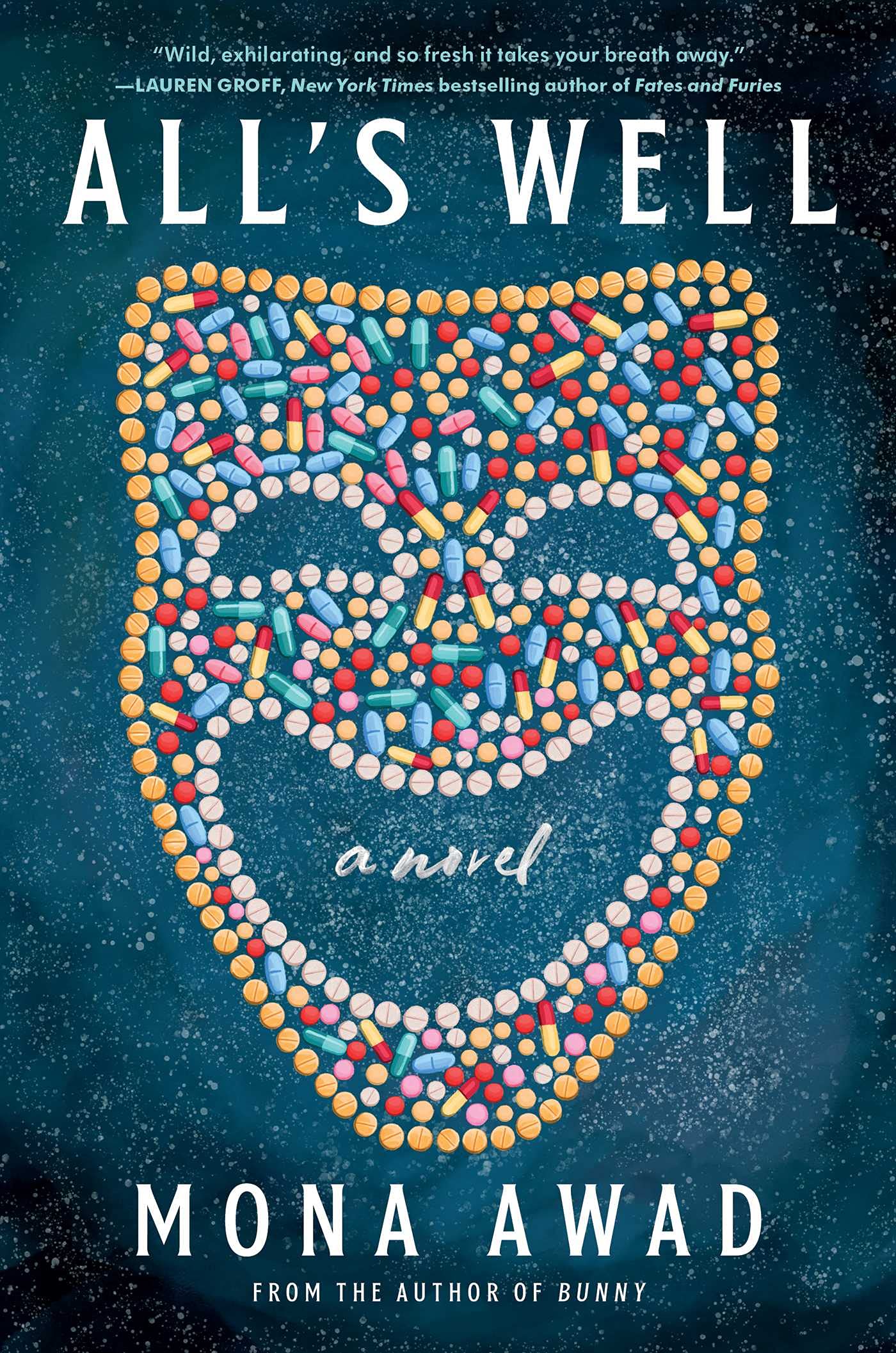 Mona Awad, All’s Well (Simon & Schuster, August 3)
A comedy mask made of pills—very good. Though to be fair, the Canadian cover is very good too.
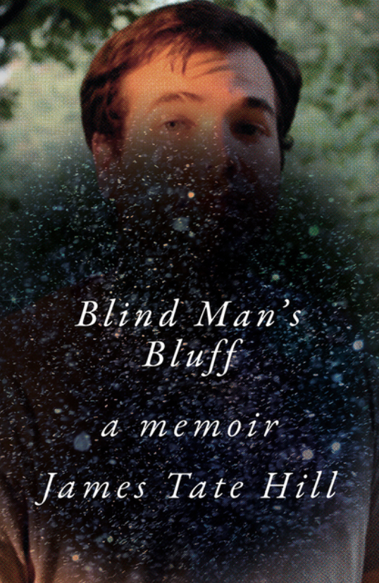 James Tate Hill, Blind Man’s Bluff; cover design by Sarahmay Wilkinson (W.W. Norton, August 3)
Oof. This one is weirdly gorgeous—it’s the vintage texture of the photograph, the perfectly placed obscuration, but also it’s the way it illustrates Hill’s experience as detailed in this memoir.
 A.K. Blakemore, The Manningtree Witches; cover design by Jo Walker, art direction by Sarah Wasley (Catapult, August 10)
More flames, but make them tarot.
 Saïd Sayrafiezadeh, American Estrangement; cover design by Pete Gareau, art direction by Ingsu Liu (W.W. Norton, August 10)
This cover looks pretty straightforward at first—but soon it begins to feel awkward, almost claustrophobic. There’s something—dare I say—strange about it. It’s the text, turns out, which if you’ll notice is slightly off-kilter, creating a subtle disconcerting feeling that works very well here.
 Virginia Feito, Mrs. March; cover design by Jaya Miceli, art direction by Steve Attardo (Liveright, August 10)
Here’s another subtly disconcerting one—this time it’s those hands, which are inverted from the way we’d normally see them in an image like this. It’s a small shift, but it makes a big difference. Then, of course, there’s the vintage font and trompe l’oeil weathering, and you all know how I feel about that.
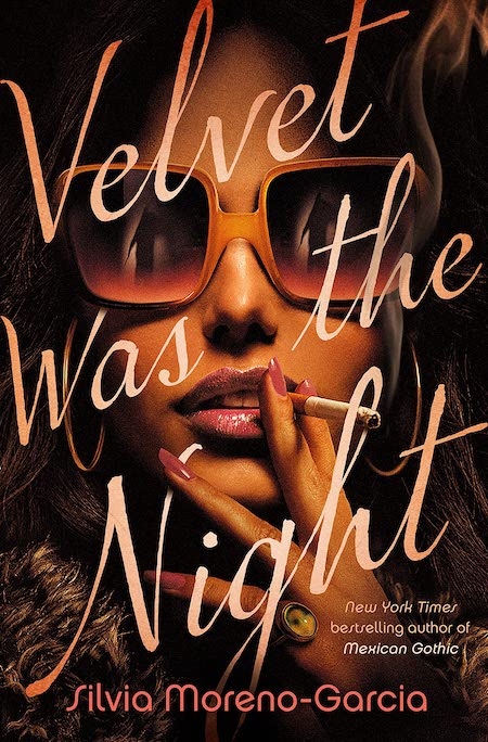 Silvia Moreno-Garcia, Velvet Was the Night; cover design by Tim Green (Del Rey, August 17)
You can pretend to be too cool for these sexy, saturated 70s movie poster vibes, but you’ll only be lying to yourself. Besides—look at the way the cigarette interacts with the ‘h.’ Doesn’t get much cooler than that.
 Jonah Lehrer, Mystery: A Seduction, A Strategy, A Solution; cover design by David Litman, art direction by Alison Forner (Avid Reader Press, August 17)
Here’s something I’ve never seen: a book cover in the form of a scratch off card. (If only it were a real feature!)
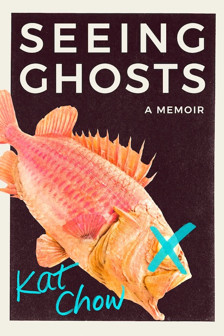 Kat Chow, Seeing Ghosts; cover design by Tree Abraham (Grand Central, August 24)
The fish is great, and so is the color story—but it’s the X for me.
 Jo Hamya, Three Rooms; cover design and illustration by Kelly Winton (HMH, August 31)
The room recalls Van Gogh—a hyper-saturated, technicolor version of Van Gogh—but what I really like is the unusual text placement, which both alienates and contains the eye. Framing in general being a subject of interest here.
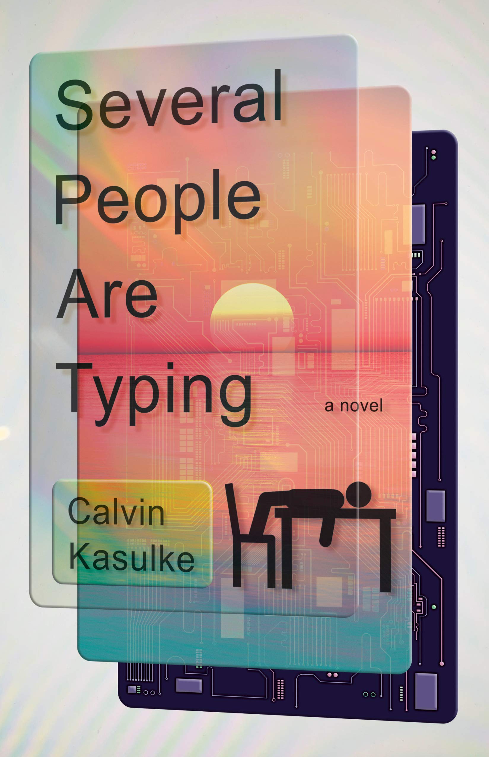 Calvin Kasulke, Several People are Typing; cover design by Michael J. Windsor (Doubleday, August 31)
Like a well-designed app, this cover looks so juicy that you can’t help but want to touch it. (That’s how they get you! Turn your phone to black and white!) Also, having just tried to put a new protector screen on my phone, I doubly appreciate this cover.
 Stephen Graham Jones, My Heart is a Chainsaw; cover design by Lisa Litwack (Gallery/Saga Press, August 31)
Simple, evocative, and very effective.
Emily Temple
Emily Temple is the managing editor at Lit Hub. Her first novel, The Lightness, was published by William Morrow/HarperCollins in June 2020. You can buy it here.


