The 11 Best Book Covers of September
All Your Back-to-School Accessorizing, Handled
Another month of books, another month of book covers. September is always a huge month for books—blockbusters on every corner (er, Tuesday)—and the covers that go along with them are, accordingly, striking and lush enough for the pages of Vogue (September also being a huge month for Vogue, as you may know). Below, you’ll find a list of my favorite book covers from the month; as ever, if I’ve missed yours, drop it into the comments.
 William B. Irvine, The Stoic Challenge; design by Jared Oriel, art direction by Sarahmay Wilkinson (W.W. Norton, September 3).
I love a good type-based cover; this one is particularly notable for its subtle sense of balance, and the way that large black mark might be a defiant finish or a rolling ball.
 Carolina De Robertis, Cantoras, design by Jenny Carrow (Knopf, September 3).
I mean, it’s just a beautiful image—there’s no denying it. The type treatment, set perfectly along the horizon, only adds.
 Jhumpa Lahiri, ed., The Penguin Book of Italian Short Stories; art by Nathalie Du Pasquier, design by Tom Etherington (Penguin Books, September 10).
I actually am not sure that I can justify why I find this cover so appealing—it’s abstract and muted, which aren’t always design pluses—but I do. Maybe because it’s actually a work of art transmuted elegantly into a work of commerce?
 Emma Donoghue, Akin; design by Margaret Lonergan; illustration after the photograph La Promenade des Anglais by Martin Hürlimann, 1937 (Little, Brown, September 10).
That sun-soaked travel poster realness is giving me life.
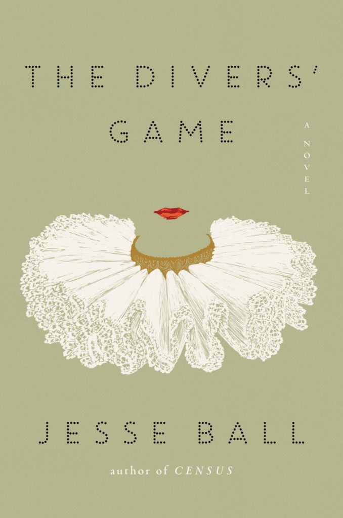 Jesse Ball, The Divers’ Game; design by Sara Wood (Ecco, September 10).
Like Jesse Ball’s work itself, this cover is weird, compelling, and a little incomprehensible. But it makes me want to know more. So, perfect.
 Anne Boyer, The Undying; design by Strick&Williams (FSG, September 17).
Not only is it visually appealing (and a little terrifying), but the transposition of the volume markings from the barrel (now blank, see!) to the book is genius.
 Paul Kingsnorth, Savage Gods; design by Two Dollar Radio (Two Dollar Radio, September 17).
Either you’ll love this or you’ll hate it—the color story and simplicity are giving me real Wes Anderson vibes, which puts me squarely in the former camp.
 Ann Patchett, The Dutch House; art by Noah Saterstrom, design by Robin Bilardello (Harper, September 24).
Another cover this month that makes very good use of some very appealing art.
 Nancy Hale, ed. Lauren Groff, Where the Light Falls; design by Rodrigo Corral Studio (Library of America, September 24).
The golden child of this month’s crop.
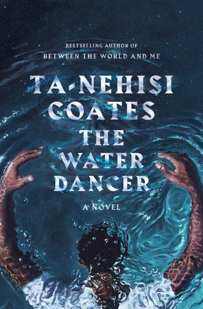 Ta-Nehisi Coates, The Water Dancer; art by Calida Garcia Rawles, design by Greg Mollica (One World, September 24).
While Coates’ first novel was still in progress, he visited the studio of artist Calida Garcia Rawles and asked her to “read the work, feel a type of way and then create something,” according to The New York Times. The result is this gorgeous painting and book cover, which manages to feel hyper-realistic and fabulistic at the same time.
 Martha Minow, When Should Law Forgive?; design by Yang Kim, art direction by Ingsu Liu (W.W. Norton, September 24).
I just love the clean lines and framing here; it feels like a captured view in a way I don’t often find with book covers, especially for nonfiction.
Emily Temple
Emily Temple is the managing editor at Lit Hub. Her first novel, The Lightness, was published by William Morrow/HarperCollins in June 2020. You can buy it here.


