The 11 Best Book Covers of November
Pity You Can't Eat Them, Really
Another month of books, another month of book covers. The design in November was double-sided—I saw a lot of bold primary colors, but just as much desaturated, subtle color. It’s always nice to have variety. So whether you need to cuddle down into the early dark or wake up from your cold stupor, here are a few design standouts from the month that was.
 Wolfgang Hilbig, tr. Isabel Fargo Cole, The Interim (Two Lines Press, November 2)
It would have been a good cover even without the layering; but the enlarged echo of the face behind the screened vintage-style photo gives it extra depth and interest.
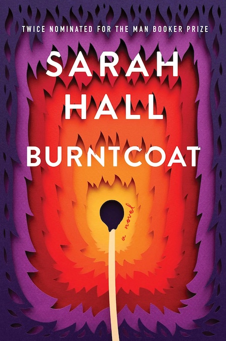 Sarah Hall, Burntcoat; cover design by Mumtaz Mustafa, illustration by Owen Gildersleeve (Custom House, November 2)
I’m always a sucker for this cut-paper technique; here I particularly like the way the image oscillates between suggesting a flame spreading outward and a hole sucking inward.
 Selva Almada, tr. Annie McDermott, Brickmakers; cover design by Carlos Esparza, art by Carle Vernet (Graywolf, November 2)
The energy in this cover is striking; it shows just how much you can do without color.
 Rax King, Tacky: Love Letters to the Worst Culture We Have to Offer; cover design by Mark Abrams (Vintage, November 2)
I love everything about this cover (and also imagine it was very fun to create). The tri-color text against black? Tacky. The cocktail girl? Tacky. The ’70s food ad font? Tacky. The whole thing? A delight.
 László Krasznahorkai, tr. John Batki, art by Max Neumann, Chasing Homer (New Directions, November 2)
This one’s a bit of a cheat, since it’s an illustrated book, but boy—does that falling eye get me.
 Uwem Akpan, New York, My Village, cover design by Jaya Miceli, art direction by Ingsu Liu (W.W. Norton, November 2)
I always like a book on a book, and this one is particularly artful.
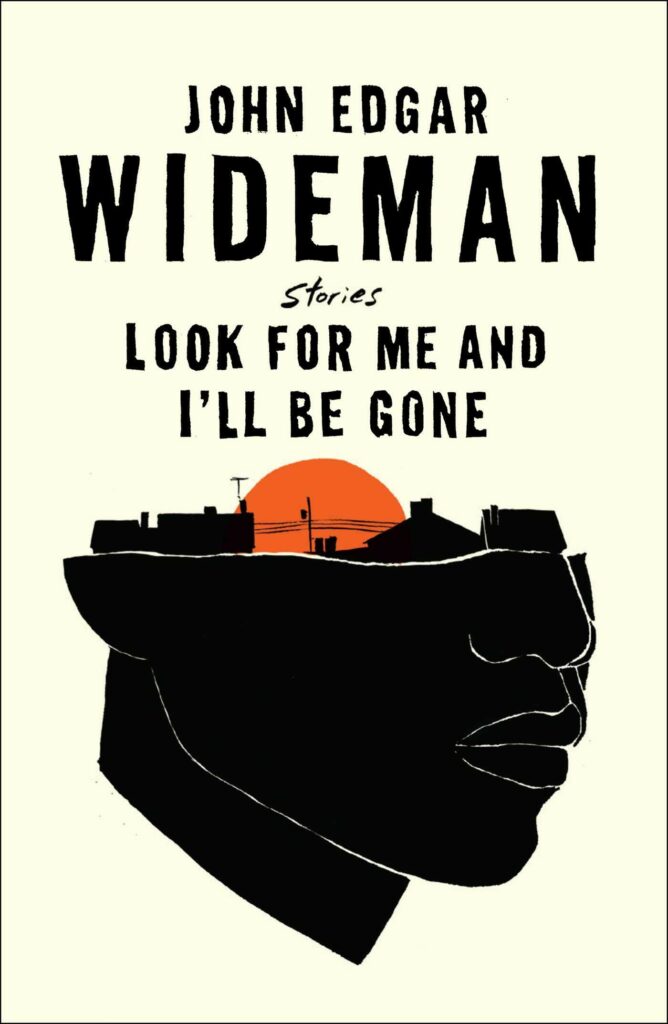 John Edgar Wideman, Look for Me and I’ll Be Gone: Stories (Scribner, November 9)
I’m impressed by the elegant balance in this composition—the way the text balances out the heavy black of the illustration, all of it pulled toward the hot spot of the center. It feels complete; suggesting the whole head of the person without, you know, suggesting a head.
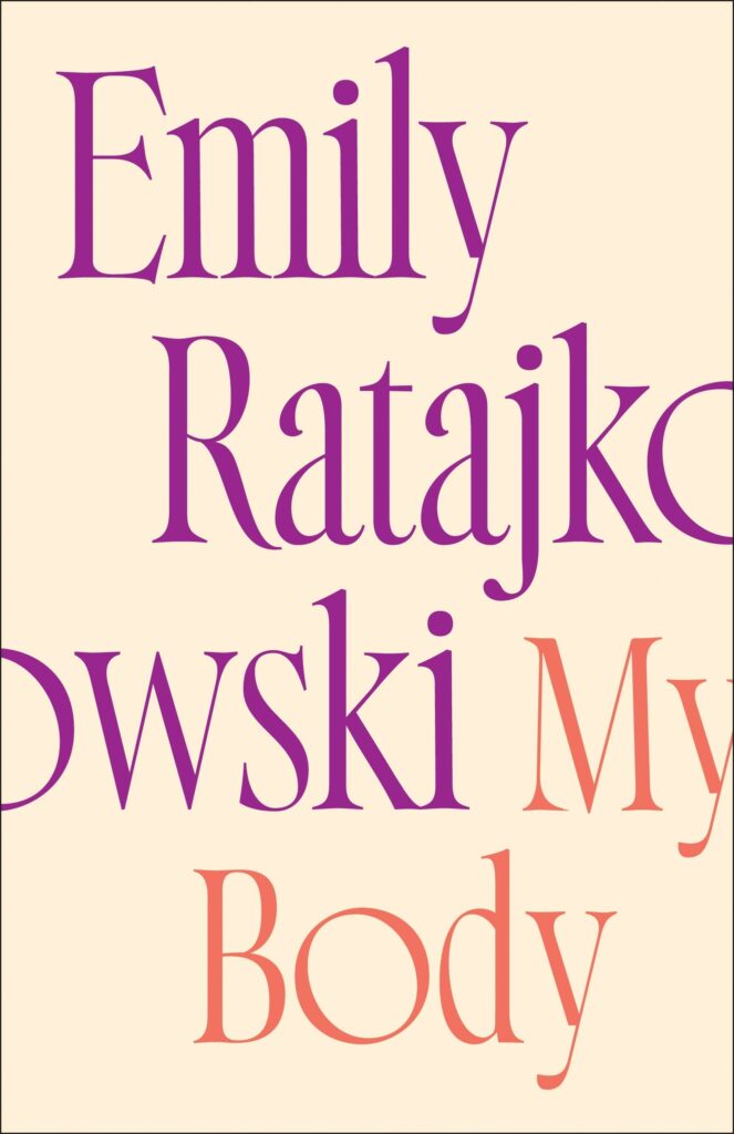 Emily Ratajkowski, My Body; cover design by Christopher Sergio (Metropolitan Books, November 9)
It strikes me that this book (not to mention this title) would present a challenging task for a designer: it couldn’t have been too figurative, or too feminine, or too sexy. This all-text cover is an excellent—and still winking—solution, though one can only imagine it sprung from another frustration: how to jam on that long last name.
 Lisa Russ Spaar, Madrigalia: New & Selected Poems; cover art by Julie Heffernan (Persea, November 16)
It’s all about the stunning art here (though the font is a perfect compliment), which would be beautiful enough on its own (that gold!)—but then you notice that it depicts a woman bursting into flames, and also birds. It is a very good cover too for these sumptuous, ecstatic poems.
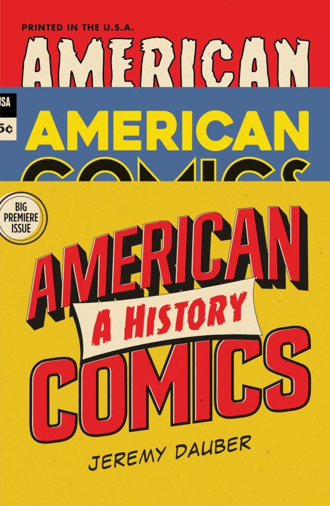 Jeremy Dauber, American Comics; cover design by Gray318, art direction by Sarahmay Wilkinson (W.W. Norton, November 16)
I love the cleverness of this cover, designed to look like comic books in a rack. Perfect color balance, too.
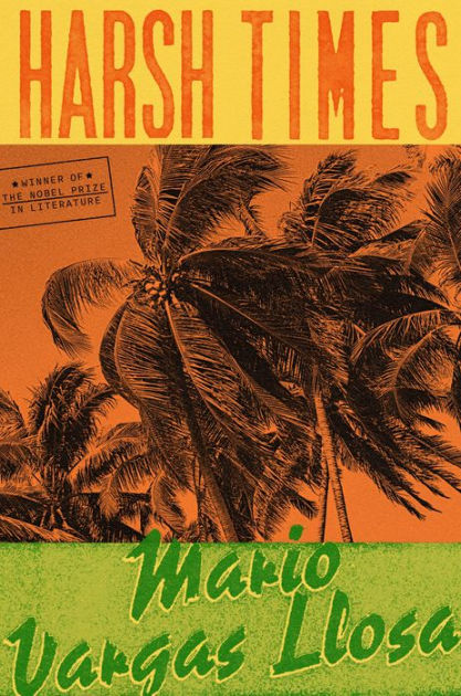 Mario Vargas Llosa, tr. Adrian Nathan West, Harsh Times (FSG, November 23)
Every element of this cover—the two fonts, the color story, the vintage washout, the little stamp—works to evoke a mood, just about perfect for this novel set in 1954 Guatemala.
Emily Temple
Emily Temple is the managing editor at Lit Hub. Her first novel, The Lightness, was published by William Morrow/HarperCollins in June 2020. You can buy it here.


