The 11 Best Book Covers of July
High Art for High Summer
Another month of books, another month of book covers. July brings us a fresh summer basket of juicy, saturated colors, clever concepts, and weird peek-a-boos. Here are some of my favorites from the month that was:
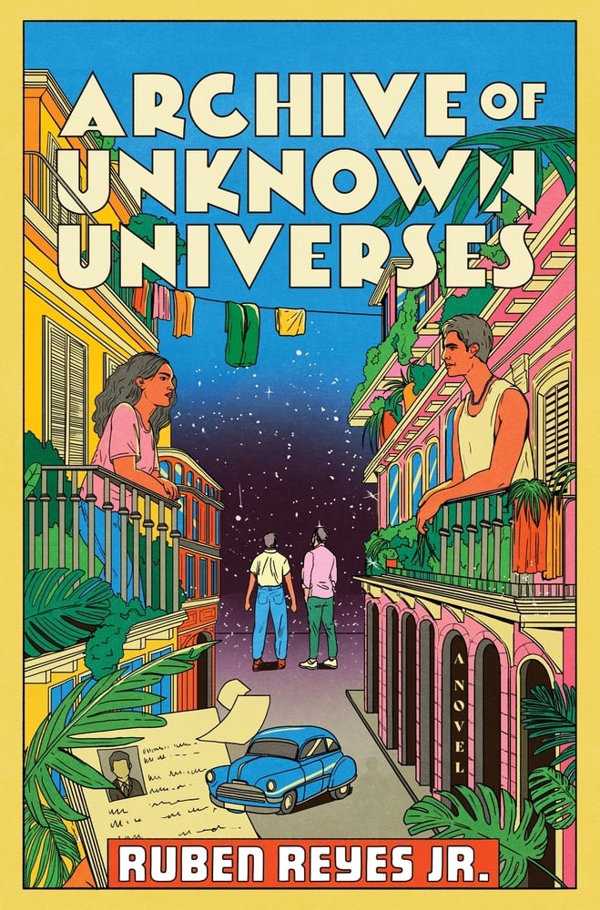 Ruben Reyes, Jr., Archive of Unknown Universes; illustration by María Jesús Contreras (Mariner, July 1)
Love the font, love the frame, but what I find most pleasing is that an illustrated cover can look so matte and so juicy at the same time. (Contreras also illustrated the cover of Reyes’ There Is a Rio Grande in Heaven which pulls off a similar effect.)
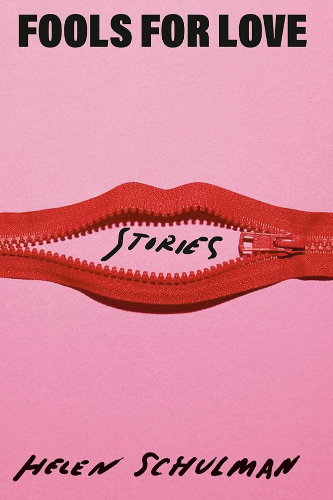 Helen Schulman, Fools for Love: Stories; cover design by Janet Hansen (Knopf, July 8)
I have seen many many many mouths on book covers (people like mouths, I wonder why?), but never quite like this—I love both the concept and the restraint. I also appreciate that Hansen carried over the font for the supplementary text from her design for Schulman’s Lucky Dogs.
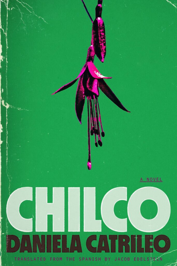 Daniela Catrileo, tr. Jacob Edelstein, Chilco; cover design by Charlotte Grimm (FSG Originals, July 15)
I can go either way on faux-distressing these days, but the colors and balance are really doing it for me here.
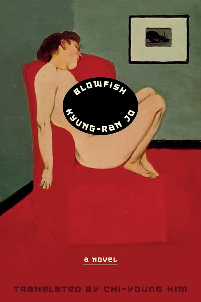 Kyung-Ran Jo, tr. Chi-Young Kim, Blowfish; cover design by Giacomo Girardi/Rodrigo Corral Studio, based on the Korean edition (Astra House, July 15)
This art might have made for a thousand good covers, but the title placement, on its little faux-sticker, makes it great.
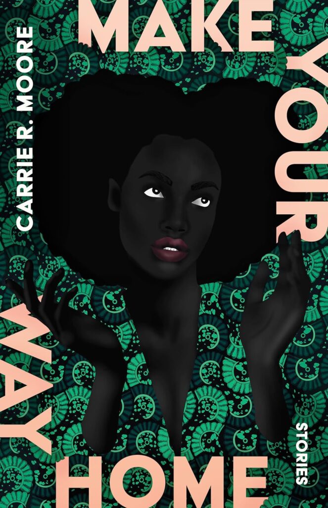 Carrie R. Moore, Make Your Way Home; cover design by Beth Steidle (Tin House, July 15)
Holy saturation, Batman. I love the intensity of the colors, the takeover pattern, the text treatment on the edges (with, for contrast, its subtle gradation).
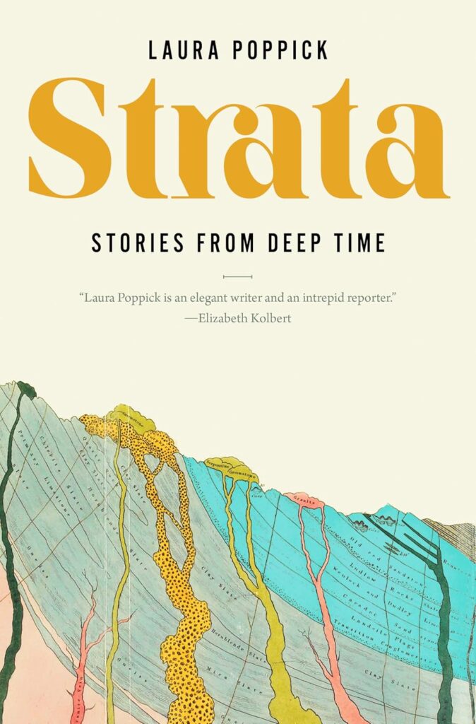 Laura Poppick, Strata: Stories from Deep Time; cover design by Steve Attardo (Norton, July 15)
Just perfectly what it needs to be. Love the font.
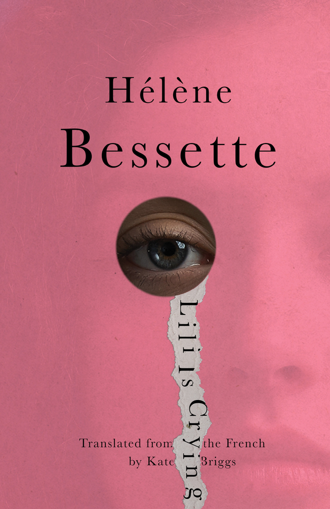 Hélène Bessette, tr. Kate Briggs, Lili is Crying; cover design by Jamie Keenan (New Directions, July 22)
The paper tear/tear with the title in it! The face just barely visible! Brilliant.
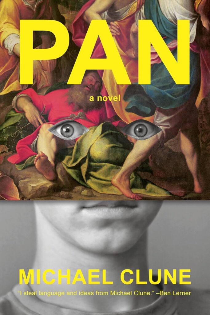 Michael Clune, Pan; cover design by Janet Hansen (Penguin Press, July 22)
As Dan at Casual Optimist pointed out, peephole eyes are weirdly prevalent this month. But I particularly appreciate this one for how unabashedly creepy it is.
 Kate Broad, Greenwich; cover design by Olga Grlic (St. Martin’s Press, July 22)
What can I say, I love a drip.
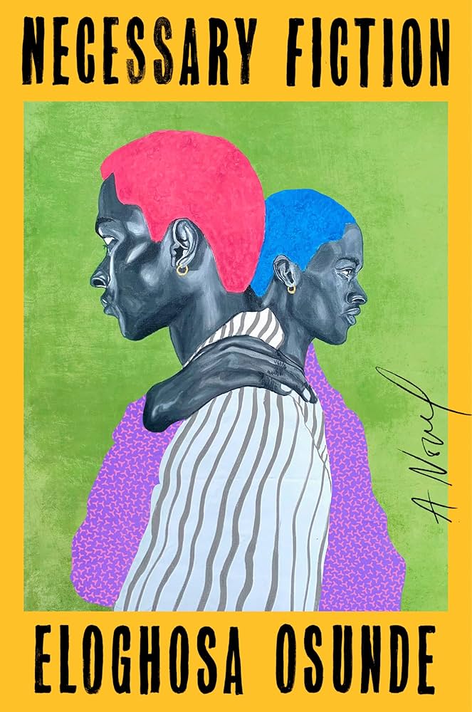 Eloghosa Osunde, Necessary Fiction; cover design by Lauren Peters-Collaer, art by Affen Segun (Riverhead, July 22)
Another great frame, another great color story, another great piece of art.
 Tre Johnson, Black Genius; cover design by Dominique Jones (Dutton, July 29)
And one with no color or art at all, that manages to be just as impactful, in its own way.
Emily Temple
Emily Temple is the managing editor at Lit Hub. Her first novel, The Lightness, was published by William Morrow/HarperCollins in June 2020. You can buy it here.