
The 10 Best Book Covers of November
The Lushest of the Lush
Another month of books, another month of book covers. November is when publishing starts slowing down a bit for the holidays, but even that couldn’t keep the beautiful books—and weird books, and funny-as-hell books—down. Below are my ten favorite book covers from the month (some of them are even gracing the fronts of my favorite books); feel free to add yours in the comments.
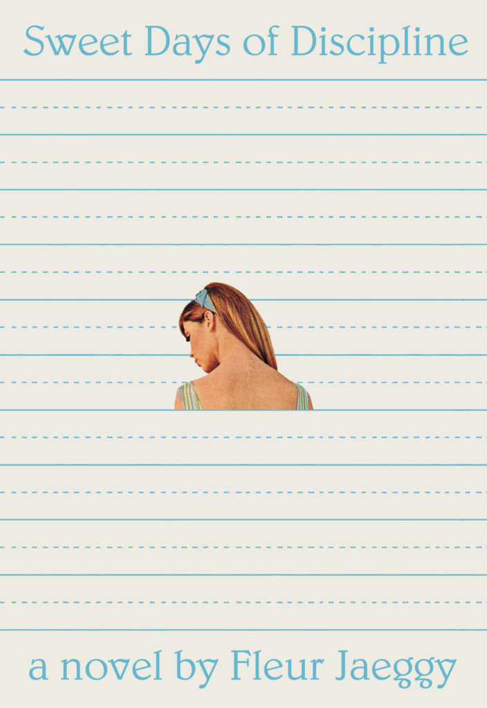 Fleur Jaeggy, Sweet Days of Discipline; design by Oliver Munday (New Directions, October 29)
This cover could not be more well suited to the novel at hand—no surprise, really, because a) it’s Oliver Munday, and b) he completely fell for the book once it was assigned to him. “The disclosure of skin was the missing sensual charge,” he wrote of finding the central image. “She looked vulnerable, a posture often reserved for unsuspecting moments. The framing of X’s obsession was always one of conquering, and as such, the figure was prey. There was Frédérique, set amid the sea of straight lines, clearer to us than she’d ever again be to X.” Perfect.
 Nona Fernández, tr. Natasha Wimmer, Space Invaders; design by Walter Green (Graywolf, November 5)
The perfect cover to evoke childhood and mystery, and yes, video games full of “ghostly green bullets.” Plus, it’s so different from all of the other covers we see, which is an alluring factor in and of itself.
 Heather Christle, The Crying Book; design by Nicole Caputo (Catapult, November 5)
Everything about this cover is just gorgeous: the cutout tears, the night sky showing through, the impressionistic pattern, the way the design just barely overlaps the minimalist text treatment. It’s a book cover that makes you want to pick it up and take it home.
 Carmen Maria Machado, In the Dream House; design by Kimberly Glyder (Graywolf, November 5)
Like Machado’s memoir itself, this book cover is perfectly weird. I love the way the design burrows into the girl at the center of the house—this also, for me, evokes a sense of peering out from under a nest, or maybe a fort, of blankets—so that you instantly focus on her. It’s only later, creepily, that you see the dark figure at the door. Which is exactly as it should be.
 Shannon Pufahl, On Swift Horses (Riverhead, November 5)
The initial effect is simply luscious: so much color and texture that you don’t even really understand what you’re looking at. But what you’re looking at is a super weird collage, of an explosion in the desert topped by a rose. And then there’s that font, which might as well be glowing.
 Flea, Acid for the Children: A Memoir (Grand Central, November 5)
I mean, whatever, but you can’t beat that photo.
 Michael Crummey, The Innocents; design by Emily Mahon, painting by Diana Dabinett (Doubleday, November 12)
The artwork here is intensely captivating, and the text treatment—all lower case, translucent—complements it perfectly.
 Kristen Richardson, The Season; design by Yang Kim, art direction by Ingsu Liu (W.W. Norton, November 19)
Such a simple idea, but it’s the way it is done—so cleanly, so evocatively—that makes it great.
 Dexter Palmer, Mary Toft; or; the Rabbit Queen; design by Janet Hansen (Pantheon, November 19)
A funny, bonkers cover for a funny, bonkers book—and yet, even so, it’s actually the restraint that makes it sing here.
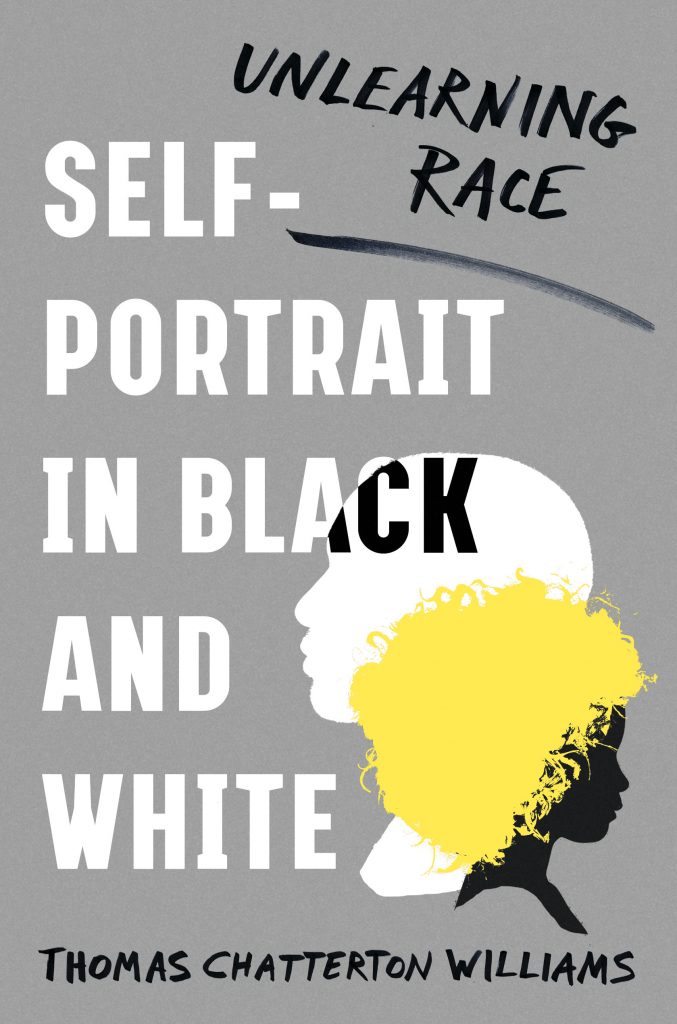 Thomas Chatterton Williams, Self-Portrait in Black and White; design by Jaya Miceli, with AD Ingsu Liu (W. W. Norton, November 19)
Understated and clever—but that pop of yellow is really what makes it.
Emily Temple
Emily Temple is the managing editor at Lit Hub. Her first novel, The Lightness, was published by William Morrow/HarperCollins in June 2020. You can buy it here.


