The 10 Best Book Covers of May
Pattern and Texture
Another month of books, another month of book covers. Here are some of my favorites from May:
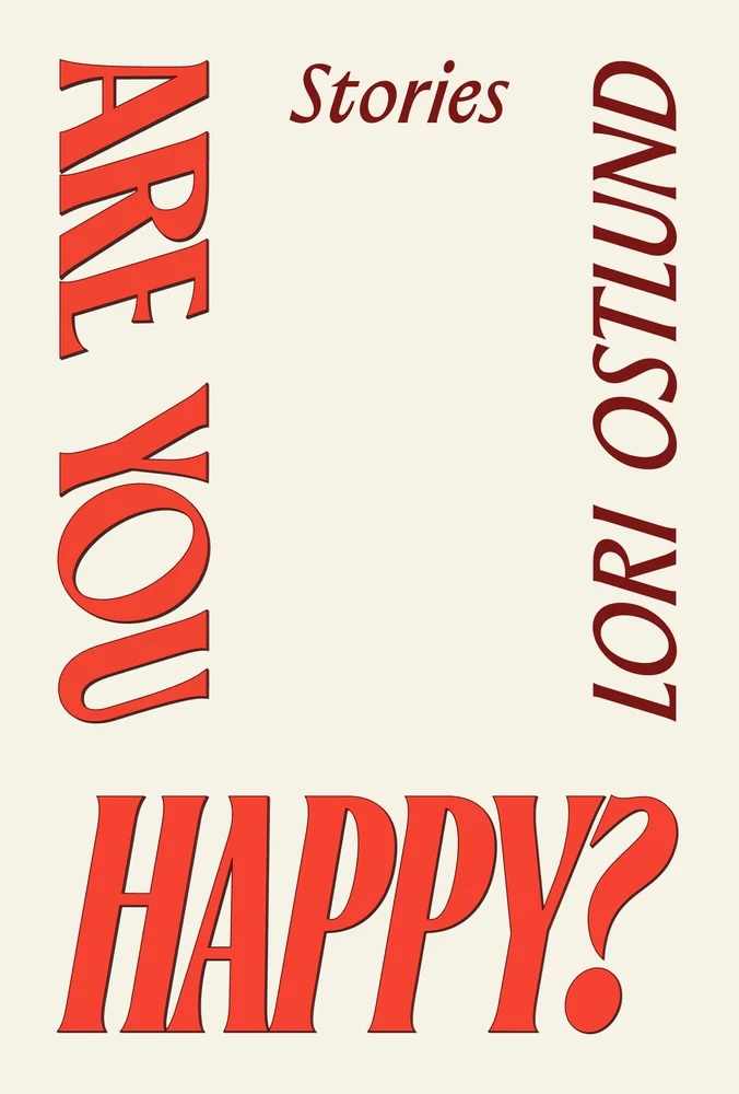 Lori Ostlund, Are You Happy?; cover design by Rodrigo Corral; lettering by James Plattner (Astra House, May 6)
It takes special skill to make a text-only cover like this sing; I love the ’70s vibes, the balanced/unbalanced white space, and the aggressive HAPPY?
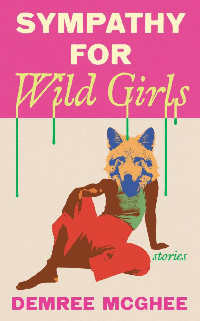 Demree McGhee, Sympathy for Wild Girls; cover design by Dana Li (Feminist Press, May 6)
I have a soft spot for wolf girls, but even if I didn’t, the color-blocked drips would get me.
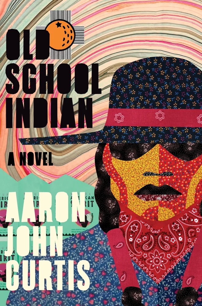 Aaron John Curtis, Old School Indian; cover design by Emily Mahon (Zando, May 6)
The mash of textures! The orange! The American Spirit packs! It seems like it should clash, but it really all works.
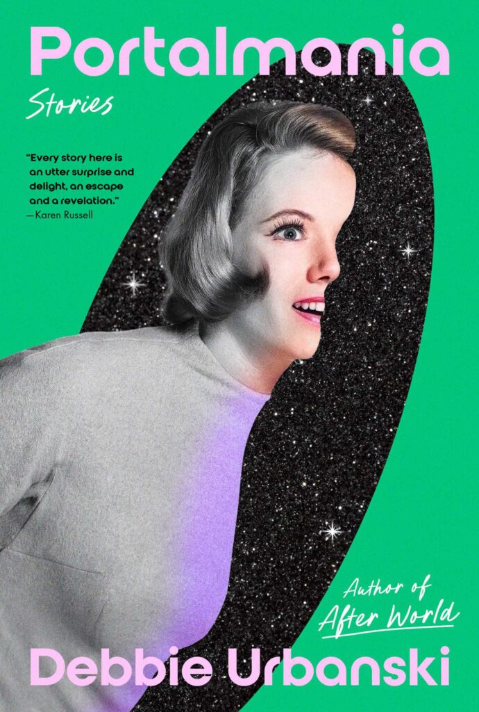 Debbie Urbanski, Portalmania; cover design by Math Monahan (Simon & Schuster, May 13)
The expression on the girl’s face is even more frightening than the infinite maw.
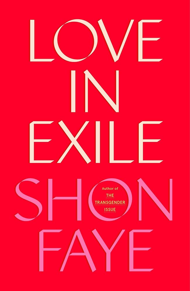 Shon Faye, Love in Exile; cover design by June Park (FSG Originals, May 13)
Another all-text cover in my favorites list this month, this one more straightforward, but quite elegant and lovely.
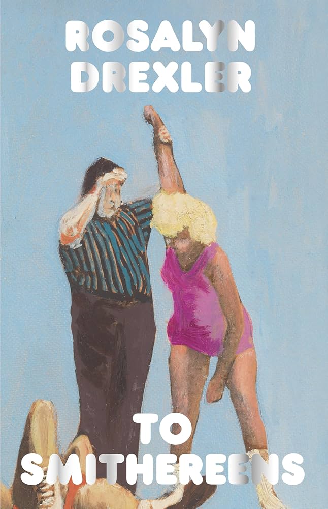 Rosalyn Drexler, To Smithereens; art direction by Claire Hungerford, art by Roasalyn Drexler (Hagfish, May 20)
Each book in Hungerford’s paperback series for Hagfish (which focuses on reissuing out-of-print books from overlooked writers) will be graced with a typeface invented in the era the book was originally published. For this one, published in 1972, she chose Letraset’s gloriously silly 1971 font Frankfurter. It is perfectly paired with Drexler’s 1962 painting “Lost Match.”
 Yiyun Li, Things in Nature Merely Grow; cover design by Na Kim (FSG, May 20)
Perfectly subtle.
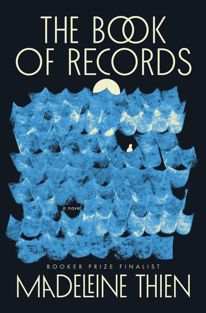 Madeleine Thien, The Book of Records; cover design by Jack Smyth, art direction by Sarahmay Wilkinson (Norton, May 20)
I love the stamp-like quality of the waves, and the custom nestled text.
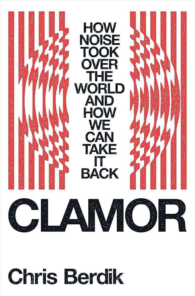 Chris Berdik, Clamor; cover design by Kevin Moore, art direction by Derek Thornton (Norton, May 20)
A very cool solution for a subtitle.
 Paula Bomer, The Stalker; cover design by Kate Sinclair (Soho Press, May 27)
So hilarious, so creepy. I love it.
Emily Temple
Emily Temple is the managing editor at Lit Hub. Her first novel, The Lightness, was published by William Morrow/HarperCollins in June 2020. You can buy it here.