The 10 Best Book Covers of July
They'll All Look Great With Your Swimsuit
Another month of books, another month of book covers. In July, many of those book covers are being Instagrammed next to a beach towel, or perhaps on a dock, or even a picnic bench. For this and other uses I have chosen ten of my favorites—this month, they’re collage-heavy, text-forward, and a little funny, as a group. Take a look, and as always, feel free to nominate your own favorites in the comments.
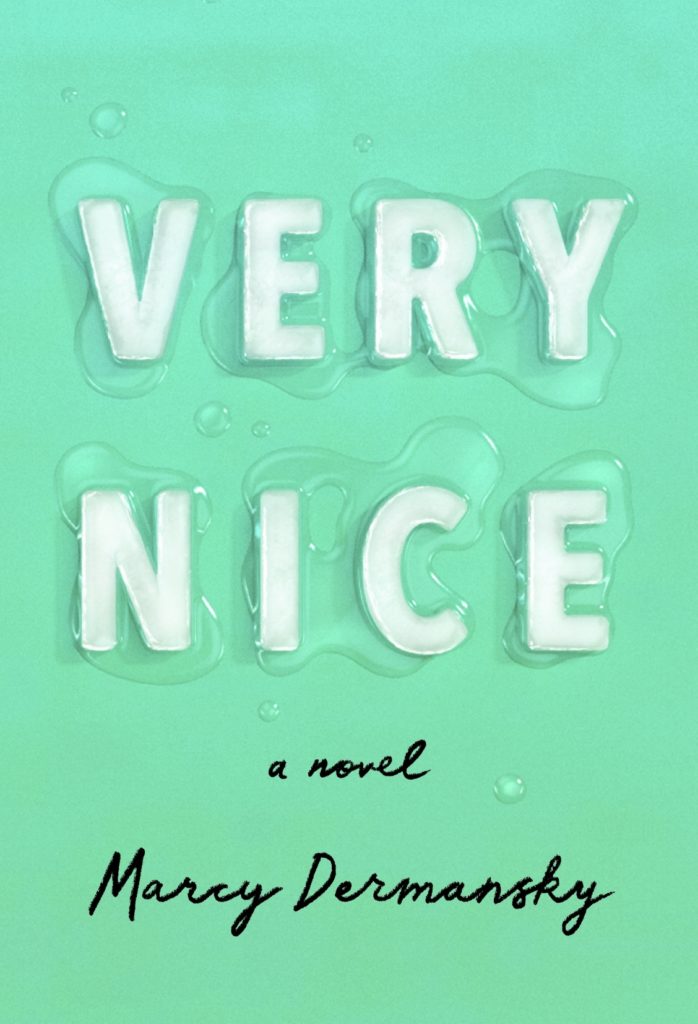 Marcy Dermansky, Very Nice, design by Janet Hansen, illustration by Justin Metz (Knopf, July 2)
That ice . . . it’s very nice. (Sorry. There was no way I could avoid that.) This cover just looks like summer, and the errant droplets give it an extra dose of realism that gets me good.
 Nick Laird, Feel Free, design by Yang Kim (W. W. Norton, July 2, 2019)
This cover is simple and understated, but evocative—it looks like a feeling (is that feeling freedom? not exactly, but that would be too on the nose anyway). Plus, the blues are perfectly chosen.
 Lila Savage, Say Say Say, design by Jenny Carrow (Knopf, July 9)
I can only imagine that it’s fun for designers to work with a title like Say Say Say—the repetition creates a lot of design possibilities. Here, Carrow has taken a text-forward approach, and it’s quite striking. Combined with the abstract black and white background, it’s extra appealing.
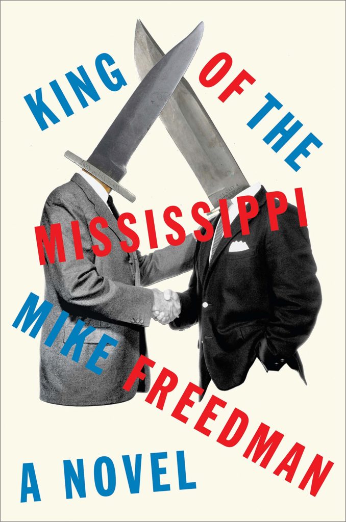 Mike Freedman, King of the Mississippi, design by Matt Dorfman (Hogarth, July 9)
Hot tip, publishers: if you publish a book with men whose heads are knives on it, there’s just no way it’s not going to make it onto this list. (Which I know is a priority.) I love the abject insanity of this cover, which is obviously mostly about the collage but also underscored by the off-kilter, two-color text treatment. Another one that makes you want to pick it up, just to find out what it’s all about.
 Lara Williams, Supper Club, design by Oliver Munday; art: Tabletop Still Life by Severin Roesen (Putnam, July 9)
I love the old-world decadence of the chosen artwork—which is also perfect for the novel—combined with that modern, bright yellow scrawl, which itself is barely contained by the constraints of the physical book. You almost get a sense of vandalism—the present scribbling its mark on the past.
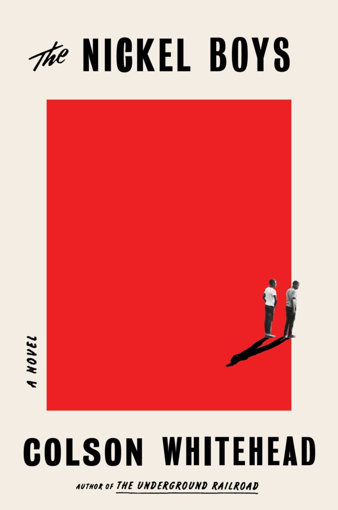 Colson Whitehead, The Nickel Boys, design by Oliver Munday (Doubleday, July 16)
Another lesson in simplicity: that stark red square that becomes ominous once you’ve read the book; the block text; the two tiny figures, and my favorite detail: the shadow that brings them together—an elegant, meaningful detail that brings so much to this otherwise straightforward cover.
 David Szalay, Turbulence, design by Lauren Peters-Collaer (Scribner, July 16)
The background pattern is lovely on its own; it gets even lovelier (and a little stranger—what are we do imagine these lines are?) when you notice its interaction with the text.
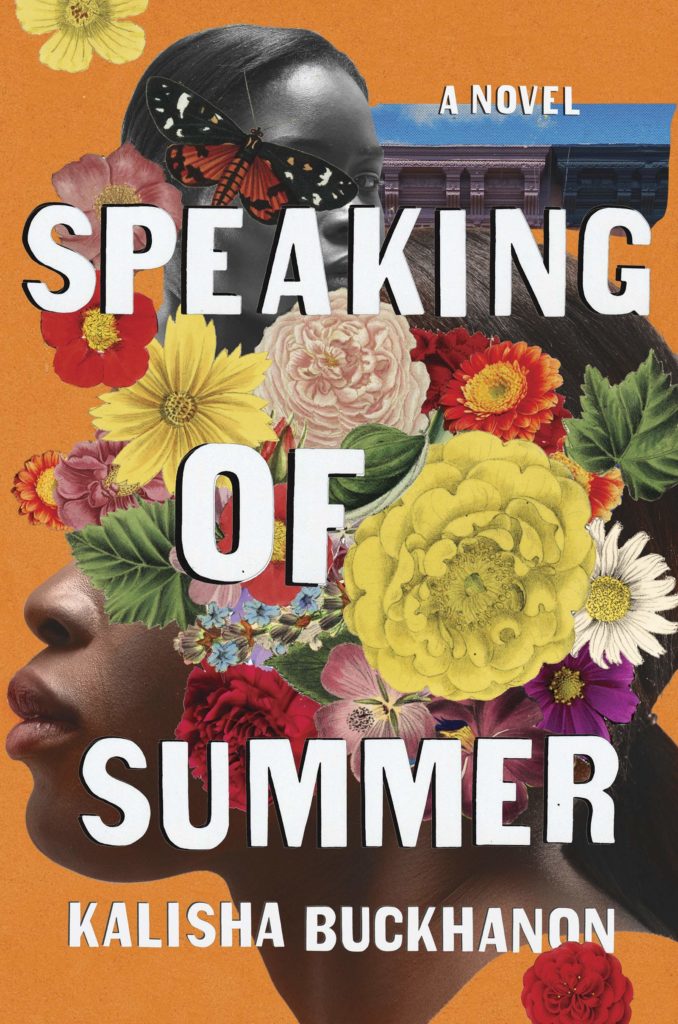 Kalisha Buckhanon, Speaking of Summer, design by Jaya Miceli (Counterpoint, July 30)
This gorgeous, abundant photocollage also feels just like summer—I love the colors (orange is unusual for a book cover) and the choice of vintage-style flowers, which give the whole thing a timeless, weighty feel.
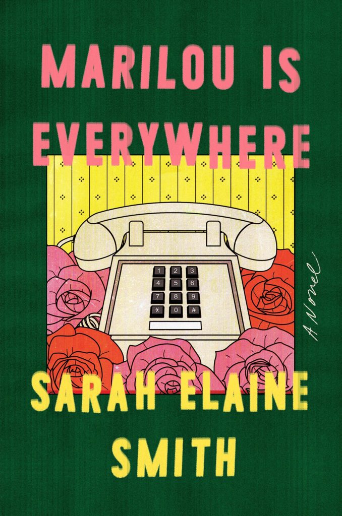 Sarah Elaine Smith, Marilou is Everywhere, design by Grace Han (Riverhead, July 30)
I wouldn’t normally love a cover that’s more or less just a phone. But something about the colors here, and the boldness of the whole presentation, has convinced me.
 Jordi Puntí, This Is Not America, design by Planeta Art & Design; illustration by Lara von Lars (Atria, July 30)
Obviously, I’m a sucker for a good book cover collage, but this one is particularly good, and weird. I mean, all the dishes are swimming pools? The centerpiece is a chalice of fruit? What’s going on? I love it in every way.
Emily Temple
Emily Temple is the managing editor at Lit Hub. Her first novel, The Lightness, was published by William Morrow/HarperCollins in June 2020. You can buy it here.


