The 10 Best Book Covers
of January
To Distract You From the Dismal Skies
Another month of books, another month of book covers. The new year (new decade!) of book design has begun with a move towards lushness: in color, in texture, in depth. These covers are the equivalent of a soft, purple cashmere sweater and a big chocolate cake you get to eat all by yourself—that is, just what you need to nurse the 2019 hangover that never ends. (Reading these books will also be good for your hangover, and also your brain.) So without any further ado:
 Miranda Popkey, Topics of Conversation; design by Sinem Erkas, photograph by Maria Švarbová (Knopf, January 7)
Is this a poster for a buzzy new Wes Anderson movie or the cover of a buzzy new novel? Good color, visually arresting, and what the kids call “quirky.” Plus, I don’t know how to explain this exactly, but the subtle integration of the title and the water—not to mention the author’s name and the tile—really soothes my brain.
 Chris McCormick, The Gimmicks; design by Milan Bozic (Harper, January 7)
Instantly striking—Bozic is a master of color, and this block print style, which could have felt a little static, takes on enormous dynamism because of the interplay between text and image.
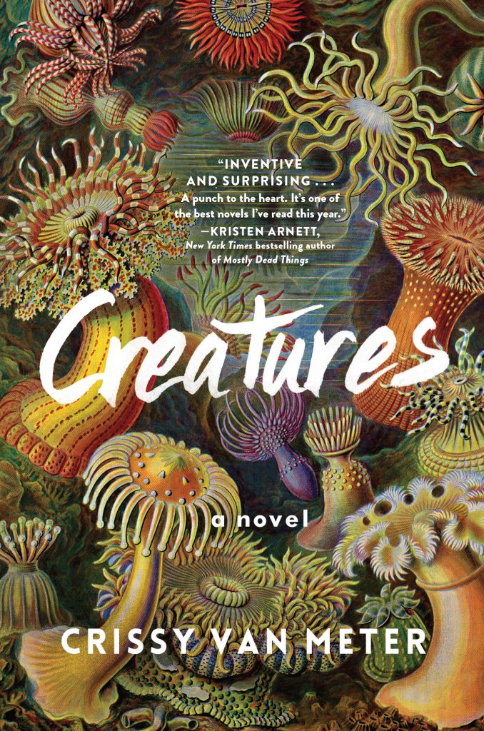 Crissy Van Meter, Creatures; design David J. High, art by Ernst Haeckel (Algonquin, January 7)
The lushness of this cover is almost overwhelming—like almost all of Haeckel’s work, the image puts a strange and otherworldly (and also vintage) gloss on the world as we might know it (if we looked harder). Mostly important: it makes me want to dive in.
 Sun Tzu, tr. Michael Nylan, The Art of War; design by Jaya Miceli, art direction by Ingsu Liu (W. W. Norton, January 7)
I love this bold and appealing new take on the cover of a classic text—especially the way the text treatment is subtly tucked under the imbricated armor. I’m a sucker for that kind of thing.
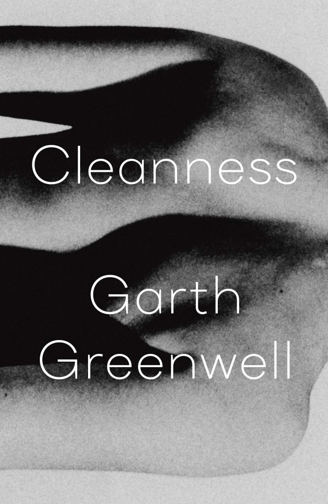 Garth Greenwell, Cleanness; design by Thomas Colligan (FSG, January 14)
So simple. So good. So adaptable—you see what you want to see, or at least at first. If anything could break your heart more than Garth Greenwell’s actual writing, it might just be this book cover.
 Anna Wiener, Uncanny Valley; design by Rodrigo Corral (MCD, January 14)
Uncanny is right—is it blurry? Is it 3-D? Is it one of those bendy plastic thingys? Are those buttons? What is this book? All the questions (well, one of the questions) that every great designer wants you to be asking.
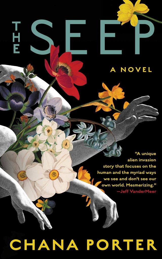 Chana Porter, The Seep; design by Michael Morris (Soho Press, January 21)
When Soho Press asked Porter what kind of cover she wanted for her book, she asked for “lush overgrowth, water, flowering, fruiting—or anything that alludes to the natural world overtaking the domestic.” She got it. The cover is a gorgeous, weird explosion, but perfectly balanced by the simple text treatment.
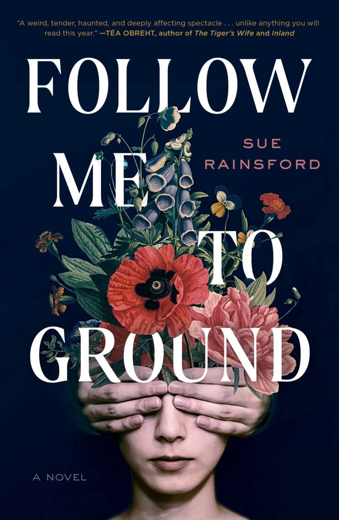 Sue Rainsford, Follow Me to Ground; design by Jaya Miceli, collage by Toon Joosen (Scribner, January 21)
Follow Me to Ground and The Seep are sister covers—it’s kind of incredible that they’re coming out on the same day, and I love them both. But in a way, they’re opposites: here, the wildness comes from within instead of from without. It’s a similar mood but an entirely different movement.
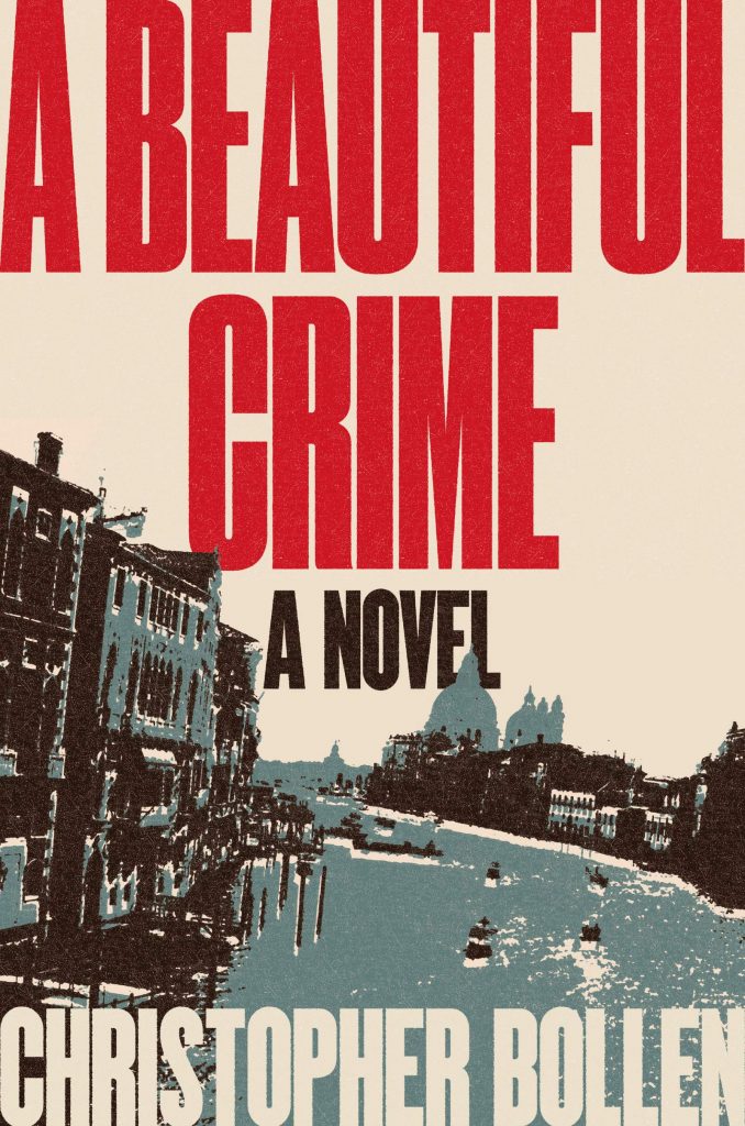 Christopher Bollen, A Beautiful Crime; design by Milan Bozic (Harper, January 28)
This looks like an old Italian movie poster and I am here for it. Amazing what can be done with four colors!
 K. J. Parker, Prosper’s Demon; design by Christine Foltzer, art by Sam Weber (Tor.com, January 28)
I mean, how could anyone resist?
Emily Temple
Emily Temple is the managing editor at Lit Hub. Her first novel, The Lightness, was published by William Morrow/HarperCollins in June 2020. You can buy it here.


