Secrets of the Designers: On Creating the Look for a Literary Journal
John Freeman Talks to Michael Salu About the Conception of Freeman's
John Freeman: I’ve worked with you before on a brand (Granta) which was already well established. I’m curious how this differs, basically creating a visual identity from scratch.
Michael Salu: It was interesting trying to gather a starting point for the look of a new journal (Freeman’s). I supposed I’d begun with thinking about what might hook into the strong literary tradition of the journal and your own rather lucid, oak-distilled Americanness, if you don’t mind me saying? I wanted to create a feel to the journal that I suspect had quite a part in raising you and maybe get a touch of a bygone idea of America, but also create a fresh contemporary brand that could cloak the intended international perspectives that fill its pages.
So I began with looking at The Beat era, Ginsberg, Kerouac et al. Walker Evans and other artists from that era and the paraphernalia surrounding them during and soon after their respective heydays. I think of the scenes, the journals, the academic publications, the poetry and photography books. The typography of this time carries a certain robustness, directly inspiring the Freeman’s masthead. There’s such myth and movement through images more recently, so working with young photographers seemed an interesting way to go.
 Walker Evans, “Shoeshine Stand.”
JF: Well you threw a bulls-eye dart there. I grew up driving distance from City Lights, which was my MFA and also how I found a more modern collision between aesthetics and ethics. Planet News could be a book for untruthy times. You’ve worked with me before though and must have known the journal would have a global list of contributors. How’d you figure you would signal that or do you feel like all the ways of signifying in that regard are too broken to employ?
MS: I’d say there’s a visual vernacular that’s universal. Particularly when it comes to magazines. It’s something we question little, the formula road-tested for optimal impact. The image as a signifier for something you want to or need to identify with. Using this formula in a literary context playing with that signification is I think a way to draw on the grouping of ideas you seem to aim at both now and before.

JF: One thing I know is you always wanted your covers to speak to readers’ intelligence and skepticism, can you give me an example of how that interaction grows out of questioning the vernacular you just described?
MS: I suppose I spend a fair amount of time examining the semantic data that exists within images, how they shape our narratives and there are certain strict codes we adhere to certainly for “commercial” purposes. What do they mean to the individual and our societal hierarchies? These codified archetypes of being, or saying that we imbibe and occasionally those life myths are disturbed and we struggle to react. Thinking about Charlie Hebdo and the recent Trump cover by Der Speigel, yet the likes of Vogue arguably carry more power as their tropes of propaganda are consistent and far-reaching. I’ve always been interested in subverting those codes. Remember Granta 110 and 115? In fact I’ve always wondered how you read images given your granular engagement with words.
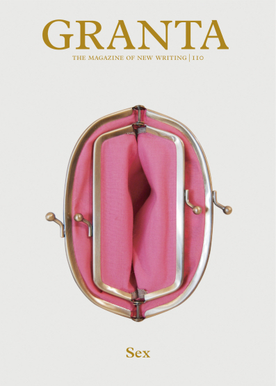
JF: Have you read Geoff Dyer’s book on photography, The Ongoing Moment? In it he argues quite persuasively that the history of photography is a tale of how that semantics was built. As in we’re often taking a picture because we’ve seen a picture like it. And so these images get rooted deep into our culture as they get taken and retaken, respun.
Until reading his book I’d always thought recycled images were the hallmark of consumer life and advertisements. But now I realize consumer life merely activates the psychologically potent images that have transcended semantics and become a kind of myth. For instance, some of the early Marlboro ads look like a color version of a Walker Evans photograph, which over time no longer represents a person or even a time period but becomes a trope of resilience. I guess the covers of books and magazines are where art and commerce meet, so my hope in them is to find something that might at first glance feel like it’s pulled from those mythic archetypes and then a split second later—like the car on your Arrival cover, or the slide in Family—becomes something less containable.
MS: I haven’t but I shall. Interesting. In some ways the repetition is simply an echo of the actions of the self. I guess we could say there was never actual meaning in the mechanics of the recorded image anyway but maybe even that might be readdressed today in light of how images are now “read.” I often look at two levels. One of obfuscation and another of analysis, aggregation and development. The former seems to serve the latter rather well and I wonder how deep that binary will run. I suppose this is maybe why I feel a tad disillusioned with images after working with them for so long because that spin cycle of disinformation is faster, more reactionary as there’s an unprecedented immediacy to the movement of image and rooting of image.
I gave a Ted Talk about this deception economy a little while ago and I think even in the last year this culture has changed up a gear. It’s interesting how well versed we all are now in the fundamentals of what was traditional “graphic design.” The juxtaposition of an image and some words, appropriating and changing context of both to add in a third signification. In some ways the democratic movement of meme culture is a good example of this, the hysteria and immediate opinionating of a supposed botched diplomatic handshake or the world press award-winning photograph from the assassination of the Turkish ambassador to Russia and the propagation of myth on both sides of the ideological divide.
I suppose it’s why I was keen to work with young photographers like Thomas Albdorf and Stefano Galli on the Freeman’s cover series. Those who’ve grown up in this swirl and whose own works are often irreverent takes on this repetition and absurdity and working with an integration of the surreal as a strong part of our common day-to-day grammar and trying to grapple with the slippery materiality (or lack thereof) of this space. Yet in all this we’re not even talking about the next phases of image, the real weaponization of them, how likeminded images find each other through information read, stored and analyzed via the daily platforms we use through deep learning and such. This to me is more interesting, systems that will eventually have seen more images than us makes for an interesting discussion.
I’ve recently been reading Douglas Hoftstader’s I Am a Strange Loop in which he examines realms of consciousness and the notion of “I” through this self perception and self invention or reinvention. I thought some of those tenets were interesting in relation to the image and I wonder what the aggregation of this consciousness means if it’s true worth is only in the hands of a few. I’m not trying to be all doom about it, but I think it’s certainly worth questioning in light of where we currently are.
JF: I completely agree with you, there’s been some kind of breakdown between looking and perceiving, and I think it has something to do with how much time we are spending doing both at once in platforms that simultaneously transmit self-perception. Mental processes of response and alteration are now made into constant activities. So when we get rudely pushed back into one of the reactive, hard realms of physical reality—say, walking down the street—it’s confusing.
Have you ever been walking down the street and a cell phone zombie bumps into you and they look up annoyed and confused, as if they might just try to swipe your face right, or click the X on the corner of your face to close down the browser image? Maybe it’s not that common in Berlin but Seventh Avenue on the way to work it’s an almost daily experience. I’ve also been that person on the phone, especially in the past three-and-a-half weeks. Still, one thing I’m continually surprised by, however, is in the midst of all this weaponization of the image, as you put it, there is still an impulse for beauty. As in, there are unavoidable responses to things which touch us as viewers almost biologically—through light and color. That was my response to the cover of the Home Issue—it was as sensory as light coming out from behind a cloud, I kept turning my face to it. Made me think of a line from Apoillnaire’s great poem, “Zone,” “The window is opening like an orange / The beautiful fruit of light.”
MS: It is why when you asked me to create a look for this series, I saw an opportunity to sidestep the often boorish nature of the magazine image and yours is exactly that kind of reading one hopes for. A doorway to poetry, often amorphous, always one’s own and hopefully within that a more subtle recalibration of a memory. As Berger riffed, Why are we never convinced by knowledge? Maybe we have to live it again.


