Secrets of the Book Designer: My Job Isn't To Make Things Pretty
On Accessing Feelings, Going for the Gut, and Almost Dying in El Paso
Recently, I was having a drink with a close friend—not a designer—and we were talking about one of my latest covers. “Damn, man,” he said. “Where do you think of this stuff?” I get this question all the time. I usually laugh it off, or reply with some version of “eh, I don’t know.” Or I’ll quote Lucas from Empire Records: “Who knows where thoughts come from? They just appear.” What I never say is that it has taken years of experimenting, failing, succeeding, rethinking, and over-analyzing to come up with a process that feels right to me. Because the truth is, I don’t think of ideas—I identify feelings. More specifically, I identify how I want you to feel when you look at a book, and then I create that feeling. My job isn’t to make things pretty; it’s to dig deep and find the guts of every book.
Every now and then it hits me: being a book cover designer is one of the coolest jobs I could have lucked into. Usually, it’s at the start of a project, or when we launch the new list. When I haven’t yet cracked into the manuscript; when all I’ve got is a placeholder title, a short summary, and some comparable books. That’s when the adrenaline picks up. Each time I start a project, I begin with a new set of words, some blank sheets in my notebook, and a passionate editor who knows that this book might just make an impact on someone’s life. It’s my job to give that book a face and a voice. I’m the front line. I build the portal to your imagination.
For me, design is about anticipation. Design is the visual handshake, the wink, smile, and wafted perfume that lures us through the world. No matter what you’re designing—a book cover, an identity system, signage, or a whole experience—before the consumer gets to the content, they come face to face with that portal, and it fills them with a certain feeling. That feeling lies in my hands.
In terms of practical application, I think about book covers the exact same way I think about branding. In fact, something I’ve come to learn over the course of my career is that a book cover is a brand. In both cases, you’re working with the formal elements of image and typography in order to transmit a message and spark someone’s imagination. Before you read a title, you see the title. Typography carries tone. It carries the heartbeat of the book. The imagery, or lack of imagery, captures your imagination. It helps create a setting. It helps enforce the style. It works together with the typography to draw a portrait of the world between the covers.
When working with a brand, you have to fully understand it. You have to understand the lifestyle of the customer who connects with that brand. The brand is a capsule that contains style, tone, and purpose which, when it reaches someone, projects certain qualities onto that person. To me, a book is exactly the same. Though the balances may be slightly shifted, a book often says something about the reader as much as it says something to the reader. Both a brand and a book contain a personality, and as consumers, it’s up to us to decide if we want to be friends.
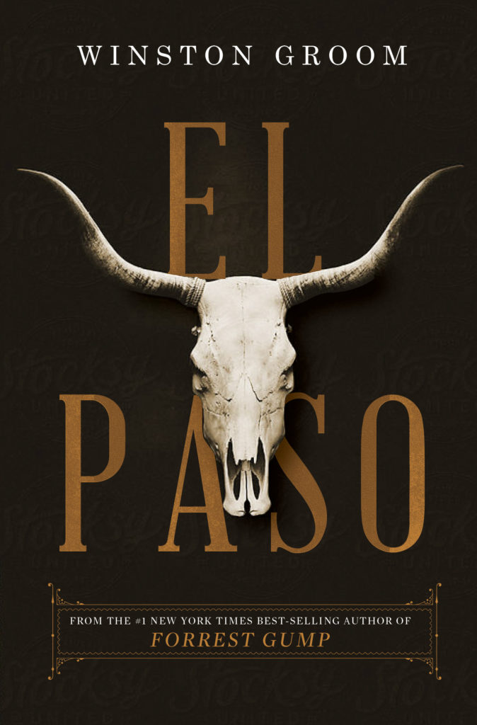
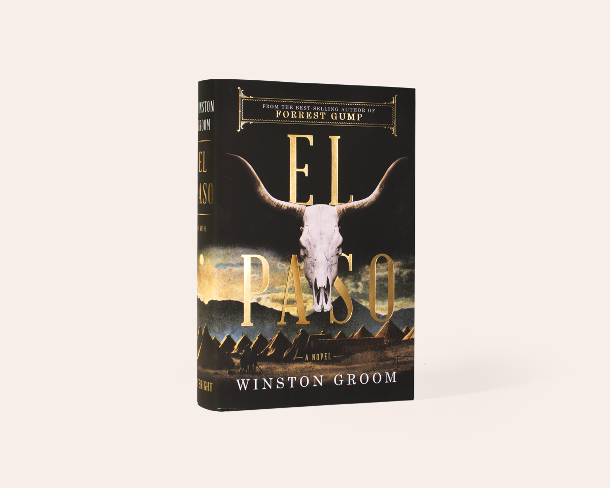
The best example I can give to illustrate this process is the cover I designed for a book called El Paso.
El Paso was a big book for us. It was written by Winston Groom, the author of Forrest Gump. That alone was an important detail when it came to designing the cover. El Paso is also rooted in history (the history of Pancho Villa to be exact) and filled with details of the railroad boom, kidnappings, guns, mountains, bloodshed, airplanes, rattlesnakes, and adventure. The plot is epic.
But even with such a grand storyline, I thought this book was undoubtedly going to be discussed as “the new book from the author of Forrest Gump.” From a design perspective, word of mouth was going to be vital—probably more so than usual. So I had a preliminary conversation with my editor about what the cover should look like, and I made my bid for a simple cover. I thought it needed to be easily described. I thought there should be something iconic about it—but not in the abstract way people usually mean when they say that. I meant it literally: I thought this book needed a central object on it—an icon—or at least an obvious central image. When it came up in conversation at a bar or a party, I wanted it to be easily described as “the book with that thing on the cover.” At the time I didn’t know what that thing was going to be, but I felt it needed that hook.
There are times when I go in the complete opposite direction—if the voice of the book is more abstract and ethereal, for instance. This one, however, was direct and bold. Add to that the fact that Pancho Villa was a real person, so any book with Pancho on the cover would seem like non-fiction; this was something we’d have to work against in the design. So we tried a few things. Then a few more. Then a hundred thousand more. I tried to capture tones of mystery with some, adventure with others, time period with some more, and even a nod to history with a few.
We weren’t necessarily trying to see which was the best design with all these covers; we were looking for the right voice for the book. What was the brand? How did the cover make you feel, and what did it say about the book? After agonizing over this for weeks, we eventually we chose the one we’d affectionately named the “Horn Cover.” The editor said it was the only cover that gave him chills. Mission accomplished.
Actually, it wasn’t.
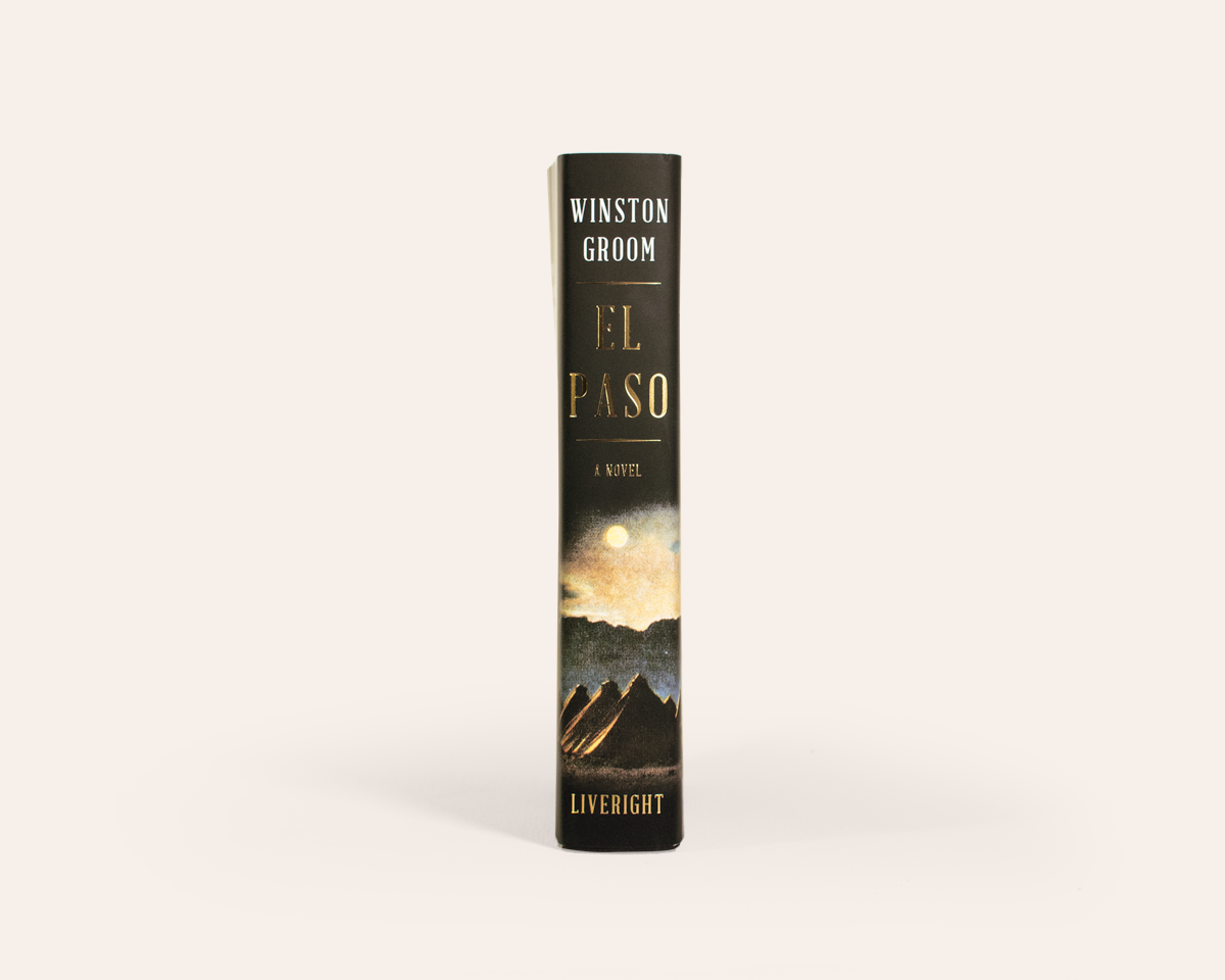
Eventually, the saga ended with a stroke of luck. My editor found an old postcard of El Paso, Texas from the right time period. We added it to the horn design, and boom—it became a surreal interpretation of the book that also achieved the iconic look we needed. It gave the story a sense of place. It softened it a bit and gave the voice a more vintage tone. We finished the cover with gold foil and and a soft touch. Done! Everyone was happy. It was still bold. It was iconic. It felt right for the book. I was proud, but more importantly, it sold like hot cakes, which pleased the numbers people. Always please the numbers people!
My view of this craft can be a little too idealistic at times. I know that. It can frustrate my editors, and that’s hard because I love my editors. If I’m honest, El Paso almost broke me (cue the violin). I can laugh about it now, but the process does drag you through the mud a bit, because it’s impossible to create work with the intention of fueling emotion without putting some of your own emotion into it. It’s an easier route to just figure out what the sales team wants and deliver it to them, but that doesn’t interest me as much. I like finding the guts. It’s the one thing I won’t compromise on. If you take away my way of thinking, my process, my slightly over-ambitious goals for every project on my plate, then you remove any chance for my work to have heart behind it. My idealism has led to my identity as a designer and a visual artist.
One of my favorite covers to work on was for the 1,200-page Alan Moore novel Jerusalem. All you need to know about this book is that its concepts are rooted in the fourth dimension and it claims to be a history of the world. Key elements are symbology, the location of the story, and the creepy communication between different periods of time. Oh, and a phallic drawing plays an important role. I can see your face now. Don’t worry, I was lost before I even began! This was a very difficult brand challenge: I had to speak to Moore’s loyal audience, communicate an impossible concept, and pique the curiosity of new readers with a bite-sized idea, all while designing a fresh package. And by package, I mean a hardcover book simultaneous with a boxed set containing the same book split into three portable paperbacks. The caveat here is that we were fighting an uphill battle—we were trying to convince the author that his drawing was not right for the US market. We wanted to do something… different.
I’ll skip this knock-down-drag-out story, but in the end we were unsuccessful—and not because we were wrong. In fact, I still consider this to be one my most successful attempts at capturing the identity of a story and presenting it in a fresh and memorable package. I found the guts. The pulse. I felt so sure that I knew what the face of this 1,200-page book should be. The author disagreed, and we couldn’t put these designs into production. But this was a great lesson to learn, and an even better exercise in branding.
Sigh.
So when my friends ask how I think of this stuff, I should respond by saying it’s the wrong question. The real question should be: how do I think about this stuff? I believe everything in this world has a pulse, and approaching my work with that opinion allows me to tap into an emotional side I otherwise couldn’t. Thinking about each book cover as a multi-dimensional canvas has helped me clear my process of all the junk. It’s hard, but it’s simple. It’s not just about figuring out what your audience will see. It’s about figuring out what they will feel.
Steve Attardo
Steve Attardo is a cross discipline Art Director, Designer, and Photographer based in New York. He’s the Art Director for Liveright Books/W.W. Norton and the founder of Nineytnorth Design, his Hudson Valley-Based branding and Identity studio. Formerly an Art Director with the New York Times, his work has been celebrated by the likes of the AIGA, New York Book Guild, and GD USA. Working with a range of clients from household names to the smallest hard working businesses, Steve’s work is expressive, typographic, visceral and cuts with just enough edge. He holds a BFA from the School of Visual Arts, a professor at Pratt Institute, and has spoken about design across the U.S. Follow him on Instagram @steveattardo


