Resisting the Obvious Design for a Book Cover
The Cover Reveal for Sarah M. Broom's The Yellow House
Read author Sarah M. Boom on her book cover here.
A few years ago, I read a piece in The New Yorker that was so beautifully written and emotionally charged that it stayed with me for quite some time. The author, Sarah M. Broom, wrote about the impact Hurricane Katrina had on her family and their home in New Orleans East, an area most tourists never see. Little did I know I would eventually design the jacket for the book which had its beginnings in this article. When Gretchen Mergenthaler at Grove contacted me to work on The Yellow House, I said yes immediately—I was really looking forward to spending more time with this author’s work.
What I love about The Yellow House is that it moves beyond the confines of a traditional memoir. Sarah not only documents her family’s story but, through their experiences, also writes an alternative history of New Orleans and an examination of race and class. She reminds us that it’s impossible to understand a city without first understanding its people, and that the two are inextricably linked.
I was so taken with the manuscript that I wanted all of these ideas to be represented in the jacket. But when I sat down to start working, I soon realized I was setting myself up for failure. I also underestimated the difficulty of designing a jacket with such a specifically visual title. I struggled with the idea of showing the house or avoiding it completely. I knew Sarah was a fan of the jacket I designed for Lisa Brennan-Jobs’ Small Fry, so I tried to channel some of that energy into her designs and take more of an abstract or even metaphorical approach.
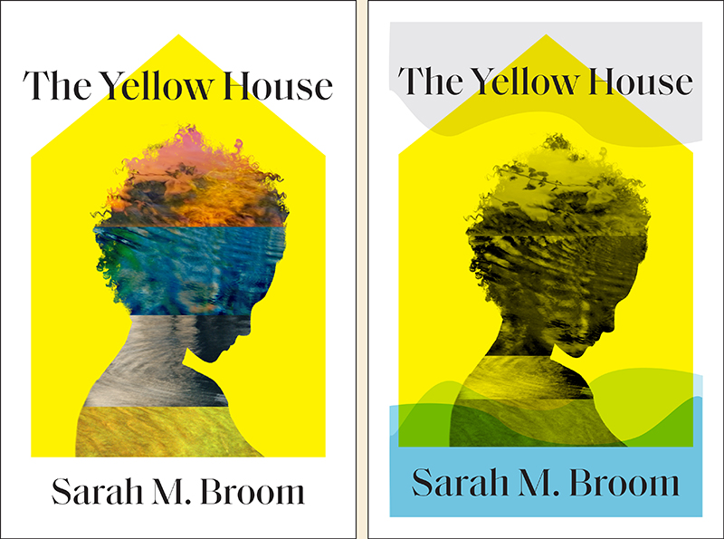
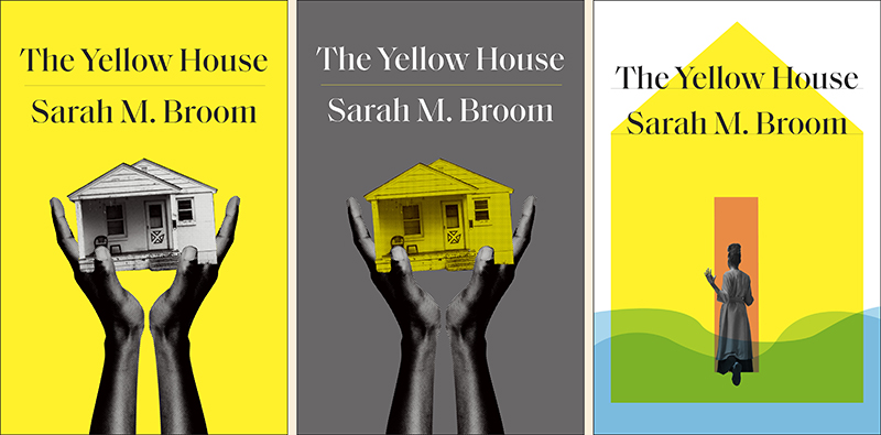
Unfortunately, the first round wasn’t what Sarah had in mind. She wanted something more unexpected—she felt these were too “on the nose” and that they were trying to tell a story, but the narrative was too obvious and reductive.
In hindsight, I completely agree. Sometimes a first round allows you to work through your ideas so you can eventually land in the right place. Rejection can be a very good thing for the design process; if the criticism is well thought out, it can often help you get to a better design.
The second round proved much harder for me—I was starting over completely, but I didn’t have a solid idea of where to go next. I looked back at some family photos Sarah provided, thinking those might serve as inspiration. And I spoke to Sarah directly about her manuscript—we discussed how her family’s house was essentially a character in the book, that her writing explored the cartography of relationships, a map of loss, and the blueprint of a family.
I started to think…what would Sarah’s family tree look like? How could New Orleans and their neighborhood be represented? What if her family tree wasn’t a tree at all, but a map? And that’s when the idea came to me to design an actual “map of loss” using snippets of her family photos.
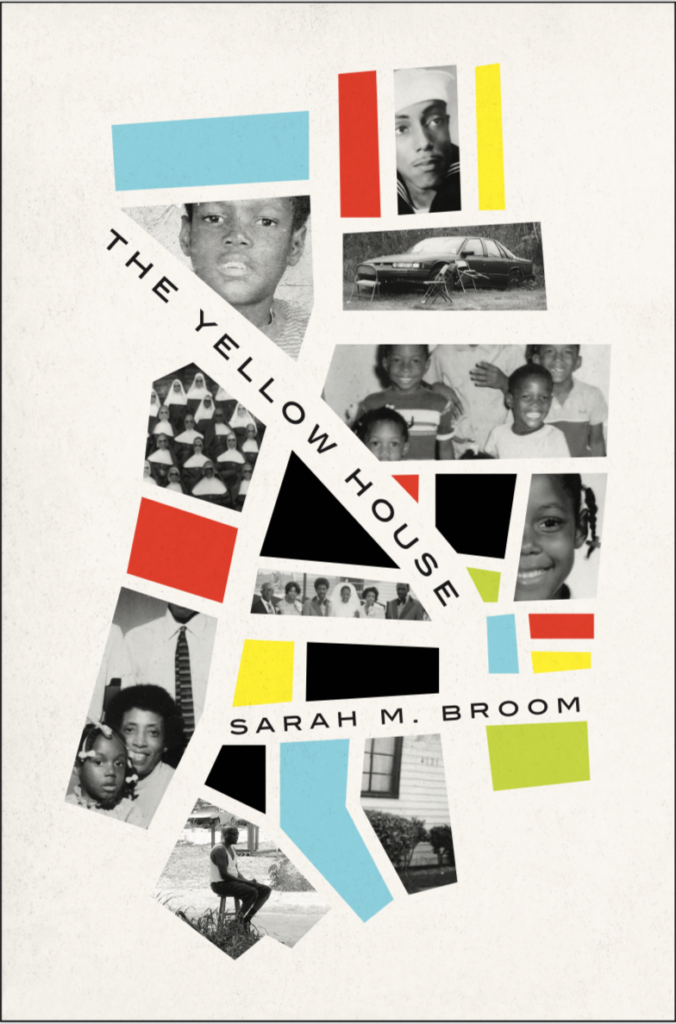
Grove sent Sarah the second round of comps I submitted, including the “map” design. Apparently my brainstorming paid off, because the author ended up choosing it.
I love it when a project really challenges me to think more intensely and push beyond what seems like the “right” solution. I’m incredibly happy with the final design and, most importantly, the author is too.
Alison Forner
Alison Forner is an art director at Simon & Schuster, where she designs and art directs book covers for their flagship imprint. A graduate of Barnard College, Alison was a professional dancer, a poet, and a print production manager before moving on to a career in graphic design.
