
Paul Rudolph's Strange Vision of a Cross-Manhattan Expressway (and Other Unfinished Projects)
In Conversation with One of America's Iconic Architects
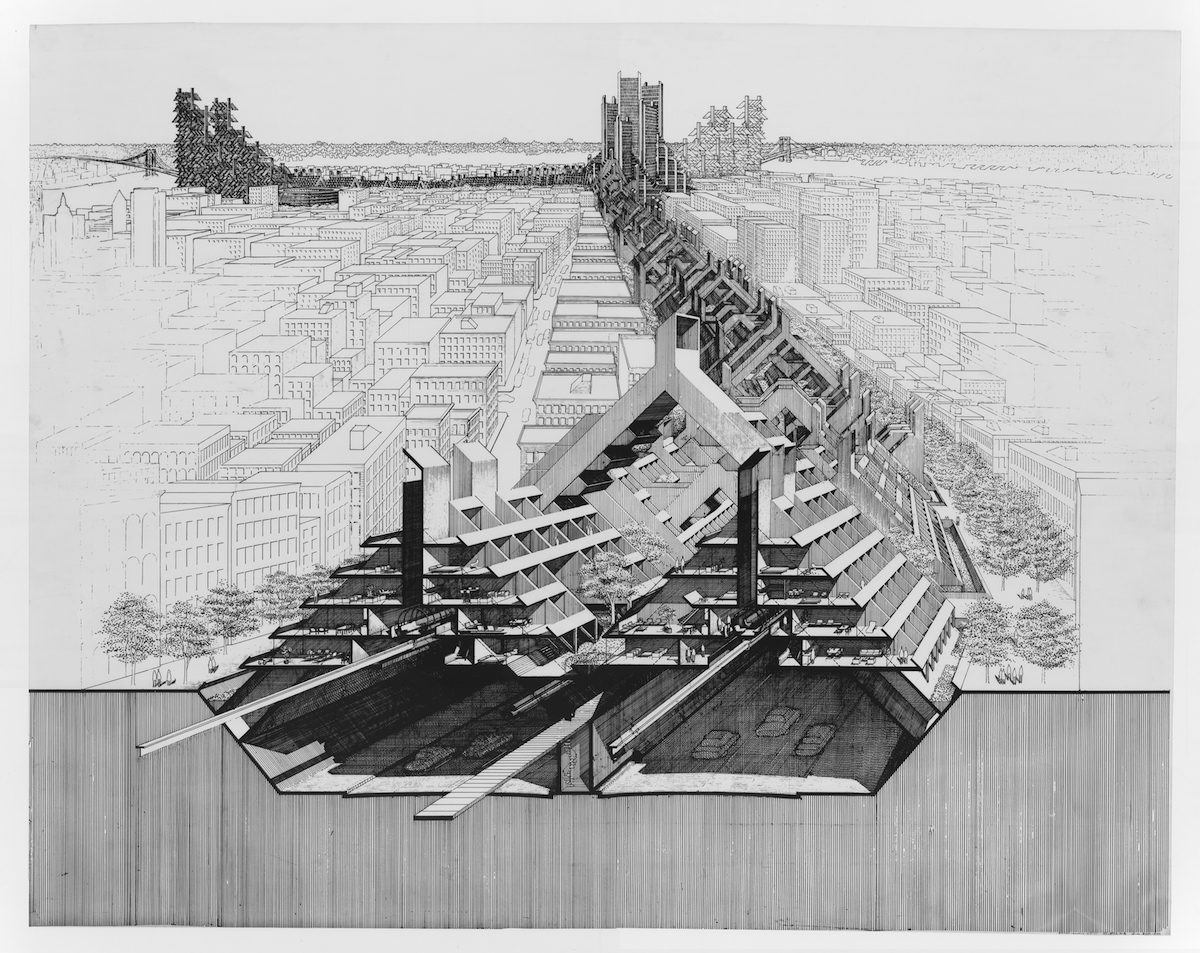
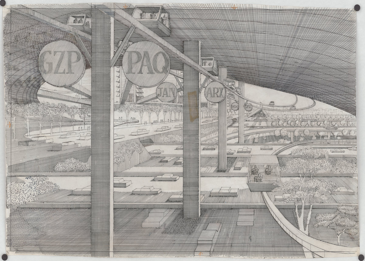
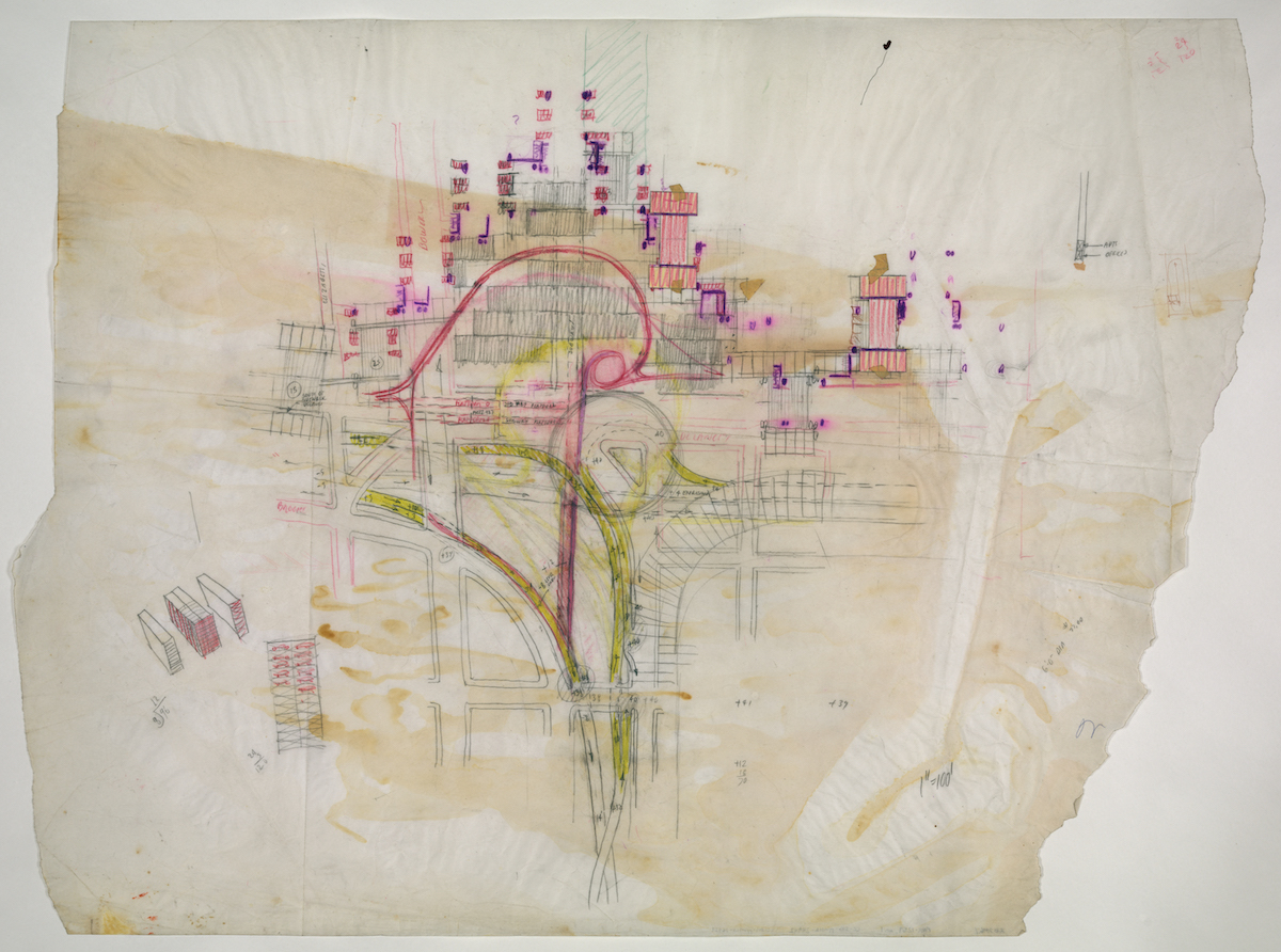
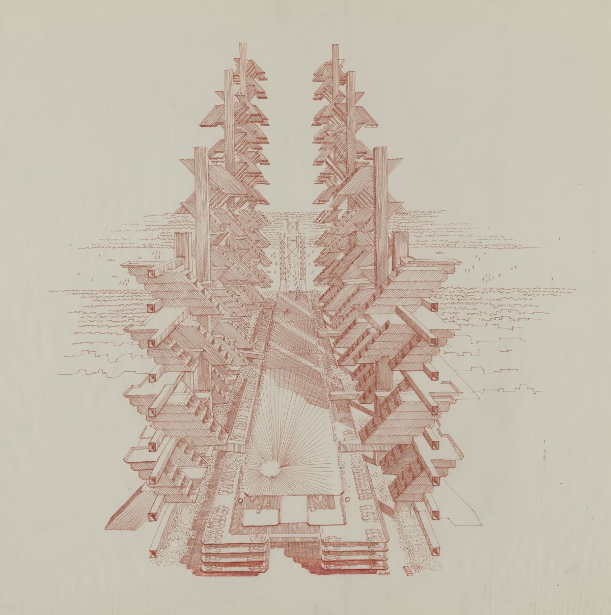
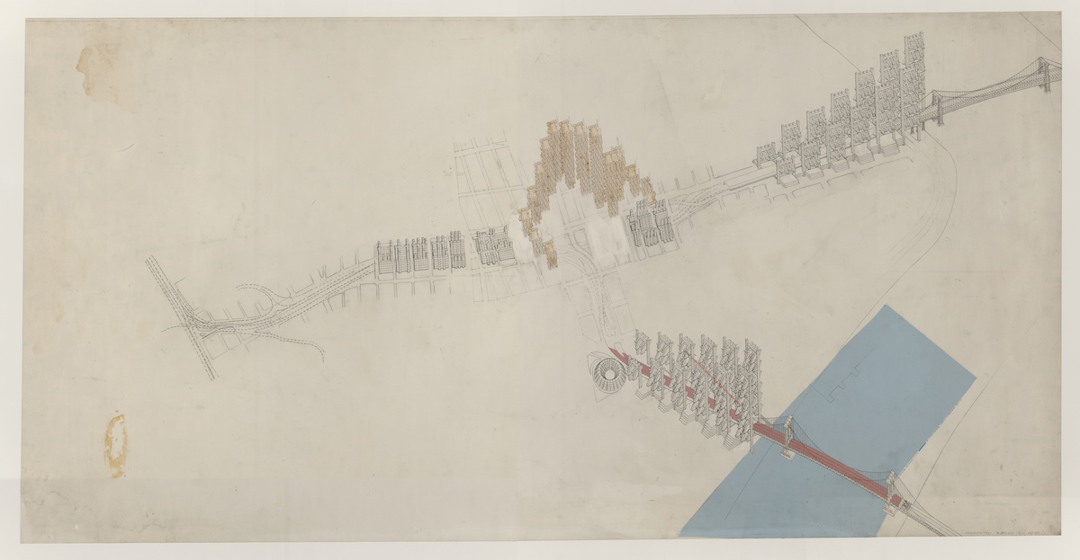
Legendary American architect Paul Rudolph’s interest in relating buildings to context occasionally extended into idealistic urban design proposals that were (like comparable proposals by his contemporaries) never executed. The most ambitious and best known of his urban schemes was his design for mixed-use development above the proposed Lower Manhattan Expressway. During the 1950s period of interstate highway construction, this was considered an essential link between the Holland Tunnel and two East River bridges, but in the 1960s attitudes shifted sharply in favor of neighborhood preservation.
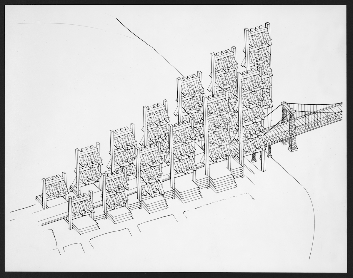
In 1967, the Ford Foundation commissioned Rudolph to study potential new development along the route. In his proposal several levels above the highway would be devoted to local traffic, parking, and pedestrian circulation, flanked by bands of new construction supported on triangulated framing, the heights and uses of which would vary with the neighborhoods it passed through. The scheme was variously greeted as visionary or nightmarish, but opinions became moot in 1969, when the city effectively vetoed the expressway itself.
This is an edited excerpt from a longer interview conducted by Robert Bruegmann in 1986 for the Chicago Architects Oral History Project, organized by the Department of Architecture at the Art Institute of Chicago.
*
Robert Bruegmann: This notion of the multi-level space in a dwelling is something which you’ve obviously been dealing with since the very earliest houses, and this is, you said, one of your prejudices or obsessions. Do you have any idea why you feel that? Why, in contrast to most people who still prefer to live on one level, are you always driving to try to design multi-level units?
Paul Rudolph: It seems to me to be innate in human behavior or human instinct. It’s the difference between Wright’s handling of space, which is based on the needs of the human being psychologically, as opposed to Mies who didn’t use space psychologically at all, and indeed the international stylists. Later on, Le Corbusier started to handle the space psychologically to satisfy psychological needs. Wright, instinctively from the very beginning—and it seems to me that’s the most unique thing about his architecture is his spatial aspects—is absolutely wedded to the needs of the human being from an emotional point of view. That’s the other reason why finally his work is much greater than any of the others. He understood that so well. Mies didn’t have a clue. The whole idea of the continuum of space, which I guess is shown best in the Barcelona Pavilion or the Farnsworth House in Illinois, is a marvelous thing. I don’t mean to say it isn’t, it’s just that it touches the tip of an iceberg. That’s the reason why Wright is so much a greater architect than Mies.
RB: There was this interest in space for Corbusier, but it seems that he always had very few prototypes in mind and that the artist’s studio with the balcony overhanging the two-story living space seemed to be one of the types that reappeared throughout his career. That also seems to be something that influences you very strongly.
PR: For the whole of the international stylist you can say, it was always the two-story high to the one-story high thing. That has a little bit to do with the multi-storied notion and the frame as a regular element. It’s not so easy to get around that. Wright managed, of course, but Wright didn’t build that many multi-story buildings either. The easy way to do it is the two-to-one ratio, but that seldom works very well, in fact. It’s a kind of equality that is unfortunate. Incidentally, Corbu’s other spatial notion, in my view anyway, was the spatial element within the larger spatial element. The core, for instance. His use of that was maybe not always so fortunate. Although, at some point it became no longer a core but rather it became a whole volume of space as in his government building in Chandigarh—the General Assembly Building—where the space wraps around that. There are all sorts of bumps and grinds, appurtenances, that come out into the major space, but then the central space, of course, is the assembly.
Also, Corbu’s other spatial thing has to do with the Stein House outside Paris and also his truly great house in India. Therein the space is continuous, bending, turning, sweeping—moving horizontally as well as vertically—through the whole. Essentially, while the space flows it is always defined by at least two vertical planes. He was a great one to define space by implying a division of space by defining it horizontally as well as vertically, but it was transparent. I’m not describing this very well—let me start over. More important for Corbu’s sense of space later on than the two-to-one ratio was the continuum of space for the whole building. This is most clearly shown, I believe, in his house for India wherein a block of space was defined and then he cut into it and out of it and through it and pierced it and so forth so that it became continuous. It was very different from Mies’ notion of space, which was, of course, always a regular series of columns in a series of horizontal planes. We call them floors and roofs. That was a subdivided—but never vertically—horizontal flowing of space.
RB: Are you describing Corbusier’s ideal design as a single block where the free elements are always juxtaposed implicitly to the regularity of the thing? There’s a geometric purity within his putting in counter-distinctions to the irregular or curving elements.
PR: It isn’t so in the Villa Savoye; you think it’s so, but it isn’t, partially because of the ramp. As a matter of fact, that’s an important point too. I think he would have developed his notion of the vehicle of flowing space more had he lived longer. That was very profound, for me anyway. It was much more developed than Mies.
I should say about Grange Road that this is a building that I have been thinking about for thirty years. It cannot be built in the United States because of the labor involved.
RB: With Frank Lloyd Wright it comes out as something entirely different. You never have the sense that it’s a single unified space that’s subdivided. If anything, it is spaces that are either pushed or pulled or added or subtracted.
PR: Yes, of course. He didn’t give a tinker’s damn about the structure. I’m sure he gave lip service to it, but he would bend it any old way. It also has to do with Wright’s idea of siting. I think he was a master at it, which Corbu was never very good at. Wright’s siting and wedding things in a relationship, literally, to the ground was masterful. The block of space was an anathema to him. He was probably against the Parthenon, for God’s sake.
RB: Is it fair to say that you think you initially start out with the idea of a regular structure and that’s a major organizing principle? Then when it gets down to development and plan you have to push apart the columns?
PR: From the very beginning.
RB: You think of that at the very beginning?
PR: Oh yes. A multi-storied building has to have a different scale at the bottom than it does elsewhere. Because the size of the site is not that big, I wanted to drive under it so that I didn’t have a lot of things coming out from the building. That meant certain dimensions are needed for the automobile that are not needed for the apartment. It meant a different structure from the very beginning. I also, from the very beginning, would start with a core. In this particular case it was in the middle because it’s obviously where the core needs to be. It also makes sense structurally to have four apartments per floor with the core in the middle of the circulation.
You were asking how I really go about working and I can tell you exactly. I can think through very elaborated schemes about a project. That’s what I do because I’m very busy. Because I’m constantly thinking about the thing I will think, “Oh, it could be this way or it could be that way.” Before making any sketches I will really think about it a great, great deal and, finally, I will resolve that into essentially three or maybe four—it depends on the project—schemes. I will then, always to scale, start sketching and try to bring it down to one scheme as quickly as possible. I have the ability now to think through and see, “Oh well, this won’t work very well.” It works on certain points, but it won’t work for others.
RB: When you first make those sketches, what kind of sketches are they?
PR: Anything that I can get my hands on.
RB: Will they tend to be a sketch in section?
PR: The section for me is as important as the plan, maybe more important because it tells you more about the space. I draw on the backs of napkins, any and everywhere. I will make lots of sketches, don’t misunderstand me. I hate to think how many sketches were made of this building.
RB: You don’t have one particular thing that you invariably start with? You don’t sit down and draw twelve columns?
PR: No, I would never think of doing that. I know what twelve columns are. I don’t have to draw that.
RB: That’s something that’s not talked about very much with your buildings. They’re almost always reproduced in black and white. I guess there’s always a lot made of color with your Tuskeegee Chapel. Do you have any particular palette you’re interested in because of Southeast Asia?
PR: Well, I can’t say that I’m interested in a particular palette. For me, color is one of the most complex things in the world because it’s always so different in different lights, different quantities at different times of the day, and when juxtaposed against other colors the actuality and the appearance are two different things. Maybe I’m very tentative about color because I tend to think that monochromatic schemes are the best. It has also has to do with the fact that people change things. Maybe if you’re tentative about the coloring then that’s an invitation for them to change, I don’t know. One of the aspects of color that fascinates me is the reflected light from the color. I have worked with concrete, at least earlier, a great deal and I would often make a very warm-toned carpeting. The reflected light changed the concrete and bathed it in a warm light. I find much architecture very offensive in terms of its color, as a matter of fact.
RB: Is there much color in any of these projects?
PR: There’s no color in this; it’s white and gray, period. There’s a very real reason for that. There are a hundred different apartments here and each one of them will be God only knows what.
RB: Can you envision people putting up curtains behind the glass there?
PR: My business is to make it strong enough so that no matter what nonsense goes on there is still something.
RB: So, it won’t shock you when you go in and people have put up curtains?
PR: I’m beyond shocking.
RB: Ideally, what would they do?
PR: They wouldn’t put up any curtains. Well, I shouldn’t say that—I genuinely think the window treatment for privacy can be done in many different ways in such a building. The fact of the matter is that because of the cantilevers involved you don’t see into the building so much. You see the underneath side of the building. The underneath side of these elements is tremendously important.
RB: What’s the relation of this to your own house?
PR: The apartments up here are very similar in feeling; these are larger than my apartment but the handling of the space is very similar.
RB: Your work at your apartment certainly pre-dates this by some time. This Singapore project I imagine is like 1980 or something.
PR: Yes, and I started on my apartment before that, yes. You must understand that at least in terms of my domestic work much of that is spatially not unlike my apartment. The floor is a tray and the ceiling heights go from six-foot six to thirty feet.
RB: That is only to say that your apartment and this are part of the continuum.
PR: I should say about Grange Road that this is a building that I have been thinking about for thirty years. It cannot be built in the United States because of the labor involved.
RB: What specifically?
PR: The forming of the concrete is, let’s face it, very elaborate. There’s a great deal going on in this building, for better or for worse. There are many different apartment types and structurally and mechanically it becomes tremendously involved. I was just saying that this was not at all off the top of my head. It’s a marvelous example of a building that I’d really been thinking about in principle for a long, long time.
RB: We’re talking about a matter of economy there, then that it could be done.
PR: Yes, it could be.
RB: Do you think this could actually be built in a site in the United States? Would there be anything particularly inappropriate for this to be built?
PR: No. I think of it specifically for a warm climate because of the shading devices and the outside spaces. Do you know what this is? I couldn’t tell the owners this. This is a study of the use of modules. Do you know the project that I have done? I’ve done two major projects and, unfortunately, they’re unbuilt. One was for the Ford Foundation, for the Lower Manhattan Expressway, and the other is the Lithographer’s Union Graphic Arts Center. I took modules and hung them from masts and then cantilevered girders. Of all my proposals, that’s the building that I want to build the most. You can’t do that in Singapore, so this is a sketch for that, you see. Of course, if I told the owners that this is a sketch for what I think will ultimately be built with trailers, they would think I was out of my mind.
RB: That’s very interesting that you bring that up because the notion of the 1960s about megastructure—that is, certain parts that are fixed and other parts are added on to it—clearly had a lot of influence on what you were doing. How much do you think you were specifically influenced by the British Archigram and the megastructure people generally and how much has followed you?
PR: Oh gosh, I couldn’t say that. The notion of the “plug-in” you see doesn’t really interest me very much, frankly. It’s a matter of economics. It is so expensive to get the thing done in the first place. It’s difficult for me to think that anybody’s going to remove elements and change them a great deal. I think you change interior arrangements greatly. Also even with the modules or the trailers, I think only about twenty-eight percent of them actually get moved from a site because making the foundations and hooking them up with water is too great an expense. Once they are there then they are there. The portability is a misnomer to a degree.
RB: So many of buildings that came out of that, including a lot of Japanese buildings like Tange’s Yamanashi News Center. Clearly, you’re never going to take away a part of that or even add to that, but visually it implies that. Would you say that that’s true of your high rise work?
PR: I don’t really think of it that way. That isn’t to say that it couldn’t be because I think it’s implied. In my project for the Lower Manhattan Expressway that was clearly a part of the thinking because it was so large that programmatically things would change. In a building like this, which is relatively small, I don’t quite see it.
“I would go around the world to see a Corbu building or a Wright building. I wouldn’t go across the street to see some things.”
RB: Let me ask a more specific question. For example, one of the problems was the problem of monumentality. Everyone was talking about it constantly after World War II. Something like your Jewett Art Center at Wellesley College seems to have, in many ways, the same kinds of problems facing it as the chapel at the Air Force Academy. That is, you need something more than just a box and it’s got to relate to other things. In fact, there is some kind of attempt to be Gothic in both of them. Were you consciously aware of being fellow travelers?
PR: You have to understand that I’m not too much interested in what other people are doing. I’m very selective about who I’m interested in. I would go around the world to see a Corbu building or a Wright building. I wouldn’t go across the street to see some things. It’s really true. I know it sounds terrible, but it’s absolutely true. Because I’m interested in feeling and understanding, I learn from traditional architecture; I don’t learn from modern architecture by and large. That’s the reason why I feel really lucky that I’ve traveled as much as I have. I don’t like looking at most twentieth-century buildings. I love looking at Wright and Corbu, but I don’t even like looking very much at Mies. I will make a special trip, if necessary, to see the Barcelona Pavilion, but I wouldn’t go very far to look at another Mies office building.
__________________________________
Text from Paul Rudolph: Inspiration and Process in Architecture © 2020 Princeton Architectural Press. Reprinted with permission of the publisher. Images courtesy Library of Congress, Prints and Photographs Division from Paul Rudolph: Inspiration and Process in Architecture. All images are courtesy of the Library of Congress, Prints and Photography Division from Paul Rudolph: Inspiration and Process in Architecture, published by Princeton Architectural Press.
Robert Bruegmann
Robert Bruegmann is an historian and critic of architecture, landscape, preservation, urban development and the built environment. He received his BA from Principia College in 1970 and his Ph.D. from the University of Pennsylvania in 1976 with a dissertation on late 18th and early 19th century European hospitals and other institutions. In 1977 he became assistant professor in the Art History Department at the University of Illinois at Chicago where he was University Distinguished Professor of Art History, Architecture and Urban Planning and Policy when he retired in 2009. He is currently Professor Emeritus.


