Illustrator Neil Packer Goes Behind-the-Scenes of Folio's Complete Plays of Shakespeare.
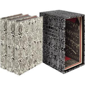
On 8 November 1623, the First Folio of Shakespeare’s plays was registered, bringing together the great playwright’s work as a single printed collection for the first time and saving it for centuries to come. 400 years on, Folio is delighted to commemorate the anniversary with a sensational limited edition; a triumph of the bookmakers’ art and a legacy for future generations, which includes a foreword by Dame Judi Dench and an introduction by Gregory Doran, the RSC’s Artistic Director Emeritus. Neil Packer’s designs for the elegant, bespoke bindings are inspired by Elizabethan blackwork embroidery – his artwork perfectly replicated in sumptuous silk and linen jacquard cloth woven by Stephen Walters & Sons, the oldest silk-weaving company in Britain. Packer has also contributed 40 illustrations and designs for the presentation box.
Olivia Rutigliano chats with Neil Packer about the making of this extraordinary work of art.
Olivia Rutigliano: Your artwork appears all over this edition—on the pages, lining the slipcase, even embroidered into the material that the books are bound in. What was it like illustrating these very different parts of the book—how did you decide the design for each part—i.e., how did you get the idea to make an illustration of the playhouse the inside of the slipcase, or how did you decide which symbols to feature in the pattern for the binding?
Neil Packer: Firstly it is necessary to understand that producing a project on this scale and of such importance is very much a collaborative endeavour. Before I even begin on the illustrations, very lengthy discussions will have been had about an approach. This will have included the art director, the production director as well as the editors, and it is necessary for everyone to be in agreement about the aesthetic of what the finished book might feel like.
My job is then to visually flesh out that aesthetic, not only within the illustrations for each of the plays but, as you suggest, to bring that same feel to all of the other elements of the book. I trained as a graphic designer and cut my teeth in the industry working on corporate identities back in the 80s. Perhaps some of that stuck with me as I still hugely enjoy bringing a harmony to all the separate elements of a project like this.
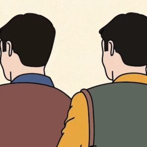
The look of the illustrations for each of the plays was primarily driven by 16th-century woodblock prints but I also wanted the images to nod slightly towards figures from Victorian toy theatres. The idea of the theatre within the slipcase came out of that idea as these tiny characters would of course require a stage.
All of these processes bring with them their own challenges and with this project we were attempting to take the design to places that none of us had ever ventured before. In particular the silk bindings for the three 3 volumes was something entirely new to us all and a great deal of time and effort was given to understanding what was possible to produce in the form of silk on linen woven on a jacquard loom.
The idea of the symbols was born out of necessity as we didn’t want any text to appear at all on the binding designs. It needed to look as much like Elizabethan blackwork as possible. However it was important that the reader should be able to identify each of the volumes at a glance from within the slipcase. So it seemed a logical solution to change one of the elements of the design for each of the volumes and to align them on the spines, (a crown for The Histories, a jester’s hat for The Comedies and a heart for The Tragedies) – an easy enough solution to think up but extremely difficult to get to work in practice.
OR: What medium did you work in to create these designs?
I had intended for the illustrations in this book to look like woodcuts and to perhaps carry some of the slightly unsettling nature of woodcuts from Shakespeare’s period. They are however not woodcuts but worked in very fine pencil on tracing paper. Heads, limbs and torsos are drawn separately as are the other elements of each illustration. This is to give some flexibility when putting them together in the final image. My instinct is to at least try to draw everything to correct proportions but that is not the aesthetic I wanted for this project as part of the appeal of 16th-century woodcuts is that they have a beautifully skewed aesthetic to them, something I can more easily try to match by manipulating all the elements separately.
The pencil lines are scanned and loaded into photoshop where I layer a negative on top of a positive version and then, using the clunky mouse and the eraser tool, cut away at parts of the negative image giving them a slightly coarse woodcut look. I then add my own roller textures and add colour to parts of them. I have a strict dogma about using photoshop which keeps as much of the algorithm out of the process as possible and I have deliberately only learnt a tiny corner of what is possible within the system.
OR: I saw that you made a pop-up theater based on your slipcase illustrations! It’s wonderful. How did you make it?
NP: The pop-up theatre was something we had talked about for a long time but we were not exactly sure how it might fit into the larger project. It came right at the end of the project and is really just a publicity prop. It is based on a design I created 40 years ago., In fact I still have the original one and astonishingly enough it still folds up perfectly after all that time. Over the intervening four decades I made another three of them and have tried, with no success, to get interest in a commercial version in some form. The problem is that it is too complicated to build as multiples and this particular version, which is repurposed artwork from within the book reproduced as giclee prints and hand-mounted, hand-cut and hand-assembled, took at least two weeks to build just the one.
It is hugely enjoyable to start to think again in three dimensions and to spend a bit of time working on something physical, but probably building one of these every ten years or so is quite enough.
OR: How do you decide which scenes from the plays to use when illustrating the cover page for each play?
It is effectively a matter of achieving a balance between two or three problems, as is often the case with any design decision. Firstly, how recognisable is the image? Should one opt for the obvious scenes which everyone knows? But these scenes might not be so recognisable as a visual image, after all it is Shakespeare’s written language that often marks out a moment rather than what is happening visually.
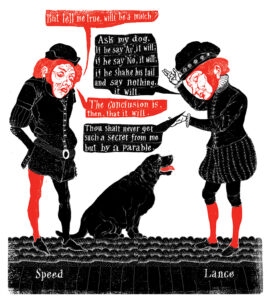
Some of the plays might have a unique factor to them such as Lance’s dog in The Two Gentlemen of Verona, (the only dog in all of Shakespeare) thus giving it a unique identity and trumping some of the more famous scenes from that play.
Another factor is what will work best as a strong and memorable image but more important still is to try and put clear water between all the images, to try and make them as different from what has gone previously as possible, and although it is important to try and balance all these sometime competing issues the final image should be identifiable as that from a given play.
OR: Do you have a favourite illustration in this edition?
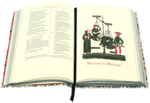
NP: Much ado About Nothing, I think it ticks all the above boxes.
OR: Do you have a favorite Shakespeare play?
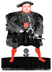
NP: Richard III
OR: Since Shakespeare has been adapted countless times in all kinds of media, is it hard not to be influenced by previous images/aesthetics/renderings you’ve seen, or do you end up leaning into that influence a bit?
NP: Yes, very possibly but I think it is partly, at least, unconscious. I think that is how influences work generally, it is maybe as simple as absorbing the things we love in whatever form, and for this project particularly in the form of live theatre, but also film, artworks and even music probably has had an influence on some aspects.
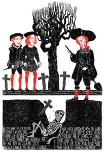
A good example of influence might be the image for Richard III. Looking back at this image now, more than a year after I made it, I can see that clearly the Elizabethan woodblock print is my starting point with all of that unsettling atmosphere which usually attends them. But I can also see the influence of outsider art, particularly in the depiction of the ghosts I notice a little of my liking for Albrecht Durer’s engravings within the faces and I am pretty certain that Richard’s stance, with his weight on the two sticks, comes from Antony Sher’s legendary breakthrough performance of Richard III in 1984, these ideas may have been in my mind at the time of making this drawing but they would have been seeded I’m my head decades earlier.
OR: You’ve worked with the Folio Society since the 1990s—is there a particular Folio release that you were especially excited to work on?
NP: I have to say that I have enjoyed every Folio Society book that I have ever worked on, they have an uncanny talent for marrying illustrators with particular books. It is interesting that probably 70% of the books that Folio have commissioned me to illustrate were already books I have read and loved. The other 30% were books I had not previously read but became books that I love. Obviously the last two books for The Folio Society have been extraordinary., and to follow Mythical Beasts and Dante’s The Divine Comedy with The Complete Plays of Shakespeare is an extraordinary privilege, but I try to bring the same amount of passion to every project and it has always been the case that once a project is finished, the book I am most excited about working on is the next one.
*

Neil Packer was born in Birmingham in 1961. He trained at the Colchester School of Art before becoming a full-time illustrator in 1984 with the publication of his first children’s book. He has had a long career working in design, publishing and advertising, mostly in the United States. He has illustrated a number of titles for The Folio Society, including I, Claudius (1994), The Name of the Rose (2001), Catch-22 (2004), One Hundred Years of Solitude (2006), Foucault’s Pendulum (2016), Mythical Beasts (2021) and most recently the award-winning limited edition of The Divine Comedy. Packer’s work has been exhibited in London, Singapore and the United States.
__________________________
The Folio Society’s limited edition of The Complete Plays of William Shakespeare, celebrating the 400th anniversary of the First Folio, features fabulous artwork by Neil Packer, a foreword by Dame Judi Dench and an introduction by Gregory Doran.
More information about the making of this edition is available here.
Olivia Rutigliano
Olivia Rutigliano is an Editor at Lit Hub and CrimeReads. Her other work appears in Vanity Fair, Vulture, Lapham's Quarterly, AirMail, the Los Angeles Review of Books, Public Books, The Baffler, Bright Wall/Dark Room, Politics/Letters, The Toast, Truly Adventurous, and elsewhere. She has a PhD from the departments of English/comparative literature and theatre at Columbia University, where she was the Marion E. Ponsford fellow. She hosts the podcasst "Culture Schlock" at Lit Hub Radio. She is on instagram at @oldebean, twitter at @oldrutigliano, and bluesky at @oliviarutigliano.bsky.social.