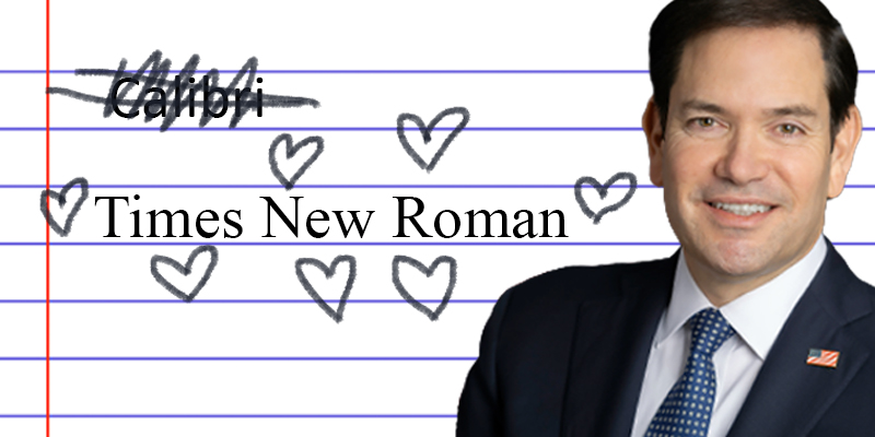
Marco Rubio’s State Department has deleted Calibri and installed Times New Roman.
As Reuters reported yesterday, Secretary of State Marco Rubio has enforced new font restrictions in the state department, because Trump and his hogmen continue to keep their eye on what matters to Americans.
Under the last administration, the State Department shifted to using the sans serif Calibri for official business, which they said was more accessible to people with disabilities and was standard across the Microsoft products that the Department uses.
But this change was too modern and too accessible for Rubio’s Department. In a huffy cable, they announced: “To restore decorum and professionalism to the Department’s written work products and abolish yet another wasteful DEIA program, the Department is returning to Times New Roman as its standard typeface.”
“This formatting standard aligns with the President’s One Voice for America’s Foreign Relations directive, underscoring the Department’s responsibility to present a unified, professional voice in all communications,” the cable added.
We love to debate typefaces, but this isn’t a good font fight. This Administration is obsessed with rooting out anything that is equity-minded or might make government a more welcoming place. This move also fits with their aesthetic obsessions, which are rooted in a selective view of the past. Their social media accounts are full of fashy, AI-generated “this is what they took from you” images, which are a mix of mid-century suburban whiteness that only ever existed in toaster advertising, combined with the sort of neoclassical column-and-marble triumphalism popular with bank branches and used car lots. This “it was better back in the day” style will be familiar to anyone who’s come across Twitter accounts with Roman statue avatars that are frothing about “a retvrn to beauty.” These types favor gleaming Roman columns, tacky gilding, and oversized everything, meant to imply domination, hierarchy, and regressive traditionalism. Makes sense there would be a preference for Times New Roman, which has a capital “I” that looks like a little column.
My favorite writer on this strange style is McMansion Hell’s Kate Wagner. She’s the best on Trump’s architectural initiatives, from the fashy executive orders on “traditional” architecture to the design for Trump’s ball room, which she locates at the intersection of Don’s taste for ‘80s “Liberace-chic penthouse interiors” and his architect’s taste for neoclassical revivalist, anti-postmodernism.
This control of aesthetics to root out what is seen as strange and undignified has long been a hallmark of reactionary modernists (see the Nazi “normal type decree” ), but I suspect that an insufferable dork like Rubio is also still thinking like a teacher’s pet who can’t imagine submitting anything not in the professor’s preferred size 12 Times New Roman, with 1-inch margins.
The through line in all this is an austere aesthetic of unembarrassed domination that is also somehow insecure in its flashiness. So of course these guys are going to sneer about “indecorous” modern fonts that are designed to be be chic, forward-looking, and make reading on the computer a bit easier.
James Folta
James Folta is a writer and the managing editor of Points in Case. He co-writes the weekly Newsletter of Humorous Writing. More at www.jamesfolta.com or at jfolta[at]lithub[dot]com.


