Luke Bird on Channeling the 1980s for the Cover of
The Prettiest Star
You Truly Cannot Go Wrong With a Little David Bowie
Carter Sickels’ novel The Prettiest Star is aptly named. The title is taken from the David Bowie song of the same name, which makes sense for a book in which music and 1980s culture play an important role. The novel is also overwhelmingly and, at times, heartbreakingly beautiful.
The design brief, from Meg at Hub City Press, was a delight. The moodboard was crammed full of references to 1980s design culture and typography, and included two of my favorite book covers of recent years: The Comedown and The Nickel Boys. Both covers are incredibly bold in terms of their layout, unashamed in their use of color, yet evocative and very beautiful.
Meg seemed keen that the book didn’t “read LGBTQ from ten feet,” and asked that we stay far away from black and white photographs, as she thought that particular trend might be running its course. The most important thing, she said, was to create a bright, on-trend cover which was befitting of the book, and which gave a sense of time (1980s) without being overtly retro or pastiche.
Alongside references to mixtapes and music, the main character Brian narrates around a third of the book on videotape, so the design and visual cues from 1980s cassettes and VHS tapes were mentioned as another possible area to explore (see examples here).
But perhaps the most devastating scene in the book involves Brian, who has AIDS, diving into a public swimming pool and, in Meg’s words, “everyone losing their minds.” Meg had picked it out in the brief, but was understandably worried that images of swimming pools were becoming too commonplace on book covers. The scene had such an effect on me, though, that I really wanted to try and work it into a visual of some sort, and that’s where I ended up starting the process.
I had the idea that the surface of the water could be formed by bands of color, which would be a subtle nod to the LGBTQ flag, as well as a not-so-subtle nod to the kinds of colored, graphic bands seen in 1980s VHS branding (see above). In order to assuage Meg’s concerns about the swimming pool, though, I wanted to make sure that the cover was striking, unusual and very graphic. I worked a set of pool steps into the colored bands. I thought they had a nostalgia about them, and they helped set the scene without being too obvious.
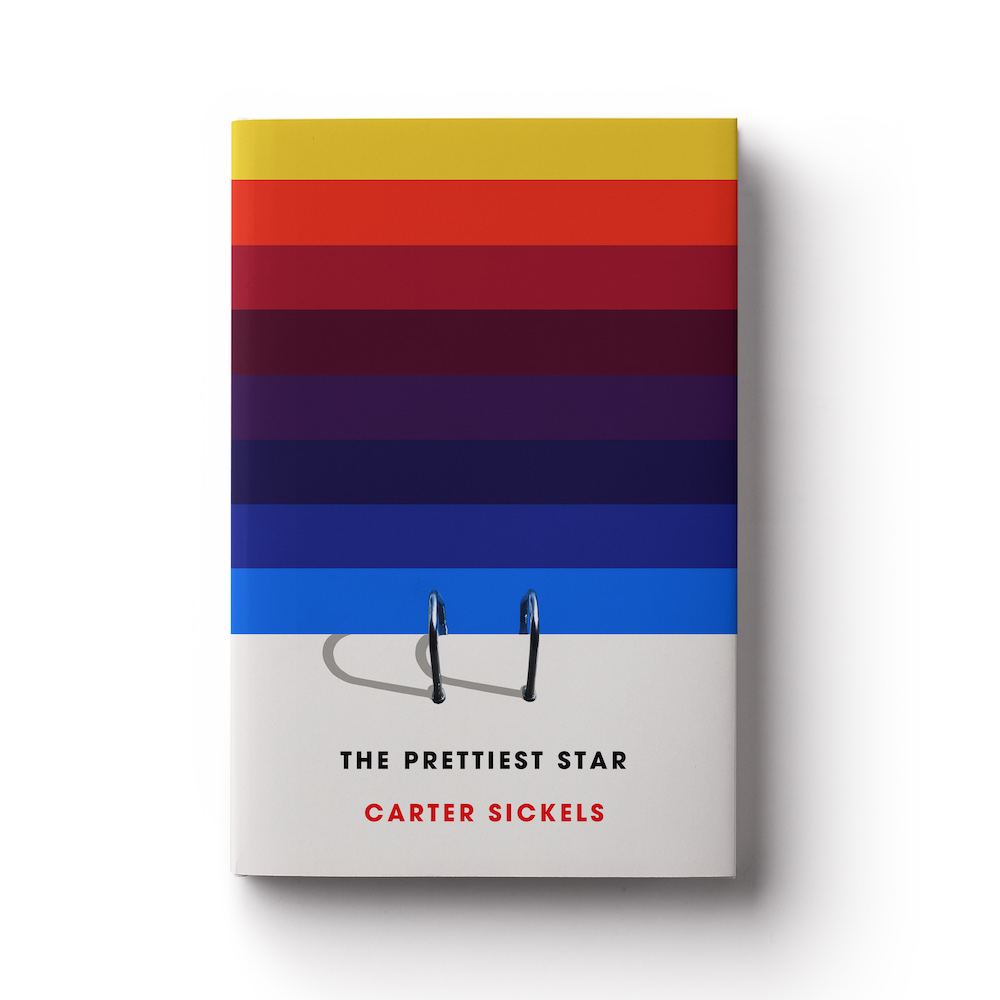
At this point—a quick note on type. The moodboard included typefaces which were commonly used in 80s visual culture, like Lubalin, Century Gothic and Helvetica, and as all of those typefaces are still in regular use today and can be very effective with the right imagery, I didn’t veer too far from them in any of my visuals.
I worked up a further visual which showed a whole pool, zoomed-out, with one tiny figure floating in it. I felt this referenced Brian’s social isolation, as well as the exact scene I was trying to depict. I paired it with a thick, off-peach border and type in Grotesque Bold. Something about the blue/pink palette felt very 80s to me.
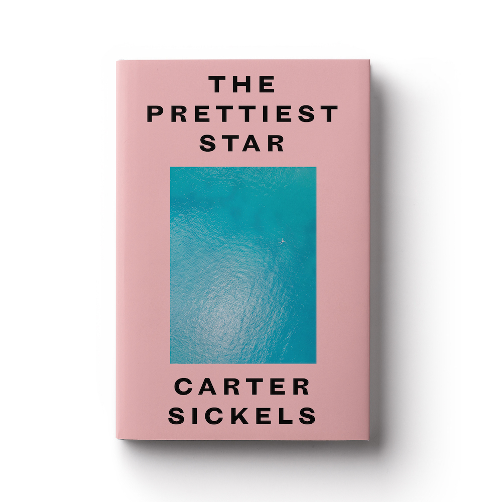
The brief hadn’t ruled out the possibility of a purely typographic cover, so I worked up one further watery visual in which the type is submerged in a swimming pool, and abstracted by the reflections and movement of the water.

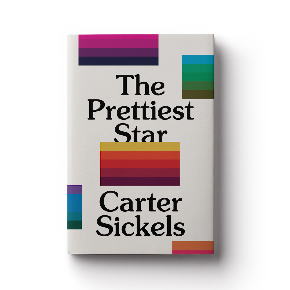
Alongside these pool visuals, I produced two further graphic/typographic visuals. These used colored parallel lines in blocks of five. As with the first pool visual, I felt that they had a dual meaning (that of a nod to the LGBTQ flag, without being overt, and the kind of graphics used in 1980s media packaging).

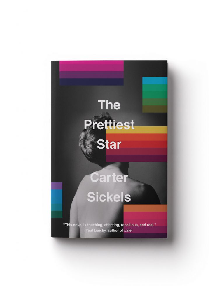
As a final visual, I wanted to show something photographic, so that all bases were covered. Taking inspiration from Bowie’s cover for Heroes (1977)—as well as the genius re-purposing of that image for 2013’s The Next Day—I thought a black and white image might work well with the colored blocks I’d used on the two aforementioned typographic visuals.
The only problem with that idea was that the brief had explicitly forbidden a black and white cover. . .
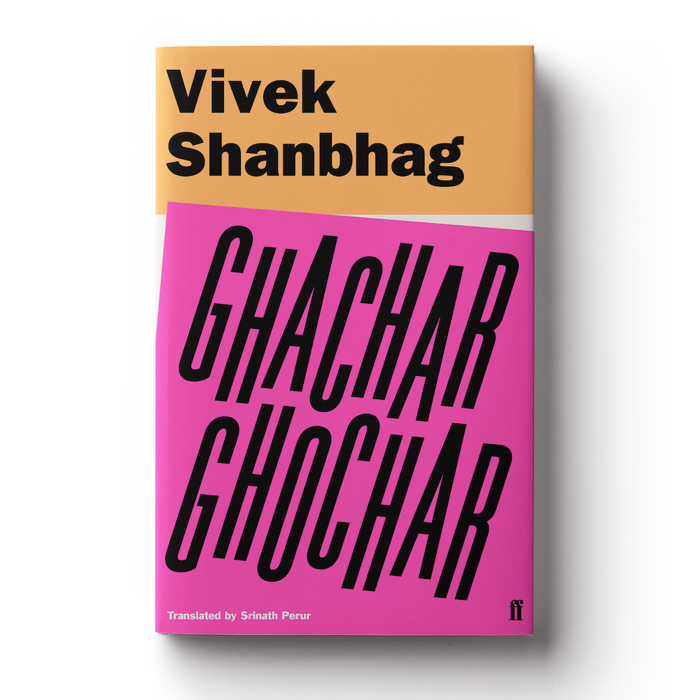
As a designer, I like to unsettle. It’s my job to present options which are requested in the brief, and options which make you stop, and think differently about the book. I always try and offer both. When I designed for Faber & Faber, I was often guilty of trying to turn the iconic Faber design heritage on its head, by designing in the same overall “style,” but printing in neon ink, purposefully messing with the cleanliness of the design, or using over-the-top print finishes (see Vivek Shanbhag’s Ghachar Ghochar below). Elsewhere, more than once I’ve suggested crudely covering the face of the main protagonist on a cover. Ostensibly, this is because I think showing the main character’s face on the cover of a novel forces you to form pictures in your mind before you’ve read the book, and that defeats the point of reading in more ways that I need to explain here. But I think it also makes for a really striking visual approach.
I found this image by Roberta Lo Schiavo on the high-end stock photography site, Millennium Images. I think it’s beautiful. The contrast is so definite. The man in it is roughly the right age to be Brian, and I felt the slightly soft focus and graduated, mottled background had an 80’s vibe. The fact that he is shirtless makes him seem vulnerable, which I liked, and I thought it could also be a precursor to him entering a swimming pool. I thought subverting his face with the blocks of color would create intrigue and make for a striking cover (as I have already mentioned), but I also felt that it was another way of showing the overarching sadness of his story.
In all honesty, the two elements seamlessly “clicked,” so it didn’t need a great deal of skill to bring it together once I had the raw elements. I was keen, though, to make sure the type didn’t fight with the design, or the subliminal messaging. For that reason, I opted for dependable, old Helvetica, which was used frequently itself throughout the 80s. Meg and I looked at a couple of alternatives in the coming weeks but, eventually, we settled back on the original (albeit with a very slight tweak to type-size).
Carter has been really effusive in his support for the cover design, and that, for a cover designer, is the holy grail. I only hope I’ve done this stunning and important novel justice.


