Is This the Biggest Book Cover Trend of The Year?
All the Cool Books are Wearing It
We see a lot of books here in the Literary Hub offices, and after a while, it’s impossible not to start noticing trends. If 2017 was the year of the pink book (and it was), 2018 is the year of the all-caps typography—or to be more precise, big, blocky, sans-serif type treatments, usually somewhat condensed (or at least more vertical than they are horizontal), usually in white or black (but sometimes in warmer colors) against either a riotous, black-based background or a neutral one. Some of the fonts are a little fatter, some a little skinnier, some of the backgrounds are brighter, some darker, but all of the covers are clearly in the same big, bold family.
It’s easy to see why this is such a popular style right now. First of all, like skinny jeans, it pretty much looks good on everybody. More importantly, this style proclaims literariness, importance, and coolness all at once. The big letters say: this is an important literary book. The exuberant backgrounds say: and it’s totally hot right now. As you may notice, most of the books below are by women, and it’s exciting to see their work signaled in this way—too often in past years, books by women have automatically been given the “women’s fiction” (loathsome term, but relevant here) treatment: the back of a woman’s head with some frilly script, or a woman’s body with no head at all, or two girls walking off into the distance holding hands, etc.
But these books below avoid that, and at least for this reader, they also have something else in common: they all spark a covetous feeling—that is, they make my fingers twitch. These designs make me want to pick up (and buy!) the book in question, which is the real measure of a successful cover treatment.
Below you’ll find a sampling of the trend, but be warned: once you see it, you’ll see it everywhere.
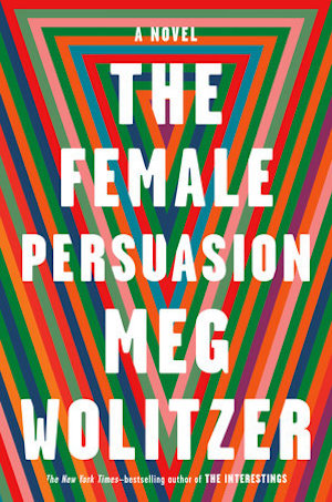 Meg Wolitzer, The Female Persuasion, Riverhead Books, April 3, 2018; design by Ben Denzer
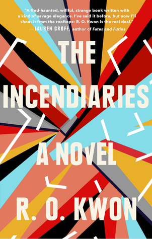 R. O. Kwon, The Incendiaries, Riverhead Books, July 31, 2018; design by Jaya Miceli
 Yrsa Daley-Ward, The Terrible, Penguin Books, April 24, 2018; design by Elke Sigal
 Chloe Benjamin, The Immortalists, Putnam, January 9, 2018
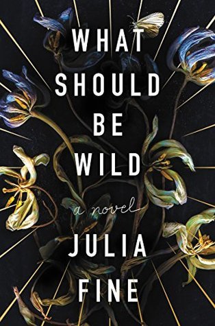 Julia Fine, What Should Be Wild, Harper, May 8, 2018; design by Sarah Brody
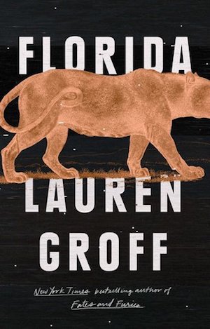 Lauren Groff, Florida, Riverhead Books, June 5, 2018; design by Grace Han
 Olga Tokarczuk, Flights, Riverhead Books, August 14, 2018; design by Grace Han
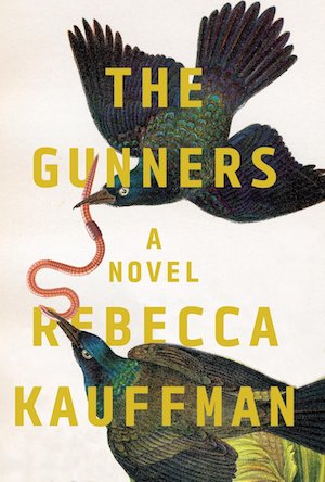 Rebecca Kauffman, The Gunners, Counterpoint, March 20, 2018; design by Nicole Caputo
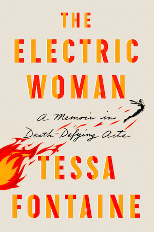 Tessa Fontaine, The Electric Woman, Farrar, Straus and Giroux, May 1, 2018; design by Abby Kagan
 Will Boast, Daphne, Liveright, February 6, 2018
 Aja Gabel, The Ensemble, Riverhead Books, May 15, 2018; design by Grace Han
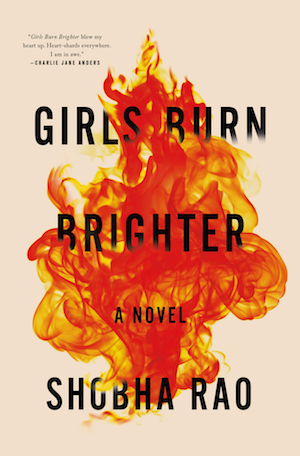 Shobha Rao, Girls Burn Brighter, Flatiron Books, March 6, 2018; design by Kathryn Parise
Though it’s dominating this year, the trend was already picking up steam in 2017—see the following covers for proof:
 Katie Kitamura, A Separation, Riverhead Books, February 7, 2017; design by Jaya Miceli
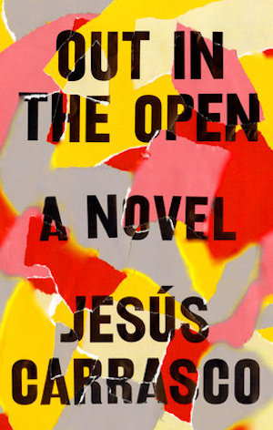 Jesús Carrasco, Out in the Open, Riverhead Books, July 4, 2017; design by Ben Denzer
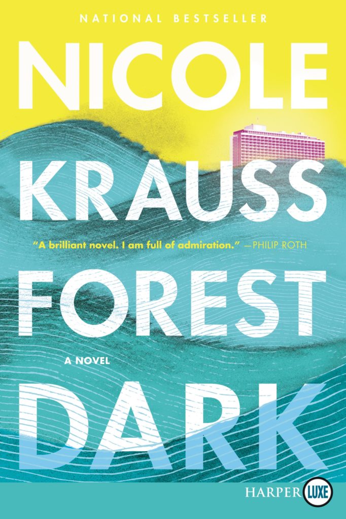 Nicole Krauss, Forest Dark, Harper, September 12, 2017
But if I had to guess, I’d say that it all began with the outstanding cover design for Lauren Groff’s 2015 novel Fates and Furies, designed by Rodrigo Corral and Adalis Martinez for Riverhead (an imprint that, as you may have noticed, makes up a good portion of the above list of books):
 Lauren Groff, Fates and Furies, Riverhead Books, September 15, 2015; design by Rodrigo Corral and Adalis Martinez
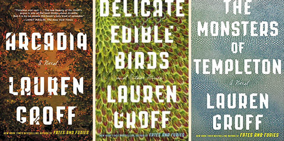
Certainly it is that cover that has been the blueprint for the 2016 redesigns of Groff’s other books, to great effect:
Maybe the conclusion is simply this: emulating Lauren Groff never hurt anyone.
Emily Temple
Emily Temple is the managing editor at Lit Hub. Her first novel, The Lightness, was published by William Morrow/HarperCollins in June 2020. You can buy it here.