
How to Give Octavia Butler the Covers She Deserves
Repackaging the Patternist Series for the Mother of Afrofuturism
Designing a book cover is hard. Designing book covers (plural) is harder. Designing a set of four book covers for a much-loved-by-many-but-too-long-overlooked-by-more speculative-fiction series—a series that spans not only generations but millennia, not only continents but entire universes; a series by a Hugo- and Nebula Award-winning author who is widely considered to be the mother of Afrofuturism—that is easily one of the biggest challenges I’ve faced in my two decades in publishing.
There are general challenges that come with designing any series of books. The goal is to have each title stand on its own, be unique. But only to a point. Because at the same time, you want to establish an overarching look that applies across the full set, tying them together as a whole. There should be similarities across the individual titles that embody a shared visual DNA. But think sisters, not twins.
Add to that a compressed schedule. Ideally, you design the set as a set, which is to say, concurrently. Of course, you’ll still need the first cover to go to the printer before the others. So, the goal is to design three or four covers in the same amount of time you normally have for one. Not only design them but get them approved.
Then there were challenges specific to Octavia E. Butler’s Patternist series. I’ve already mentioned the staggering scope of the series’ content, but there was also the difficulty of positioning. Butler’s books have always been categorized as science fiction, an apt description but one that has rather pigeonholed her work. True, the Patternist books encompass a complicated chronology of past, present, and far future, and plot elements that include a parasitic alien plague, telepathy and a networked hive-mind, as well as shapeshifters and human hybrids—all the stuff of science fiction. But Butler also addresses issues of race and sex, gender and culture, ethics and morality. She critiques existing patriarchal power structures and raises questions about equality and humanity.
All of which is to say, decades ago Butler was addressing ideas that are only now making their way into the larger cultural conversation. Grand Central Publishing saw a genuine opportunity to introduce her work to a broader audience, one that wouldn’t necessarily spend an afternoon browsing the sci-fi/fantasy shelves at their local indie bookstore but would undoubtedly be drawn in by such topical and universal themes. In fact, we had begun the process of repackaging her works with this idea in mind a year earlier with a fairly successful re-issues of Butler’s Parable of the Sower and Parable of the Talents.
One final challenge was that Butler passed away in 2006, which left the approval process in the hands of the literary agent and the Butler estate. I was sure they would fiercely protect her legacy, a legacy that commands respect. One of the few—if not only—Black female science fiction writers of her time, Butler not only won numerous Hugo and Nebula awards over the course of her career, but she was also the first science fiction writer to be awarded a prestigious MacArthur “Genius” Grant in 1995. When I was tasked with art directing the Patternist series repackage, I was determined to impress her estate, and do right by her memory.
The task was daunting, so I hired a designer/illustrator who had experience with series design. I told him that both the in-house group and the agent and estate had loved the covers for the two Parable books, so we should start there: simple forms displayed in a bold and graphic manner with a limited-but-bright color palette. It was important that any human figures read as Black, and that we give priority to female figures, as so much of Butler’s work centers around powerful female protagonists. With the generous help of my editor I also provided short synopses of each title as well as main themes and a few potential visual elements.
The earliest comps were very simple, with little to no texture or hand-made qualities but the introduction of ghosted patterns to the backgrounds. The agent and estate were not sold. The patterns, for one, were a non-starter: too busy. They worried the background colors were bright and loud rather than rich and earthy. They asked that it be more elegant, more dynamic, and tell a bit more story. The agent mentioned artist Kara Walker—known for her black cut-paper silhouettes—more than once, for both the bold energy of her figures and the narrative quality of her scenes which was a helpful connection to make. But the concepts of “elegance” and “dynamism” are rather subjective, and the plots had already proved themselves difficult to distill down to an essence.
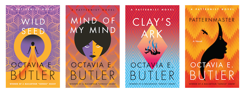
After some back and forth—and plenty of discussion with the editor acting as mediator—we determined that by elegant, they likely meant more stylized human forms in more sophisticated poses, as well as a textural or brushy quality to the art (as there had been on the Parable books), that lent an air of being hand-drawn rather than machine-made. As for dynamic, we soon understood that the symmetry of the earliest comps was what the agent and estate were reacting against. By simply breaking the vertical axis and giving each cover a certain degree of asymmetry—even as the figures revolved around a central “moon” shape that remained static—they felt much more alive. The designer came back with revisions and, in relatively quick succession, Wild Seed and Mind of My Mind had approved covers.
Soonest begun was not soonest done in this case, though. At the halfway point, our designer suddenly had to bow out for personal reasons. And I found myself with a wholly unexpected challenge: finishing up the last two books in the series and matching the already-established look. I would like to say that—having art directed and overseen the design and approval process for the first two books—I jumped in and stuck the landing on the first try with both Clay’s Ark and Patternmaster. But, sadly, that’s not how it went.
My first comps were almost laughable: too detailed by half, poses too stiff, colors too bright. Clay’s Ark involves a pair of twin sisters who end up in a cult-like community run by a man infected by an alien parasite. I opted for silhouettes of girls with natural hair. I showed one of the sisters [spoiler alert!] pregnant. I had a menacing male figure lurking off to the side. In the earliest comps I even included a barn and a grassy horizon on a garish orange background, entirely too bright to match the series. Patternmaster tells an epic story about a telepathic ruler warring with a group of alien hybrids and his two sons’ struggle to succeed him. I tried fighting figures that looked like something on a Greek urn, one with an animal head to suggest the hybrids, and inexplicably added gradients at top and bottom. I tried again and put a massive male figure surrounded by smaller human subjects set against a grounded mountain landscape, apparently forgetting that part of what made the earlier covers work was the way the art seemed to float in and fade out into the space.
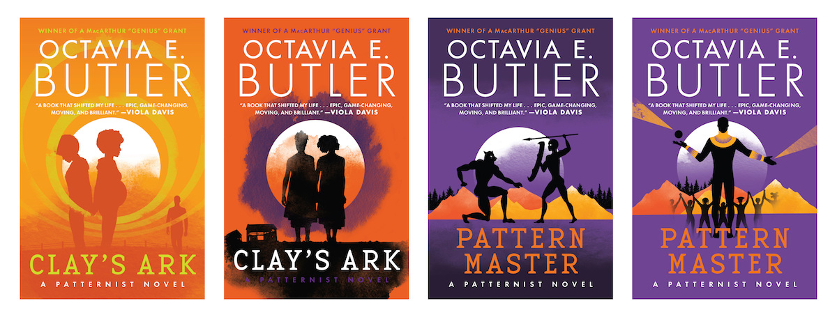
When the editor balked, recognizing and then diplomatically explaining that these “weren’t quite right,” she and I went back over everything the estate and agent had asked for during the design of the first two covers. Together we determined what kinds of changes would be most effective to achieve the look we were after. On my second attempt, I made sure all the figures felt a bit more stylized and the poses a little more elegant—more evocative than descriptive. I let the moon remain central even as the other elements broke the symmetry and created a sense of movement. I kept the art as a whole floating in space, against background colors that were rich and intense without feeling too bright or primary. Thankfully, without too many rounds of revisions, the estate and agent were fully on-board.
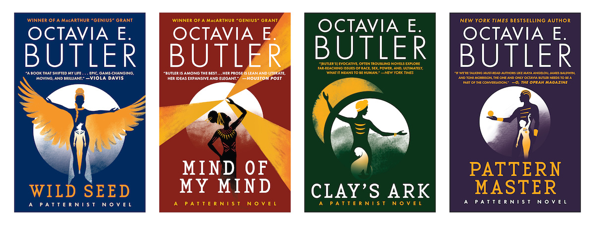
And in a pleasant turn of events, right before the final files for Patternmaster went to the printer, we learned that our re-issue of Parable of the Sower had made it onto the New York Times Bestseller list. For all of the successes in her life, all the honors and awards garnered during her too-short writing career, this was the first time Ms. Butler’s work had earned that particular recognition. It was long overdue and much deserved, and we couldn’t have been prouder as a company to help get her there. In the end we had just enough time to add one more thing to the Patternmaster cover: a line above Butler’s name reading “New York Times Bestselling Author.”
Elizabeth Connor
Elizabeth Connor is a Senior Art Director at Grand Central Publishing. She began her career in the William Morrow art department in 1997, when everyone around her said publishing was a dying business. But, ya know, so far, so good.
