The Tale of Shikanoko is a four-volume epic set in the mythic, medieval Japan of Lian Hearn’s imagination. The first volume, Emperor of the Eight Islands, comes out in the United States on April 26th; the remaining volumes will all be published by the end of 2016.
The books are inspired, in part, by old Samurai stories such as The Tale of Heike and The Tale of the Soga Brothers—and they are, in fact, full of dramatic combat and rival clans and traditions of honor, all of which emerges from Hearn’s lifelong study of Japanese history and culture. But these volumes are also brimming with supernatural beings, guardian spirits, and a palpable sense of magic that seems fantastical in contemporary terms, yet would be a fundamental part of the way Hearn’s characters understand their world.
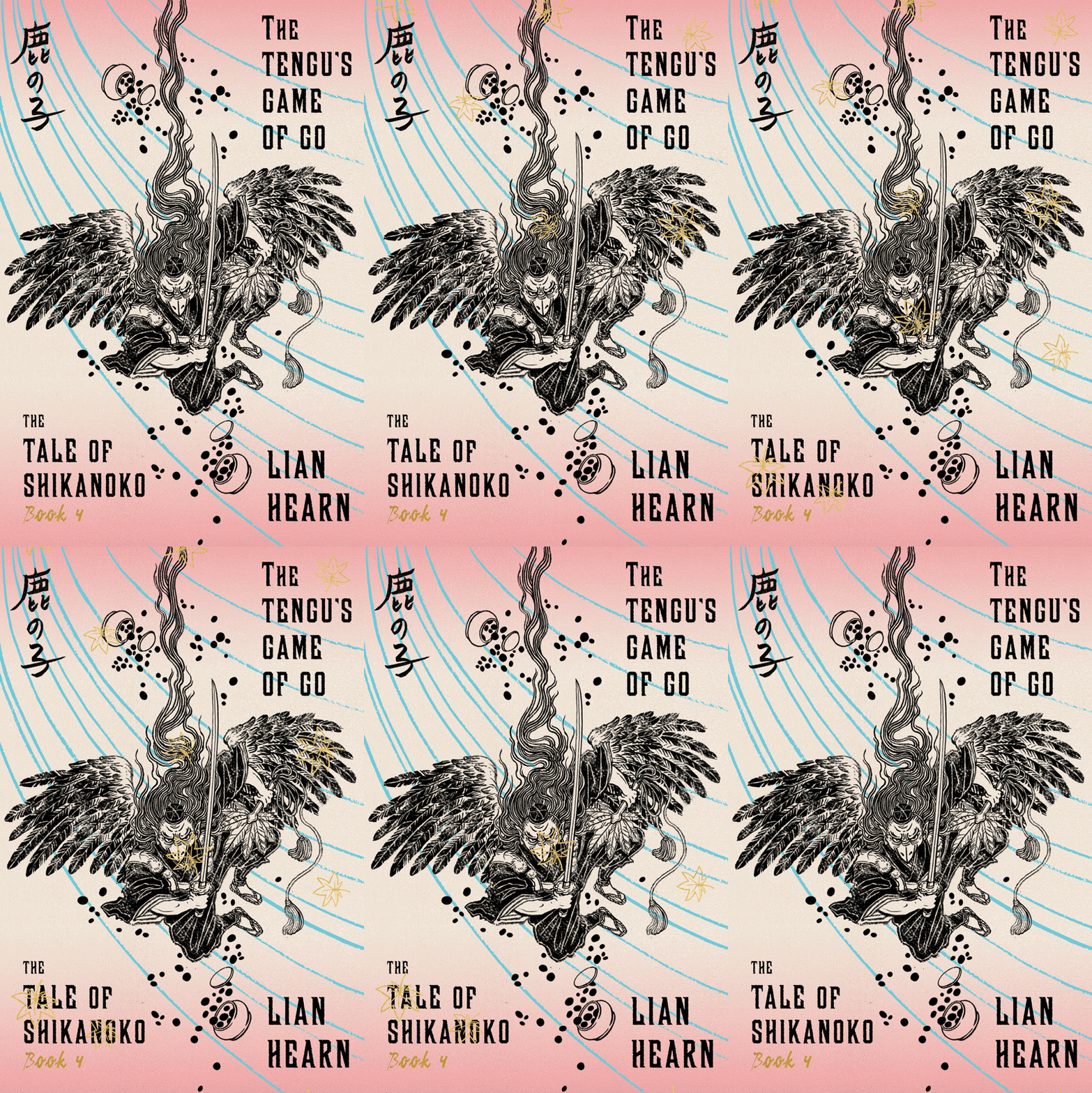
To design the covers for the series, FSG Associate Art Director Alex Merto brought on award-winning Japanese illustrator Yuko Shimizu. They spoke about how they created the look for The Tale of Shikanoko. The following interview also appears at FSG’s Work in Progress.
Work in Progress: The illustrations look like they’re done in a specifically Japanese style and technique. How were they created? By hand, with brushes and ink, or digitally?
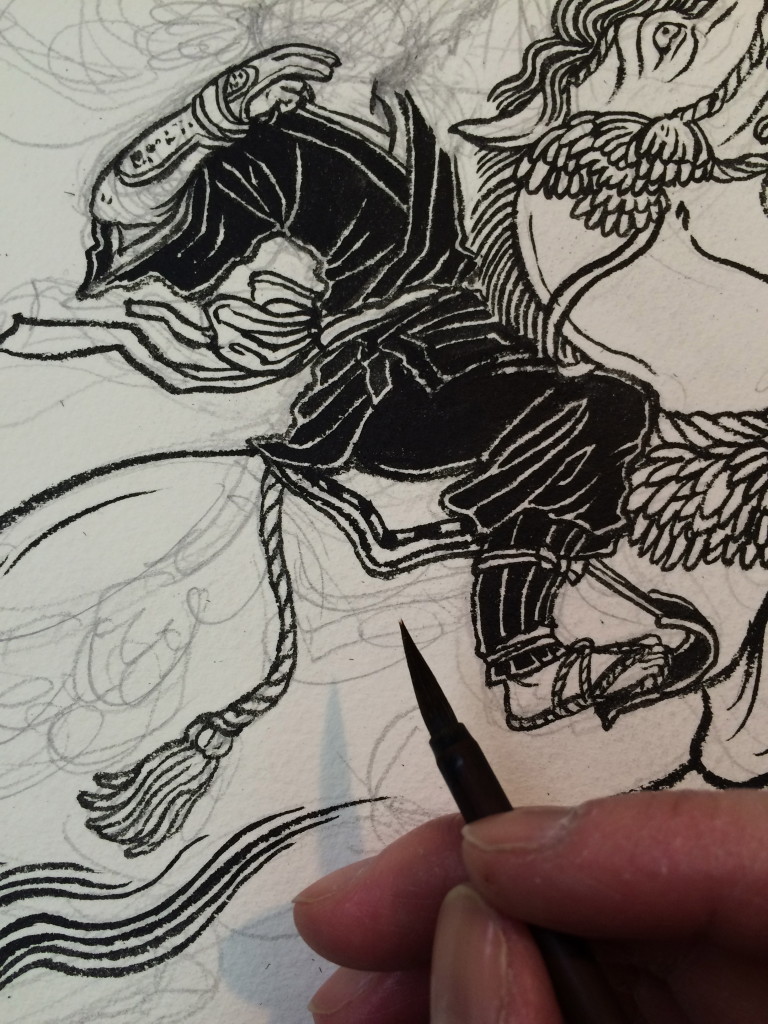
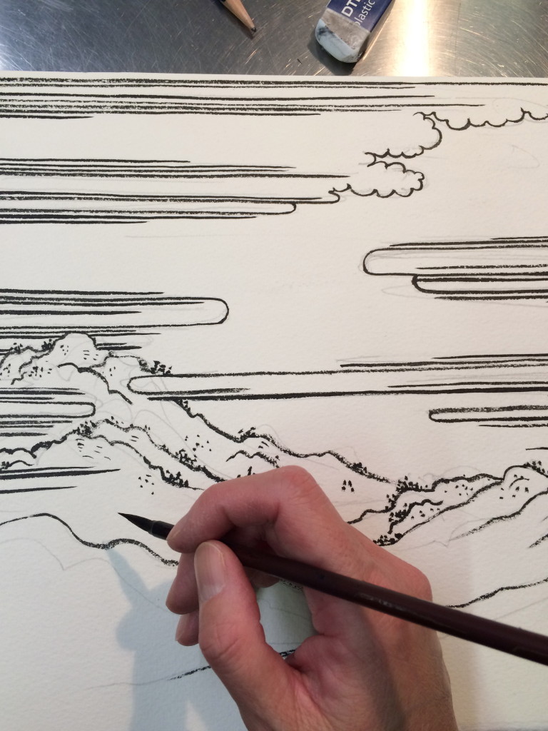
Yuko Shimizu: They are all ink drawings with brush on paper. No digital work, other than how the colored sections are separated from the rest of the drawing.
WiP: Did you feel an obligation to match the style and content of the images to the era that Lian Hearn is writing about? Or did the fact that the work is imaginative—not historical—free you up?
Alex Merto: Yuko came to mind as soon as I started reading these stories. Her illustration style pairs perfectly with Lian Hearn’s writing because it blends traditional Japanese style with surrealism. That’s what we were aiming for with the design of this series.
YS: By reading the manuscript, I guessed the approximate time periods where the story takes place, and looked for tons of references. Technically speaking, the details in images do come from multiple time periods, but I tried to depict details from only the periods that would make sense.
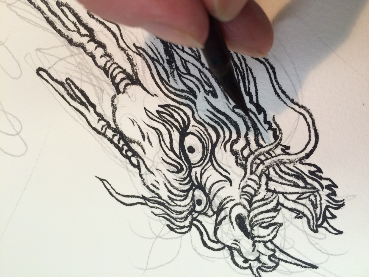
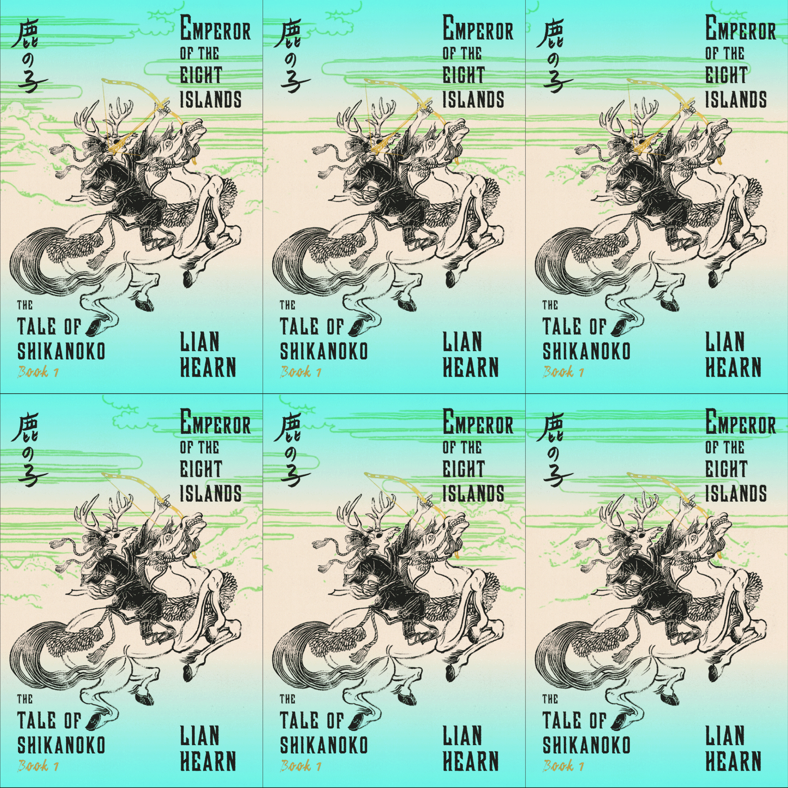
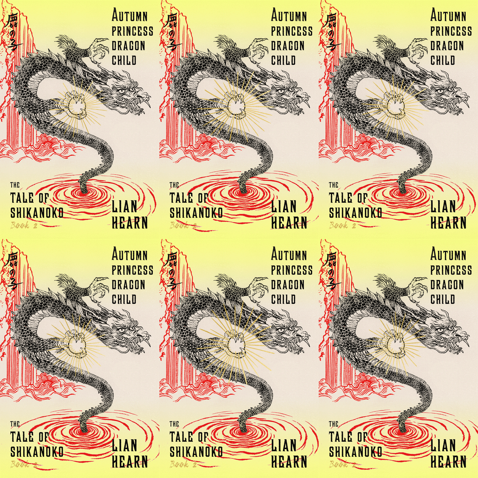
WiP: Two of the covers feature imaginary/supernatural figures, a dragon and a Tengu. How did you know what they should look like? Did the details come from the text or from other knowledge and research?
YS: It is just like in the West, where there are ideas of what [Western] dragons or unicorns or trolls look like. In our culture, we have many images of Tengu and dragons throughout art history. When I illustrate Japanese images, I do all the image searches in Japanese, so I get more reliable reference materials. There are of course many different depictions of Tengu (it’s a mythical creature after all), and I picked what made the most sense in the context. Depictions of dragons are usually very specific, and really easy to find reference materials.
WiP: How did you choose what to illustrate for each cover? Do you read the books and allow the images to emerge from that or do they come from somewhere else? Who chooses what should be illustrated—Alex or Yuko?
YS: Some covers came with very specific art direction. Alex knew exactly what they wanted to see. Some were the results of discussing and going back and forth.
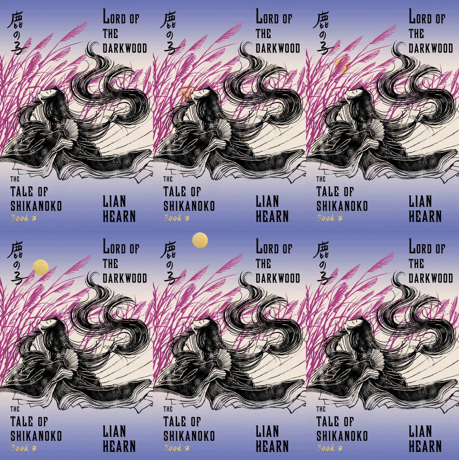
AM: I wanted the design to feel traditional but also feel like it lived in its own world. We achieved this by using a combination of neon inks and foil rather than the traditional colors you typically see on books about Japan (red, black, and yellow). I couldn’t be happier with the way things turned out.
WiP: Presumably it’s unusual to get to design a whole series of books at once, since it’s unusual to have a series published all within the same year. What influence does that have on how you think about and work on the project?
YS: It was nice in a way that it turned out to be a true collaboration with Alex, the designer. It is more common that I provide illustrations, and designers design the title font, etc. . . and those are usually done separately. In this case, we had all four books; Alex came with the general direction, which was a solid set design. We tackled the illustration, and then Alex went back and adjusted the set design. Having that back and forth—we each did what we were good at, and trusted the partner to do what we were not strong at—I think we came out with something that is really fresh, something I probably would not have done if I had been left alone to do the whole image on my own. It’s a unique experience.
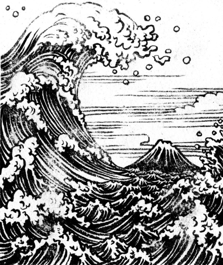
The set of four books will have an image on the spine when they are placed together. Which was Alex’s idea. I can’t wait to see that. So cool. It’s something you can only do when all four books were designed together.
Yuko Shimizu (清水裕子) is a Japanese illustrator based in New York City and an instructor at the School of Visual Arts. In 2009, Newsweek Japan named her one of “100 Japanese People the World Respects(世界が尊敬する日本人100).” Her first self-titled monograph was published in 2011 (Gestalten); a second monograph, Living with Yuko Shimizu, was released in 2016 (ROADS Publishing of Ireland). Other books include A Wild Swan, a collaboration with novelist Michael Cunningham (FSG, 2015), and Barbed Wire Baseball, a multi-award-winning children’s book written by Marissa Moss (Abrams, 2013). Over the last ten years, her work has appeared on Gap T-shirts, Pepsi cans, VISA billboards, and ads for Microsoft and Target; on book covers for Penguin, Scholastic, and DC Comics; and on the pages of The New York Times, Time, Rolling Stone, The New Yorker, and many other publications.
Alex Merto is a designer and the associate art director at Farrar, Straus and Giroux. He is also the co-owner of a multidisciplinary studio in Brooklyn called Graphiatrist. He has worked at multiple publishing companies, including Penguin, Random House, and FSG.


