How to Design a Cover for the Emotional Center of a Novel
Math Monahan on creating the cover for The Lookback Window
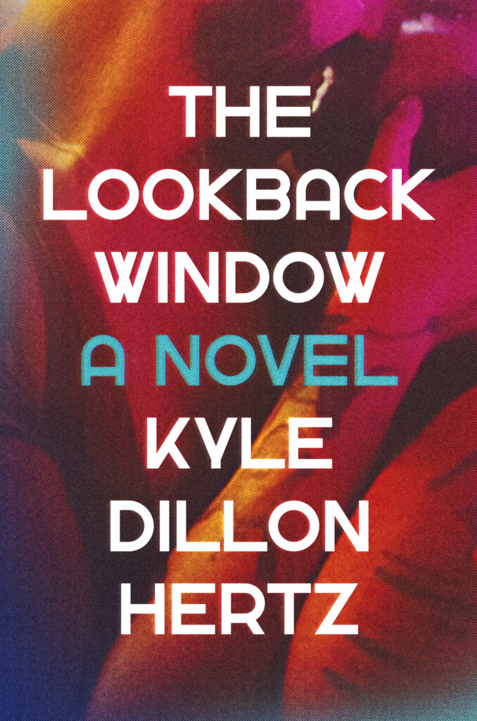
When I began working on the design for the cover of Kyle Dillon Hertz’s debut novel The Lookback Window, I had two goals in mind: I wanted the book to be taken seriously, and I wanted to get it into the hands of readers who might not otherwise find it.
Right from the beginning of the manuscript, I knew it was unlike anything I’d ever read before. I quickly became deeply invested, and the fact that I knew the novel was semi-autobiographical only strengthened the bond I felt with the characters. The premise was fascinating—I’ve read books of characters working through trauma, but this was different. It laid bare the experience of a person working through trauma (or not working through it) with an unusual constraint: a time limit. One year. One year to make a decision. One year to call for justice. One year to figure out what justice even means.
I was given the name of one of the author’s favorite artists to consider for the cover, but I began looking for my own images as well. I find it important to do my own image research when I’m working on a cover design, even when the author or editor comes into the project with strong preferences. I need to see what’s out there, and I need to feel something in the images that reflects what I felt while reading the book. Often, I might be searching for one kind of image and run across something completely different, but I know I’m on the right track when something strikes a chord and I just can’t unhear it.
In my search, I found myself gravitating toward images (mostly black and white) of young men. I was trying to find Dylan, the protagonist of the novel. Cover designs for the books of Ocean Vuong and Hanya Yanagihara kept circling in my thoughts. Emotional. Straightforward. GRAVITAS! I asked myself: if I’m going to put Dylan on the cover, how do I present him? This wasn’t just a matter of creating a visual for character and setting; this would be the reader’s first moment with him. So I looked back to the manuscript to see how he presented himself there.
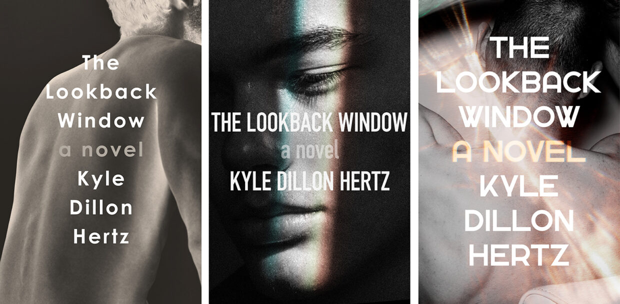
In the novel, we meet Dylan as an adult, but his story is interwoven with flashbacks from his childhood. As an adult, we see him engage in various sexual encounters in New York City and Fire Island. As a child, we witness his sexual and emotional abuse. The two storylines felt vastly different—in one, Dylan was in control; in the other, he had no control at all—but both centered on the body, and what it meant or could mean. This was it, I thought. This was how I wanted to represent Dylan. This dichotomy was what the whole book balanced on.
I began looking for images and ways to manipulate images that could illustrate this duality. I wanted the viewer to think, That’s an attractive young man, but should I be looking? or perhaps even What is my part in this? I wanted to evoke a sense of a vulnerability and a feeling of this isn’t meant for me. To say I wanted it to feel voyeuristic is too easy; it was more than that.
Another direction I explored revolved around images of water. The book opens and closes with water—but again, these scenes wind up being very different moments, both for Dylan and for the reader. Of course, water can symbolize so many things. It can be calming and serene, a fun getaway, or a dangerous depth. (This is all in the book! Can you hear that chord being struck?)
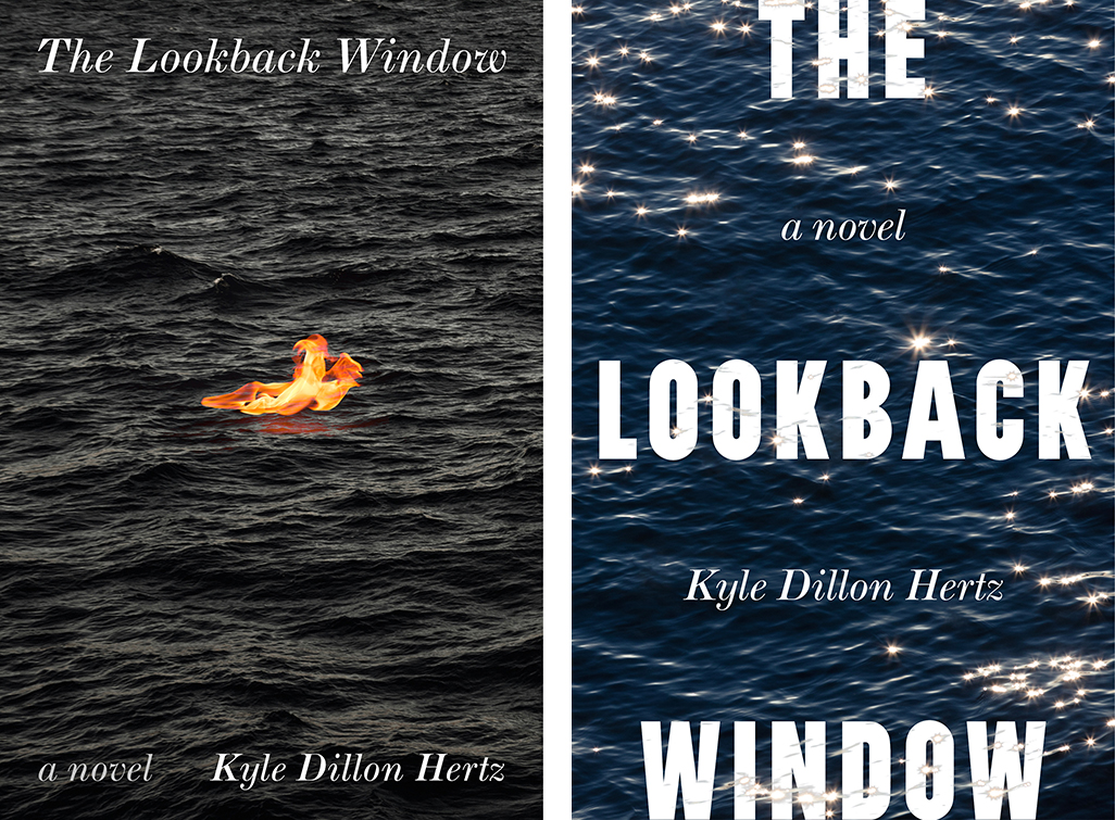
This is when I was able to circle back to the artist the author had suggested. They had a few pieces depicting water, but they weren’t straightforward. They had this magazine-like texture to them, even a crease running down the image, suggesting a centerfold. It brought the image into the world of print; it put it into my hands. It made the water more real than just a photo of water would have. In fact, it didn’t feel like water—it felt like paper (at least to someone who thinks about books all day). It felt like the story of water.
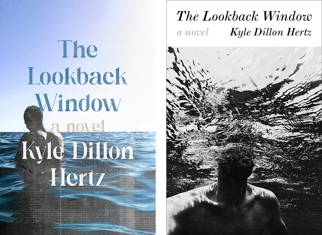
I liked where we were with the designs, but standing back, they were very dark, both visually and emotionally. Everything felt heavy and serious, and in some ways, that was right for the book. This is a heavy book, but you come out of it with a big sigh of relief, the kind of long sigh that leaves you slightly lightheaded for a moment. Through many rounds of designs and discussion we eventually found the thing we had been missing: hope. What these designs had failed to do was show the fun, positive (if sometimes messy) moments of this character’s life and evolution. This book isn’t a lamentation. It’s a story of trauma, but also of recovery.
It was at this moment the editor suggested using an image from the author’s own social media. It was a photo of him and his boyfriend dancing in a bar. It’s noisy, crowded, there are fluorescent lights, but somehow the photo managed to capture an intimate moment, one that was in full view of the public, but wasn’t for us. It was joy, it looked to a future, it offered a promise. After playing with type and texture, we found the cover. Simple, colorful, intimate, loud. The last chord was struck.
Math Monahan
Math Monahan is a book designer working in New York City, and a Senior Designer at Simon & Schuster. He earned an MFA at the Stamps School of Art & Design, University of Michigan (Ann Arbor, MI) and a BFA at the Milwaukee Institute of Art & Design (Milwaukee, WI).


