How T Kira Madden's Long Live the Tribe of Fatherless Girls Got Its Glitter
Tree Abraham on Designing the Cover for a Book You Truly Love
I was in awe of T Kira Madden even before I began reading her memoir. Aside from her long lists of professional accomplishments and critically lauded publications, her Author Questionnaire (a Q&A completed by the writer that gets sent to the cover designer early on) introduced her memoir as the truth of a biracial, queer child in 90s Florida navigating a life of extreme privilege and predators, of family secrets, crime, addiction, and abuse—but ultimately as a love letter to her parents. Her bio told me she was a “Writer, Photographer, & Amateur Magician.” Awesome.
At the beginning of the design process, Madden provided very refined notes on her visual likes and dislikes, accompanied by reference images. Often this kind of specificity might foreshadow a difficult approval process with an author. But in Madden’s case, her references revealed an edgy visual sensibility and aptly distilled style that perfectly reflected her voice.
The book wasn’t originally assigned to me. As a designer at Bloomsbury Publishing, I had read the manuscript, and saw some unsuccessful rounds from a freelance designer. Eventually, I took over the design process. (Fun fact: in addition to multiple designers, Madden’s memoir had multiple titles before becoming Long Live the Tribe of Fatherless Girls: first The Rat’s Mouth, then Tell the Women I’m Lonely.) Early covers featured photographs: of Madden’s family, of a hot air balloon, of Madden as a superheroine. The book’s evolution reflected in-house discussions about how best to summarize and package the book. Should it feel sad and heartbreaking, triumphant, funny, or something else?
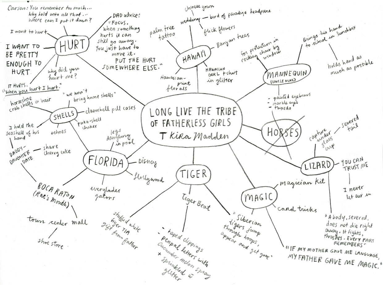
In reality, Long Live the Tribe is all these things and more. Madden retells the painful memories of her youth with an emotional variegation revealed through tender retrospection. Reviewing the mind map I made on my first reading of the manuscript, it’s obvious that Madden’s quest for love and belonging is resolute.
The first cover direction I tried references the first chapter of the book, in which Madden’s mother sticks a salvaged male mannequin in their window to ward off intruders. Madden becomes fixated on the mannequin as a father figure, so much so that she detaches one of his hands and hides it in her school lunchbox, holding the hand for as much of the day as possible. It’s this wistful reaching for parental affection that I tried to capture.
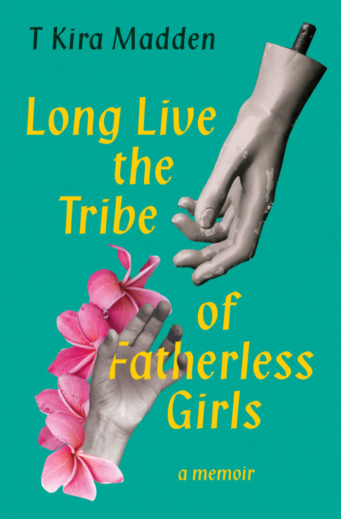
Everyone liked that it felt Floridian, but some were concerned about the dismembered limbs. Next, I tried a more classic approach featuring a photograph of Madden as a child, but still saying FLORIDA.

Not the right mood. Madden’s initial visual “likes” had included collage, so I did a few rounds with photo remnants.

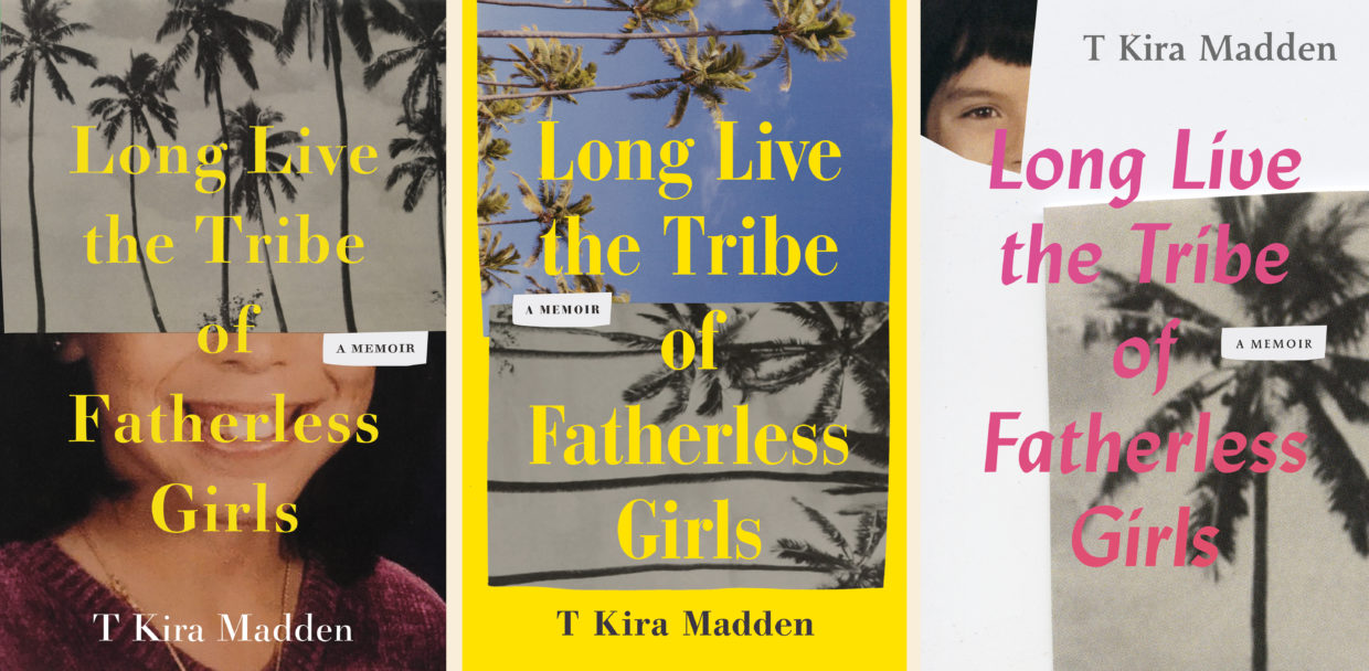
The scraps felt true to how stories are pieced together throughout the book: some memories more vivid, others hazy glimpses. But this approach felt too much like an ominous kidnapping story. So I tried something more abstract and atmospheric, with experimental cutting and scanning.
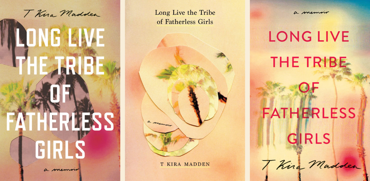
Now it was too vague. My art director, Patti Ratchford, suggested glitter. Madden loves glitter. I love glitter. Glitter is one of the trends of the early Noughties that are speckled throughout the book; it crops up in eye shadows, hair and body sprays, lip-glosses, and bejeweled clothing. Glitter represents every pre-teen girl’s attempt to be pretty and sexy, a makeshift armor one dons for a school dance, a party, the mall, or the beach.
Glitter also features in the story of nine-year-old Madden sending off a letter, sprinkled with the stuff, to the teen magazine TigerBeat, requesting to be featured in their pen pal section alongside other lonely girls. Her feature wins her many pen pals, and some disturbing prolonged correspondence with older men.
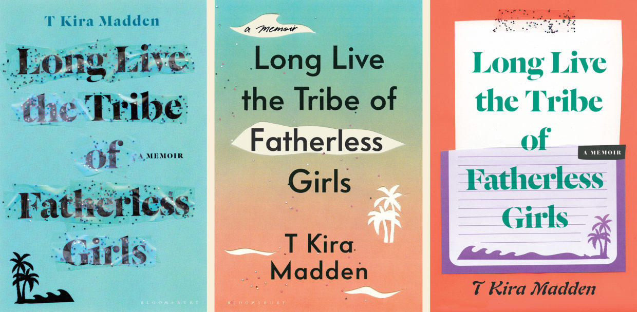
I spent months coated in glitter, first trying to find the right balance and colors, and then trying to figure out how to replicate real glitter onto a mass-produced book. For the final effect, photographer Tamara Staples took many shots of actual bits of glitter, with different lighting sources, on a white background. I isolated and mixed all the glitter images in Photoshop, dropped in the gradient background, and selected tiny bits for foil, over which the 4-color design would be printed with a random selection spot glossed.

I think the final cover mirrors the prismatic “feels” of the memoir: tinges of sorrow, awaiting a rising sun with a glimmering fortitude in the pursuit to be wanted.
Tree Abraham
Tree Abraham is a book designer for publishers in Canada (where she’s from), the UK (where she studied), and the US (where she lives). She is currently a senior designer at Bloomsbury in New York. Her best ideas come while swimming or reading the dictionary. When not designing, she can be found traveling to unmarked places, digging in dirt, and writing unsolicited manuscripts.
