Hervé Tullet Reflects on a Career of Creating Creatively Unconventional Children’s Literature
"Like in a publicity stunt, the strength of the image gives all the explanation necessary."
Hervé Tullet is a perennial favorite among buyers and sellers of children’s books as well as among the art crowd. His books have been translated into many languages, and he’s been featured in exhibitions around the world.
*
THE BOOKS
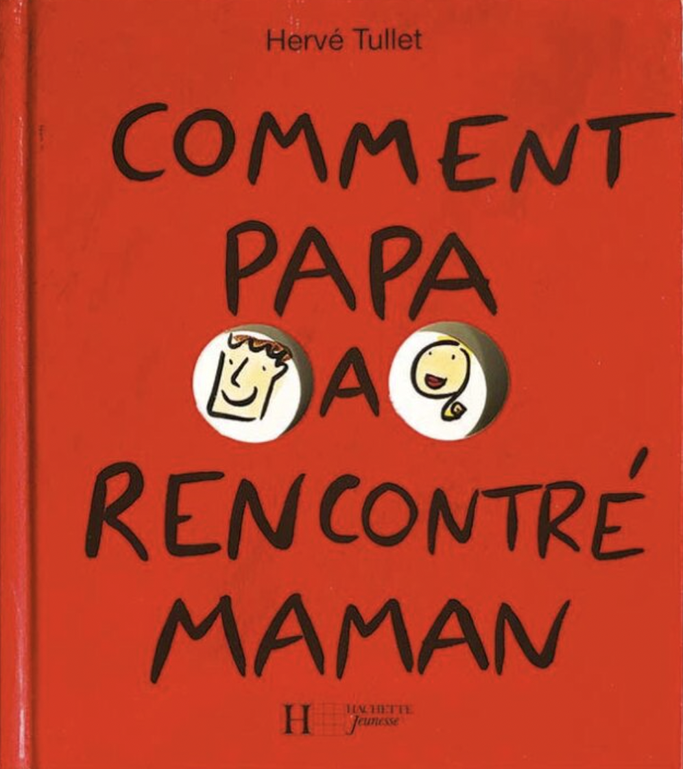
Comment papa a rencontré maman (How dad met mom), Hachette Jeunesse, 1994
This was Hervé’s first book for kids. At the time it was published, the market for children’s literature was undergoing a profound change. New techniques were being deployed; new qualifications were emerging. Hervé was a freelance illustrator who painted on the side.
There was nothing urgently pushing him toward this work, but it allowed him to add another string to his bow and to get his foot in the door of an appealing sector. His experience as a father, looking for innovative ways to support reading with his kids, led him to this project, which humorously dramatizes a meet-cute through little sketched couplets.
Hervé Tullet: When I was imagining my first book for children, I thought I understood the mechanics of this type of book. A parent reads to the child: The parent has fun, the kid has fun watching their parent have fun. At least that’s what I had experienced with my children and with certain books that I could find at the time.
I wanted to make a book that was funny for both adults and children, but that would remain at a child’s level.
That doesn’t mean getting down on all fours,
It means speaking normally, and above all not hesitating to speak directly to children.
Through this experience, I invented several things.
The book garnered interest from readers eager for offerings that broke with a certain tradition of the bedtime story. Booksellers and librarians perceived its uniqueness, with its very loose, unpolished drawing style, driven above all by the idea, and running on clichés, like media content.
I worked based on what I had learned in advertising, on a metronomic rhythm, “tick tick boom,” particularly in all the research I did to produce videos. At the time, new content was starting to be shown on TV: short bits, funny and incisive, very energetic gags. This required a real intensity, an almost automatic search for ideas—all this was my culture.
We would juxtapose a problem and a revelation; it was binary, efficient.
My first book for kids was in a certain sense the book of an ad man.
A little trendy, a little zeitgeisty, funny, with a subject that raised themes not yet approached in children’s literature.
From a certain point of view, it’s a book about love and violence—
Maybe my first provocation?
I wanted to make a book that was funny for both adults and children, but that would remain at a child’s level.
In fact, the story itself is not the main event, or at least it isn’t meant to be taken at face value. Rather, it is the play of associations among ideas and the humorous portrayals that make up the book’s primary appeal. There is also its use of a cutout, until then only used by artists like Tana Hoban or Katsumi Komagata (whose books Hervé discovered thanks to his first editor at Hachette, Fani Marceau).
Hervé Tullet: What came to me first wasn’t the story, but the associations;
Little by little I accumulated playful links or transitions: from the guy to the black eye.
Like in a publicity stunt, the strength of the image gives all the explanation necessary.
I worked on basic typewriter paper, very thin and delicate,
The drawings were absolutely not up to snuff; the hands, for example, were reversed,
I felt my weaknesses in this domain.
Once the book was published, it didn’t sell. But the question of sales was very abstract for me.
For the second book, I didn’t have an idea. So I did what everybody does: a sequel, then another. It was logical.
But the second book was drawn better.
The third even better.
There was a progression in the style.
Most importantly, every book followed in the same vein; which must mean that there was a vein. And a subject.
I wasn’t on the wrong track, so I ploughed ahead.
*
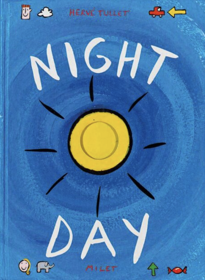
Night/Day, Seuil Jeunesse, 1998/Little, Brown & Company, 1999
The dynamic of dialectic oppositions, already very present in Hervé’s first book, was refined during his first few years in children’s illustration. Both his notebooks and the box of ideas that sat on his current editor’s desk overflowed with these binaries. The result was a volume about opposites, a theme that had not yet been explored in concept books but that would be widely taken up afterward, until it became a children’s genre in and of itself. That’s how Hervé’s book came to be honored with a Ragazzi Award at the Bologna International Book Fair, in the nonfiction category, with an emphasis on “a feeling of complete innovation.” Even today the contemporary quality of the book speaks clearly, through the profusion of concepts included, the movement from page to page, and the use of the cutout. For its author-illustrator, this book was foundational.
Hervé Tullet: They say you’re always making the same book.
Night/Day is my base structure:
The fundamentals of opposites: small, big, right, left, up, down, surprise, reversal, contrast, play, humor.
An idea; a progression.
I had regularly noted down oppositions in my notebooks, but I didn’t yet have in mind the principle of the hole, even though I had used it in my three previous books.
Suddenly the idea of the hole became the link, the transition between concepts!
And bam, right away I put on some music! Specifically, a compilation of Japanese Gagaku music from Ocora Radio France. This music has a depth to it; the sound is dense; you can immerse yourself in it, like you can in contemporary music.
What I was searching for, what I was imagining, it was a powerful idea.
As the CD played I threw everything onto pages of A3 paper with India ink, in black and white—what I was searching for, what I was imagining, it was a powerful idea; the clarity of the idea.
I assembled everything, the sketches, the raw work, and I headed to the publishing house.
Then a problem arose: The editor wanted to do the book in black and white!
Immersed in a certain culture and set of references, they had this vision for the book,
But at the time it seemed impossible to me,
Because black and white was too radical, too demanding, too “design,” too dependent on drawing; I thought I wouldn’t be able to manage it.
And Fani Marceau, who had been recruited alongside me, came to my rescue, And I made the book in my way
And in color!
*
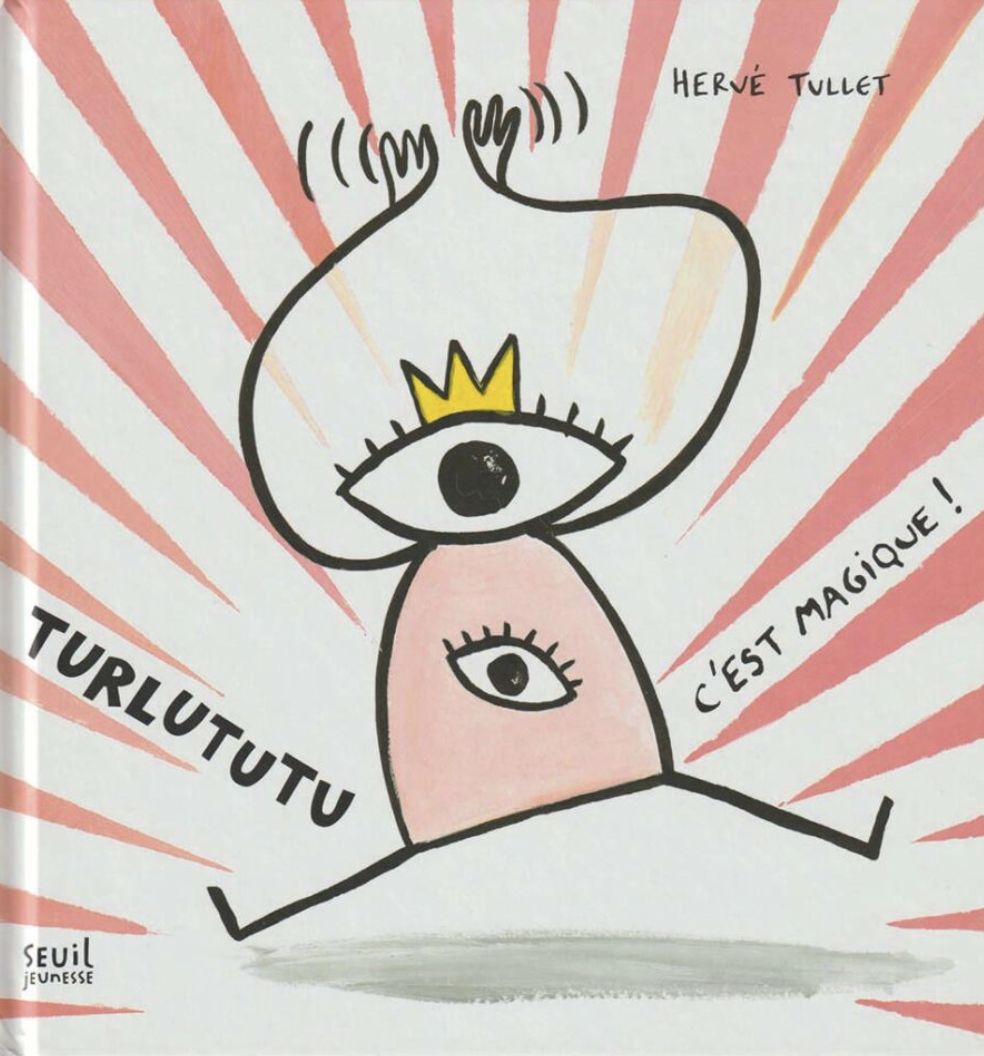
Turlututu: C’est magique! (Turlututu: It’s magic!), Seuil Jeunesse, 2003
This book was the first step toward the narrative system that would be revealed in full with Press Here seven years later: playing with the persuasive force of the narrator to incite the reader to interact with the book in all sorts of ways. Here, a character/narrator, Turlututu, is established. Drawn in an archetypal manner, with a (crowned) head and a heart shaped like an eye, he addresses the reader directly, questions them, and gets them to act.
Hervé Tullet: He’s named Tutu (Tullet),
Turlututu is me:
He moves like I do when I’m running an event and I bring a child up on stage (I overact, I’m a performer),
But he’s me in two dimensions, rudimentary.
He has two eyes because he looks a lot.
At the start, I was intuitively attached to this character, enough to refrain from making him more sophisticated.
Intuitively, this suited me, and I later understood why: He’s a stick figure, that first character that children draw.
As a character, he emerged very quickly.
I remember someone at the publishing house saying, “Careful, he’s a character, you need to work on him.”
But I had no desire to work on him; he’s flat, without volume or expression, he’s always drawn the same way, his arms have a limited number of movements,
I was happy with this unexplored character.
I could see that it was a style that adults wouldn’t like.
But, in fact, that leaves room for the idea.
Turlututu is nevertheless a good companion who follows me still.
While many books for children show magical characters such as fairies or witches, Hervé strove to offer children a strong element of truth in the magic and render it effective within the book. A simple turn of the page produces anticipated actions, which the narrator declares to be magical. It’s similar to the way that illusionist shows worked in the nineteenth century. In the third book in the Turlututu series, C’est toute une histoire! (It’s quite a story!), the person reading aloud (therefore the adult) is put in an awkward position vis-à-vis their listeners, since the narration has them describe images with words that don’t match.
Hervé Tullet: The most wonderful page in Turlututu: C’est Magique!, the one that for me reveals the most, is when he disappears, and the reader finds themselves with a blank page.
I think it’s precisely there that the principle of Press Here appeared for the first time.
In Turlututu: C’est toute une histoire there’s also a fundamental reversal. Since the image is shown but the accompanying word is wrong, suddenly the child is the one who knows how to read, not the adult. The drawing of the sun is captioned with “a radiator,” the car with “a horse.”…
When you read this on stage with children and their teacher, a rift opens up: The adult doesn’t know how to read!
This provokes a great moment of confusion in the reader, and that moment is important because it completely reverses the rapport between teacher and student, or even between adult and child.
For me, the Turlututu books were really an experiment.
But at a certain point, it became a little tiring.
Looking for ideas was fun, but doing the drawings, the background, repeating characters,
Turned out to be more boring and that’s how I decided to stop.
Turlututu is nevertheless a good companion who follows me still.
And I’m always astonished by the vivacity of this character.
*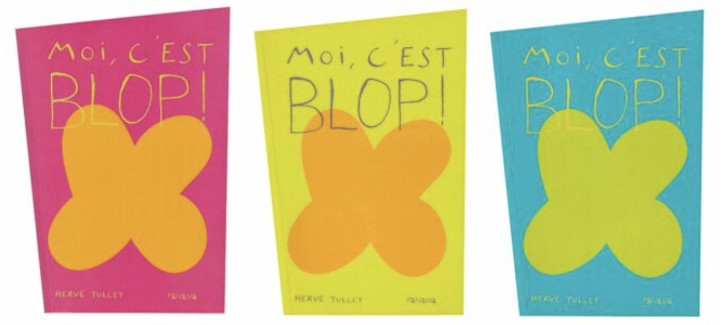
I Am Blop!, Les éditions du Panama, 2005/Phaidon, 2013
With its trapezoidal shape and its four chromatic cover variants, this book is profoundly original. Starting with a hollowed-out form on the first page, the book establishes a declension with variations—black, white, big, little—then very quickly adds some surprises such as the mirror facing “Blop discovers.” From page to page the reader witnesses ideas put into action, more and more rich, audacious, and surprising, as if they were witnessing the unfurling of a creative thought in real time. The book evokes Andy Warhol, because in this wonderful idea factory, the reader finds the same use of repetition, transformation, and combinations of forms and colors, of which the icon Blop is emblematic.
Hervé Tullet: When I tackled Blop, I wasn’t motivated, because it was a heavy project:
At the beginning, I had in mind a repeating splotch, and it bores me to draw the same shape over one hundred pages.
I sensed that it was an idea, but I couldn’t tackle it.
Blop has a link with outsider art, or Arte Povera, in its simplicity, or in the systematization of its repetition.
I had an obsession with shape and I wanted to manage to reveal meaning with nothing, to rediscover the feeling I had when reading Little Blue and Little Yellow by Leo Lionni: creating an entire universe and emotions with simple bits of color paper.
A notebook in the shape of a parallelepiped gave me the internal rhythms, but it took time before I wanted to show it to the editor,
And yet, she immediately expressed enthusiasm: It clicked in the way it only does when you have a special rapport with an editor.
It clicked enough that I could face completing ninety pages!
Hervé invented a shape that has the simplicity of geometry but that appears in nature as a clover, a cross, a butterfly, and an infinite number of incarnations. This would be proven by the hundreds of contributions that arrived in response to Hervé’s blog post calling people to send in “their” Blop. It was the first act in the viral interaction between readers and author via the internet.
Hervé Tullet: I took myself seriously when I made the shape Blop.
It was very much a designer’s gesture, with extensive and in-depth research, on tracing paper: a real logo creation.
And the surprise, when the book came out, was that that shape existed already: I realized that Blop exists everywhere.
Yet this shape didn’t have a name.
Then I wanted things to spread through communities and groups, and it worked: The readers searched for the shape in the real world, in everyday life, on the street.
It became viral because it was obsessive.
The primitive form of Blop is a cross: There was a missionary quality to its diffusion that I’ve found again today with the propagation of the Ideal Exhibition.
The book was in a way completed by the readers, magnified one hundred times,
Yet I had imagined none of this when I was making it.
The other big revelation with I Am Blop! was that it was a book of sounds.
That was unanticipated, too.
But it nevertheless became of primary importance during public readings that I did for this book, and it added a whole other dimension,
Which later led to Say Zoop! (OH! Un livre qui fait des sons); a digested Blop.
The book’s other powerful idea was to make the Blops move within the space of the book, for the storyboard sequence. For the first time I had the intention of animating a figure, like a precursor of choreography.
*
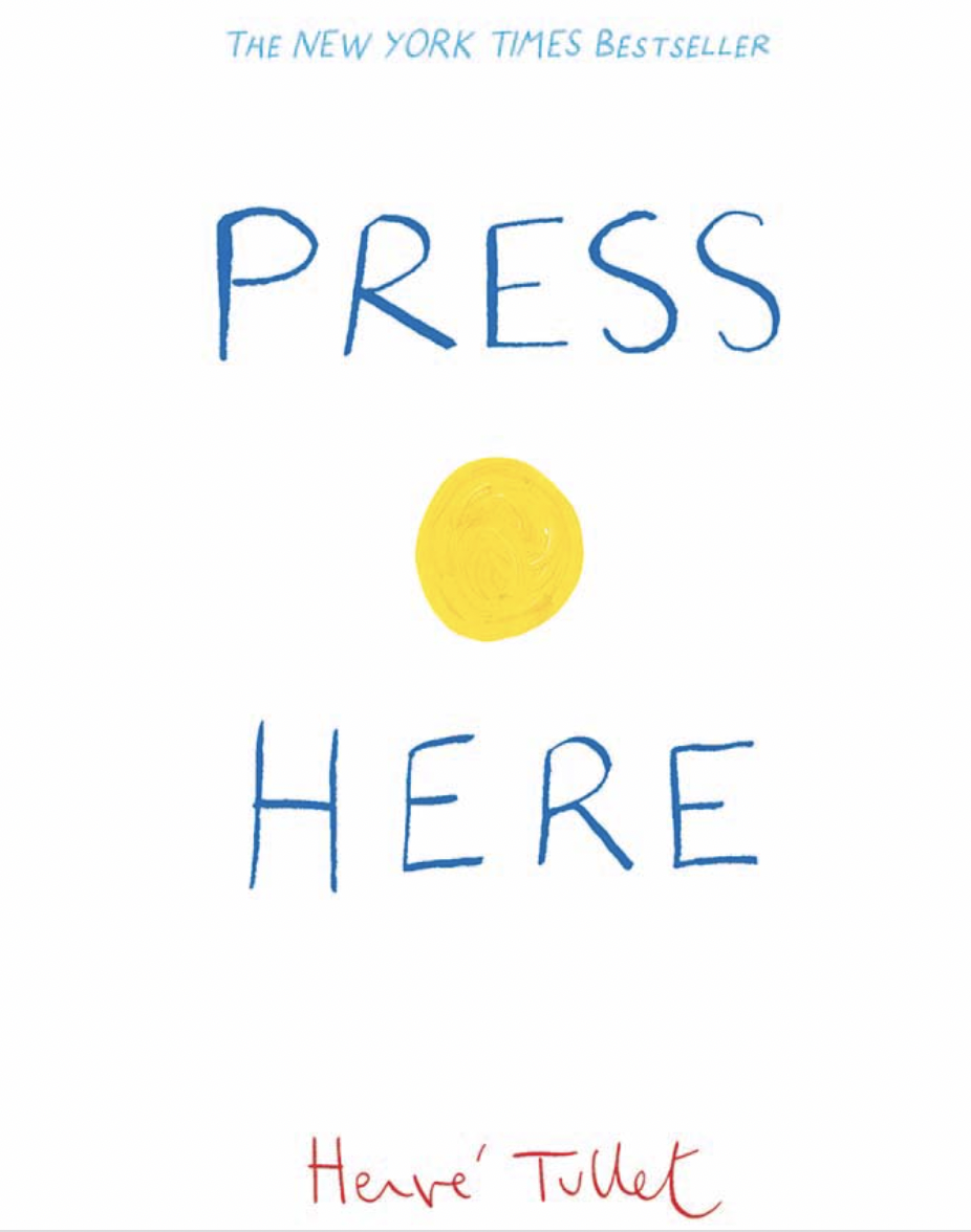
Press Here, Bayard Jeunesse, 2010/Chronicle Books, 2011
It had taken Hervé fewer than twenty years, progressing without failure, to arrive at the maximum purity of the idea, at its very essence. The narrative interactive principle was perfectly in place, and he touched the nerve center of childhood: the absolute belief in a magical world. As touchscreen tablets began to appear, Hervé leaned on the reflexes that young readers had learned from using multimedia devices, asking them to interact with a dot in the book, which produces an immediate effect once the page is turned. The book anticipates the reader’s reaction by determining it. In so doing, it can give the illusion that it’s obeying the reader’s commands and draw out of them a series of actions and gestures never before seen in the world of books.
Hervé Tullet: The inspiration for the book was so powerful that it no longer needed to use Blop, so I could move from Blop to a dot. Which is even more obvious and radical.
A graphic obviousness,
The purest form of drawing for an idea.
And so I searched.
I made my first attempts at dots on a musical score: Things were in motion!
Very few notes—and therefore dots—were needed for it to work.
I made a notebook, in one go, but it lacked the multiplication of dots.
There was a mathematical clarity, a power which you cannot escape, like a fraction.
I had long reproached myself for not taking pleasure in making my books. I was always trying to escape drawing,
But with Press Here, I had fun, even if I drew it in two days.
There was, even so, an aesthetic, or maybe a fostering, and even a design. I used hollowed-out rulers to make the dots, but I also wanted to escape perfection.
I made my first drawings on a matte paper, with Posca markers:
It was flat, cold, smooth, and it looked too much like a digital image.
I then did a trial on Chromolux paper: the Posca dried in a certain way,
I placed a finger on top of the dot: It left a print, a vibration.
That was it, I had it! I carried on, I didn’t make ten drawings in one go: I made one, bam, another, bam, another . . .
And this aligned with the format of one of the notebooks: Fifteen dots fit on one spread. All this fell out naturally and reassured me about my relationship with chance and destiny: There was a mathematical clarity, a power which you cannot escape, like a fraction.
The drawing became less important,
And the book was practically done.
The first dot was a yellow dot, like a sun.
There have been plenty of books that I honestly thought were the best in the world. Here, I cherished the hope of having arrived at a perfection of the idea. But I had no inkling of the consequences. I had in mind to make the Little Blue and Little Yellow of the twenty-first century, but not at all to match its success. In fact, one can’t imagine making a bestseller.
All images courtesy of the publisher.
__________________________________
Excerpted from Hervé Tullet’s Art of Play: Images and Inspirations from a Life of Radical Creativity by Hervé Tullet and Sophie Van Der Linden. Copyright © 2022. Published by Chronicle Books.
Hervé Tullet
Hervé Tullet is a New York Times–bestselling author and has received numerous awards. His books include Press Here, Mix It Up!, Let's Play!, and Say Zoop! He lives in France.
