Fury Made Visible: Call and Response for Civil Rights through Graphic Design
Silas Munro on the Intentional Aesthetic of a Revolution
“You’re bearing witness helplessly to something which everyone knows, and nobody wants to face.”
–James Baldwin, 1962
Protest graphics are the products of a specific kind of urgency. This vital energy does not serve the time-pressured needs of a brand message or the clarion call of capitalism for design to grease the wheels of our economic engines. The buttons, pamphlets, flyers, and posters in this volume, from multiple generations in the Civil Rights struggle, are fury made visible. Across time and space, the objects in this volume capture a series of calls and responses of the dire needs of Black communities in pain, networks of human beings fighting for civil rights who have faced and continue to face oppression. Each material artifact shown speaks to the demands of activists making designs in matters of life and death.
Call-and-response is a musical structure that is made up of two phrases that form a rhythmic dialogue. This pattern of musical refrain begins with an initiator who makes a “call.” That opening phrase can be sung, played, or danced, or it can be a medley of all three, and it is always answered by a reciprocal expressive response. Call-and-response as a musical structure has its origins in African music—though you also find it in African American gospel and rhythm and blues, Colombian cumbia, and Peruvian huachihualo forms. This multiplicity of geographies and diasporas was created by the forced migration of Africans through the transatlantic slave trade. The resulting musical aesthetics highlight improvisation and collaboration—skills necessary for community cohesion as conquests by colonial empires stretched across the Americas.
 Carte de visite portrait of Sojourner Truth, 4.13 x 2.5″, 1864
This embedded racial capital in the movement of people also became embedded in typography as a form of “print as property” when, for instance, nineteenth-century enslaved Black printers under duress typeset broadsides that enforced slave catcher laws. Remarkably, the growing Abolitionist movement upset this dynamic as both white and freed Black printers usurped the iconic bold Victorian typographic language, seizing the means of production to print and post messages of emancipation and freedom. An 1864 Emancipation-era carte de visite by Sojourner Truth is inscribed with the words “I Sell the Shadow to Support the Substance.”
Each material artifact shown speaks to the demands of activists making designs in matters of life and death.
This poetic statement foreshadows the sacrifices of abolitionists, organizers, and everyday people who used graphic design to demand their equality. In the case of Truth—an innovative, often overlooked contemporary to Frederick Douglass who had been born into slavery and illiteracy—her photographic likeness, printed on cards with liberatory text, funded her life as a traveling preacher, blues singer, and free Black woman. Though they had their differences, Douglass and Truth were pioneers who used both word and image in dynamic ways to further the goals of emancipation. One of Douglass’s key phrases was “the color line,” an imaginary barrier between the formerly enslaved people and the former enslavers drawn using the arbitrary rationale of skin color. It would be W. E. B. Du Bois who would take that phrase and construct a life’s work that paralleled several critical phases of activism and graphic production reflected in Making the Movement’s robust collection.
Du Bois, as a researcher, sociologist, and historian, shrewdly employed graphic design to advocate for African American equality. Much can be delved into with the innovative data visualizations in his 1899 Philadelphia Negro and 1900 Georgia Negro projects. Du Bois also helped start the Civil Rights movements as a cofounder of the National Association for the Advancement of Colored People (NAACP). He served as the first editor of The Crisis, the official publication of the NAACP, which is still in production today.
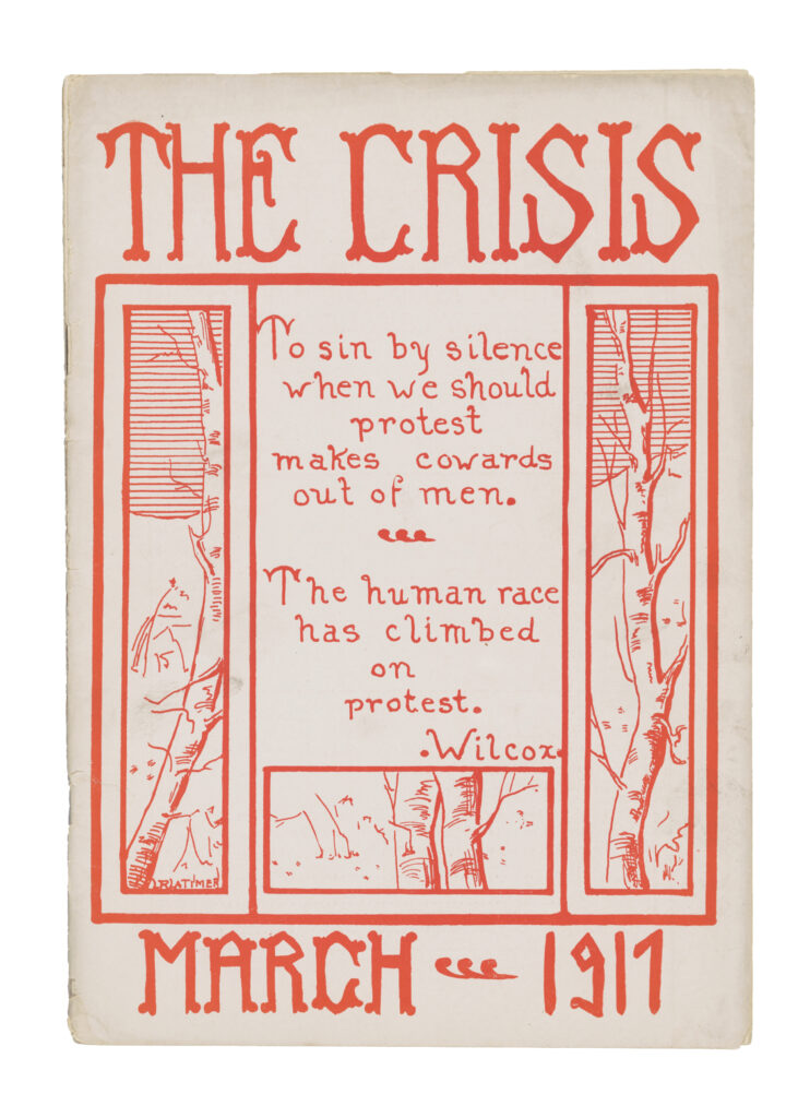 Louise R. Latimer (cover designer), W. E. B. Du Bois (editor), The Crisis 13, no. 5 (March 1917), letterpress, 9.75 x 6.88″ (Collection of the Smithsonian National Museum of African American History and Culture)
The Crisis represents a visual and intellectual engine of that output. Reflecting in 1951 on the impact of the enduring publication, its business manager, George Schuyler, recalled, “Here for the first time with brilliance, militancy, facts, photographs and persuasiveness, a well-edited magazine challenged the whole concept of white supremacy then nationally accepted.” Du Bois commissioned a stirring array of designers, artists, and writers during his tenure as editor, including seminal figures who emerged out of the Harlem Renaissance: Aaron Douglas, Frank Walts, and Louise E. Jefferson.
Jefferson was a prolific maker: a graphic designer, calligrapher, cartographer, and photographer. Opportunity magazine, another significant publication of the Harlem Renaissance, also featured her work on its covers. Over Jefferson’s long life she photographed iconic figures in Black culture and protest, including Martin Luther King Jr.
We can see King’s image, touch his fingerprints, and feel his essence as another strong voice in the turning tide on social justice. There is no other graphic symbol that speaks to the culmination of his legacy, expressed in his last speech on the eve of his assassination recounting his journey “to the mountaintop,” than the 1968 poster I AM A MAN. The poster’s proclamation is typeset in bold letterpress with a simple but profound statement that asks not to be seen only as a Black person, but as a human being who is deserving of equal treatment. The signs were produced by the Memphis sanitation workers’ union to protest the negligent deaths of two Black sanitation workers. King took trips to Memphis several times that spring to support the workers’ movement. The poster is composed with a straightforward and minimalist power that matches the insistence of its message. The underline beneath “AM” is a form of visual punctuation—it is a response to the call of nineteenth-century abolitionists: “Am I not a man and a brother?”
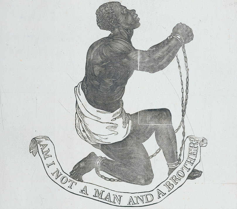 Based on a design by Josiah Wedgwood, “Am I not a man and a brother?” woodcut appearing on the broadside publication of John Greenleaf Whittier’s “Our Countrymen in Chains,” 10.5 x 9″, 1837 (Library of Congress Rare Book and Special Collections Division)
The phrase echoes a woodcut of an enchained enslaved African that accompanied the broadside poster publication of John Greenleaf Whittier’s antislavery poem “Our Countrymen in Chains.” The broadsheet design is itself an iteration of a seal designed by Josiah Wedgwood for the Society for the Abolition of Slavery in England. The phrase “Am I not a man and a brother?” and the image of a Black man in chains also appeared on nineteenth-century abolitionists’ lapel pins.
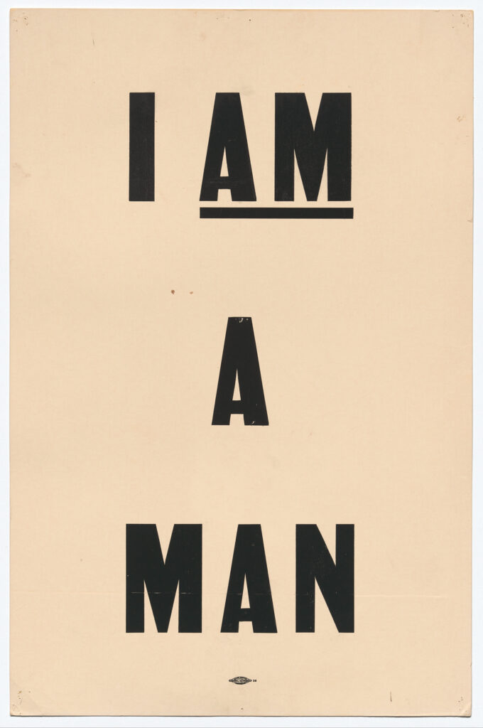 Anonymous designer for the American Federation of State, County, and Municipal Employees (AFSCME), I Am a Man, letterpress, 14 x 21.5”, 1968 (Collection of the Smithsonian National Museum of African American History and Culture, Gift of Arthur J. “Bud” Schmidt)
The empowerment found in the refrain “I AM A MAN” was mirrored in calls for “Freedom Now” by the NAACP and its allies, which tragically evolved and increased in urgency as the continued violence against Black bodies through police brutality and the sacrifices of the lives of King and other activists battered the movements. This energy shifted into the Black Power movements of the late 1960s, 1970s, and early 1980s.
In the aftermath of the police and FBI negligence around the murder of civil rights activist Malcolm X in 1966, two young activists, Bobby Seale and Huey P. Newton, launched a groundbreaking movement named the Black Panther Party. It was first called the Party for Self-Defense, and it encouraged community members to lead armed watches to protect against police violence in Black neighborhoods. Making their rounds, Party members projected a bad and bodacious image in the streets, with the sartorial flair of knit berets, leather jackets, and rifles in tow. The Party began in Oakland but spread its values of anti-racism, human rights for all, and radical socialist philosophy through various social programs and public awareness announcements. The design cornerstone of the party’s activist messaging was the Black Panther, a weekly newsletter that cost twenty-five cents and achieved a circulation of three hundred thousand copies at its height—competing with the distribution scale of papers in a number of US cities.
During its most active phase from 1968 to 1971, the party expanded nationally to have affiliates in more than fifty cities. The Black Panther offered a “Black Community News Service” that highlighted stories of grassroots Black liberation energized and inspired community action, and served as a printed embodiment of the party’s Ten-Point Program—a political, social, and philosophical platform that called for full employment, equitable housing, and access to education and health care.
Du Bois, as a researcher, sociologist, and historian, shrewdly employed graphic design to advocate for African American equality.
Black Panther Party principles—which included the anti-capitalist ethos of Karl Marx, the adoption of Second Amendment rights by Americans of color, and the use of organizing practices developed by labor unions—were red-flagged by FBI surveillance. The Bureau manipulated the press to stigmatize the image of the Party in order to justify aggressive actions by FBI agents, which included imprisoning key Panthers such as Huey P. Newton and Angela Davis. They even went as far as assassinating members, as in the case of Chicago chapter chairman Fred Hamilton. FBI harassment also included ongoing pressure to shutter the Black Panther newsletter’s production. Designer, illustrator, and Minister of Culture for the Party Emory Douglas remembers that lawyers shepherded the newspapers from the printer to safeguard their public distribution.
Digital production has revolutionized the typographic language of protest as much as digital venues have increased the audience of protest graphics.
Today a protest march can be attended as easily from our bedroom as from the streets of our local neighborhood. As technology advances, so do additional spaces for creating and displaying protest graphics. More people attended the protest marches honoring the tragically murdered George Floyd in the summer of 2020 on their phones than in person. One can easily see social media posts as the digital broadsides of our day. Our daily feeds are flooded with digital compositions thanks to the graphic power of personal computers that are now integral to the contemporary design process—whether a formally trained designer is at the helm or not. Protest signs get generated with the minimal friction of a few double taps in the mobile application of your choice.
Digital production has revolutionized the typographic language of protest as much as digital venues have increased the audience of protest graphics. Vocal Type Foundry, founded by the Black graphic and type designer Tré Seals in 2016, is a pioneer of this vanguard. Martin (which is used as the display typeface for this book) is a revival of the design of the Memphis sanitation workers’ “I AM A MAN” signs. Martin and other typefaces including Marsha, Carrie, and Ruben represent the painstaking archival research that Seals has contributed to the typographic representation of other protest movements, including the Stonewall uprising, women’s suffrage, and the Chicano Moratorium, respectively.
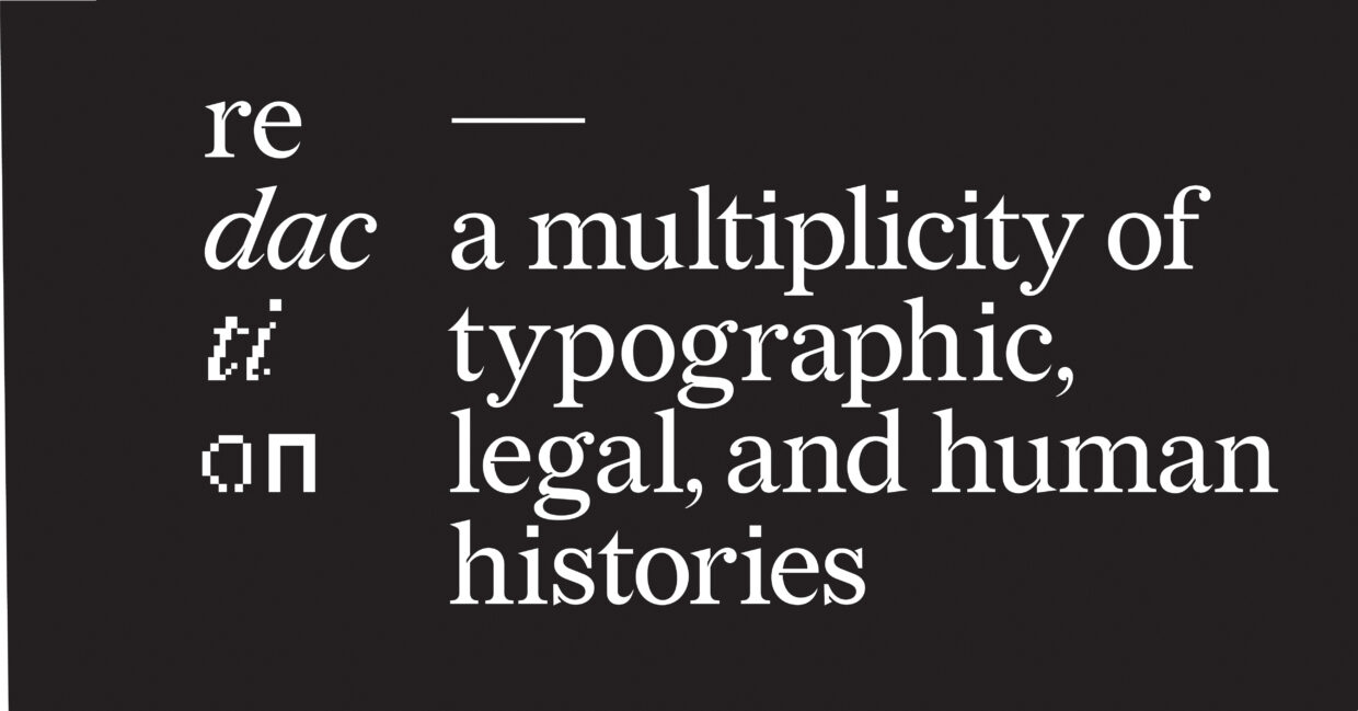 Titus Kaphar and Reginald Dwayne Betts (concept); Forest Young (creative direction); Jeremy Mickel (typeface design), Redaction typeface, 2019 (Courtesy Forest Young and Jeremy Mickel)
In the typeface Redaction, a collaborative effort by Titus Kaphar, Reginald Dwayne Betts, Forest Young, and Jeremy Mickel, a shifting pixel grid becomes a metaphor for extreme racial discrimination in the US legal system: notably, its cash bail practices and how they disproportionately result in prison time for poor people of color. Redaction is essentially a mix of Times New Roman and Century Schoolbook—both types heavily associated with legal documents. Rather than being sold commercially, Redaction is served up in an Open Font License, which permits the typeface to be free for use as an open-source tool. This spirit of collaboration and free exchange is one of the Civil Rights Movement’s goals that has come to fruition.
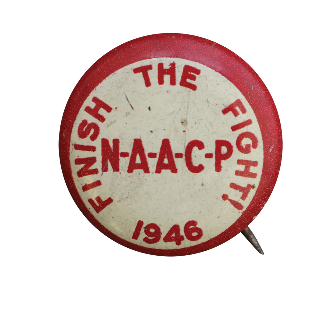 NAACP “Finish the Fight” pinback, .75″, 1946 (photo courtesy of William Davis)
With all the cycles of progress and setback, the 1940s NAACP slogan “Finish the Fight” comes back to mind. Facing the global forces of the COVID-19 pandemic suggests a new reality of a metaphoric endemic battle against restrictions of our collective rights. The calls and responses of solidarity among protesters in the Civil Rights, women’s liberation, countercultural, LGBTQIA+, and Black Lives Matter movements all set up this current moment of embracing an economy of means necessary through centuries of making design under duress.
_____________________________________
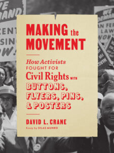
From Making the Movement: How Activists Fought for Civil Rights with Buttons, Flyers, Pins, & Posters by David L. Crane, published by Princeton Architectural Press, reprinted with permission of the publisher.
Silas Munro
Silas Munro is the founder and a partner of Polymode, a studio that leads the edge of contemporary graphic design through poetic research, learning experiences, and making cool shit for clients in the cultural sphere. Collaborations include the City of LA Mayor’s Office, Cooper Hewitt Smithsonian Design Museum, Mark Bradford at the Venice Biennale, and MoMA. Munro’s writing appears in the book W. E. B. Du Bois’s Data Portraits: Visualizing Black America, published by Princeton Architectural Press and featured in Smithsonian magazine, the New Yorker, and Black Perspectives. Munro expanded this research into the first BIPOC-centered design history course, Black Design in America: African Americans and the African Diaspora in Graphic Design, which continues to shed light on moments of oppression and visibility. Munro holds an MFA from CalArts and a BFA from the Rhode Island School of Design. Munro is founding faculty member and cochair for the MFA in graphic design at Vermont College of Fine Arts. He is particularly interested in the often-unaddressed postcolonial relationship between design and marginalized communities.
