Exclusive cover reveal: See the cover for Athena Dixon's The Loneliness Files.
Literary Hub is pleased to reveal the cover for Athena Dixon’s memoir in essays The Loneliness Files, forthcoming from Tin House this fall. Here’s a bit about the book from the publisher:
In Spring 2020, the world as we knew it ground to a halt at the start of the COVID pandemic—streets emptied, shelves were bare, and the world quieted to a hum. The first two weeks at home seemed like a gift to writer Athena Dixon, a respite from a busy life. But as weeks turned into months and then into years, Dixon, along with the rest of the world, learned that humans are lonely. Disconnected. Isolated. Dixon found herself confronted by a lifetime of loneliness, a history of distancing herself from a family legacy of alcoholism, living alone as a middle-aged woman without children or pets, working forty hours a week from home, more than three hundred and fifty miles from her family and friends. How had her past decisions led her to an apartment alone, craving human connection while the world sat idle? How did she come to feel this way? How had her connections eroded away?
Dixon began watching mystery videos on YouTube, listening to true crime podcasts, and playing video game walk-throughs to have another human voice in her home. She discovered the story of Joyce Carol Vincent, a woman who died alone, her body remaining in front of a glowing television set for three years before the world finally noticed. In The Loneliness Files, Dixon explores disconnect and loneliness in a hyperconnected world, pondering if we are destined to be a body behind a screen, lost in the hustle of the world, forgotten by the rest of the living.
And here’s the cover, which was designed by Tin House Associate Director of Design & Production Beth Steidle:
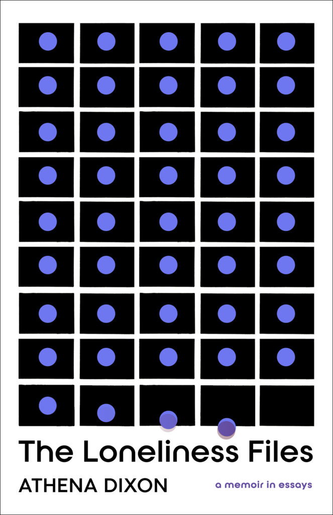
“My cover felt almost perfect the first time I saw it,” Dixon told Literary Hub.
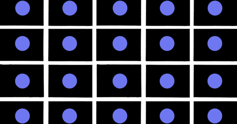
I am a big fan of 1960s book covers and mid-century design in general and this cover hit these highpoints for me. What I admire most about this era is how simple lines and shapes were used for massive impact. So, what I really enjoy about the cover is the balance of the squares and dots in relation to the loneliness and isolation the book circles. I immediately associated the graphics as individuals caught in their own lives—existing around each other yet not touching. The final row struck me as those individuals stepping outside of themselves and finally connecting to the world at large. That’s my hope for the collection—allowing readers to acknowledge those places of isolation and finding links to a life outside of it.
“It is hard to visually represent loneliness in a way that does not skew towards the familiar—white expanses, empty rooms, curtains and windows, vases without flowers,” Steidle explained.
And while those images successfully convey their message, this book is modern and urgent, and needed a different approach. Modern loneliness is crowded. It is filled with bodies, digital and analog, with real life on one side and manufactured life on the other. Early in the design process, I stumbled on an article on the history of black rectangles used in art. There were black rectangles representing death in books of elegies, and black squares representing what existed before the universe began, and a black square totality as the edge of art. If a black rectangle can represent anything, including a computer screen, then a circle can represent a person, together becoming a discreetly nested reality. Mid-century book designers were masters of the full expression that could be achieved through color and geometry and, fortunately, the author and I are both fans of this aesthetic. I liked the idea of funneling the history of the black rectangle, going as far back as the 1600s, through a 1960s lens, to come up with a portrayal of modern solitude.
The Loneliness Files will be published by Tin House on October 3, 2023. You can preorder it here.


