The following is drawn from a conversation that occurred at the opening night of Penguin Random House’s Be My Cover Exhibit, which features 100 of the best of their book covers published worldwide within the past 10 years. On Monday, Peter Mendelsund, Jaya Miceli, Oliver Munday, and Helen Yentus as they discussed their design experience with curators Fabrizio La Rocca and Roberto Maria Clemente—the full conversation can be viewed here. The exhibit, which is located at The Strand, will be up through May 23rd.
![]()
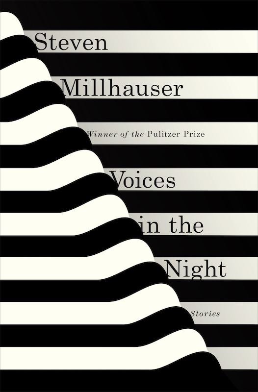 Voices in the Night by Steven Millhauser, designed by Janet Hansen
Roberto Maria Clemente: The first question is probably the most obvious one: do you ever buy a book by its cover?
Peter Mendelsund: I tend to read very few first-run trade-published books these days. Now that I don’t have to read for a living I can read whatever I want, so I’ve been gravitating towards older books that I never got to. And in that case you have this huge ecosystem of covers to choose from on Abe Books, used bookstores, places like [The Strand] . . . If I’m choosing between 20 versions of Moby Dick and there’s nothing else to distinguish them, then yeah, sure. Occasionally I’ll even rip off, physically tear off the covers of which I love, the covers of which I hate, just so I can have them in my house and be able to abide them.
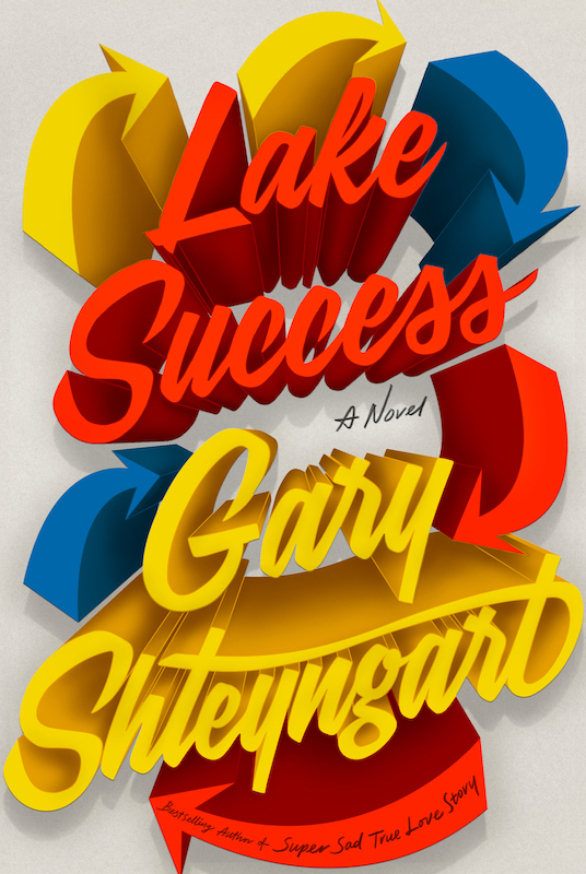 Lake Success by Gary Shteyngart, designed by Rodrigo Corrall
Jaya Miceli: I would have to say yes. Being a book jacket designer, I’m attracted to to the covers of books. I have been since I was a child.
Fabrizio La Rocca: When do you know that you have what you need from that book? At what point of reading the book do you think that you’ve captured the idea, or it’s somehow revealed to you?
Helen Yentus: I sketch in the margins or write down words and hope there’s something there. After I finish, I go back through those stupid sketches, bad ideas, words that aren’t helpful. So yeah, never. I think other people design differently, but I always assume whatever I’ve worked up in my head is not going to work when I’m getting down to doing it.
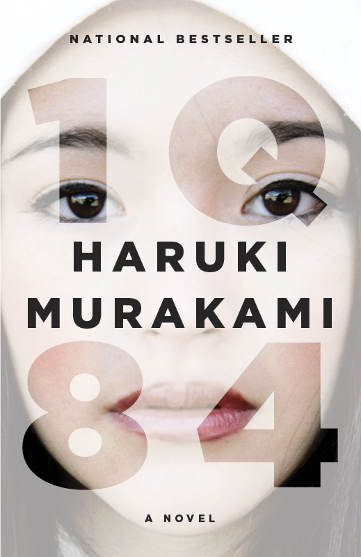 IQ84 by Haruki Murakami, designed by Chip Kidd
Oliver Munday: The reading experience of working on contemporary fiction as opposed to reading for pleasure or reading the classics—they couldn’t be more different. And when you impose on yourself to find something in the text—I had an experience of reading The Underground Railroad when it was in manuscript form. They presented it as this big book, one of the biggest books they published that year. I read it and it was very good. It was a quick read and I was trying to be as diligent as possible. I felt that I had gotten enough from it and did the cover.
Then I went back and read it in ARC format, which feels more real—it’s between the manuscript and the actual printed book. I was relieved of that burden and it was a completely different experience. Reading a book a second time, it’s obviously a different and more rich experience. But there were things I had missed, I think because I was reading with such speed and had a task at hand. I don’t enjoy doing that and it is such a relief to not have to do that as much anymore.
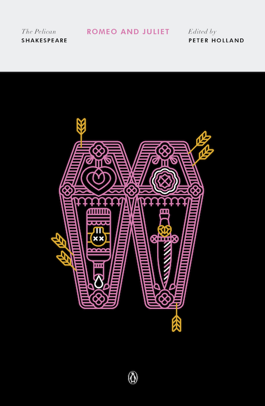 Romeo and Juliet by William Shakespeare, designed by Manuja Waida
JM: I do something similar to what Helen does. I underline. I try to tap into a feeling or a mood, but that comes at the end when I’m done and I’ve put the book down. I try to go with some sort of feeling. Generally my sketches never really work out, so it’s trial and error. I just start working—I’m designing and moving things around, turning things upside down. It’s always the accident, that freak accident that happens and then I’m like, “oh oh, wow! I didn’t even do that. It was an accident and it worked out beautifully.” For me, it’s more of an expressive thing and it’s tapping into a feeling.
OM: I feel shitty: I never sketch or underline. I don’t take notes, because then it feels like homework to me.
RMC: If you don’t like the book, does it affect your work?
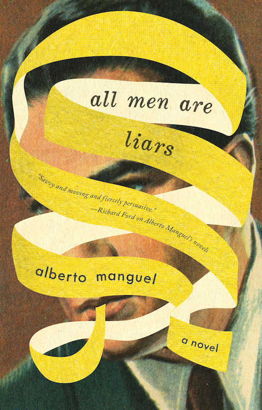 All Men are Liars by Alberto Manguel, designed by Jason Booher
JM: I have a job to do. Whether I like the book or don’t like the book—my job and the role I’m taking as the designer is that I need to create something that is going to be striking and interesting and make this book something that someone’s going to pick up.
HY: I prefer not to like the book. You can think about it and figure out what your ideas are and pull yourself away a little bit and really think critically, think about the packaging, the selling. What does this need to be? How can I do my job?
I have a really hard time if I like a book; I have a much harder time if I love a book. If I love a book, it’s all just pressure and pain and self-loathing. You’re so wrapped up in wanting to do right by this thing. I get in my own way. I almost feel like I can’t do my job. I know we don’t like to think about this, but our job is to package and sell books.
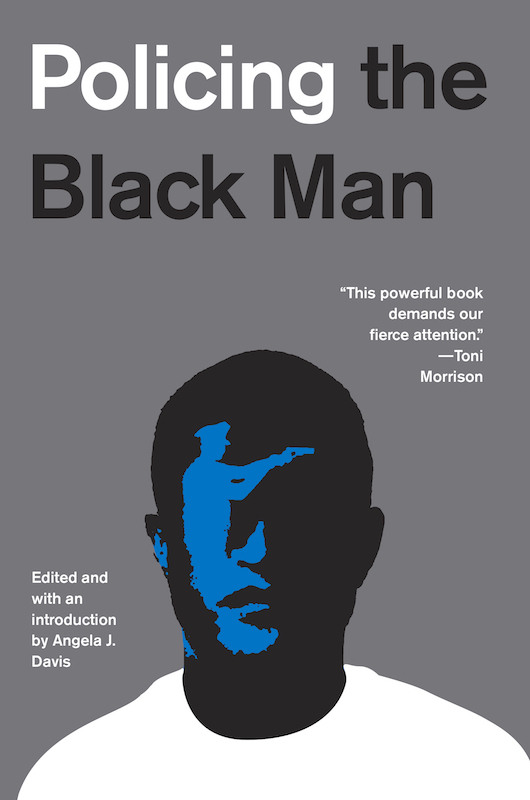 Policing the Black Man by Angela J. Davis, designed by Oliver Munday
OM: I think that distance is critical of being able to look at something as objectively as possible. And it becomes more difficult when you like something. My experience now is that not reading any of the book is the best way to design the cover . . . Just capturing an overall mood, you don’t really need so much to understand what that is. Those quick and broad strokes are successful in a way that if you get too bogged down in the granular details it becomes difficult to do.
FLR: So we’re talking about thousands and thousands of covers among the four of you. How do you stay inspired?
HY: I’m lucky enough to work at a place where we’re allowed to play a bit and come up with projects and collaborate with other people within the company. We’ve been working on projects outside of cover design that are creative and collaborative … So things that are not covers but still hands on and creative creative, those things have been very helpful for me.
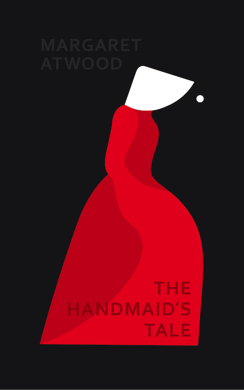 The Handmaid’s Tale by Margaret Atwood, designed by Noma Bar
PM: Couple of things. One is, yes, try channels outside of the channels you’re comfortable in. I think that can refer to media, but it can also refer to the fact that you should look outside the visual channel to music and prose. There’s just a million different interesting things in the world that one can think about that aren’t book cover designs. So that’s part of it. You have to step out of it to get some critical distance, and also the channels feed one other in interesting and productive ways.
I go to bookstores and look at all the covers and see the ways they start to cleave together and stick to the same principles and the way things start to homogenize. I think that’s natural. When we publish books, a lot of the principles that drive the way we package and market them are retrospective. We look at what worked in the recent past and we emulate those in a variety of ways. Like Helen said, sometimes the things that end up working are surprising and anomalous, and then those get copied. I think a good rule of thumb is to see what people aren’t doing and do that thing. It’s almost oppositional principle.
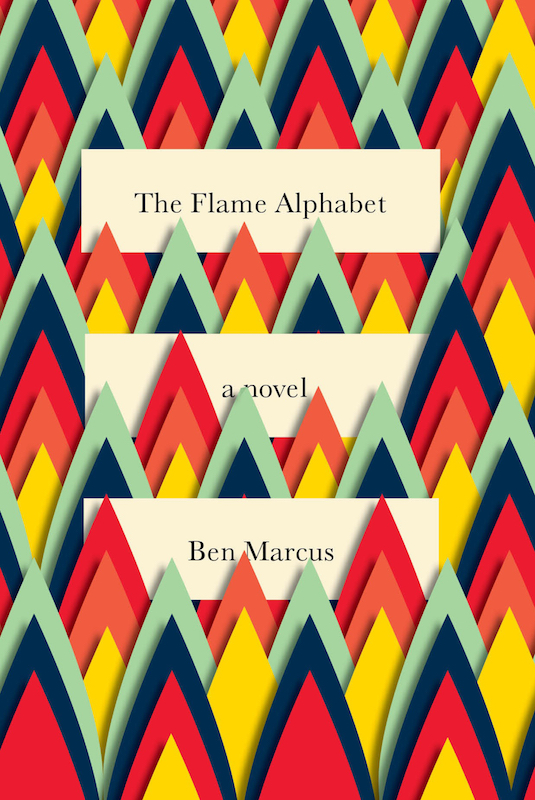 The Flame Alphabet by Ben Marcus, designed by Peter Mendelsund
OM: There’s a feeling that you get when you’re working in the rectangle when things feel strange in a way. And I think part of that is because of what you’ve seen in a bookstore. I tend to trust that instinct when there’s a space that things feel off in the right way. It is oppositional, and there is a little bit of aggression in it.
RMC: How does sheer quantity affect your work? How many covers do you work on in a year?
JM: A lot. A lot of covers. The good thing about working on so many covers is that it’s like a muscle that you keep exercising. When the next problem comes along, it’s not like you’re fresh out of ideas, because you just finished something that might trigger another idea for a new book.
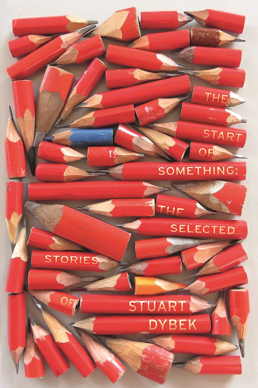 The Start of Something by Stuart Dybek, designed by Suzanne Dean
PM: There’s something great about not getting too attached to one project. I think that so much of creativity springs from an ability to feel free, to let your mind roam without too much constraint. When you’re working on a lot of things at once, you don’t get that sort of tunnel vision that getting bogged down with one thing gives you . . . It’s so important to maintain a sense of play—when you’re making anything—to not get too self-serious or emotionally invested or even to feel like every problem has a unique solution. Free yourself of that sort of onus and it tends to produce those wonderful accidents that Jaya was talking about.
FLR: Do you look for a style? Do you look for a niche? Or do you avoid it?
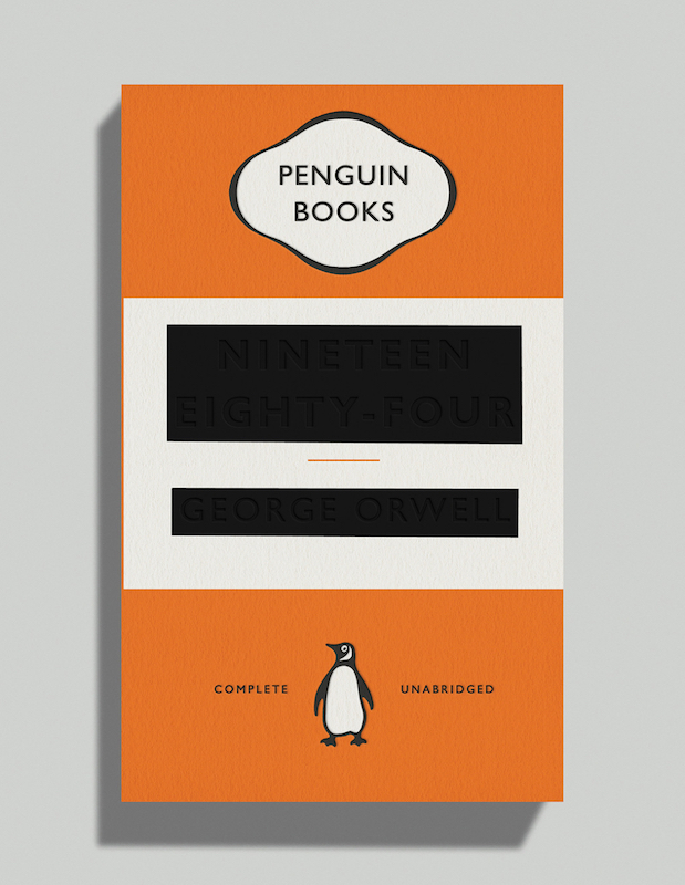 1984 by George Orwell, designed by David Pearson
HY: I try to avoid it as much as possible. I think there are designers that are very successful in having a niche, but I don’t see myself that way. I’ve always aspired to come at each project in a new and fresh way and give that project what it needs.
PM: We’re designers, so our work is contingent in ways that other kinds of creative activity aren’t. Meaning that there’s a commercial reason that we’re doing this: we’re selling books. So that means that we have to be shapeshifters because the zeitgeist changes. You have to some extent nod to whatever needs to be done for that particular book and its marketing needs. That’s sad, but it’s true. The good thing is that it makes us flexible as makers of things. We all have to look at a lot of stuff and be able to imitate it. I’d say that most good designers are magpies.


