Bruce McCall: The Story Behind Eight New Yorker Covers
Also, His All-Time Favorite
I published my first New Yorker cover in July 1993, and my last (for now) in January 2020. I’d hoped to keep on until l smashed William Steig’s all-time record number, 117. It wasn’t to be. As the Parkinson’s gradually ruined my ability to draw and paint, I saw Barry Blitt’s style so capture the political zeitgeist of America that his cover count skyrocketed in the space of six years to exceed mine. My proud record of 77 covers will soon render me a forgotten also-ran. Boo-hoo.
The magazine’s remarkable art director, Françoise Mouly, has overseen all my covers. Part of what persuades me to declare her remarkable is her intellect. A single conversation reveals a myriad of topics with which she’s comfortable. Topping her list of issues demanding agreement, but often prompting good old-fashioned argument, is politics. International, national, and municipal. She respects France but she loves America. Her quiet voice charms the listener by pouring French into English and combining them with an accent that would make a Parisienne jealous. She and hubby Art Spiegelman (the Maus Man) could between them fill the air on a 24-hour radio network.
Let’s say you’ve pitched a kids-in-the-park cover idea. Within a week it has generated at least three entirely different concepts. You’ll have interpreted each of these concepts in three rough sketches—the basic composition of the picture and the position and relative size of the central figure or thing, or in this case both. Before email, I’d send all sketches to Françoise via the Gutenberg-era apparatus known as the fax. (In the technology gap between the late eighties and early aughts, the Before Email Era, I’d also use the post office or a messenger.) Any one of these means saved the time it would take to go all the way downtown to discuss which sketch, or sketches, deserve to be amplified to “comp” form. “Comp” is short for “comprehensive,” the old-fashioned term now largely forgotten in the ubiquitous trend to compress words into info-blobs for faster-and-faster-and-faster communication.
After Françoise has received said fax comes the phone call with the word on how it hits. It usually hits. Françoise has seldom flatly nixed a cover completely. Acceptance from her is tantamount to high praise: her eyes are foolproof. In fact she has frequently given extra oomph to a cover by suggesting (never ordering) a change in perspective, inevitably leading me to admit “I wish I’d thought of that.”
Timing for cover appearances varies. Usually there’s no reason to alter a scheduled date, but there’s always the chance that some hiccup may force a change: a national tragedy, for example, that so focuses public attention that not acknowledging it would appear arrogant, uncaring, or out of touch with the zeitgeist—or all three. Such circumstances, given the pressures inherent in weekly publication, may result in a cover that’s crude, less developed, or so heavily symbolic that the average reader quickly forgets it. But New Yorker cover artists routinely rise to the occasion and frequently surpass themselves. A disaster’s emotional punch often allows a solid, sensible artist to come up with an ideal image—case in point, Françoise and Art Spiegelman’s solemn, all-black post-9/11 cover. The New Yorker has had a lineup of clutch hitters forever.
*
My favorite cover illustrations aren’t likely to be your favorites. The artist’s view is the reverse side of the coin, the end product of the idea. What I see first is the struggle that ultimately produced it, a tug-of-war that could take another book to explain. Some covers have come to me so full-blown that I’m more copyist than agonized creator. Some are the opposite: mean tiffs with my brain that persist until an idea has turned into a drawing that is then painted.
Certain of my covers betray the sense of confusion I felt as the process developed. A good cover is so smooth, so finished, that it hardly seems painted. It looks so natural; what was the fuss behind it? You don’t want to know. But if you do…
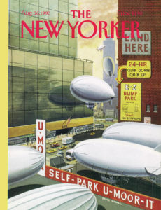
“The Blimp That Fell to Earth”
August 16, 1993
Tina Brown let it be known that the next week’s cover must be a humorous take on the deflation of a small blimp and its flopping onto the roof of a West Side apartment building. (Nobody was killed or injured, so no lawsuits could be expected.) I was keenly aware of my amateur status; had indeed painted like an amateur and lived in the status cellar. I sat at my drawing board, attempting to solve a riddle: painting a dead blimp, I believed, would result in readers young and old barfing or falling asleep—hopefully not both. Eventually, after a four-hour thinkathon that concluded at four a.m., the solution arrived: a straight-faced rendering of a blimp parking lot, with blimps arriving and departing. Large glass walls reflect the blimps.
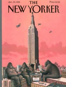
“King Kong Call”
January 23, 1995
A dream delivered this image to my brain in my sleep one chilly winter night in the country. It was so clear and intact that it had only to be transcribed. Shortly after it ran, I received a phone call from a very pleasant elderly lady, who told me how much she’d enjoyed it. Just before the end of the call she said, “Oh, by the way— my name is Fay Wray.”
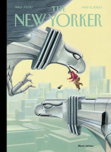
“Photo Opportunity”
May 8, 2000
Everybody knows that image of famous photographer Margaret Bourke-White, perched behind a steel eagle’s head on the Chrysler Building, sickeningly high above Manhattan. I painted a cover satirizing the scene: an angry steel eagle’s mate, lifting photographer and camera (and beret) to float helplessly in midair. The joke was on me: almost nobody knew that famous shot. The cover was confusing and pointless—a flop, and a warning to never overestimate the reader. Even the New Yorker reader.
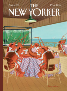
“Lobsterman’s Special”
August 4, 1997
The old switcheroo—in this case, a lobster family digging in at their table, while humans, wrists and feet bound, gurgle helplessly in a holding tank. Painting this cover flooded me with pity and disgust. Since then, I haven’t been able to stomach a lobster dinner.
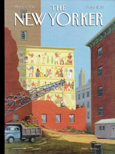
“Landmarks Commission to Meet in Special Session”
April 1, 1996
The Land of the Pharaohs injected itself into my bloodstream in the Egyptian section of the Royal Ontario Museum in Toronto on my first visit, in 1946. A mummified corpse was the main attraction (can’t beat a dead body for drawing crowds), but the hieroglyphics intrigued me more: pictures as language, but a language you can’t decipher. The Egyptian decorative tradition froze everything and everyone in identical one-dimensional poses. Every year, another ancient Egyptian tomb was found in some desolate place a long way from the Great Pyramid. These discoveries suggested a new vision for playing with scale. Fascinated during a Manhattan construction boom by old buildings demolished to dust, I looked for commercial signs buried in the gloom since 1899.
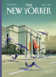
“Easter Morning”
April 5, 1999
Françoise asked me to think about doing something with the huge new exhibit of prehistoric creatures that had just opened at the American Museum of Natural History. I immediately decided to paint an outdoor scene, the best way to identify the museum. Dinosaurs and other monstrous creatures seemed overfamiliar. Birds, less so. And because the scene needed movement, and birds flock, that was that. Pterodactyls were goofy-looking, nasty-tempered flying thugs. I drew a flock of pterodactyls grubbing for rats, cats, and small dogs on the sidewalk in front of the building early on a Sunday morning. In fact, Easter Sunday morning. Pterodactyls didn’t normally don rich purple coats, but the Artist felt that would better represent Easter.
I don’t like to rattle the Art Mart by recommending one of my paintings as a “personal favorite” and thereby setting up a run, hiking prices already condemned by art sellers and buyers as “a blatant fraud.” But I must tell the truth: “Pterodactyls” is my all-time favorite. I live a ten-minute stroll from the “Natural” (a fond nickname from the same loonies who tagged the Statue of Liberty “Stat” and the Chrysler Building “Old Walt”), but that day it looked like rain. I drove my car down Central Park West to Seventy-Seventh Street, U-turned, stopped the car facing north, and commenced to draw the Natural for half an hour from behind the wheel. I drove back up Central Park West to my cross street and parked in the garage. No rain the whole time; isn’t that always the way?

“Polar Bears on Fifth Avenue”
January 13, 2014
The two mature polar bears guarding the main entrance to the New York Public Library, a wintry replacement for the more summery lions, were donated by the man called “Polar Pete,” the Arctic legend who also runs Polar Bear Farm, a six-thousand-acre refuge where he hides out when chased by a pack of polar bears. The pair sitting at the main entrance to the library are the only identical twins ever known among the species. “Sure, they’re cute, but those rascals are even harder to train than octopi,” snorts Mrs. Polar Pete, the world’s sole licensed polar bear wrangler. “Took six months to get those two to sit and stay sat,” she bitches. Their sense of smell is so acute that one or the other—or both—will pounce on anybody passing by on the sidewalk who happens to be carrying a piece of meat in a bag. Their appetites are so avid that passersby sometimes toss them steaks even before they can pick up the scent and pounce. “It’s a small price to pay,” observes one veteran butcher. “Your polar bear is a carnivore. Better to let it gnaw on a chunk of meat than gnaw on you!’’
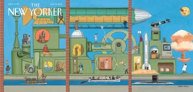
“The World Tomorrow” (triptych foldout cover)
May 18, 2015
I had no grand vision of the idea of “Innovation” through history, so when Françoise gave me three successive pages—a foldout—on which to cover the matter, I panicked. Where to begin and where to end? And considering I had to work without using words, how would I convey the scale of the subject, even with a triptych? (Innovation itself isn’t self-descriptive; it can be applied to anything.) I arbitrarily began the picture on the far left panel. Just as arbitrarily, the discovery of fire seemed a symbolic dramatization of the beginning of invention. That provided the image I used to cap the piece: the fiery launch of a rocket to a distant planet. Between the two fires lay several centuries of developments. There’s no timeline to progress and no universal agreement on which innovations were decisive, so my own, personal triptych comprised the events most relevant to what I saw as meaningful in history, from Copernicus to Bob Dylan, the printing press to the personal computer.
__________________________________

From How Did I Get Here?: A Memoir by Bruce McCall, published by Blue Rider Press, an imprint of Penguin Publishing Group, a division of Penguin Random House, LLC. Copyright © 2020 by Bruce McCall.
Bruce McCall
Bruce McCall has contributed written and visual humour to virtually every magazine in North America. He was a prominent member of the original National Lampoon, and has written for Saturday Night Live. His writing has appeared regularly in the New Yorker since 1979 and in recent years he has done many New Yorker covers. He lives in New York City with his wife and daughter.


