Author Photos: A Taxonomy
What to Choose: Prominent Hands or the Bend and Clasp?
There are as many different author photos as there are authors (naturally), but if you look at a lot of them, as I do in my line of work, you begin to notice some trends. Some are good. Some are perplexing. Some are straightforward, while others are more mysterious. Here, I attempt to create a taxonomy of some of the most common versions. It is, of course, incomplete—infinite variations, etc.—so feel free to add on in the comment section.
NB: I did my best to use only actual author photos (i.e. used on their books or in other official capacities) and not just photos of authors (i.e. taken by journalists or their moms), but I may have been tricked here and there. Sometimes moms are really great photographers.
NB II: Trends in author photos change year by year, and the same author may participate in many author photo trends over the course of their career. So none of the photos here should be considered as definitive photos of any particular author.
NB III: I did not include a category for what I like to call “normal” author photos, which are just pictures of the authors. You know what those look like, and they are fine, but not very interesting.
*
1. Prominent Hands
Sometimes it is that the weight of the head (read: massive writer brain) is simply too much to be held by the neck alone, and so the hands must help. Sometimes it is that the hands are merely near the head, just in case. In rare cases, a hand can be used as a hat.
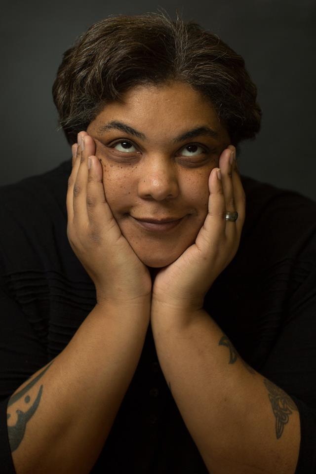 Roxane Gay (Photo by Jay Grabiec)
Sometimes the look is irreverent.
 Philip Roth
Sometimes the look is austere. (Roth is balancing on a backwards chair here, which could be its own category.)
 Haruki Murakami (Photo by Elena Seibert)
Sometimes it looks awkward.
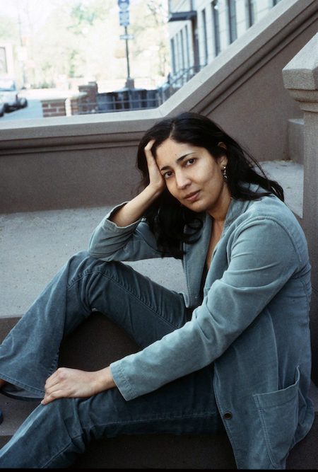 Kiran Desai (Photo by Jerry Bauer)
Sometimes it looks cool.
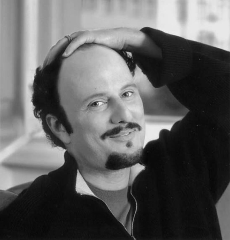 Jeffrey Eugenides (Photo by Karen Yamauchi)
Sometimes it is this photograph of Jeffrey Eugenides.
*
2. Self-Hugging
Self-hugging is usually known as “crossed arms,” but we know what it’s really all about. I mean, it’s hard out there for authors, and sometimes they need a little bit of comfort, even if the only person comforting them . . . is . . . themselves. The hug can be loose or tight, the face happy or terrified. While we’re here, I’ll direct you to this very outdated but perfect and unforgettable piece of journalism, which regards the 2014 World Cup. If anyone can recreate it for me with authors, that would be great.
 Ursula K. Le Guin (Photo by Marian Wood Kolisch)
Ursula K. Le Guin nails that “I’m just sitting here casually on my front porch being the best writer of speculative fiction who has ever lived” self-hug.
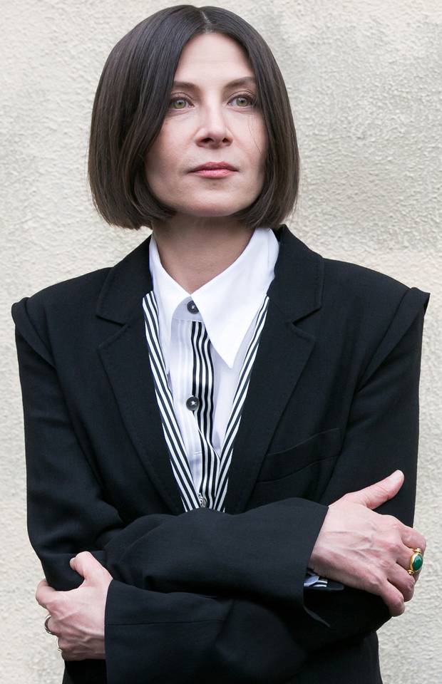 Donna Tartt (2013)
Current Donna Tartt self-hugs . . .
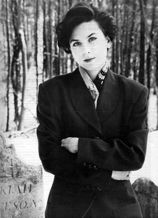 Donna Tartt (1992)
. . . but as you can see, Donna Tartt has been self-hugging for some time. Maybe we should all follow suit.
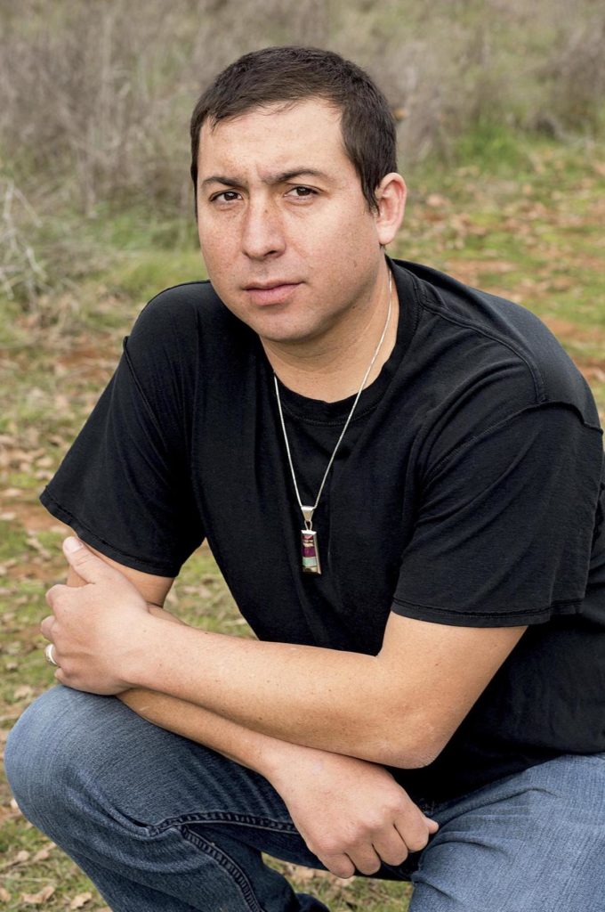 Tommy Orange (Photo by Elena Seibert)
Tommy Orange’s loose pose is sort of between a self-hug and a bend and clasp (see below).
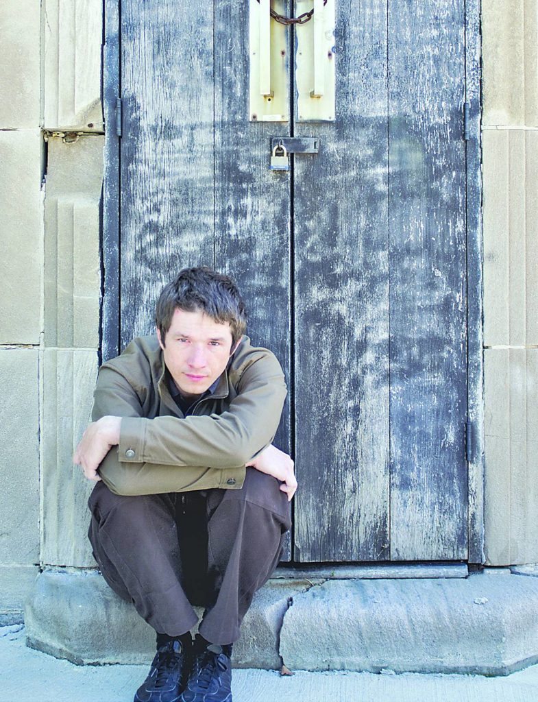 Jesse Ball (Photo by Joe Lieske)
Someone please go pick up Jesse Ball. School let out like an hour ago!
*
3. The Bend & Clasp
This is a very professional and reasonable pose for mostly professional and reasonable authors (and Barry Hannah). The author sits somewhere, on a step or a chair, leans over, puts their elbows on their knees, and loosely clasps their hands in front. It sounds more complicated than it is.
 Claire Messud (Photo by Lisa Cohen)
The bracelets draw attention to the clasp.
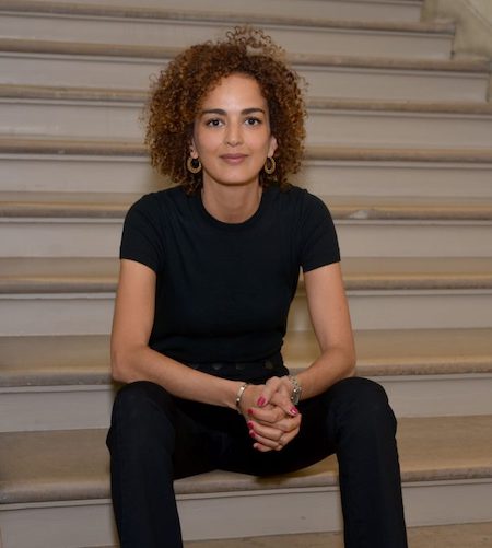 Leila Slimani (Photo by Catherine Hélie for Gallimard)
Stairs have the perfect angles for this kind of shot.
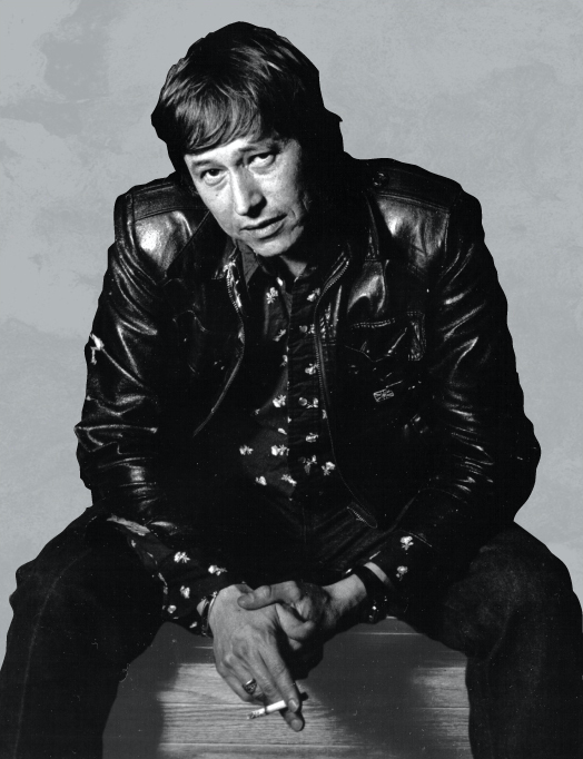 Barry Hannah (from the front of Long, Last, Happy)
That said, Hannah appears to be sitting on either nothing or a huge stack of manuscripts, and it still works.
*
4. Accompanied by Animals
The appeal of this one is obvious.
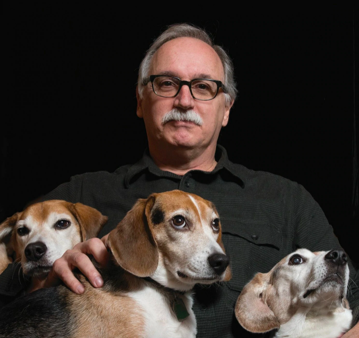 Jim Shepard (Photo by Barry Goldstein)
I mean, Jim Shepard knows how good his author photo is.
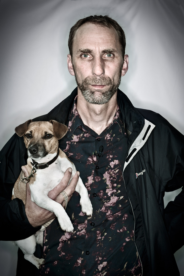 Will Self (Photo by Chris Close)
Will Self also appears fairly confident.
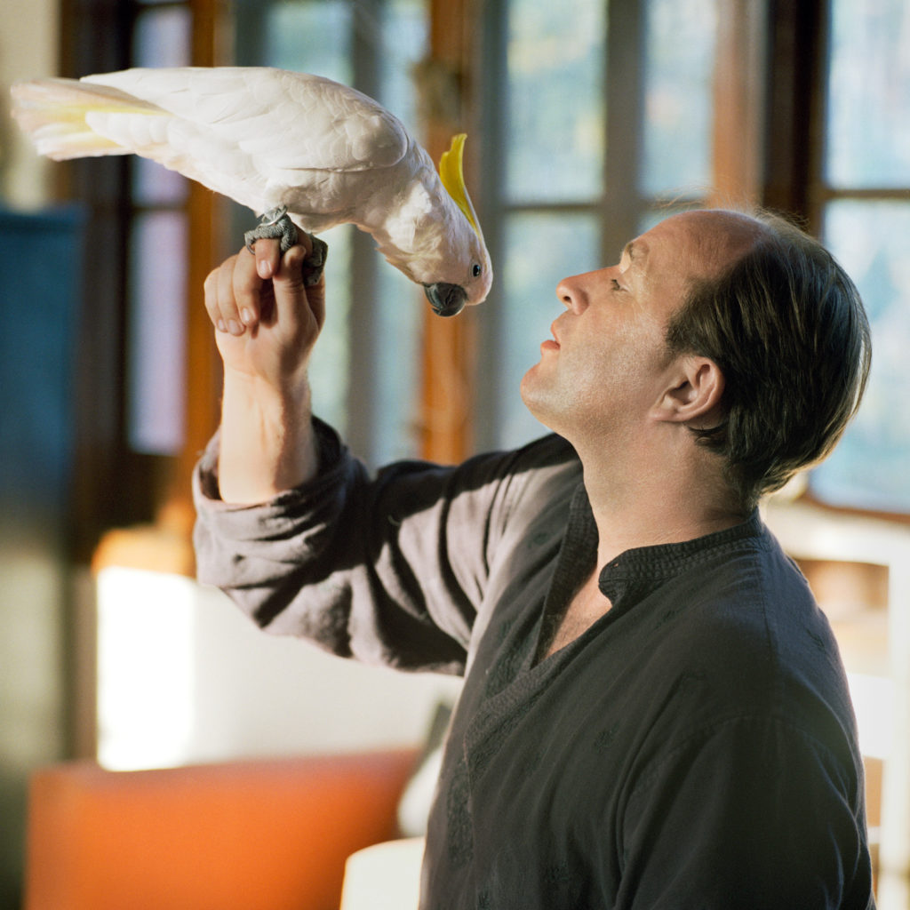 William Dalyrumple (Photo by Nina Subin)
A less conventional choice, but a memorable one.
*
5. Looking Mysteriously Away
By far the most popular. It suggests inspiration, or preoccupation, or drama, or at the very least being way too full of interesting writerly thoughts to possibly look at the camera. I will present a random sampling without comment:
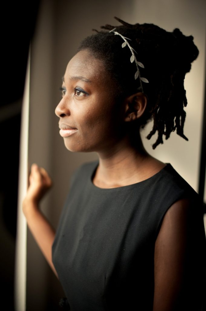 Helen Oyeyemi (Photo by Saneesh Sukumaran)
 Cormac McCarthy (Photo by Derek Shapton)
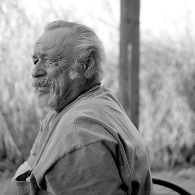 Jim Harrison (Photo by Wyatt McSpadden)
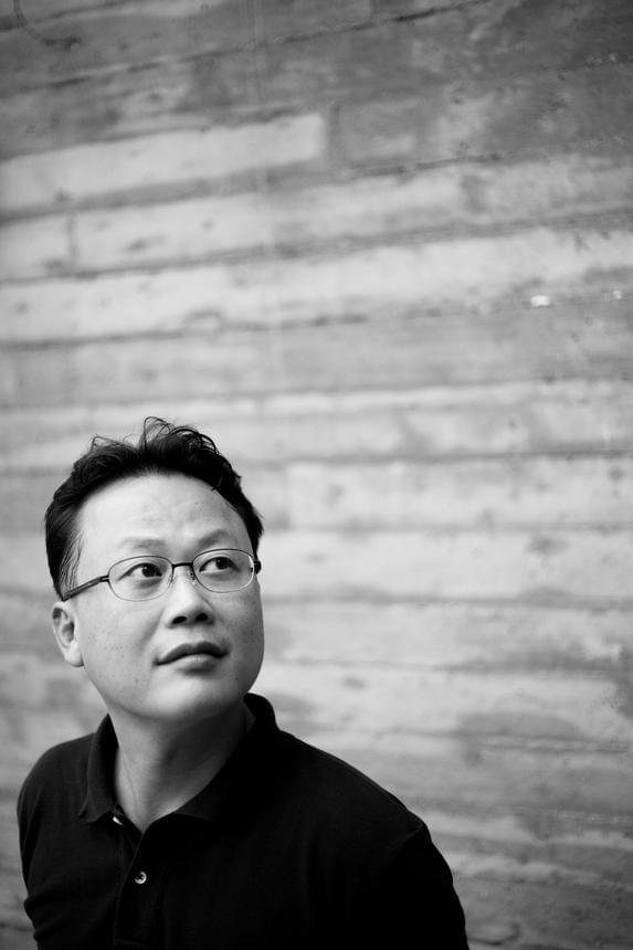 Un-Su Kim (Photo by Dahuim Pak)
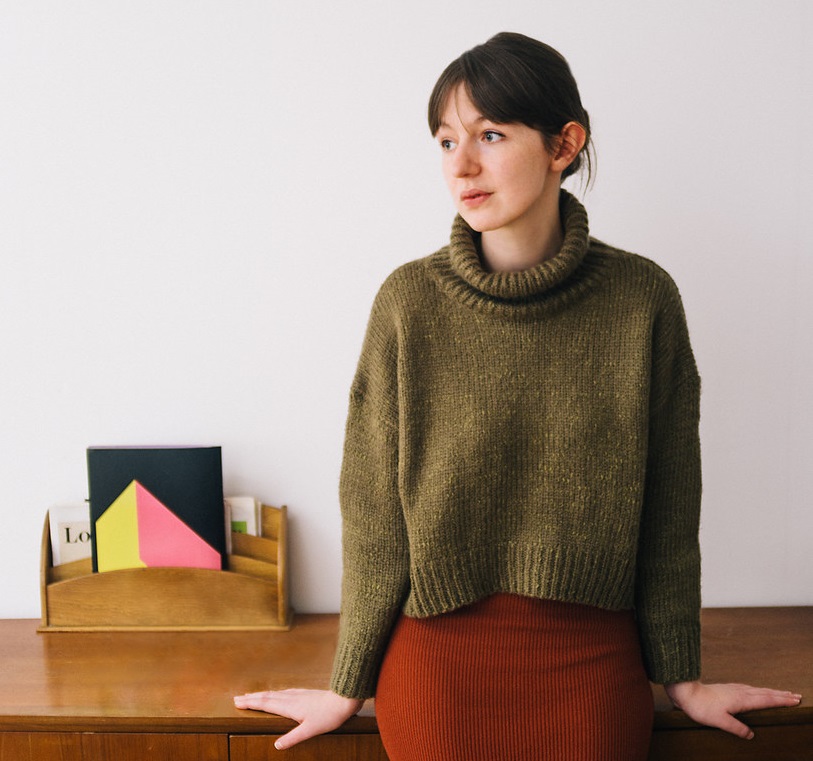 Sally Rooney (Photo by Jonny L. Davies)
 Tayari Jones (Photo by Nina Subin)
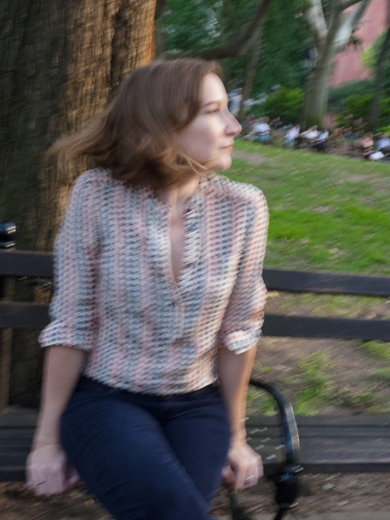 Sheila Heti (Photo by Sylvia Plachy)
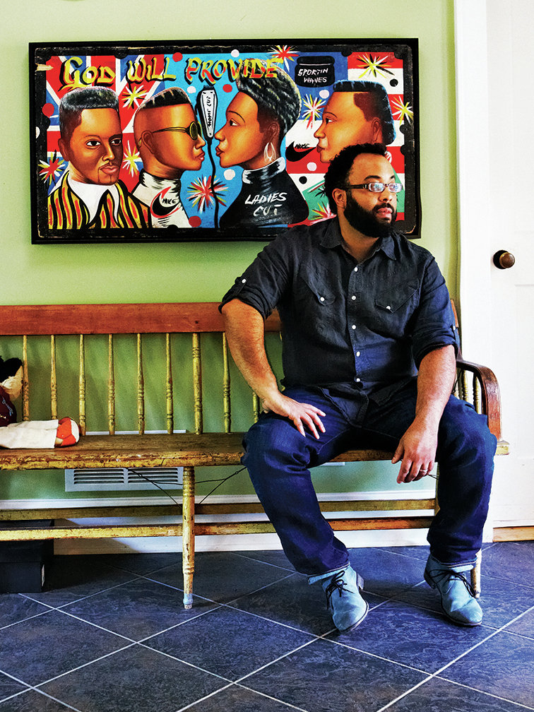 Kevin Young (Photo by Melanie Dunea/CPi)
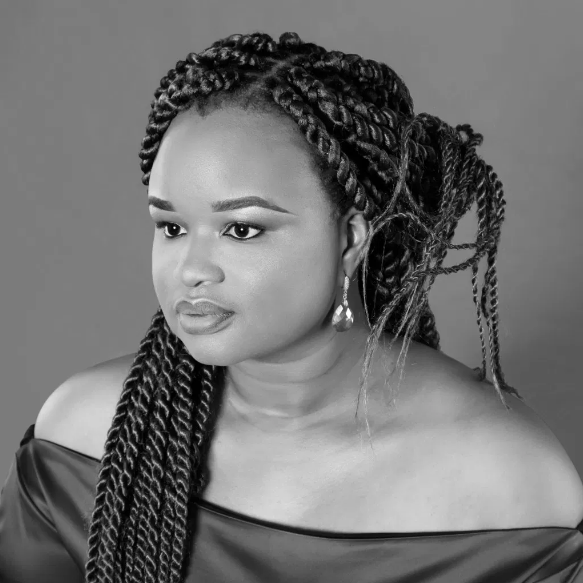 Oyinkan Braithwaite (Photo by Studio 24)
*
6. Confrontational
In which the author stares down the camera like it’s done something to them.
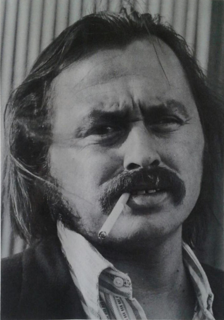 Jim Harrison (Photo by Jill Krementz) (from the back of A Good Day to Die, 1973)
It really seems as though the photographer has done something to Jim Harrison.
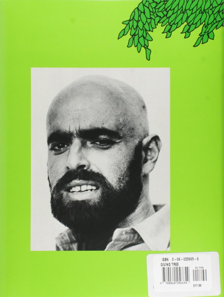 Shel Silverstein on the back of The Giving Tree
A famously frightening author photo—especially for the back of what is ostensibly a children’s book.
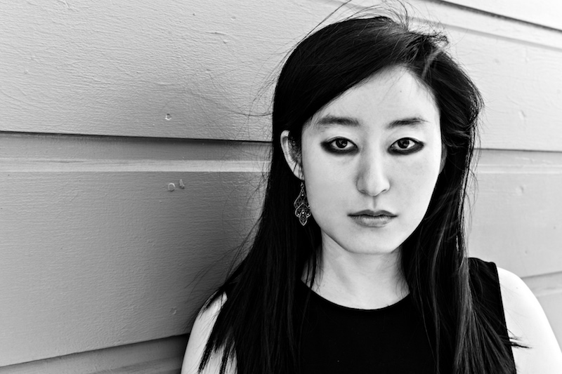 R. O. Kwon (Photo by Smeeta Mahanti)
Here’s a more modern example, in which Kwon looks straight at the camera, but the effect is not angry or terrifying but confident and powerful.
*
7. Full Length and Living Life
It’s relatively unusual to se a full-length author photo, but when they’re done well, they can be glorious.
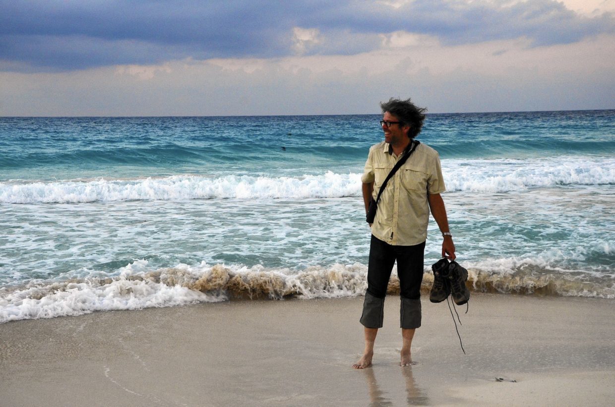 Jonathan Franzen
Great sock tan.
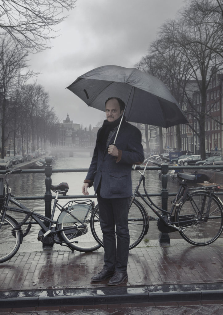 Jeffrey Eugenides (Photo by Marte Visser)
Eugenides again, this time in the rain, with an umbrella, and a bridge, and some bicycles. Is that Paris? It might as well be Paris. [Ed. note: Amsterdam or London?]
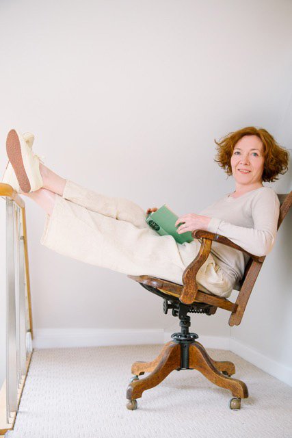 Diane Setterfield (Photo by Susie Barker)
I definitely want to be friends with her.
*
8. Passport Photo
Head-on, mild expression, neutral background. The everyman of the author photo—inoffensive, gets the job done, but not particularly memorable.
 David Mitchell (Photo by Paul Stuart)
A very handsome, totally normal photograph of David Mitchell, whose books are the opposite of normal.
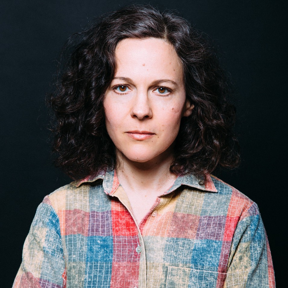 Sandra Newman (Photo by George Baier)
Ditto Sandra Newman—maybe this is really a trend for photographs of authors whose books have exciting creative formal elements?
*
9. Just Oozing Luxurious Mystery
This would be the polar opposite of the Passport Photo style. Warning: should only be attempted by the coolest of writers.
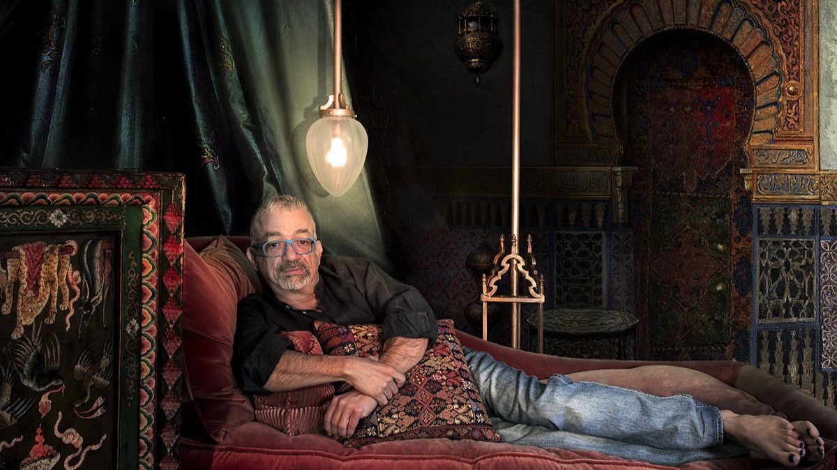 Rabih Alameddine (Photo by Oliver Wasow)
This photo, from the jacket of The Angel of History, is unbeatable. The opulence! The eyewear! The nail polish. Chef’s. Kiss. Emoji.
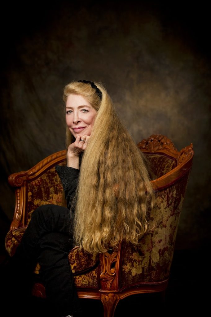 Lucie Brock-Broido (Photo by Karen Meyers)
Almost any photograph of Lucie Brock-Broido has a magical quality on account of her unbeatable fairy princess hair, but the chair in this one is really giving her locks their due (and appropriate era).
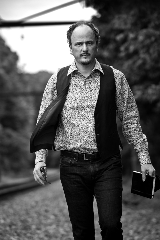 Jeffrey Eugenides
Ah, the infamous vest, most luxurious of all literary clothing items (sorry to Colum McCann’s skinny scarves). We all knew we’d end up here. Honestly, I could have used a photograph of Jeffrey Eugenides for almost every category. There are many, and they really run the gamut, and yet somehow they’re all memorable. To his publicity team: congrats.
Emily Temple
Emily Temple is the managing editor at Lit Hub. Her first novel, The Lightness, was published by William Morrow/HarperCollins in June 2020. You can buy it here.
