33 Joan Didion Book Covers, Ranked
The List You Never Knew You Always Needed
It’s no secret that the editorial staff of Literary Hub has a major soft spot for Joan Didion. So in honor of the new documentary about the high priestess of American letters, I took a look at her history of book covers. I was surprised to realize that Joan Didion has very few fantastic book covers. I really don’t understand it. They’re rarely horrible, and some are iconic (mostly because of what’s inside) but they’re usually quite boring: just plain-text covers, or sometimes strange collages, or sometimes (often better) old photos of Didion herself. So with that in mind, here are a few of her best—and a few of her worst. NB that I haven’t ranked all of her covers—there are many varieties on many a theme—but instead chose notable and representative versions. And necessarily, these are the aesthetic preferences of one woman—and I found some of them quite difficult to compare, spread as they are over so many decades and styles—so feel free to argue for your own favorites below.
 Penguin Books, 1986
33.
This one is. . . not great!
 A Book of Common Prayer, Italian edition, Edizioni e/o, 2013
32.
The colors are nice.
 Simon & Schuster, 1984
31.
If only it were millennial pink.
 Penguin, 1979
30.
This looks like it should be a cover of a J.G. Ballard novel, but I still find it interesting because it’s so unlike the rest of her covers.
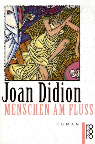
 Delta, 1968
29.
Somewhat radioactive-looking, if you ask me. But the movement on the cover makes me interested in finding out what’s inside (or would, I suppose, if I didn’t already know.)
 Vintage, 1993
28.
This looks like an amazing thriller.
 FSG, 1968
27.”Someone discovered the Type on a Path tool. Also fonts. And yet, somehow it still looks cool. . .
 Simon & Schuster, 1977
26.
Now this one is radioactive in a much better way.
 Knopf, 2003
25.
This first edition cover of Where I Was From is objectively lovely and mysterious, but it feels so unlike Didion to me that I simply cannot put it any higher.
 Knopf, 1996
24.
The concept here—and the little filing joke folded into it—is great, which makes up for the overall visual blandness (or maybe just 1990s-ness) of the cover.
 Run River, German edition, Rowohlt, 1995
23.
Dated but fun.
 The Year of Magical Thinking, Italian edition, Saggiatore, 2006
22.
In some ways, this is a throwaway design—flat font choice, stock image of a flower—but the overall effect is simple and appealing.
 FSG, 2008
21.
I’ve never really liked this cover, despite its current ubiquitousness. It doesn’t evoke the essays inside to me particularly well. On the other hand, the fact that it’s mostly just a picture of Didion’s face in big sunglasses is pretty great.
 Play It As It Lays, Italian edition, Saggiatore, 2014
20.
I want to hate this cover, but I relate so much to its subject, sitting impatiently in the middle of the desert with her great shoes and her bad swing and her wrapped baby shower gift, that I simply cannot.
 Pocket Books
19.
I’m actually pretty fond of this book cover—I love to see literary works given the mass market paperback treatment, especially when the covers seem explicitly meant to trick lovers of lowbrow crime novels into picking them up (that font!). Plus, the hummingbird in the compact is a pretty memorable image. Extra points for camp!
 A Book of Common Prayer, Italian edition, Bompiani, 1979
18.
There’s something so appealing about this pink sea; and it looks simply mysterious until you stare at it for a while and see the woman’s face begin to emerge.
 A Book of Common Prayer, Estonian edition, Perioodika, 1982
17.
Gotta love this picture of Joan.
 Vintage Books, 2004
16.
This one too.
 Penguin, 1974
15.
It makes no sense, but I love it. (Hippies, I guess!)
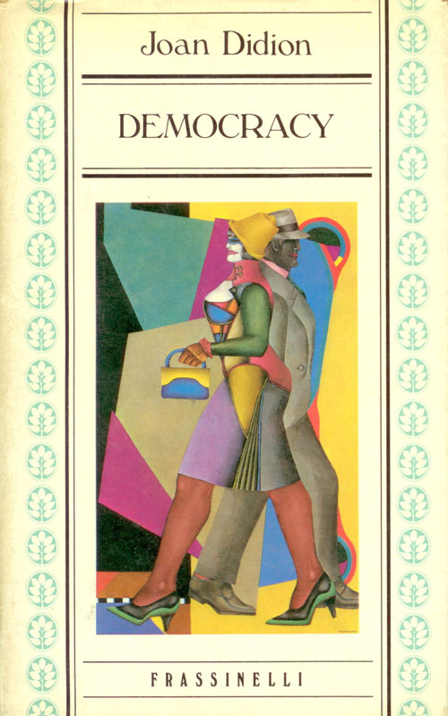 Democracy, Italian edition, Frassinelli, 1984
14.
I’ve actually never read Democracy, so I can’t say if this bizarre illustration is appropriate, but I find it endlessly fascinating. I love the weird color-blocking and the way it’s daintied-up with the mint-colored leaves and delicate font choice.
 Penguin Books
13.
Surprise: this is Lit Hub’s official favorite picture of Joan. That’s why I put it at lucky number 13.
 Play It As It Lays, Italian edition, Bompiani, 1978
12.
I find this cover very attractive, in that surrealist 70s way—surrealist, that is, until you notice the fact that it’s a snake down there.
 After Henry, German edition, Ullstein, 2016
11.
This German cover looks really modern and clean to me—and I’ve never seen that photograph of Didion before, which gives it extra points.
 FSG, 2009
10.
You can never go wrong with iconic badass Joan in her car.
 FSG, 2005
9.
Writer Nicholas Rombes once described this cover as having “that sort of sad, post 9/11, Sofia Coppola feel,” which it totally does. It also borders on falling into the hateful faceless/headless woman book cover trope, but I like it a lot better after looking at the original photograph by Julia Fullerton-Batten.
 Andre Deutsch, 1969
8.
The perfect edition to take along with you on Ken Kesey’s bus, or on any bus, if you want to jazz it up a little. I’m a sucker for late-60s, early-70s design, so sorry but this one is high on my list.
 Vintage, 2011
7.
I like this cover better than the straight-text treatment against the light blue—Vintage has chosen the perfect shade of blue here, and the perfect photograph of Joan and Quintana Roo.
 The Year of Magical Thinking, Chinese edition, New Star Press, 2017
6.
This edition looks like nothing else in this series, but it’s simple and beautiful. I think the hot air balloon is a bit cute for the book at hand, but the upside-down boat seems correct to me.
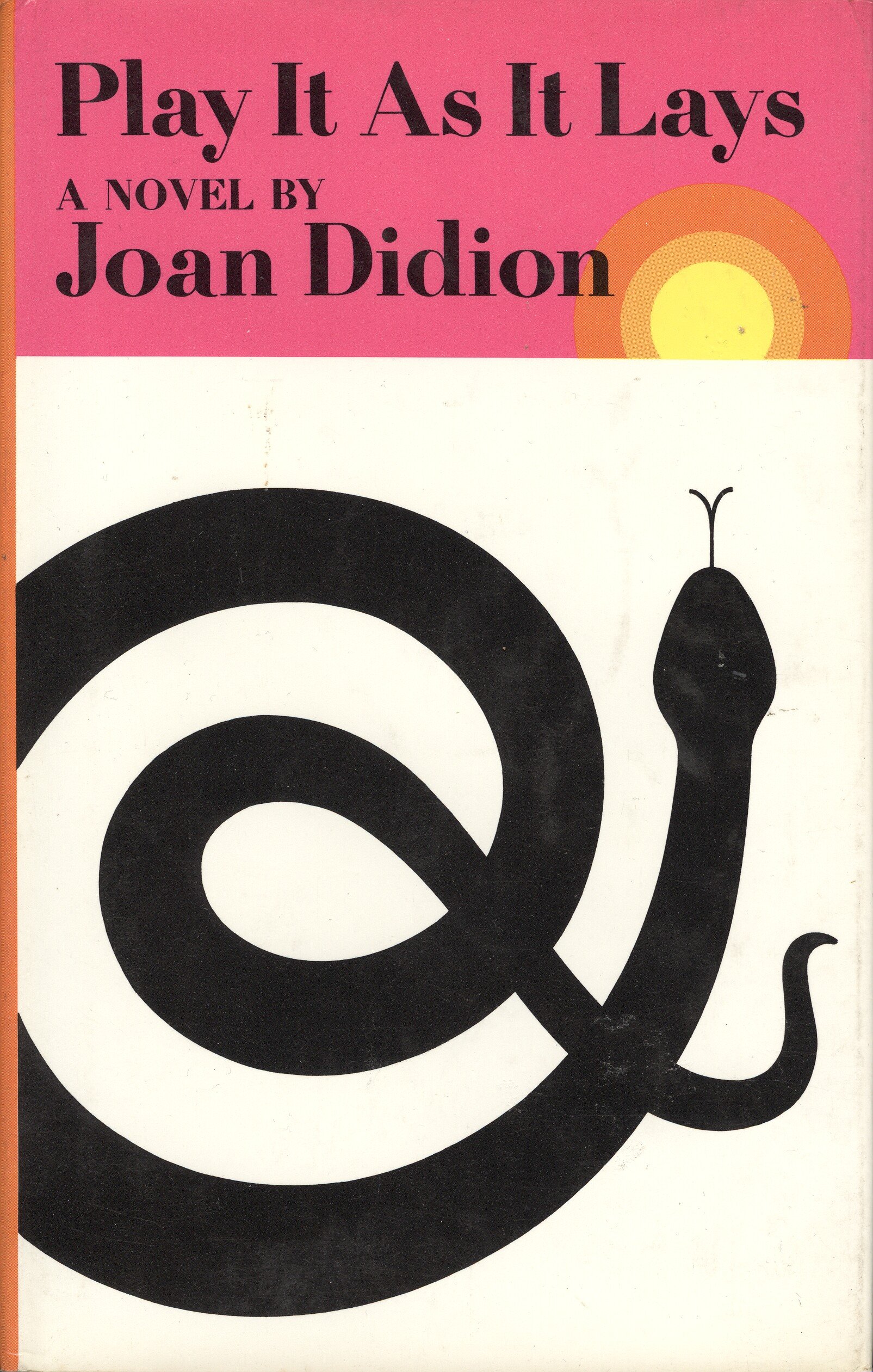 FSG, 1970
5.
Quintana Roo reportedly called Play It As It Lays “Mommy’s snake book,” which it certainly is—rattlesnakes are a central motif. The iconic design for its first edition, created by Janet Halverson, is almost hypnotic, and very LA—that coiled rattler, stretching its tongue towards the rising sun.
 Penguin Books, 1973
4.
I cannot help but love this cover. It’s meta. It’s cheeky. It’s relevant for the 70s and for today. Is it really a book about “the truth about women as objects?” Who can say. But the cover is fantastic.
 Picador, 2017
3.
I love this new Picador Modern classics edition of Didion’s most iconic work. It’s not a particularly good likeness of the writer, but something about it is still deeply pleasing—maybe simply because so few of her book covers are actually illustrated.
 Simon & Schuster, 1979
2.
The fact that this cover is so iconic is no doubt swaying my vote here, but there’s something so pleasing about this text treatment. The depth of the colors! The swapped titles! The fact that I (and you) now know the dirty-sounding term for the dot over lowercase letter “i”s!
 Knopf, 2005
1.
This cover design by Iris Weinstein, with that deftly-inserted “John,” is a perfect treatment for the memoir at hand, which covers the year after the death of Didion’s husband, John Gregory Dunne. Much of its power comes from its subtlety; that is, you don’t even notice the lettering until you’ve looked at it in loving admiration for a little while (or until someone tells you, I suppose).
Emily Temple
Emily Temple is the managing editor at Lit Hub. Her first novel, The Lightness, was published by William Morrow/HarperCollins in June 2020. You can buy it here.