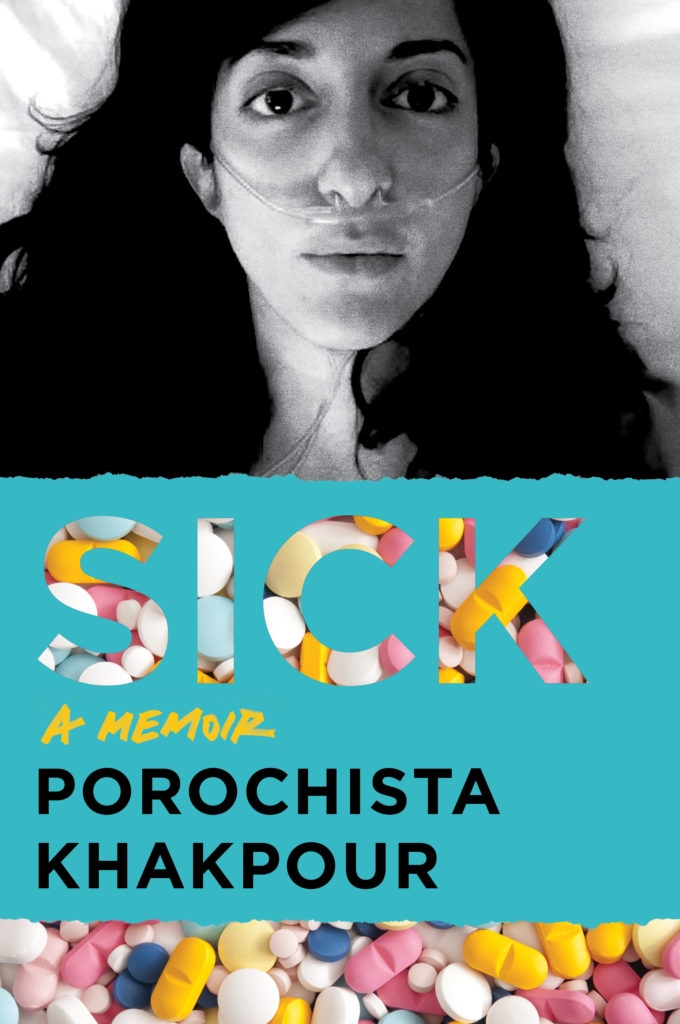
See It Here First: The Cover for Porochista Khakpour's New Memoir
A Behind-the-Scenes Look at Sick
Forthcoming from Harper Perennial in June 2018, Sick is a memoir of chronic illness, misdiagnosis, addiction, and the myth of full recovery that details author Porochista Khakpour‘s struggles with late-stage Lyme disease.
*

*
Porochista Khakpour on her new cover:
Covers have always been very important to me. On some level a book is an art object and I love buying beautiful books in hardcover just like I’d by art. With both my first and second books we went back and forth a lot on the covers—there was a lot of input from me. On my second novel, for the hardcover, I even got my friend the renowned Iranian artist Ali Banisadr to give us a detail from a mural for the cover. But for this third book of mine, Sick: A Memoir, we had a real dilemma on my hands.
This book would definitely be unlike other books I have written or would write. Do you do some play on Lyme? (At one point a lime green cover was an option to which I yelped, please no!) Hospital paraphernalia? Meds? Doctors? The one thing the team at HarperPerennial seemed to have decided early on was that it would feature a photo of me. I was mixed for a moment about this—it’s a lot to imagine your face at book stores and all over the internet for ages to come, but especially your face associated with a word like “sick!” Then it seemed to make sense to me, when I remembered how many selfies—before they were called “selfies!”—I had taken during my sickest years. There was often not much more to do. And if you are lying in your bed at home or lying in a hospital bed, you don’t really have access to mirrors. But you have your phone and photos on them would serve as mirrors, and also ways to track my condition—was I losing weight? Was I getting paler? Was health slipping away more?
At one point, I handed over dozens of these images I had taken of myself and there was a collage-like cover featuring them all. There was one photo in particular—the cover photo now—that seemed to say the most and it was clear it would be the one. We toyed with many serious treatments of it, but then I kept feeling like the “addiction” part of my memoir was missing, not to mention a sort of playful side. It’s an “illness & addiction memoir” to me—before I was properly diagnosed with Lyme I was told I had mental illness only and became hooked on benzodiazepines over the years as a result—so that part needed representation to me too. At some point, I ran into some stock photo of pills that looked like candy to me and I felt if there was some way to bring this to the cover, it would all be complete. After all, much of my book is about the journey before I got my Lyme diagnosis, all the years of hell where I did not know what was wrong with me. Well, when the designer took these two elements and made them one, I was immediately in love! I knew we had our cover. I consulted with my nearest and dearest dozen friends or so and most seemed to love this too. The sales team was in as well and so now we have it! I am so relieved I have yet another book cover I love.
Editor Sarah Murphy:
We went through many iterations of cover designs for SICK, even starting over from scratch a few times. Sometimes finding the right cover is a slower process, and the design needs to develop as the book is developing. Overall, we felt it was important that this cover convey the weight of illness and addiction without either being too bleak or glamorizing things too much. We initially had a long subtitle in place for the book, and the covers designed with that subtitle were quite different from the final – they let the text speak for itself in many ways. But the design process shifted as the scope of the book shifted, and as we landed on simply “A Memoir” for the subtitle. With that development, we needed to the art and the design to do more of the talking. Porochista had a trove of photos for us to consider from the worst periods of her illness, and we felt a black and white shot of her on the cover would make it personal, weighty, and a bit haunting. To balance that, the piles of pills in bright candy colors convey the scope of her health problems, and how consumed she was by them, but in an eye-catching way. The pills plus the blue color block for the text make the cover pop and give it a bold, edgy feeling. The final design is striking and hip, but also has a timeless feel to it, and it really comes together to visually represent all that’s at stake in this book.
Jacket designer and Senior Art Director at HarperCollins, Milan Bozic:
It was a personal experience with Lyme that drew me so strongly to SICK and helped inform the design process. Lyme feels like wading through a waist-high pile of pills and IV bags and mystery and helpless rage… In my case it was the 13th doctor, a neurologist, who figured out why my lower back was leading to my face being paralyzed (the disease reached my brain and was wreaking mystery havoc all over my nervous system). Then the seemingly endless rounds of pills and IV bags kicked in. I spent almost a month in bed—much of it staring at the ceiling and helplessly waiting—the way Porochista is here. We had to use this photo. Her eyes are begging for normalcy.


