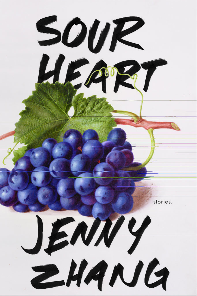
On Creating a New Imprint's First Ever Cover: Jenny Zhang's Sour Heart
Secrets of the Book Designer: Rachel Ake Starts Things Off for Lenny
The day I found out that Random House was launching an imprint with Lena Dunham and Jenni Konner, I had one immediate thought: “I need to design for them.” This certainty didn’t leave me until I had an approved cover eight months later. At the beginning, there was no book to design for, just a vague idea of what the imprint would be. It didn’t matter. I had already decided that I would find a way to work on Lenny’s debut book, no matter what.
Months later, when they announced that the new imprint would be kicking things off with Jenny Zhang’s Sour Heart, I bounced out of my chair with excitement. Zhang had been described as young, fresh, and vibrant. And the book? A collection of short stories—my favorite design challenge.
I call it a challenge because when working on story collections, there are typically around ten separate, fully formed ideas to grapple with and synthesize down to one single visual that (hopefully) represents them all equally. It requires a peculiar way of analyzing the writing to find the stories’ connecting thread and communicate it visually, but it’s a process I find deeply satisfying.
When Sour Heart came up at a cover concept meeting I was again bouncing out of my chair. (I’m pretty sure everyone in the meeting could see my excitement and anxiety in that moment and was quite entertained.) As we discussed the book, it was clear that no one was exactly sure where the cover should go. People that I had worked with many times before had new roles for the Lenny imprint and each was enthusiastically open-minded. With no preconceived notions, they were ready to experiment to find the visual direction that felt right for this imprint. This is unusual for a cover concept meeting, making my excitement grow to a fever pitch at the thought of the unpaved road ahead.
However, when we published Lena Dunham’s memoir in 2014, Lena had a designer friend create her cover instead of using someone in-house. We all wondered if she had the same idea for the books in her imprint. Our creative director broached the subject to spare me from disappointment later. “Does Lena already have someone in mind for this cover?” The editor didn’t know and wondered if he should ask her. This was when I blurted out, “No, I would like to give it a try, please!” The editor smiled and passed me all of the materials.
The manuscript was amazing. I was immediately struck by Jenny’s unique, smart voice. The stories were blunt and visceral as they confronted you with insights on being the daughter of immigrants in 90’s New York City—an unfamiliar perspective for me that I found exhilarating to read.
The only thing that actually was made clear about the Lenny imprint was that Lena and Jenni Konner wanted it to feel like an extension of their online newsletter, Lenny Letter. A sister to it. A deeper dive into the writers they love than is possible on a website. I ended up spending days on Lenny Letter, trying to fully feel out Lena and Jenni’s style and visual taste. Designing for an imprint that is new to the physical book world but that already has a strong brand online proved quite interesting. This is truly uncharacteristic for book publishing. But when you look around and see the number of books derived from podcasts, YouTube stars, and even memes, I wonder if this will become a more common approach for book cover designers to consider.
Jenny’s writing gave me the strong impression that she would have a fully-formed aesthetic of her own. So I pretty much all-out stalked the author’s online presence. At first glance, her Instagram confirmed my suspicion. Jenny obviously knows what she likes. This only added to the immense pressure I was already feeling. Three strong, young, talented women to please, and one is a major celebrity known for speaking her mind. Unsurprisingly, I was paralyzed by fear of the blank page for several days.
As I read for a design, I take notes and make lists. Lots of lists. Lists of objects, lists of questions, lists of repeating adjectives, even lists of fonts. Lists are my version of sketching because I draw too slowly to keep up with my thoughts. I kept staring back and forth between the white rectangle on my screen and my lists. But the list that finally got all the juices flowing and ended up taking me to the finish was: “Sour = gummy, apple, girl, grape, fruit, candy, honeybee, plum, peach, cherry, strawberry, blueberry, nectarine, soup, tears.” It was a list of all the sour names throughout the collection.
It worked. The first round of covers was received smashingly by all parties involved. An unheard-of book cover miracle.
The only problem was that—in-house, at least—no one knew what direction to go in next. It was the most indecisive meeting I have ever been in. The editors and the publisher sat with the covers for a few days. They showed them to sales. They showed them to Lena and Jenni. Finally, they decided to show all of them to the author—without narrowing it down at all. As expected, Jenny came through and knew exactly what she was drawn to (the Mao treatment; more muted colors; focusing on just one of the sour names). I can count on one hand the number of times I’ve been this lucky in the last three years: I just about got the final in the second round.
From here my only task was, “make it rougher with handwriting,” and with my favorite fat marker I got the cover approved.
Contending with all these colleagues working in new, unfamiliar roles was an extremely exciting (albeit scary) way to work. We were all a little lost at the beginning, but together we found the first face for Lenny.

Rachel Ake
Rachel Ake is a designer at Random House. She has also worked with St. Martin’s Press, Simon & Schuster, W.W. Norton, and Fortune Magazine. Her work has been recognized by the Type Director’s Club, the Art Director’s Club, and the Graphis New Talent Annual. She attended the School of Visual Arts.


