Who Wore It Best? US Book Covers vs. UK Book Covers for 2018
Shots Fired on Both Sides of the Pond
Over any given year, those of us in the literary media see hundreds of books pass by. Some of their covers are great, some mediocre, some simply odd, but the ones we remember from the pack tend to be either the most unusual or the most repeated. So one of my favorite exercises after a year of covering and reading about books is to shake up my memory and see how the covers I’m familiar with looked in other countries. Since big books are often published concurrently (or at least closely together) in the US and the UK, I thought I would compare some of my favorites here, and even dare to choose which one I like better.
On that note, please bear in mind that I am an American writer and reader, and therefore US book covers are made for people like me—but also bear in mind that I may have gotten bored with the American covers, and the UK ones have that sparkly new quality that makes me like them better. Or just imagine my picks are pure and unskewed, and feel free to argue with them in the comments!
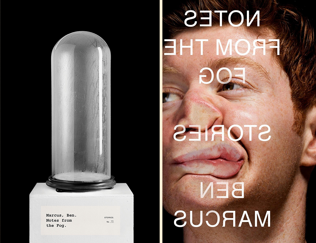 Ben Marcus, Notes from the Fog: US cover design by Peter Mendelsund (Knopf); UK cover design by Jamie Keenan (Granta)
Winner: These covers are so different in tone that it’s really hard to choose. I love the audacity of the UK cover, especially with the backward text, which is something I could easily see an over-cautious publicity department nixing. But as far as which one has the potential to make me cross the room to pick it up? I suppose that would have to be the US cover—though I’m a devoted Mendelsund fan, so take it with a grain of salt.
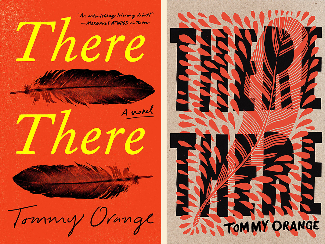 Tommy Orange, There There: US cover design by Tyler Comrie (Knopf); UK cover design by Suzanne Dean and Bryn Perrott (Harvill Secker)
Winner: Again, these are both great, and the Literary Hub office is split: some find the US cover too commercial, but think the UK cover looks like a piece of art—and some thought exactly the opposite. Personally, I don’t think either is too commercial, but the US one feels simpler and more iconic to me, so US it is. [Ed. note: BOOOOOO.]
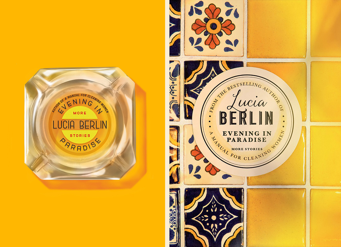 Lucia Berlin, Evening in Paradise: US cover design by Na Kim (FSG); UK cover design by Justine Anweiler (Picador UK)
Winner: Ditto above. The office was split—lots found the UK cover more interesting, complex and compelling, but I always go in for simplicity, and the purity of that juicy yellow on the US cover… Can’t beat it.
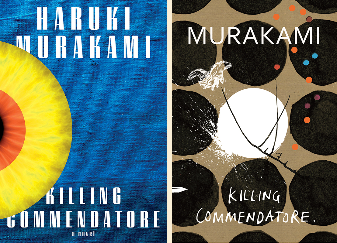 Haruki Murakami, Killing Commendatore: US cover design by Chip Kidd (Knopf); UK cover design by Suzanne Dean (Harvill Secker)
Winner: No contest: though I do love the texture in Kidd’s design, the UK cover is much more evocative and appealing—especially because, though you can’t tell here, those little dots are cut outs from the dust jacket, revealing the colorful cardboard beneath.
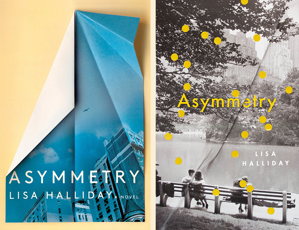 Lisa Halliday, Asymmetry: US book cover design by David Litman (Simon & Schuster); UK cover design (Granta)
Winner: The US version. Both covers play with folded paper—and the detail of the fold on the UK version is very deftly placed—but the US cover takes a much bolder stance, appropriate for the bold form of this novel, and the colors are pretty great too.
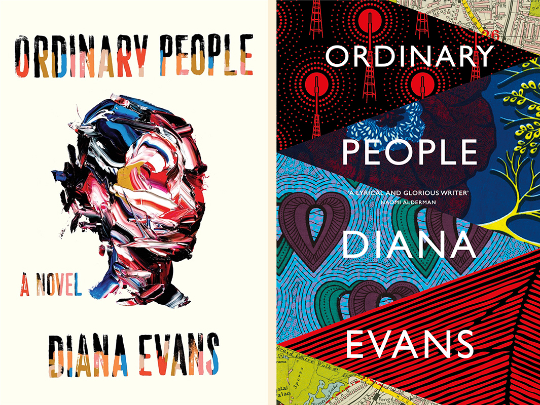 Diana Evans, Ordinary People: US cover design by Na Kim, art by Salmon Kushroo (Liveright); UK cover design by Suzanne Dean (Chatto & Windus)
Winner: This is an interesting one: I like all the elements of the US cover better—the hand painted lettering, the impressionistic face—but I think the overall impression of the UK cover is more striking. It looks more like a Big Serious Novel, but more importantly, it invites the viewer to pick apart all of its patchwork slices to find meaning.
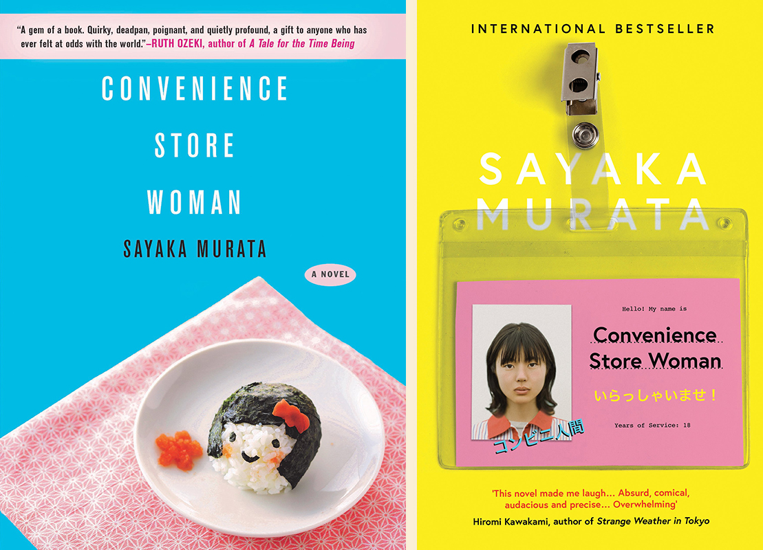 Sayaka Murata, Convenience Store Woman: US cover design by Gretchen Mergenthaler (Grove Press); UK cover design by Luke Bird (Portobello Books)
Winner: This one feels impossible: they’re like two flavors of the same kind of sweet, sitting next to one another on a shelf at the cash register. I want them both; I will buy them both. The US cover has more elegant composition, but the UK cover, to me, evokes the book a bit more directly. Again, the office is split, so I’ll go with the one I’d be more likely to pick up knowing nothing at all about the contents: the UK cover.
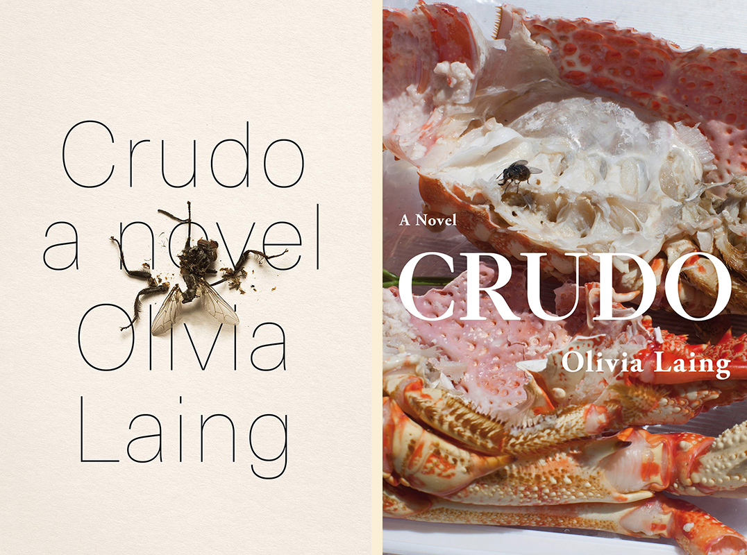 Olivia Laing, Crudo: US cover design (Norton); UK cover design by Justine Anweiler, photograph by Wolfgang Tillmans (Picador UK)
Winner: I love the fact that the fly as a design element spans both of these covers. You could almost tell a story: the US cover is what happens when the fly on the UK cover escapes the scene. But in a vacuum, I have to say that the UK cover is more compelling. That dead fly just makes me want to look away. And wash my hands.
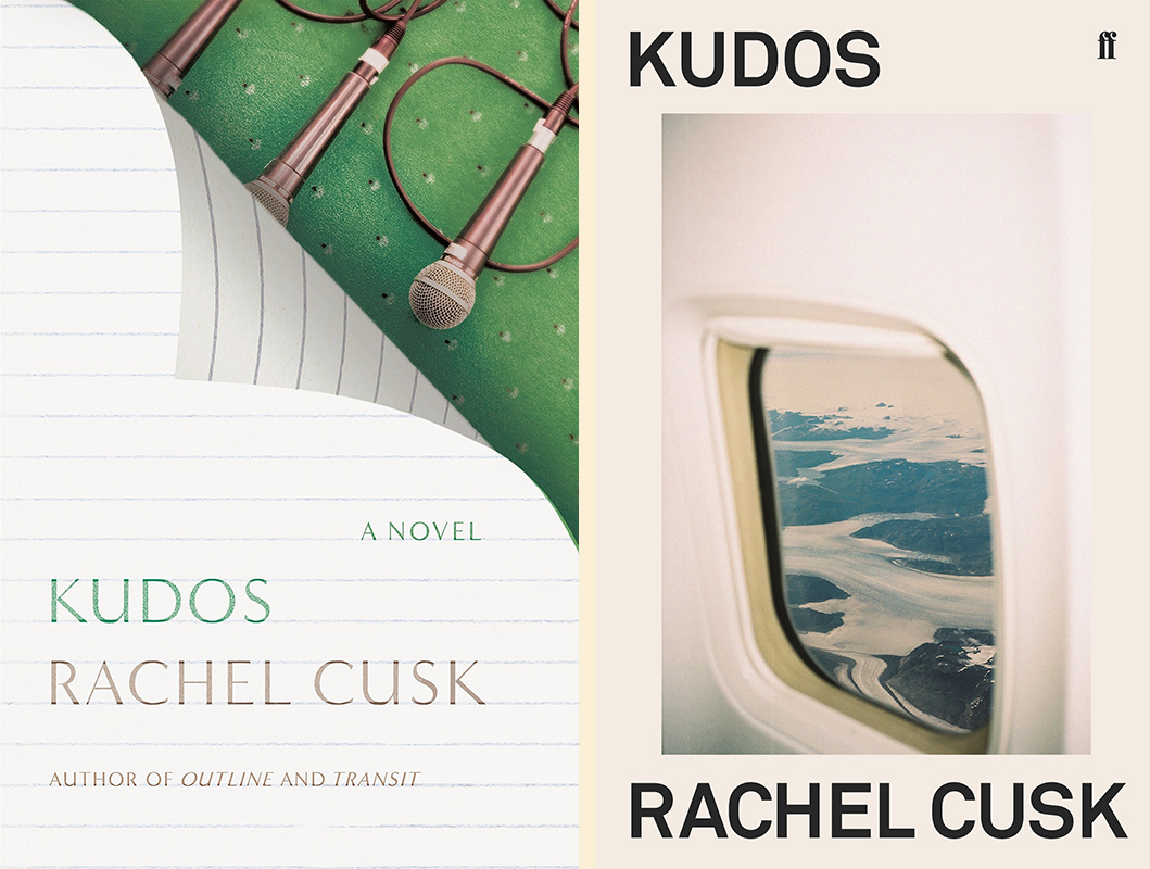 Rachel Cusk, Kudos: US cover design by Strick&Williams (FSG); UK cover design by Rodrigo Corral, photograph by Charlie Engman (Faber & Faber)
Winner: We’re definitely fans of the US cover over here, but, how can I say this—Rodrigo Corral’s UK cover is so good I want to eat it. Honestly the whole series is a knockout, and reflects the texts perfectly.
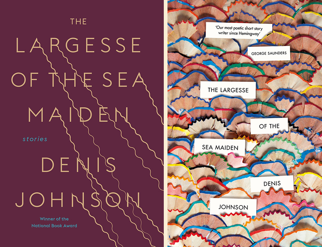 Denis Johnson, The Largesse of the Sea Maiden: US cover design (Random House); UK cover design by Suzanne Dean (Jonathan Cape)
Winner: The US cover. I like the pencil shavings, but they seem too twee and cheery (and too reminiscent of the old Ben Marcus hardcovers) for Johnson’s posthumous collection.
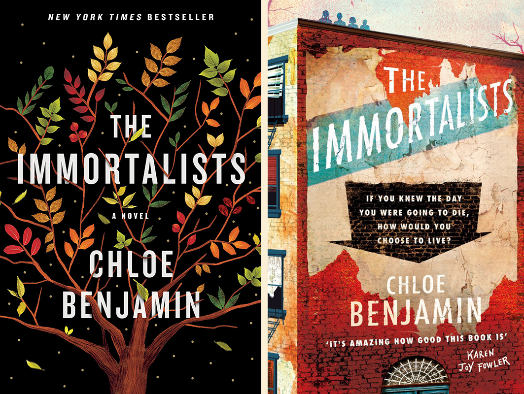 Chloe Benjamin, The Immortalists: US cover design by Sandra Chiu (Putnam); UK cover design by Yeti Lambregts (Tinder)
Winner: Another tough call that divided the office. While the US cover does sparkle, I think I personally like the UK cover best, because of its depth of field, that big downward arrow—and the fact that I can spy the four siblings lurking on the roof.
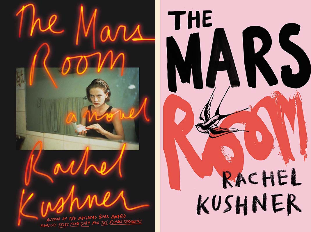 Rachel Kushner, The Mars Room: US cover design by Peter Mendelsund, photograph by Nan Goldin (Scribner); UK cover design (Jonathan Cape)
Winner: Nan Goldin and Peter Mendelsund on the US cover: a combination that simply can’t be beat. The UK cover makes the book look as though there are makeup tips inside.
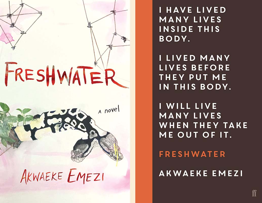 Akwaeke Emezi, Freshwater: US cover artwork by ruby onyinyechi amanze (Grove Press); UK cover design (Faber & Faber)
Winner: I often love an all-text cover, but not in this case—it just doesn’t reflect the magical energy of the book the way the US version does.
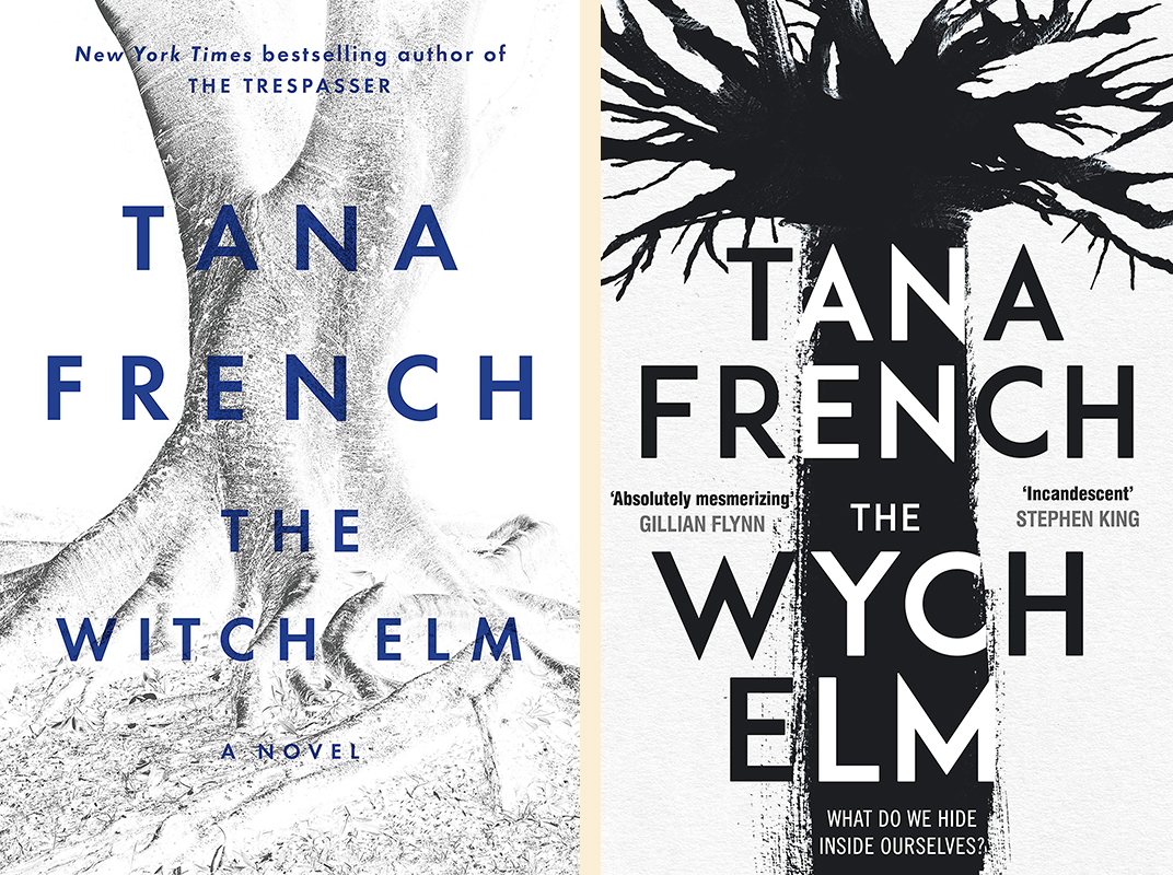 Tana French, The Witch Elm: US cover design by Darren Haggar (Viking); UK cover design (Viking UK)
Winner: This is sort of like asking me to choose between a good hair day and a bad hair day: I think my preference is obvious (the US cover). That said, I do appreciate the proper spelling of “wych.” I see why it was dumbed down for America, but I still don’t like it.
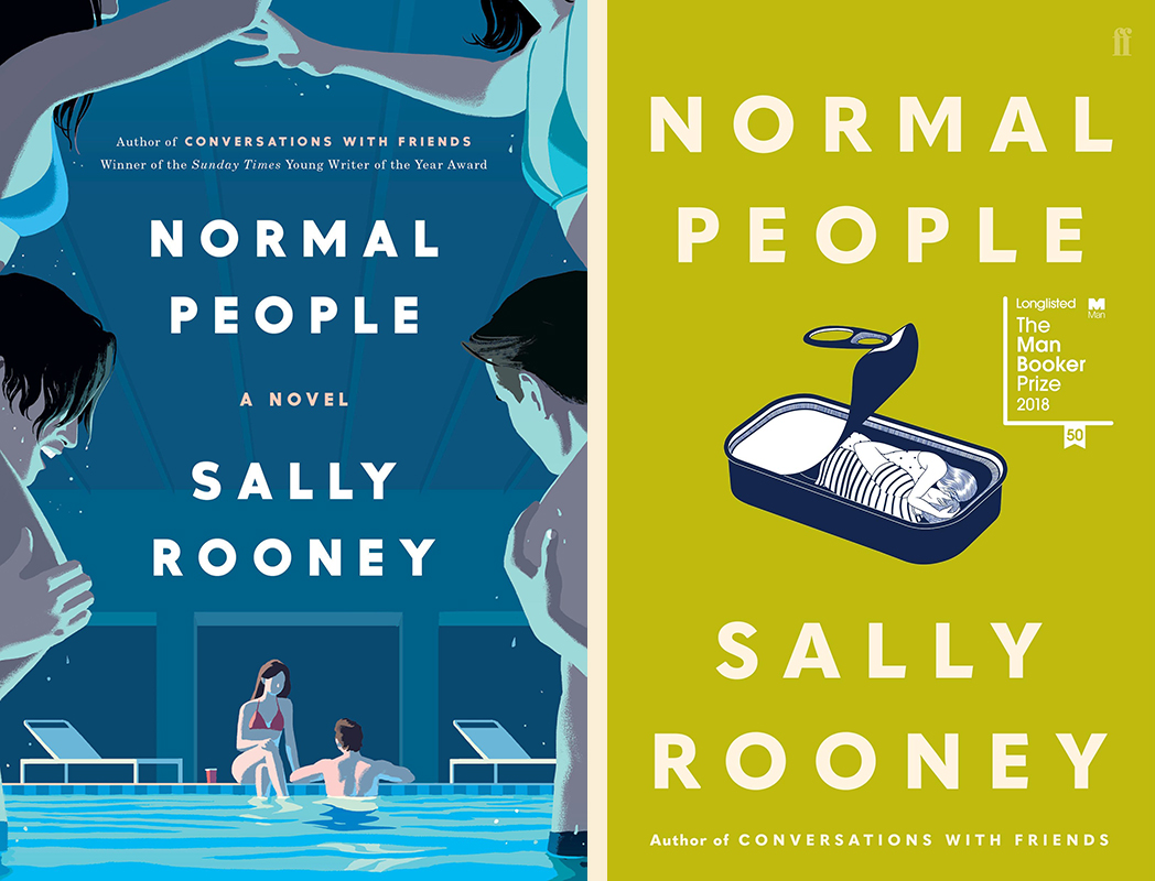 Sally Rooney, Normal People: US cover (Hogarth); UK cover design by Jon Gray (gray218), illustration by Henn Kim (Faber & Faber)
Winner: I’m cheating, because Normal People isn’t even out yet in the US—but since everyone in my office has already read it (apologies for this obvious and reprehensible brag), it feels like it’s out. As for the covers, I think I’d love the US version if I hadn’t seen the UK version. As it is though: that color! That concept! Add it to the font (great on both) and I think we have our winner.
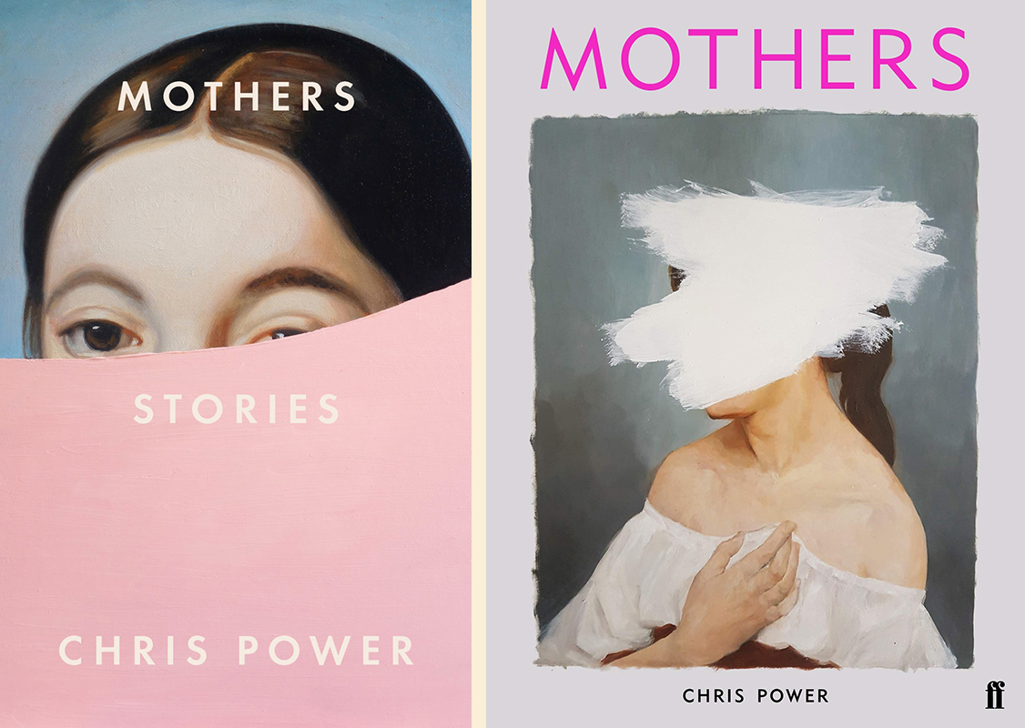 Chris Power, Mothers: US cover design (FSG); UK cover design (Faber & Faber)
Winner: Now that I’ve started cheating, why stop? Chris Power’s Mothers doesn’t come out in the US until two weeks into the new year, but I just had to highlight the covers for it here, because they’re both impossibly good. I think I might marginally prefer the US version, because I’ve seen more similar covers to the UK version, but really, I’d be happy with either or both as wallpaper. Sigh.
Emily Temple
Emily Temple is the managing editor at Lit Hub. Her first novel, The Lightness, was published by William Morrow/HarperCollins in June 2020. You can buy it here.
