What If My Book’s Cover Design Misrepresents Its Content?
Saumya Roy on Poverty Porn and the Optical Echo of Book Jackets
Days after I finished writing my first book, a nonfiction account of Mumbai’s Deonar garbage mountains and the waste pickers who trawl them, I had settled in to read Jhumpa Lahiri’s The Clothing of Books. Lahiri writes of her experience of opening her email inbox to find book covers, made without her involvement, that sometimes represented her books well and at other times felt more like an ill-fitting coat. “In reality the book jacket is not only the text’s first clothing but also its first interpretation,” she writes.
Book covers are meant to illustrate the story and its themes, drawing the reader to hold them, open them and read the pages within. Lahiri refers to the book critic S.P. Rosenbaum, who once said a book’s cover is an “optical echo of the text”—but arriving at these designs, which are intended to attract readers, can be fraught. Some of her own books’ cover designs featured images like the river Ganges and suggested an Indian setting, though the stories took place in the US (albeit in the Indian American community). The jacket and the book can make for difficult conversations, she suggests. Sometimes the jacket can elevate the book; at other times, the book can outshine the cover’s easy image.
Lahiri comments that in Italy, books often have very simple covers, noting that these minimal designs allow readers to discover books for themselves, without the easy cues that illustrated covers provide. I too, had grown up on books with red faux-leather covers, patterned brown paper covers, their first pages crammed with the names of all the people who had owned and read it before passing it on, leaving me to discover and enjoy the stories in them over long summer afternoons. I had read of British tea parties, Nordic fairy tales, and Soviet grandmas picking plums in the snow, teleporting me to distant places through those hazy, warm afternoons.
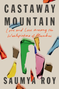
I thought of when, a few weeks earlier in Mumbai, I had opened my own email inbox to see the cover of Castaway Mountain, commissioned by my publisher in New York with little involvement from me. When I began writing about the waste pickers of Mumbai, I found myself seeking out the truth about how waste, desire and overconsumption define us and what it is that truly gives meaning to our life. How to envision a design that encapsulated my years-long relationships with the waste pickers of Deonar—their strong spirits and characters, which I hope shine through the book—and not fall into the trope of that somewhat removed museum oddity that “poverty porn” evokes?
The designer, Rodrigo Corral, had enlisted Grace Han, who had designed a cover showing different colored glass shards that frame a woman and fly across a salmon-pink background. The shards seemed three-dimensional and real, like they might leap out of the cover and cut the viewer. A minimal, modern design, it did not include any stereotypically exotic Indian objects or any indication of the reeking garbage mountains—items that might lead the reader to feel that this was a faraway, alien place and an alien problem. Instead, she had centered a woman, who could be anyone, framed by fragile but sharp glass, suggesting that just as what we use defines us, what we discard does too. The design evoked the visceral relationship the inhabitants of this township have with Mumbai’s trash, capturing the intimate nature of my book, which was written in close observation of their lives. It was the perfect “optical echo” of the book’s themes.
How to envision a design that encapsulated my years-long relationships with the waste pickers of Deonar?
My hope was that confronting life in this world made of trash would make readers think of themselves too; Castaway Mountain works as a parable for our times, and the cover designer seemed to have seized on that meaning. While the teetering garbage mountains and waste pickers are located in Mumbai and its administrative tangles that have allowed to them to grow out of control, they are also emblematic of the universal and constant accumulation of things that we feel will define us and the throwing away of things that we feel don’t. It is this introspection that Han’s design invites the reader to—all that defines us and all that does not.
When I gave my very first interview about the book, and, afterward, as I described my work to people from all over the world, I was asked what I wanted Western readers—attuned to seeing India through the lens of poverty porn—to take away from the book. I replied that books have a way of collapsing time, collapsing the distance between seemingly different cultures and people, and immersing us in them. I want readers—wherever they were—to feel this book as a visceral, immersive experience and to feel they know these people, this place, to feel the cool breeze, rain and heat on the trash mountains, as I have.
While waste pickers are seen more in developing countries, growing waste is an outpouring of growing wealth, not poverty; waste growth is used as a proxy for GDP growth. So, this is an issue in any place that is growing and consuming—in other words, everywhere. It is just that with Deonar, one can see this fully realized world, created by our waste, and the book puts us in the middle of it, of the glass shards, so we can look at our own lives as the cover invites us to do. Han’s cover, with its shimmering, colorful allure of desire that we filled up on but that never filled us, making these mountains instead, made these dark worlds of landfills ours too.
The designer, who made the cover in New York while I edited the manuscript through Mumbai’s tight lockdown, seemed to have to picked up on an incident in the book where Farha and Farzana Shaikh, teenage sisters, were walking up the garbage mountains on a hot summer afternoon. They were carrying half-filled bags of glass shards and collecting more to hand over to their older brother, whose business it was to resell the discarded glass to traders to be recast anew. Blinded by the blazing sun, Farha, the younger of the two sisters, had tripped and fallen on the mountain slopes. A glass shard in the bag had cut her shoulder blade, blood spilling on the garbage. Farzana had brought her home, but their father didn’t have money to take her to a hospital to stitch up the wound and filled it with his chewing tobacco instead. The cut had filled slowly to make a serpentine scar on Farha’s back that the family believed had brought her luck, bringing castaway treasures into her hands.
“Everything that gave meaning to Mumbaikars lives, from broken cellphones to high heeled shoes and gangrenous and dismembered human limbs, ended up here,” I write in Castaway Mountain—the fragile act of making and remaking ourselves and all that is left behind in this process. With her design, Han shows that it is not poverty we are serving up for Western or Indian readers; rather, we are encouraging them to reflect on our role in creating these worlds, and to think of all that frames us, cuts us, and gives meaning to our lives.
___________________________________________________

Saumya Roy’s Castaway Mountain: Loss and Love Among the Wastepickers of Mumbai is available now from Astra House. Copyright (c) 2021 by Saumya Roy. All rights reserved.
Saumya Roy
Saumya Roy is a journalist and social activist from Mumbai. India. She has written for Outlook, Mint, and Forbes India, among other publications. She is the co-founder of Vandana Foundation, which supports the livelihoods of micro-entrepreneurs in Mumbai and rural India. She has received fellowships from Sangam House, the Rockefeller Foundation’s Bellagio Center and Blue Mountain Center to work on this project. Castaway Mountain is her first book.


