The Unique Challenge of Designing a Book by Incarcerated Writers
Caits Meissner and Melissa Joskow on The Sentences that Create Us
Caits Meissner: So sings the final stanza of Etheridge Knight’s “Cell Song” poem, one of my favorites:
can there anything
good come out of
prison
It is 2016 and on the lapel of my leather jacket I’ve fastened a metal pin—what amounts to a potential weapon in prison—which bears the line in boldface type next to an image of a butterfly. It is a button advertising a prison ministry project, but I wear the phrase as a secret challenge as I travel in and out of prisons and jails across New York, scanned by security who allow me in with my fashion intact. I’m not considered a security threat, as an innocuous young white creative writing instructor passing through the sally port. The real danger is in my bag, and security flipped right past them: poems.
Years later, this memory surfaced when it came time to create a cover for The Sentences That Create Us: Crafting A Writer’s Life in Prison, a collection I edited in my role as Director of Prison and Justice Writing at PEN America, about the liberatory power of literature written primarily by people who have been or still are incarcerated and their allies. I hoped that first and foremost that the writers in prison who are receiving the book—75,000 copies to start, thanks to funding from the Andrew W. Mellon Foundation—would feel connected to the project upon the first glimpse of its packaging.
The first cover images we considered were clean and attractive, but it nagged at me that they represented the physical building of prison—barbed wire, faceless state buildings, bars—rather than the people behind the concrete barriers. It struck me that the design must wrap its visual identity around the concept of liberation while gesturing to the prison environment, instead of the other way around. To send the image of prison into prison, to double down on the stark imagery, would do a disservice to the vibrant and highly readable personal essays in the book. There seemed to be an opportunity to impart a sense of our ethics in working through the walls through the design of the cover itself, inspired by Knight’s ringing question.
“For people in prison, the act of writing is a direct relationship between who you are and who you want to be.”
I’d encountered this creative issue before: how to represent writers in prison. Early on in my tenure at PEN, graphic design consultants had revealed what amounted to a horror movie poster when representing our Writing For Justice Fellowship—red check marks meant to mimic hand scrawled text bloodied a black background, counting down the immeasurable days. A quick Google image search revealed the brutalist aesthetics of prison are commonplace as a visual descriptor: again, the bars, the barbed wire, the menacing watch commander’s high tower, orange jumpsuits and men with their heads in their hands, desperate and shaking in the corner.
But my experiences in over 26 prisons, jails and reentry programs across the United States offered another feeling. The words of writers in each carceral setting became their adornment in an otherwise uniform landscape of state-issued blues, grays, or greens. I became acutely aware that the only good thing that could possibly come out of prison are the individuals held in captivity and their potent stories.
That butterfly image flew back to me.
Long a symbol of social justice and migration, the butterfly is also a recognizable metaphor for metamorphosis. As Reginald Dwayne Betts, who wrote the foreword to The Sentences That Create Us, said during the book’s virtual launch event on February 1, “For people in prison, the act of writing is a direct relationship between who you are and who you want to be.”
Can there anything good come out of prison? As our book confirms across its 350 pages of testimony: yes, and it’s not because of, but in spite of prison’s punitive and isolating structure. This is thanks to the self-determination and spiritual grit of individuals who have undertaken the hard journey of self-transformation in an unforgiving environment.
The butterfly would be the liberatory symbol. Now, how to represent the prison context?
While in prison, connection with the outside world is largely maintained through the lost art of letters (sometimes censored, sometimes rerouted and scanned to another state, often unanswered, often desperate). The piles of paper sitting on our desks at the PEN America offices that come from incarcerated writers across the United States have a distinct visual style: bold stamps announcing their origin FROM PRISON, FROM AN INMATE, INDIGENT MAIL, as contributor Jeff Young wrote to me, “as if the letter may explode and the handler needs a warning.”
Butterflies made of mail: that was the pitch I made to Haymarket Books, our publisher, who agreed to take the risk in allowing us to take the creative direction out of the presses’ house and into our own hands. When I met with our PEN America designer Melissa Joskow at the pandemic-deserted office, we parsed through the stacks of envelopes seeking various stamps or handwriting ephemera to scan as source material. The process felt visceral, emotional, and humbling.
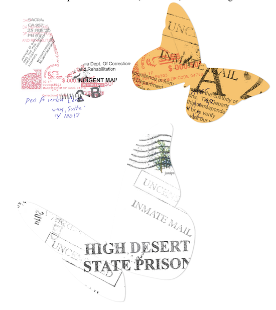
Melissa Joskow: First came the process of actually scanning the letters, digitally cutting out the elements that we wanted to include, and recombining those words (sent to PEN from incarcerated individuals) and textures into visually compelling collages. I created six different butterflies that incorporated these collaged scans of the program’s mail, and they became the cornerstone of the eventual cover design.
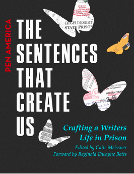
The next step was determining a composition—how the butterflies and the type on the cover would interact—and thinking through how we could incorporate elements of PEN America’s organizational brand design into the cover through typography and color. I wanted the butterflies to look somewhat like cut paper, expressing the tactile quality of the ephemera.
In one cover idea I created an abstract representation of bars, and in another I incorporated a play on an idea Caits had of the butterflies emerging from an envelope. Ultimately, we decided these ideas were too literal, and Caits and I both gravitated towards the more abstract cover options with brighter colors.
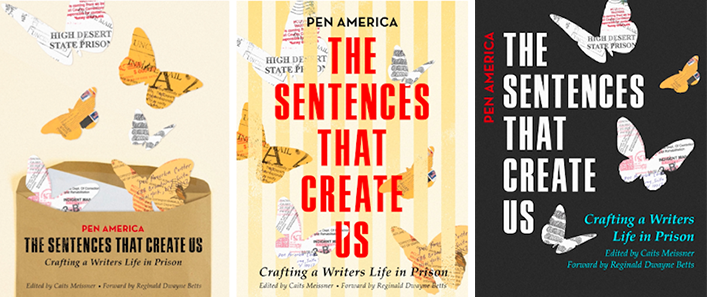
After a few rounds of revisions, we landed on a composition that we thought hit the right balance.
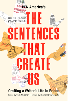
However, Caits still felt like there was a textural element missing.
The final key design idea came from Robert Pollock, Program Manager of the Prison Writing Program at PEN America, who suggested incorporating a texture reminiscent of cinder block walls as the background of the book cover. This layer provided the book cover with a necessary contrast, subtly suggesting the physical space of a prison while further emphasizing the theme of transformation through the butterflies.
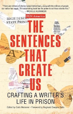
Caits Meissner: Just after the book’s release, a special affirmation arrived in my personal email inbox, noticing a specific prison stamp branding a butterfly wing:
I’m a writer, and my brother has been incarcerated for the better part of 20 years. He is currently in the SHU at Folsom, and he used to be in High Desert for a long time, so it was emotional for me to see that portion of the cover. My brother’s incarceration has been one of the sole definers of my life and my writing and teaching career, and I am so grateful this book exists. It means more than I can express to feel this kind of acknowledgement and representation.
Acknowledgement and representation. Perhaps those were the words I was looking for all along.
__________________________________
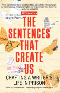
The Sentences That Create Us: Crafting A Writer’s Life in Prison, edited by Caits Meissner, is available via Haymarket Books.
Caits Meissner and Melissa Joskow
Caits Meissner is the director of Prison and Justice Writing at PEN America where she edited The Sentences That Create Us: Crafting A Writer’s Life in Prison (Haymaket Books). Melissa Joskow is PEN America’s communications assistant and graphic designer.


