The Art of the Moving Book Cover
Michael Salu on Building a Dynamic Visual Identity for Books Online
Even amidst the wild swirl of technological developments over the last couple of decades, and despite our increasingly accelerated way of living, two mainstays from the beginning of the internet remain predominant tools in the way we communicate today. One, email, became a blight, at least for me—sorry for the slow response becoming my unautomated automated reply—but if you aren’t deploying a bot assistant to do the management of a bulbous inbox, then the format and the fudged etiquette of the early days of email has changed very little. The other, the GIF (whichever way you want to pronounce it) has arguably gone on to be the main driver in revolutionizing the way we communicate.

Dancing Girl, by early gif-maker Chuck Poytner
We decry lost languages and cultures, but rarely laud the new ones that form in their place. Depending on when you were born, you might even see them (and with some justification) as dystopian tools of regression and control, but often I feel that it’s all really just a cyclical process of our evolution, a pendulum-like movement between ideas, the physics of which drags us forward unwittingly. Granted, these new languages can appear to contribute to a congealing of thought, an erasure of nuance or discourse, and a tightening of the myths we choose to live with, but new languages are also fascinating. Over the last couple of decades, our rapidly heightened visual literacy has become a language in itself, of which the GIF is the primary grammar. It was inevitable that the visual culture we grew up on—the movies, the tv shows, the “saints” of our secular time (celebrities)—would become the alphabet we deploy to share who we ourselves are, and how we really feel. We now see, think and feel through this visual language. There is even something poetically lucid about these myths of experience and narratives and time within their structure of infinite loops.
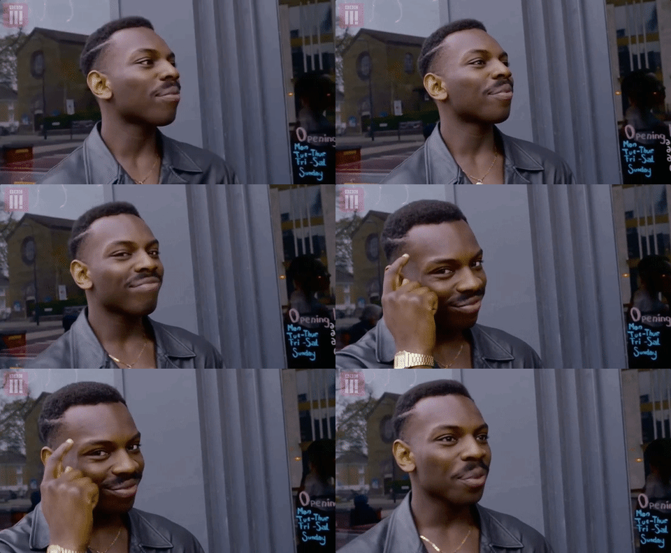
That said, and having worked in or with publishing on and off for many years, I have often wondered why publishing and the world of literature itself has been so reluctant—or maybe the right word is tentative—when it comes to using not just one of the oldest digital file formats, but motion itself as a communication tool. The worlds within the books that are published are rich with motion, both of the actual and the metaphysical, yet I find the language around the marketing and publicizing of books to be strangely, well, stilted. Often hugely diverse worlds of thought are hemmed in by a long-established template of how to communicate literary worth. I often wondered why there isn’t more inspiration taken from the expansive imagination in the concepts and worlds built by the authors themselves in the promotion and selling of a title. This template includes book covers. Oh yes, this may be a controversial statement, but hear me out. Book covers are largely driven by a series of invisible and often subjective metrics, which—if you think about how even the most basic marketing campaign uses data-specific insights about its audience—is quite an odd thing in the here and now. With Amazon hoovering up book buyer data, there must be more than enough psychographic material to reverse engineer a bestselling novel, let alone a cover.

Yet I often find the visual language of book covers quite removed from the visual culture around us. Don’t get me wrong, there are great designers doing great work, but there’s something in the formula that I find a little restrictive. When I say formula, I don’t mean format, as the consistency of the book’s format actually makes for an interesting canvas to operate within and reimagine each time. No, I’m referring more to the formulas of contemporary aesthetics, the wildness of a hyper-visual world, the amorphous way we move between video and image, the surreal interlocutions of memes. It could be argued that we’ve now passed the tipping point of our profoundly agitated mixed reality (digital and physical) and that we’re now living more of our lives digitally than we are physically.
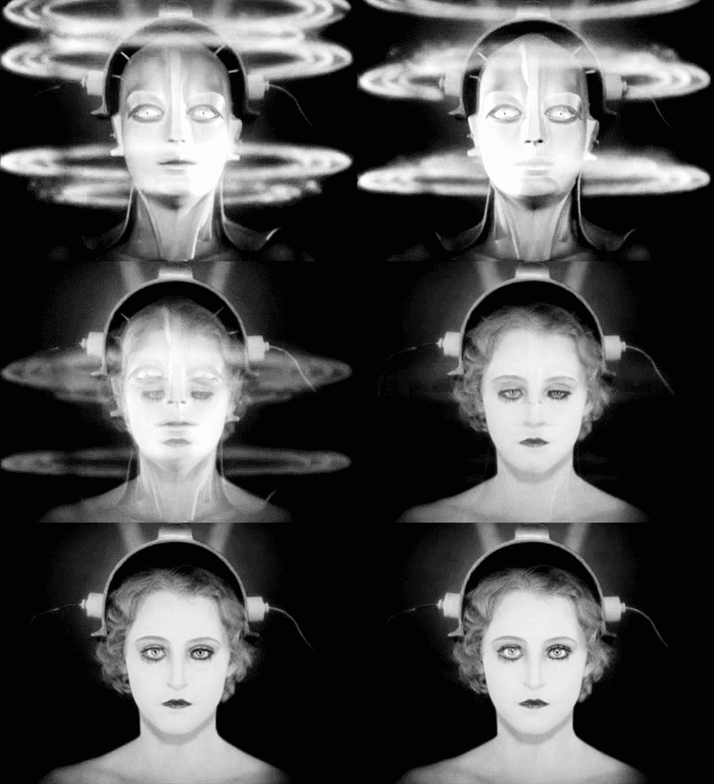
So why is the online and overall digital presentation of books so staid? Granted, the marketing budgets for books and overall margins are for the most part a lot smaller than for film or music, say, but beyond a JPEG and the odd pack shot, we rarely get a glimpse of the unique world of that book. Ever since my time at Vintage (UK), I have wanted to do more with formats that allow motion to amplify a mood, feeling or idea. I played around a little back when I was at Granta, producing some short films, animations and websites that echoed and responded to individual stories from the magazine, and occasionally books too. Still, these experiments were intermittent, and by no means a consistent and integral part of the marketing strategy around each title.
Today, I run my own creative consultancy business amongst my other work (writing and art), and I guess it’s these experiments that helped lead me to my current multidisciplinary practice, where I’m fortunate enough to work on a variety of cultural projects, including that of reimagining the face of Soft Skull Press, the indie publisher of the likes of Noam Chomsky, Maggie Nelson and Dennis Cooper, when it became a part of the Counterpoint publishing family.
Soft Skull’s new list launched with both nonfiction and fiction, its authors including Chelsea Martin, Colin Winnette, and Sam Pink. Lots of young writers, often writing through the recent past. Developing the concept space for these books, it seemed like a good opportunity to add in some additional parameters, which could open up how the cover images would be executed. I enjoy that wrestle that happens between the physical and digital, one that has been fed to me over the years by writers like Philip K. Dick, William Gibson, and Jean Baudrillard, and this playful back and forth is often in the work I produce (both visual and written). After discussing possible approaches with Soft Skull, we settled on what I like to refer to as “semantic type,” in which image is mostly stripped away and we allow the letterforms themselves to do all the work in communicating the essence of these books. We thought it could be interesting to consider each book cover as both a static and a moving image from the outset, creating a traditional cover as well as something that might have more harmony and power as it travels widely online. This has led to a very interesting design process when the motion itself becomes integral to the development of an idea rather than a stuck-on addition to the primacy of print. We’re right in the midst of it all at present, but here are a few examples of what we have been up to. Now, I don’t mean these to be at all definitive examples of what we can do with motion and covers; in fact, they’re rather simple and I have a lot of ideas to including actual narrative in the future, but as a small and inexpensive exercise it’s been fun and has gotten the cogs whirring.
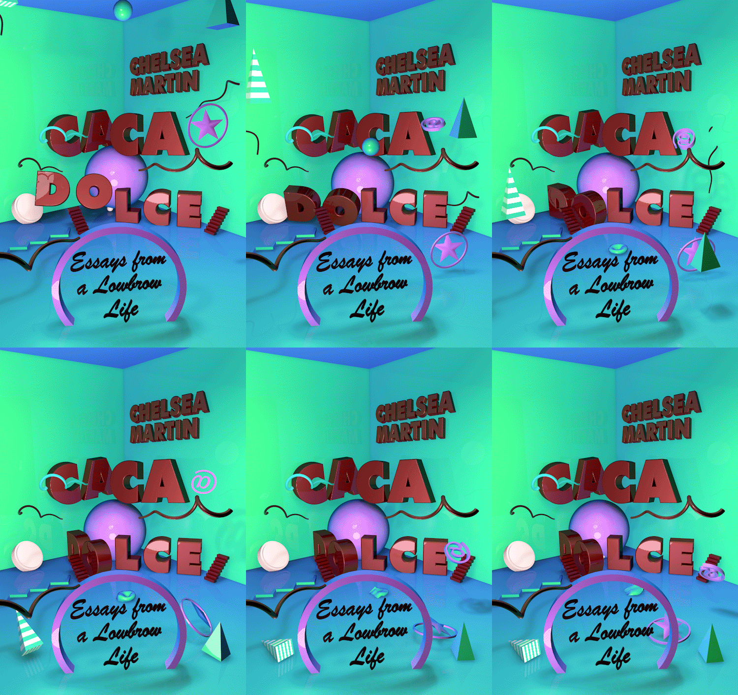
The first title of the series was Caca Dolce, a wry and candid memoir about growing up and finding a place for oneself as an artist. It is also about growing up in the internet age, with Myspace and all the other platforms for self-expression and identity that have sprung up in its wake. So: the onset of cyberspace was my inspiration. I work a lot in 3D, which offers an opportunity to build completely synthetic environments that don’t try to echo reality, but instead can channel the core of something real, a memory or motif one is trying to express. In this visual, without depicting an actual room, I wanted to evoke a kind of hyper- domesticity reimagined as a world ticking and whirring behind a late-90s MySpace page. It wasn’t supposed to be pretty. I think beauty can be overrated when we use images so fundamentally as a tool of communication, so rather than beauty per se, I aim for an evocation—or at least something that actually makes you look in a sea of things trying to make you look.
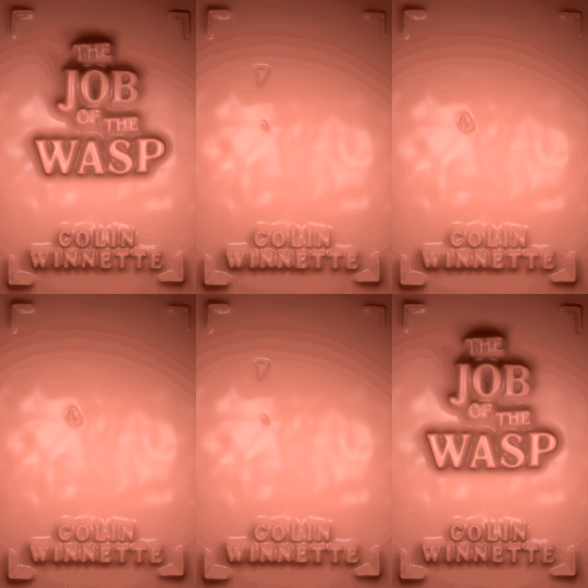
Which segues us viscerally into the cover approach for Colin Winnette’s modern gothic novel Job of the Wasp. For this one, I wanted to eke out a feeling of unrest and disquiet, which I guess can be metaphorically represented by the aftermath of a wasp’s sting, or many stings from many wasps. The idea was that the body is vulnerable, mortal and subject to malevolent influences. Artists like J. G. Ballard, David Cronenberg, Hans Bellmer, Francis Bacon, Poe, and Dostoevsky have long been bastions of inspiration for me. Their relationships to and fascinations with the body as a portal to reckoning with existence were drivers for me growing up. So I chose to create a synthetic skin for the cover, one that allowed typographic elements to live uncomfortably underneath. Again, it isn’t supposed to be pretty. Facebook’s algorithms rejected the image because of its depictions of “nudity and obscenity,” so I think I won this battle of subversion.
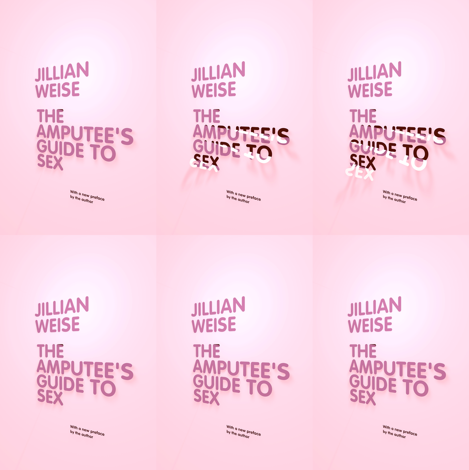
Soft Skull’s reissue of The Amputee’s Guide to Sex by Jillian Weise is probably the purest example of the underlying “semantic type” concept for the series. I took the typically restrained approach we usually see with poetry books and gave it some contemporary fuzz. I’ve always enjoyed conveying a mood or idea with the simplest of elements. How loaded can the idea of peeling be? Can it indicate the removal of clothing, the removal of selves, the removal of inhibitions, the removal of recently dried candle wax on the skin, the removal of a prosthetic limb, the removal of one’s own sexual boundaries?
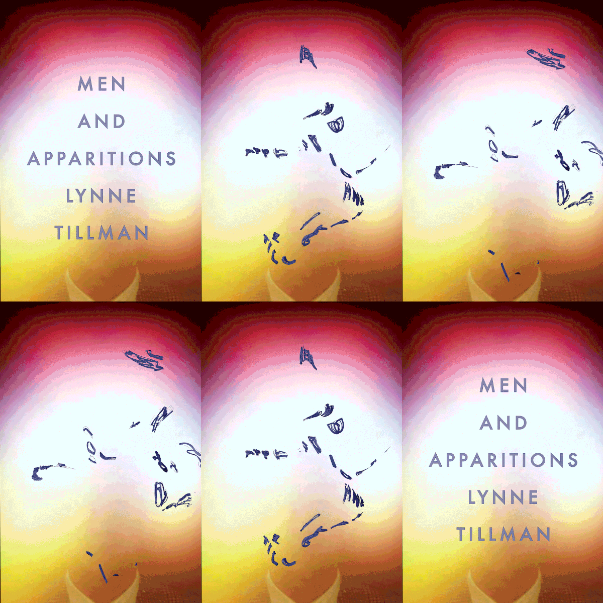
If anyone has an understanding of image, it would be Lynne Tillman, so I refrained from tampering with the brilliant work of artist Susan Hiller, from her series “Auras,” and just made the typography itself deconstruct, which seemed apt, given the way Lynne herself has tackled masculinity and the pervasiveness of images in our world, and given the world within the novel itself.

A Girl’s Guide to Personal Hygiene, by Tallulah Pomeroy, speaks for itself. I just added a touch of animated grossness to Pomeroy’s refreshingly illustrated grossness.
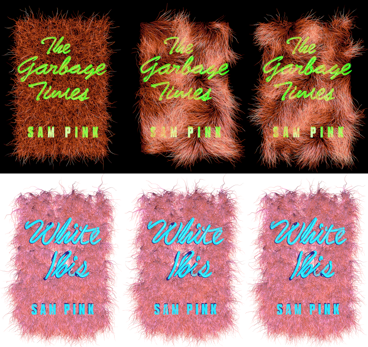
Sam Pink’s double-novella-type-novel thing, for which I believe the technical term is a “fliparoo,” probably best encapsulates the aesthetic feel for this new Soft Skull look, and is a peep into the lexicon of images, ideas, myths and stories that stay swirling around my mind to be conjured and remixed at any one moment. It is a mashing of the old and the new: pulpy album covers, retro arcade games, Miami Vice, Aquemini, strip club neon and candy wrappers, scurrying rats in the alleyways (or as our currency if you ask DeLlillo), garbage deposits behind a diner, that creepy face behind the diner in David Lynch’s Mulholland Drive, scrappy re-appropriated memes, (the original) Ghost in the Shell, Powerpoint clip art, Berlin u-bahn signage, dadaist early cyborg experiments, the countless depictions of Gaia, the countless depictions of Kim Kardashian, the handwritten sign held aloft by the homeless guy in your peripheral vision, the boarding passcode in your Apple Wallet, the attention to detail of a mescalin trip, the clamber down an infinite YouTube hole and the photocopied zines of pre-internet days all brought together as swirling, fizzing and perpetually alive new animals.
