The 17 Best Book Covers of July
It’s Hot Book Summer
Another month of books, another month of book covers. July has been hot and hectic (where’s the summer lull everyone is always talking about?) and the book covers are no different—in the best way. Read: bright colors, bold choices, and a lot of (dare I say it) fun. Here are my favorites from the month:
 Fernanda Trías, tr. Heather Cleary, Pink Slime; cover design by Alicia Tatone (Scribner, July 2)
Sometimes it can feel redundant to illustrate the title on a book cover, but here, the murky drench of well, pink slime, combined with the pleasingly large text treatment, feels extremely satisfying.
 Carlos Labbé, tr. Will Vanderhyden, The Murmuration; cover design by Anna Jordan (Open Letter, July 2)
Extra points for the commitment to the bit—that is, the author and translator’s names being upside down!
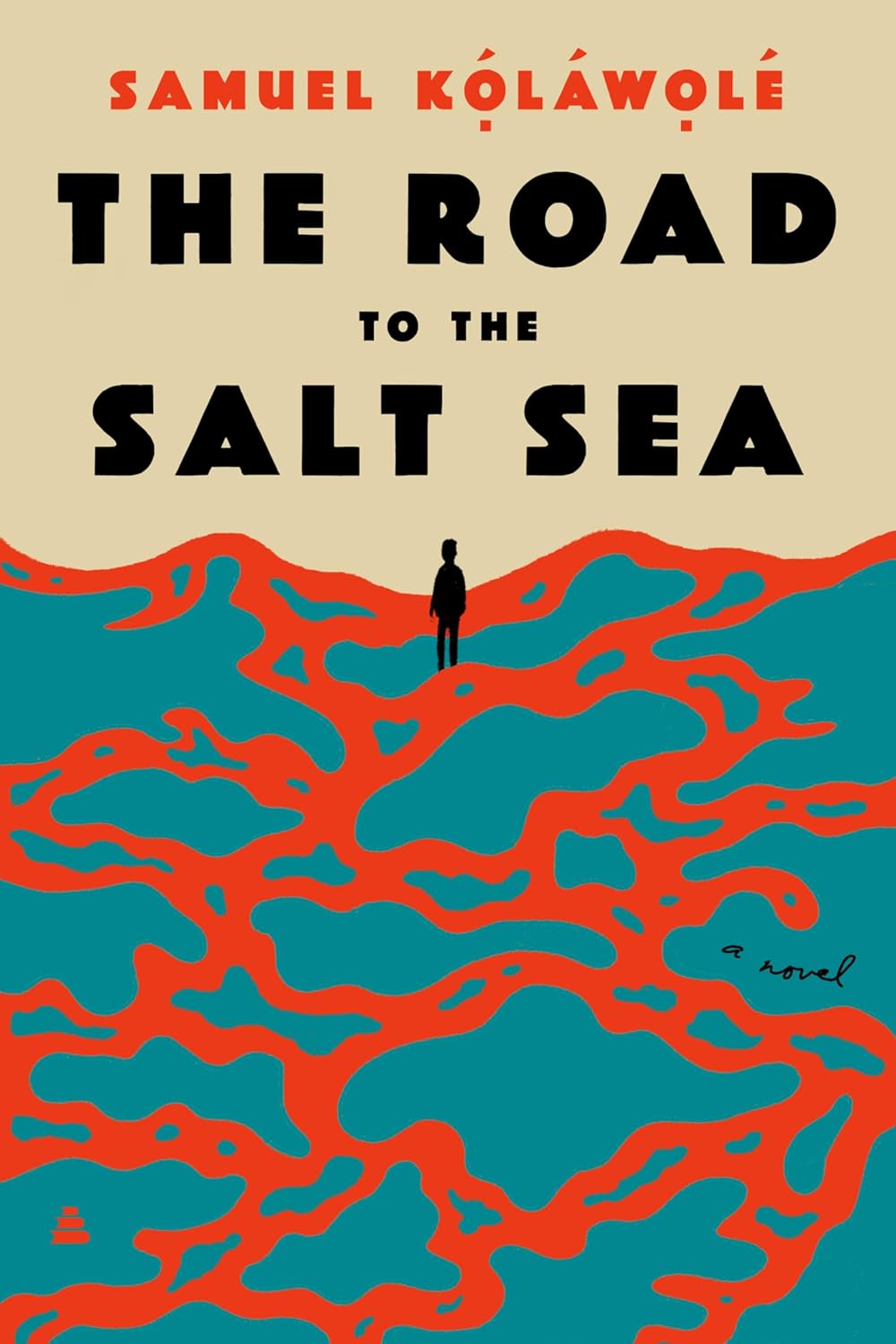 Samuel Kolawole, The Road to the Salt Sea; cover design by Alicia Tatone (Amistad, July 2)
The striking color juxtaposition really makes this cover pop.
 Louis-Ferdinand Céline, tr. Charlotte Mandell, War; cover design by Matt Dorfman (New Directions, July 9)
Glorious, elegant fragmentation.
 Yasmin Zaher, The Coin; cover design by Jaya Miceli (Catapult, July 9)
One of the most exuberant covers—the figure! the color!—I’ve seen in a while.
 August Thompson, Anyone’s Ghost; cover design by Keith Hayes (Penguin Press, July 9)
It’s giving the zine you were never actually cool enough to have stashed under your bed.
 Liz Riggs, Lo Fi; cover design by Emily Mahon (Riverhead, July 9)
Very clever—and the singeing of the O is a great touch.
 Sable Yong, Die Hot with a Vengeance; cover design by Anna Morrison (Dey Street Books, July 9)
It’s all about that long drip for me.
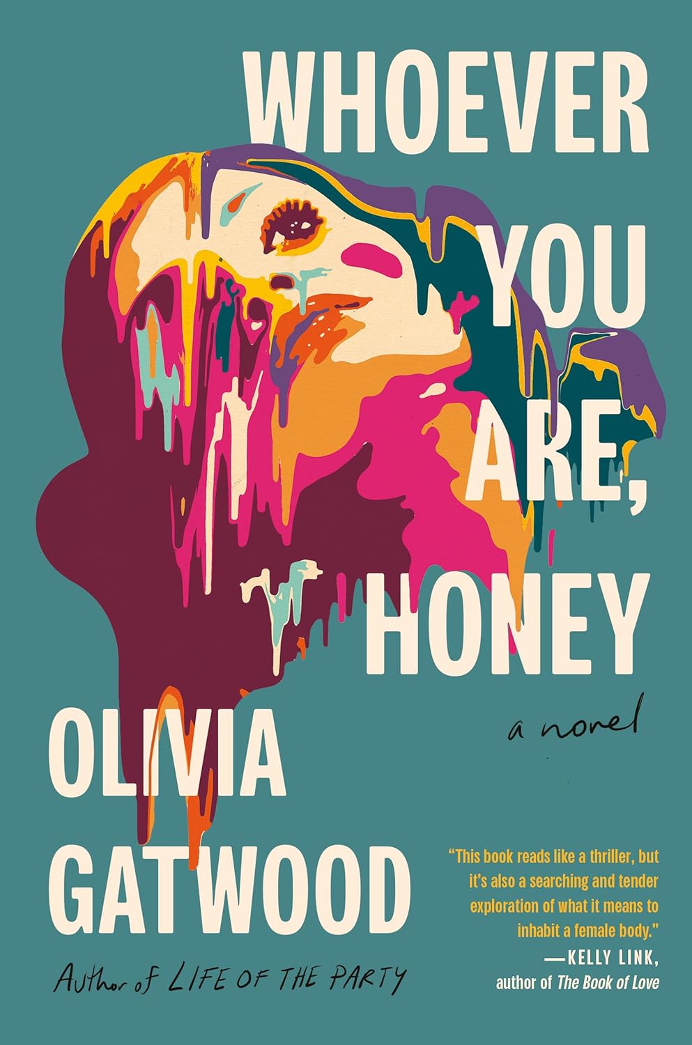 Olivia Gatwood, Whoever You Are, Honey; cover design by Jaya Miceli, art by Steven Wilson (Dial Press, July 9)
More drips, and a perfectly demented take on the traditional woman’s-face-on-a-book-cover.
 Halle Butler, Banal Nightmare; cover art: “Yelling” (1994) by John Wesley (Random House, July 16)
Relatable!
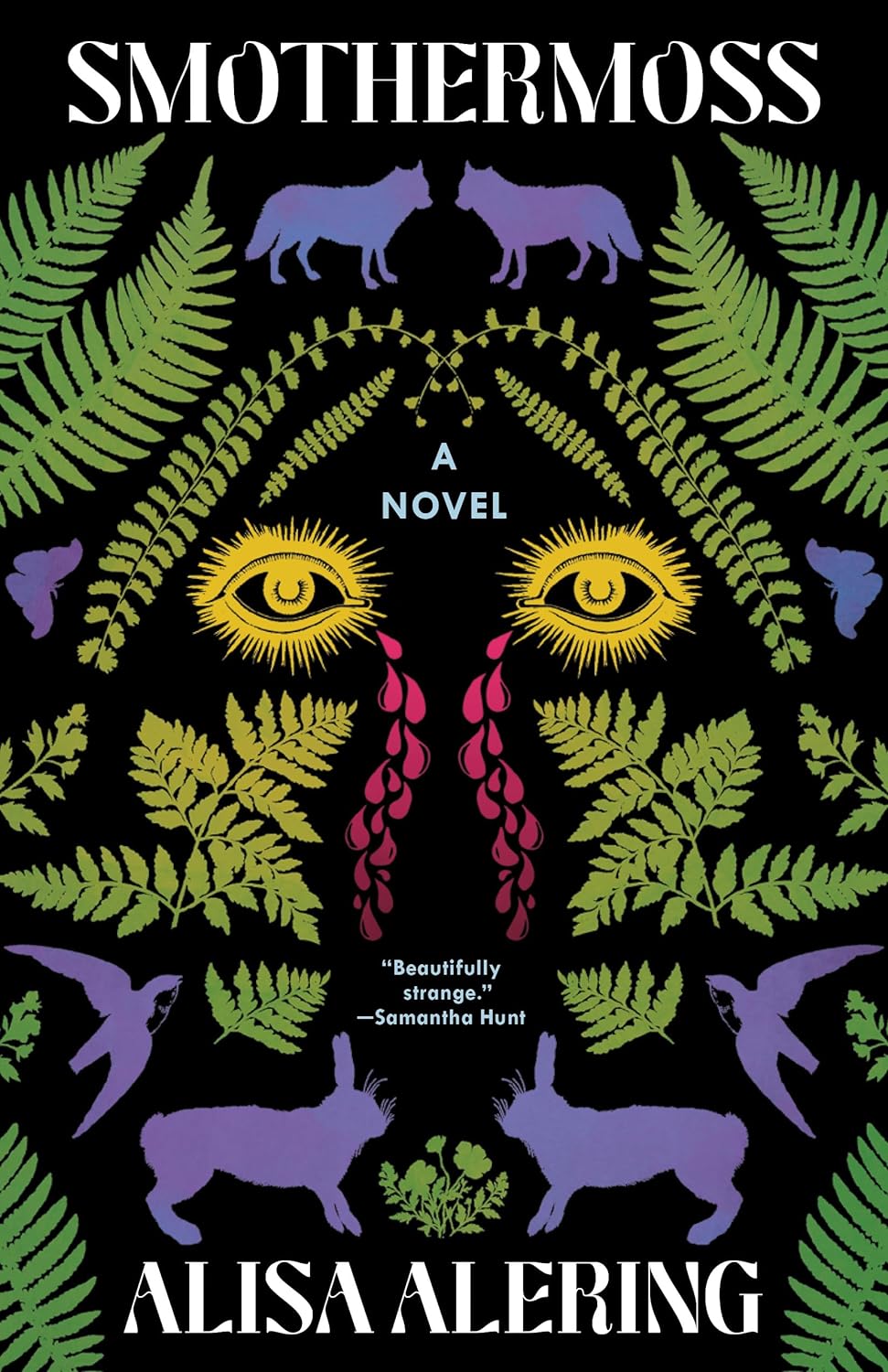 Alisa Alering, Smothermoss; cover design by Beth Steidle (Tin House, July 16)
A cool idea—a two-sided pattern that also forms an image—that stands out in a sea of the same old thing.
 Eugene Lim, Fog & Car; cover design by Michael Salu (Coffee House Press, July 16)
Modern and soothing—but also weirder than it looks at first glance.
 Daniel Hornsby, Sucker; cover design by Perry De La Vega (Vintage, July 16)
The paperback cover for Sucker manages to take the book (and the blood droplet) in an even weirder direction.
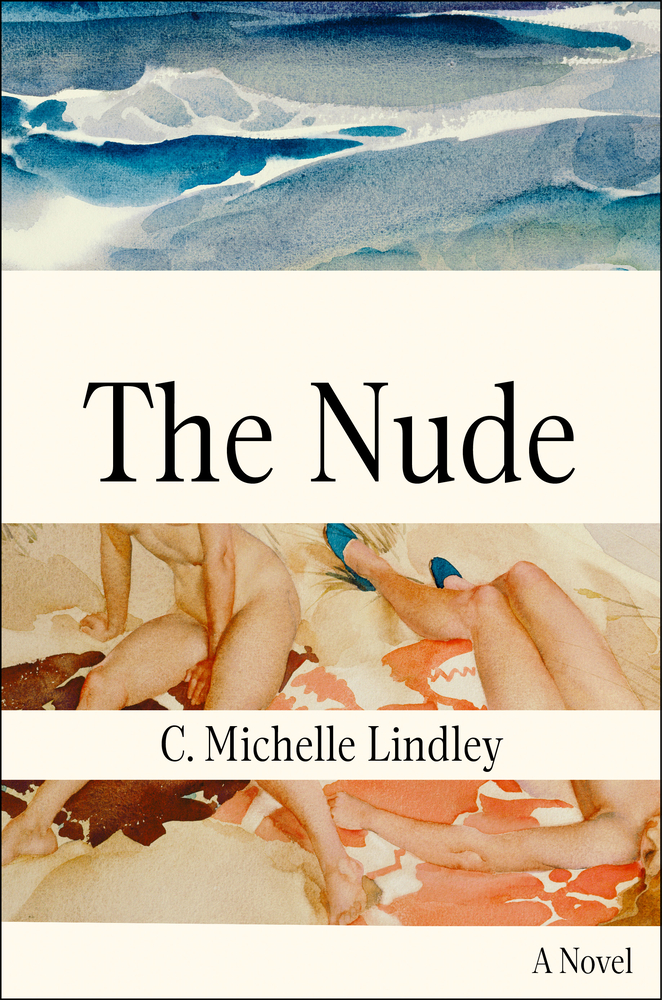 C. Michelle, Lindley, The Nude; cover design by Kelli McAdams (Atria, July 23)
“Finding our way to this cover was an interesting challenge. I started looking at paintings, and as soon as I came across this watercolor by Scottish artist Sir William Russell Flint, I knew I wanted to use it,” McAdams told Lit Hub. “I love the intimacy and the honesty of it, how the women pictured seem blissfully unaware that they’re being observed, at ease in each other’s company. I liked the idea of cutting up this softness with something stark to convey the sense of displacement the narrator feels throughout the novel. Hiding the central figure’s face felt like a good way to emphasize the voyeurism of the image as well—the idea of seeing versus being seen.”
 Sarah Manguso, Liars; cover design by Cassie Gonzales Vu (Hogarth Press, July 23)
An outside-the-box (and dread-inducing) use of text as image.
 Willy Vlautin, The Horse; cover design by Milan Bozic (Harper, July 30)
Another great yellow, and a perfectly balanced composition to go with it.
 Mai Sennaar, They Dream in Gold; cover design by Vivian Lopez Rowe (Zando/SJP Lit, July 30)
Happy, playful, and perfectly composed.
Emily Temple
Emily Temple is the managing editor at Lit Hub. Her first novel, The Lightness, was published by William Morrow/HarperCollins in June 2020. You can buy it here.
