
The 16 Best Book Covers of October
In Which We Happily Judge Covers By Their Covers
Another month of books, another month of book covers. This month, we read about what it felt like for Alison Forner to be specifically requested by Lisa Brennan-Jobs to design her memoir and explored the weird and wonderful art of Edward Carey, and also saw a lot of appealing books come into the Literary Hub office. Below you’ll find a selection of the most beautiful, most interesting, and most arresting cover designs to hit shelves these last cold and confusing weeks—and despite the fact that we’re talking about October here, only a few of them are spooky.
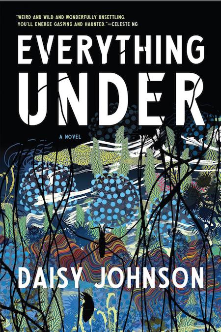 Daisy Johnson, Everything Under, Graywolf Press; design by Kimberly Glyder (October 23, 2018)
The surrealist lushness of this cover draws you in; you almost don’t notice the foregrounded insects, but when you do, the overlaid creepiness just adds a compelling dimension.
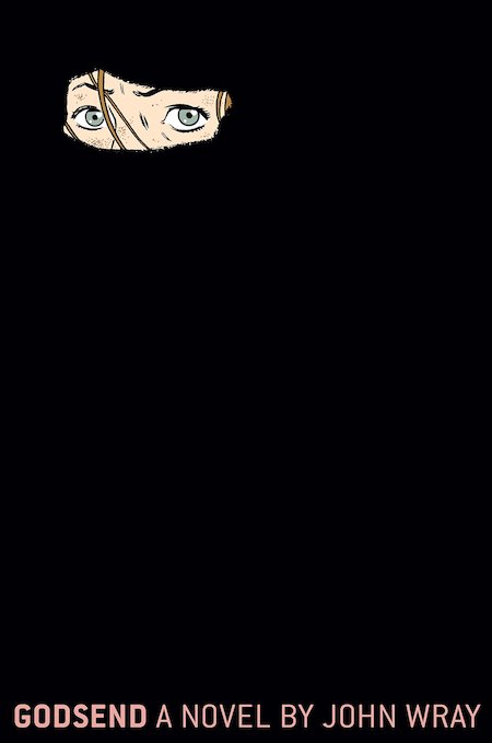 John Wray, Godsend, FSG; design and illustration by Adrian Tomine (October 9, 2018)
You can always count on Adrian Tomine. This is an undeniably striking cover, and perfect for the book, which is about a young American woman who infiltrates an all-male madrasa in Pakistan. It also calls to mind Wray’s breakout hit, Lowboy, also designed by Tomine, also mostly black, though the text treatment is less daring, and also with a mostly-obscured face. Probably not an accident.
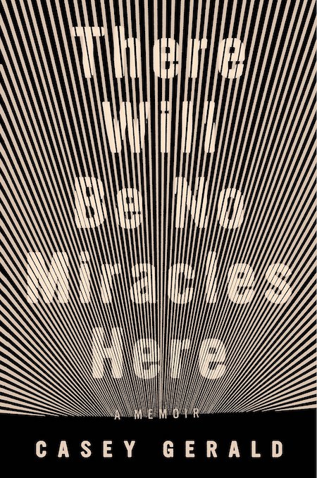 Casey Gerald, There Will Be No Miracles Here, Riverhead Books; design by Grace Han (October 2, 2018)
Hard to look at, but in the best way—this is the most claustrophobic horizon I’ve ever seen. I’m reminded of that incredible cover for Clarice Lispector’s collected stories, and also Sara Gran’s The Infinite Blacktop, which made my list last month.
 Brian Phillips, Impossible Owls, FSG Originals; design by Jamie Keenan (October 2, 2018)
Ah well, I’m a sucker for any collage cover. I think this works perfectly for Phillips’s book of essays—it signifies multiple topics, layered thinking, strange discoveries, and cheekiness. Plus, the Queen.
 Joshua Rivkin, Chalk, Melville House; design by Richard Oriolo (October 16, 2018)
Also something I’m a sucker for? Vertical text. On the other hand, I often find fake distressing annoying—but I actually think it works here.
 Jay Rayner, Wasted Calories and Ruined Nights, Faber & Faber (UK); design by Dan Mogford (October 2018)
Illustrated book covers are always welcome on this list, and so are old timey carnival vibes. But perhaps a better indicator of this cover’s success is the fact that I looked at it, smiled, and then kept looking at it. A cover that holds interest is a cover that moves copies. And look at that mighty Van Dyke.
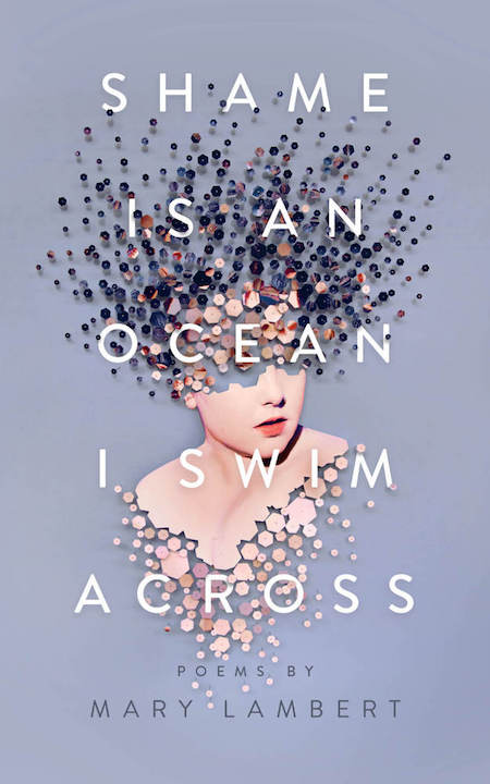 Mary Lambert, Shame is an Ocean I Swim Across, Feiwel & Friends; design by Carol Ly, art by Micaela Lattanzio (October 23, 2018)
There’s so much to love about this cover, but the best part is the sense of physical interaction between the text and image—the way the particles look like push-pins spreading across the canvas and through the title. Plus, it’s gorgeous and weird at the same time, which is almost always my favorite combination.
 Kim Sagwa, tr. Bruce and Ju-Chan Fulton, Mina, Two Lines Press; design by Gabriele Wilson, photo by Gallery Stock (October 2, 2018)
This . . . should have been the cover of You Know You Want This. It’s not pretty, exactly, but it’s so striking, and more than anything, it makes you keep looking. You will be drawn, with or without your consent, into the gaping maw of the calling cat.
 María Sonia Cristoff, tr. Katherine Silver, False Calm, Transit Books; design by Justin Carder (October 2, 2018)
The colors are phenomenal on this one, and that little upwards plane is somehow ominous and cheery at once. As perfect an evocation of “false calm” as I’ve ever seen. (The shades of Wes Anderson do not hurt when they’re done this well.)
 John Gray, Seven Types of Atheism, FSG; design by Gail Anderson and Brian E. Smith (October 2, 2018)
The type treatment here is the star—so large that it takes over the cover and becomes a sort of appealing pattern that only has meaning when you pull back a bit. Ironic or perfect for a book about the patternlessness of existence?
 Sabrina Orah Mark, Wild Milk, Dorothy; cover art by Li Shan Chong, design by Danielle Dutton (October 1, 2018)
Sometimes a good book cover is all about choosing the right artwork—and this one is sad and funny and very appealing if you’ve ever considered yourself or happened to know and love someone who is a sad clown of a person.
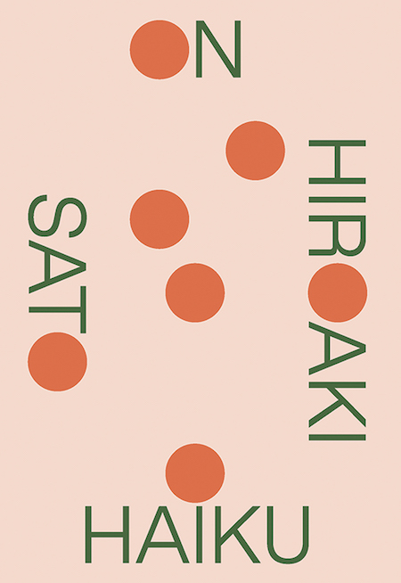 Hiroaki Sato, On Haiku, New Directions; design by Rodrigo Corral (October 30, 2018)
New Directions never disappoints, and neither does Rodrigo Corral. The simple, graphic boldness of this cover reflects its topic perfectly.
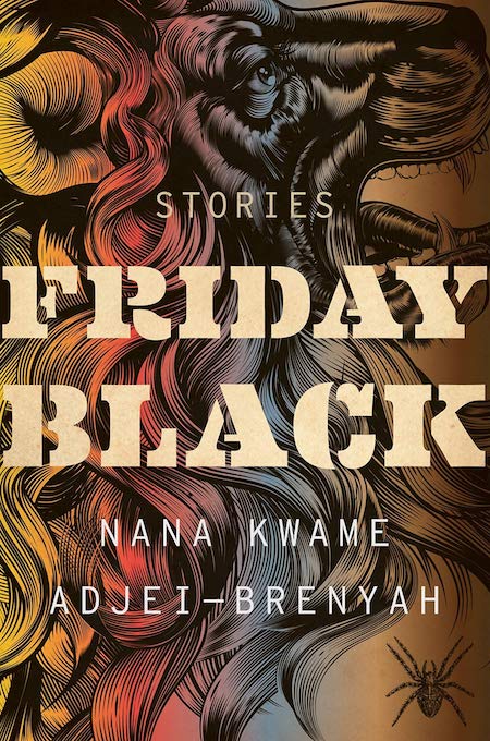 Nana Kwame Adjei-Brenyah, Friday Black, Mariner Books; design by Mark Robinson (October 23, 2018)
This is the second cover on this list that features an insect you don’t see until you really study the thing—perhaps it’s something about October. I love the rage and movement of this cover, and the way the underlying image takes its time to seep through and reveal itself. Plus, the color treatment is inspired.
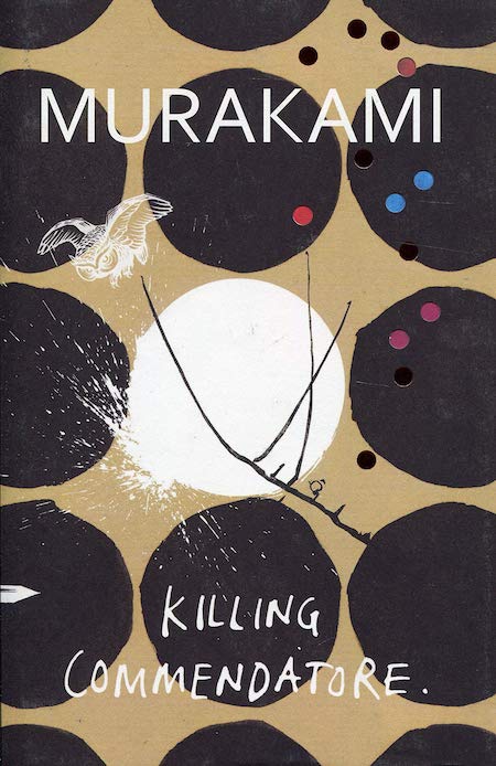 Haruki Murakami, Killing Commendatore, Harvill Secker (UK); designed by Suzanne Dean (October 9, 2018)
I’m not a huge fan of the American book cover for Murakami’s latest, but the UK version manages to be delicate and weird and funny and surrealist and totally off-kilter while still being quite inviting. Very Murakami of it.
 Leif Enger, Virgil Wander, Atlantic Monthly Press; design by Gretchen Mergenthaler (October 2, 2018)
The stars, the stars! And the font, too.
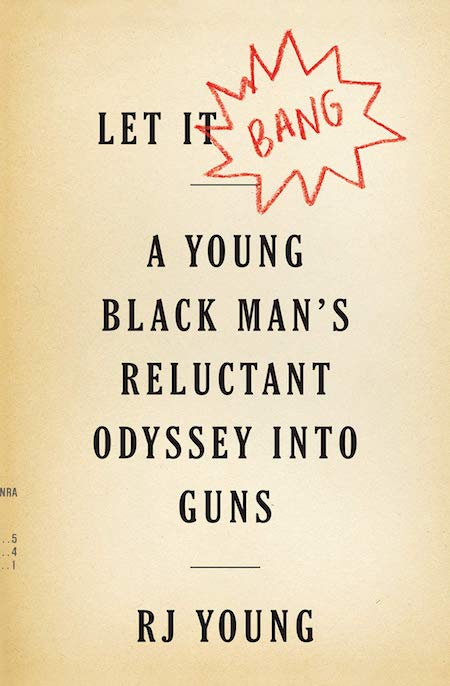 RJ Young, Let it Bang: A Young Black Man’s Reluctant Odyssey into Guns, Houghton Mifflin Harcourt; design by Alex Merto (October 23, 2018)
I think I would have been drawn to the text treatment on this book cover (dignified and loud at once) even without the inspired drawn-in-crayon BANG and the tiny runoff print from an NRA pamphlet or similar on the bottom left—but it has those things, and so it is doubly as good.
Emily Temple
Emily Temple is the managing editor at Lit Hub. Her first novel, The Lightness, was published by William Morrow/HarperCollins in June 2020. You can buy it here.


