The 15 Best Book Covers of November
In Which We Happily Judge Covers By Their Covers
Another month of books, another month of book covers. In November, color was king: we saw sherbet tones and neon greens, blood reds and high contrasts—plus literal sparkles. We also found weird sizes, strange figures, postmodern playfulness, interesting textures, and depth for days. And the books themselves weren’t too shabby either. Read on to ooh and ahh over the best book covers of the month—or, depending on how your Thanksgiving went, complain bitterly and add your own forgotten favorites in the comments.
 Yukiko Motoya, The Lonesome Bodybuilder, tr. Asa Toneda, Soft Skull Press; design by Salu. (November 6, 2018)
Talk about color: these are compelling without being exactly appealing, and same goes for the bubble forms themselves, which look real enough to touch. Plus, I’m always a sucker for a cover design in which the text and image interact, so I appreciate the way the simple title and author lines press against the bubbles behind them.
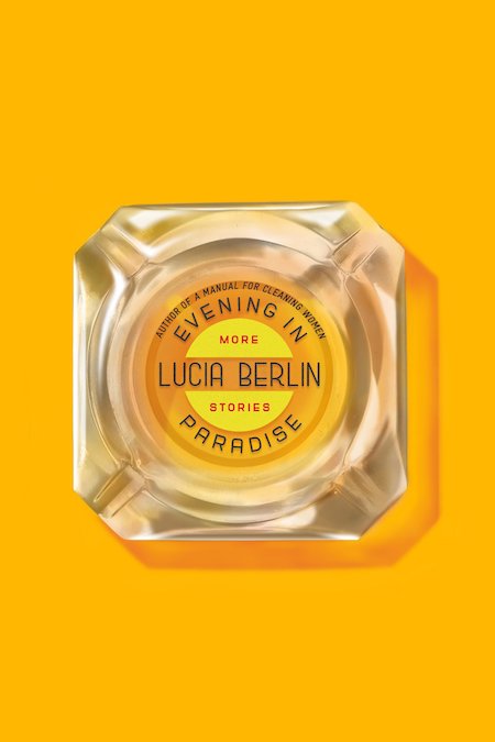 Lucia Berlin, Evening in Paradise, FSG; design by Na Kim. (November 6, 2018)
Great color, great ashtray, great restraint.
 Kristen R. Ghodsee, Why Women Have Better Sex Under Socialism, Nation Books; design by Pete Garceau. (November 20, 2018)
A big, bold text treatment is perfect for a book like this—and the Soviet-style javelin thrower and the subtle layering and texturing add to the impact. I’d almost like to see it as a poster.
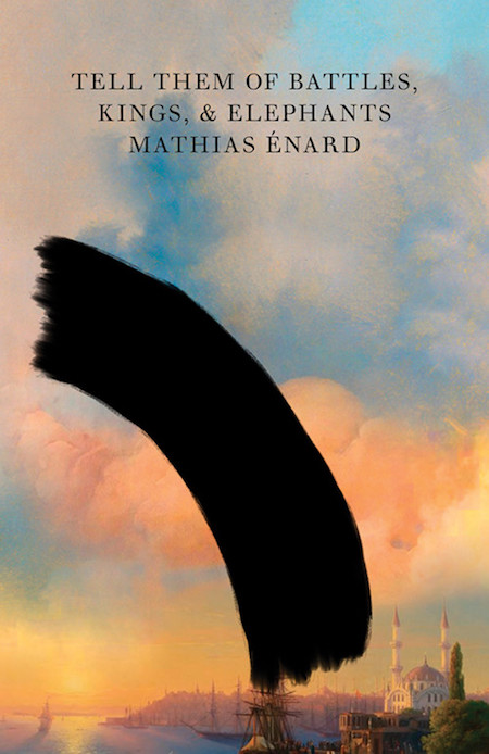 Mathias Énard, Tell Them of Battles, Kings, and Elephants, tr. Charlotte Mandell, New Directions; design by Peter Mendelsund. (November 27, 2018)
I love this: a beautiful pastel landscape partially obscured by an errant black brushstroke—in anger, perhaps? Above all else, it makes me want to read this book, which as I’ve said before in this space, is the primary indicator of a good book cover.
 Oyinkan Braithwaite, My Sister, the Serial Killer, Doubleday; design by Michael J. Windsor. (November 20, 2018)
This book cover is a precise reflection of how much fun this book is—and like the above, it made me want to read the book from across the room, and now I feel grateful to it (and the designer).
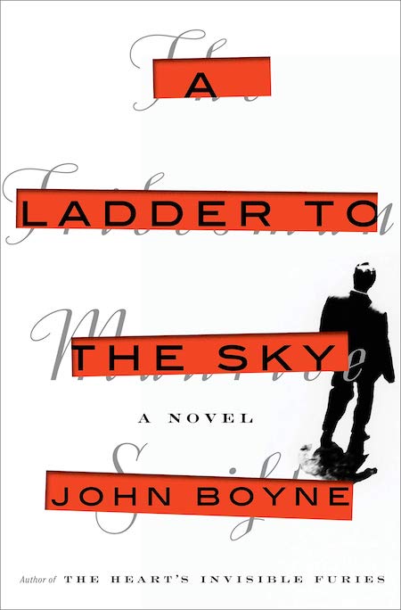 John Boyne, A Ladder to the Sky, Hogarth Press; design by Christopher Brand. (November 13, 2018)
It isn’t as flashy as some of the other covers on this list—but if you look carefully, you’ll see that book’s cover has been ostensibly obscured with that of the character—the determined, dastardly aspiring novelist Maurice Swift—which was then, it seems, defaced to show the true title and author. Inspired.
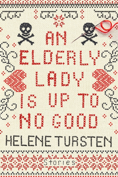 Helene Tursten, An Elderly Lady is Up to No Good, tr. Marlaine Delargy, Soho Crime; design by Janine Agro. (November 6, 2018)
Well, isn’t that just adorable? Especially because of the fact that, while you can’t tell from the image above, this book is also tiny—the perfect size for stowing in your handbag with your hard candies and spare garrote wire.
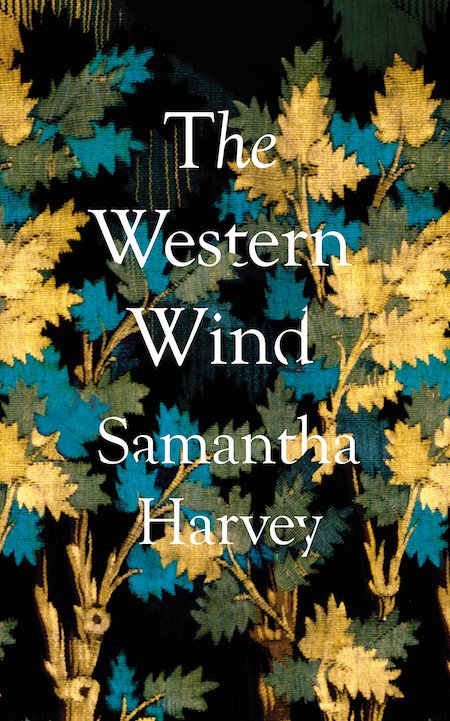 Samantha Harvey, The Western Wind, Grove Press; design by Suzanne Dean (November 13, 2018)
Again, I love the way the text and image subtly interact here, and the luminous, washed quality of the image—it almost looks like printed velvet.
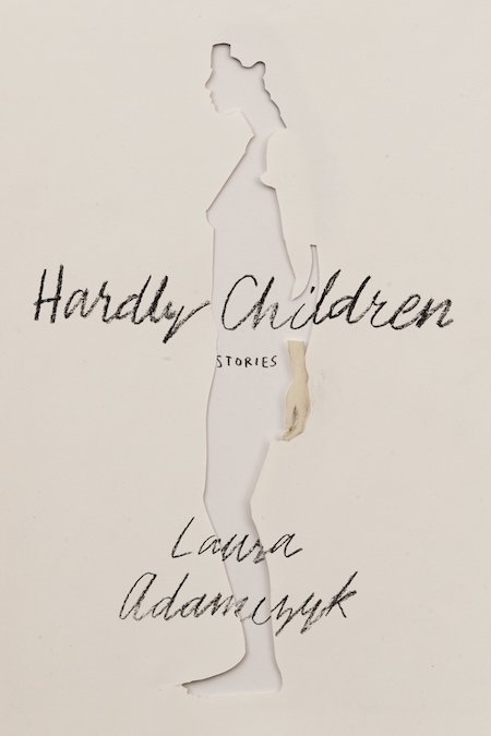 Laura Adamczyk, Hardly Children, FSG Originals; design by Jen Heuer. (November 20, 2018)
I’ve seen cut-out covers before, but I’ve never seen one quite like this: the one forgotten hand, the script over the wound. It’s evocative and great.
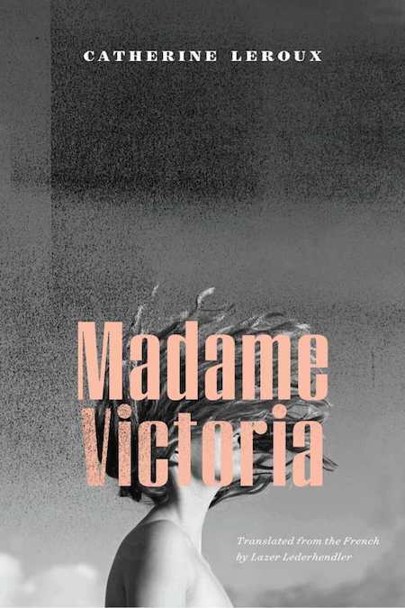 Catherine Leroux, Madame Victoria, tr. Lazer Lederhendler, Biblioasis; design by Natalie Olsen. (November 13, 2018)
I’m always here for book covers that look like French New Wave movie posters.
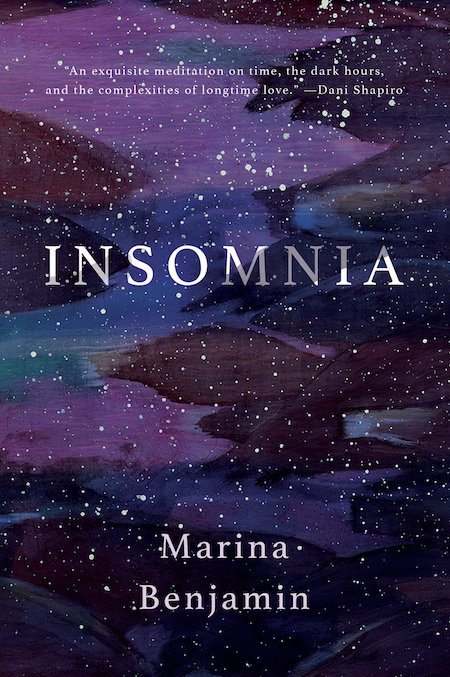 Marina Benjamin, Insomnia, Catapult; design by Nicole Caputo. (November 13, 2018)
It looks beautiful on the screen, I know, but in person, it sparkles.
 Hideo Yokoyama, Seventeen, tr. Louise Heal Kawai, FSG; design by Alex Merto. (November 13, 2018)
This cover manages to be psychedelic and subtle at the same time, but what I really like is the unusual, stamp-like text treatment—and the fact that you don’t even see the hiker at first glance. It’s almost like an optical illusion.
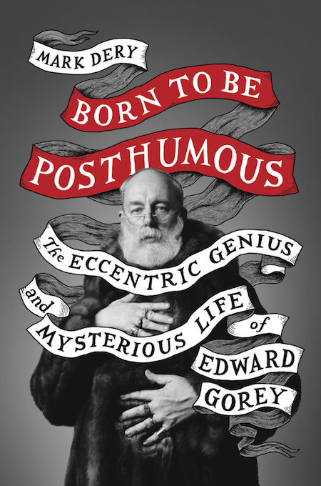 Mark Dery, Born to Be Posthumous: The Eccentric Life and Mysterious Genius of Edward Gorey, Little, Brown; design by Jim Tierney. (November 6, 2018)
Ah well, show me a cover full of Edward Gorey’s charming self and I’m always going to like it—but the ribbon is dead-on too.
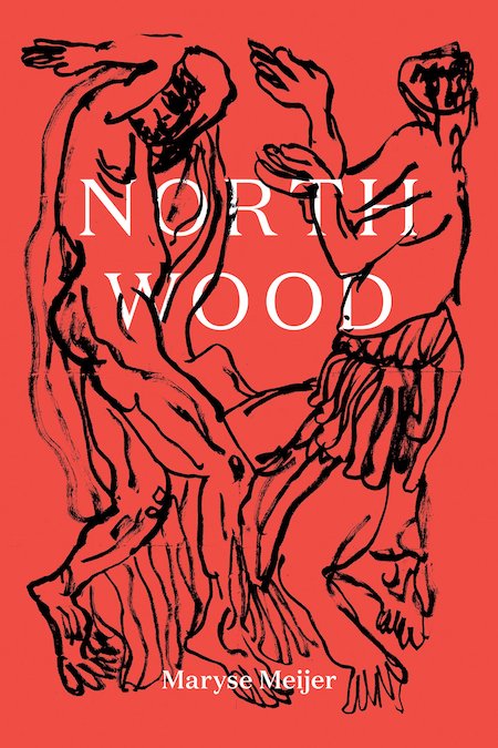 Maryse Meijer, Northwood, Black Balloon Publishing; design by Jonathan Yamakami, illustrations by Rufus Newell. (November 6, 2018)
Elegant and extravagant at the same time, and a very good shade of red.
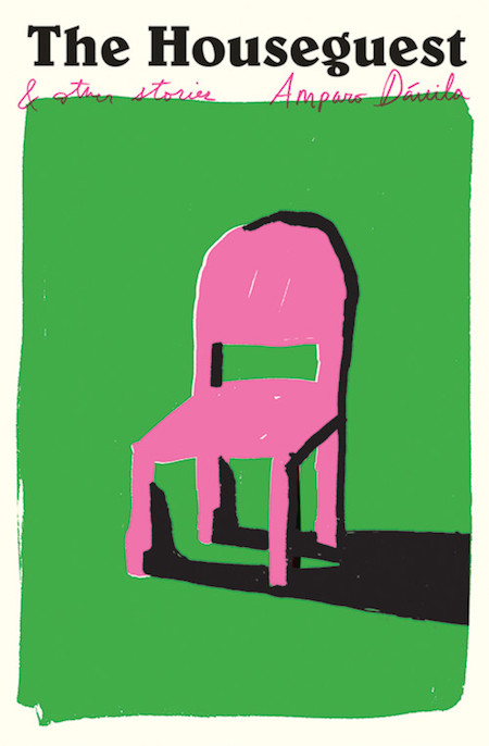 Amparo Dávila, The Houseguest, tr. Audrey Harris and Matthew Gleeson, New Directions; design by Oliver Munday. (November 27, 2018)
Here’s another one I’d happily hang on my wall: the garish colors with the simple design are pure perfection.
Emily Temple
Emily Temple is the managing editor at Lit Hub. Her first novel, The Lightness, was published by William Morrow/HarperCollins in June 2020. You can buy it here.