The 139 Best Book Covers of 2023
We Asked 47 Designers for Their Favorites
For what is now the eighth time in a row, I am pleased to present the best book covers of the year—as chosen by some of the industry’s best book cover designers.
This year, I asked 47 designers to share their favorite covers of the year, and they came back with a grand total of 139 covers (!), representing work by 85 different designers for 74 different imprints at home and abroad. The designers’ choices, and their comments, are below.
But first . . . the stats.
The stats:
The best of the best book covers:
First place (12 mentions):
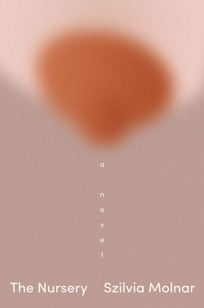
Szilvia Molnar, The Nursery
design by Linda Huang (Pantheon, March 21)
*
Second place (8 mentions):
Olga Ravn, The Employees
design by Paul Sahre (New Directions, February 7)
*
Third place (tie—6 mentions each):
Greg Jackson, The Dimensions of a Cave
Design by Jamie Keenan (Granta Books, October 26)
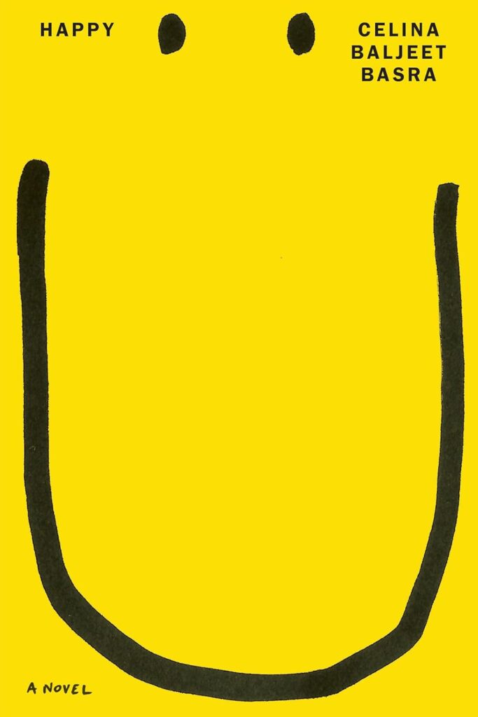
Celina Baljeet Basra, Happy
Design by Alex Merto (Astra House, November 14)
*
The presses with the most covers on the list:
First place:
FSG (19 covers)
*
Second place:
New Directions (11 covers)
*
Third place:
Pantheon (7 covers)
*
The designers with the most different covers on the list:
First place:
Na Kim (7 covers)
*
Second place:
Alex Merto (6 covers)
*
Third place (3-way tie)
Jamie Keenan, June Park, Jaya Miceli (5 covers each)
*
The best month for book covers:
First place:
August (20 covers)
*
Second place:
September (19 covers)
*
Third place:
October (18 covers)
*
The full list:
 Szilvia Molnar, The Nursery (Pantheon, March 21)
Design by Linda Huang
Such wonderful simplicity, but also cleverly articulating a newborn’s not fully developed vision and the new mother’s struggle with her dissolving identity. Love the placement of ‘A Novel’.
Everything about this cover is so elegant and minimal. Using “a novel” as part of the illustration is such a clever way to keep from adding more elements to it.
I gasped when I first saw this cover. Such a genius idea that speaks perfectly to the title while also avoiding cliches. The blurring is perfection.
Yes.
Perfectly captures the bleariness of new motherhood. Best design use of “A Novel” I’ve seen in a long time.
Tender, brilliant, beautiful. I almost can’t believe that Linda was able to get this approved, but I’m so glad she did.
Although this cover is blurred we know exactly what we’re looking at. Playful and surprising, yet elegant.
It’s placement of “a novel” for me. Genius!
What a smart and sophisticated solution, it’s really beautiful.
It’s perfect. The perfect choice of color, type, and image. Linda managed to find a refreshing way to evoke the tenderness, pain, and love of motherhood.
Such a bold, simple and evocative visualization of postpartum depression. Love the way “a novel” is set here and becomes part of the narrative.
 Olga Ravn, The Employees (New Directions, February 7)
Design by Paul Sahre
YESSS!
No water cooler talk in this office. The dripping “s” in the title is a smart way to echo the overflow above.
Sinister stock image and haunted office noticeboard type, this cover looks like nothing else. Also the back cover is a work of art in itself.
This is my favorite book cover of 2023. The image is left to sing and the simple, off-kilter type works perfectly in concert.
This seems like a depiction of an intrusive thought a bored office worker would have while at the water cooler. The falling ’s’ adds to the overall despondent mood.
The cover is beautiful, but the back cover is even better.
For me, the most striking cover of the year, hands-down. The back cover is just as good, too.
 Celina Baljeet Basra, Happy (Astra House, November 14)
Design by Alex Merto
Joyful, smart, eye-catching—instantly iconic.
Amusing, witty, and incredibly clever—a funhouse distortion of the stereotypical happy face. Turning the book over is an added treat—you’re greeted with an inverted version of the cover, with that elongated smile turned wistfully upside down.
This makes me feel happy.
Always a sucker for a bold smiley (and frowny!) face cover.
Just makes you smile. The use of the space is the key to this. Looks so nice on the shelf too.
![Greg Jackson, <em><a href="https://bookshop.org/a/132/9780374298494" rel="noopener" target="_blank">The Dimensions of a Cave</a></em> (Granta Books [UK], October 26) <br />Design by Jamie Keenan](https://s26162.pcdn.co/wp-content/uploads/2023/12/81rknU9kZL._SL1500_-663x1024.jpg) Greg Jackson, The Dimensions of a Cave (Granta Books [UK], October 26)
Greg Jackson, The Dimensions of a Cave (Granta Books [UK], October 26) Design by Jamie Keenan
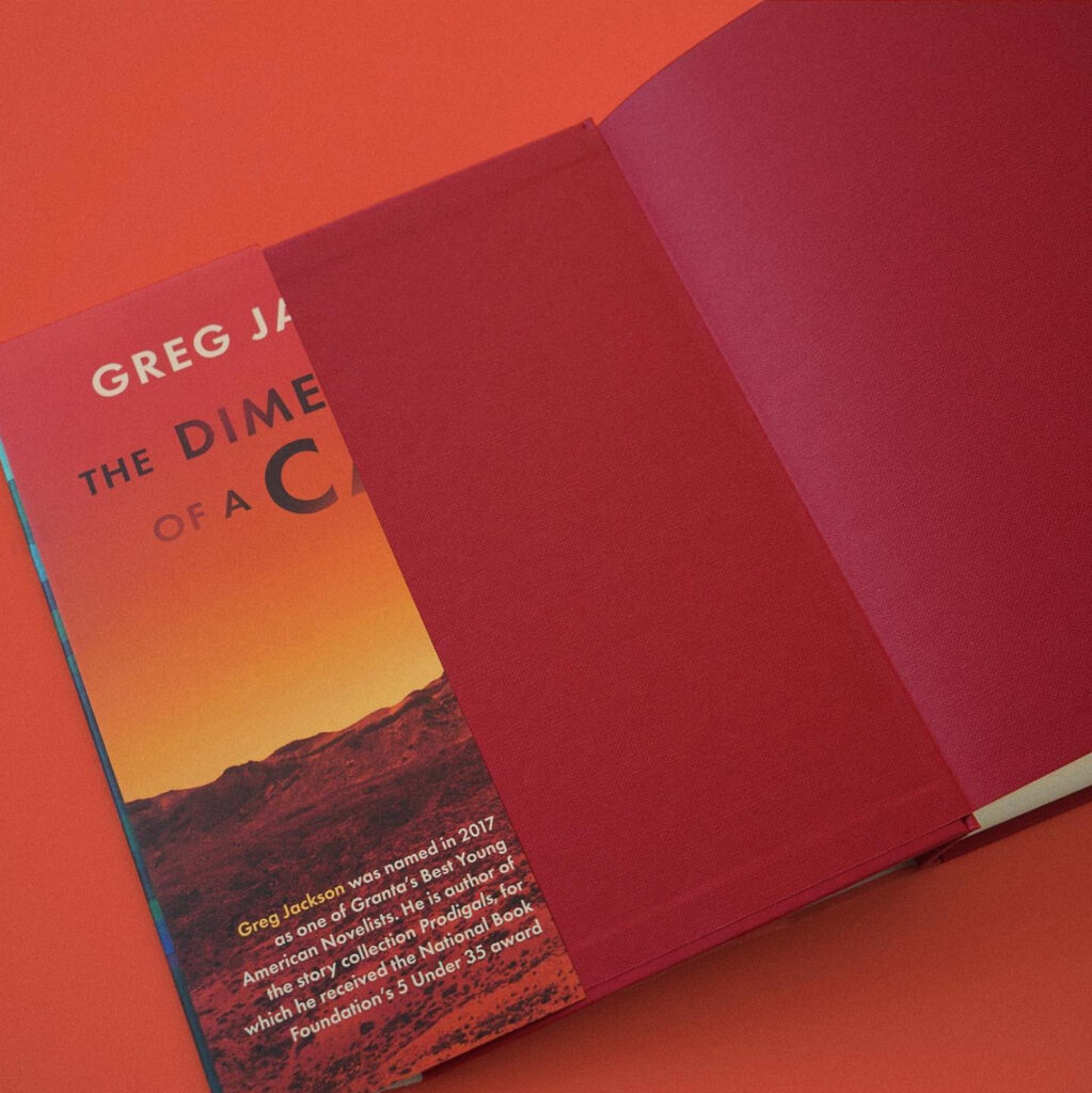 See also: the front flap!
The back flap as front cover is a perfect backwards way to start this journey.
A truly weird cover, and the flaps made me laugh out loud.
This design is so clever and trippy—tricking you into thinking you are looking at the back flap of the book. What’s really great is that the entire jacket follows through with the concept.
I love the back flap image on the front cover. So clever!
The U.S. design is excellent as well, but a particular nod of respect to the U.K. design, a mind-bender of a jacket.
Brilliant idea, brilliantly executed. So good it’s almost unsettling.
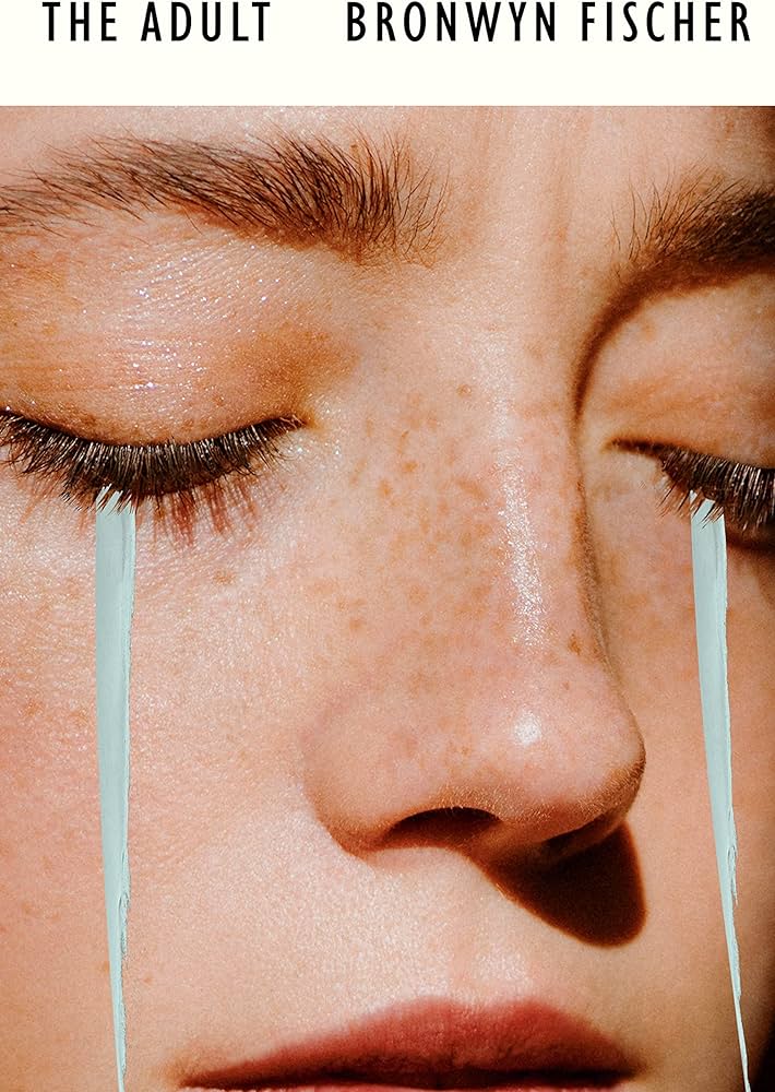 Bronwyn Fischer, The Adult (Random House Canada, May 23)
Design by Kate Sinclair
Gorgeous execution!
???
The juxtaposition of the cool, linear paint “tears” with the hyperreal portrait is enough to make ME cry. Achingly gorgeous.
Stunning interpretation of a coming-of-age novel. The super-tight crop and brush strokes work brilliantly.
I love the use of photography and paint here. Just beautiful and emotive.
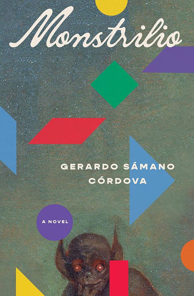 Gerardo Sámano Córdova, Monstrilio (Zando, March 7)
Design by Alex Merto
The liquidy script, creepy monster, and colorful geometric shapes combo create an intriguing and magical world I want to learn more about.
The contrast between the cheery, childlike shapes and the monster lurking down on the bottom edge makes for a compelling cover.
The creature catches you by complete surprise in its unexpected placement beneath all the happy shapes and loopy type. The eeriness of those eyes stayed with me, even after I put the cover down. Unsettling in all the best ways.
I had no idea Alex was behind this cover the whole year I’d admired it. I love everything about it; the choice of fonts, the colorful shapes, the crouching monster… everything seems to be in perfect harmony, but the tension is palpable. I want a poster!
It’s not easy to make a cover with a red-eyed monster appealing…I guess that is unless you’re Alex Merto.
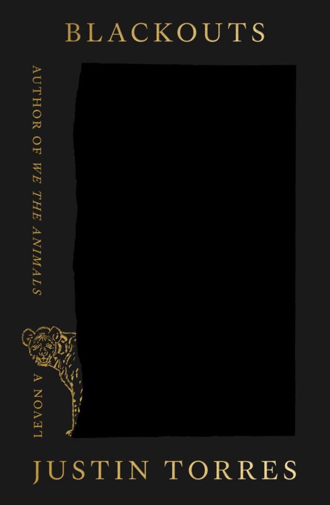 Justin Torres, Blackouts (FSG, October 10)
Design by Na Kim
Hauntingly beautiful. The glossy slab in the center, the glimmer of the gold typography, the creature emerging from the inky blackness—the alchemy of these elements reflect the novel’s theme of a story blotted out and then resurrected.
This cover is a perfect example of how to do a lot with very little. It’s an exercise in minimalism and contrast that manages to feel lush, textural, and mysterious.
Simple but effectively executed black-on-black art. It’s smart and elegant.
“It’s the wild colour scheme that freaks me out,” said Zaphod, whose love affair with the ship had lasted almost three minutes into the flight. “Every time you try and operate these weird black controls that are labeled in black on a black background, a little black light lights up in black to let you know you’ve done it.” -The Restaurant at the End of the Universe
I already thought it was perfect, and then I saw ‘a novel’. Brilliant.
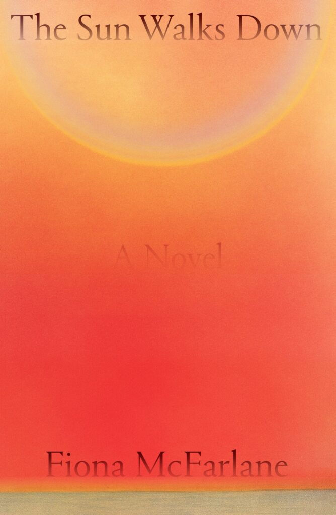 Fiona McFarlane, The Sun Walks Down (FSG, February 14)
Design by Na Kim
This cover feels simultaneously bold and delicate. I can’t get over the “A Novel” disappearing into the haze. Another one that made me gasp on first sight.
I love how beautifully simple yet atmospheric this book cover is, It’s mesmerising, like staring into the literal sun!
Moody! I love looking at this.
When it comes to effectively utilizing negative space, Na Kim dominates—and this cover is no exception. It’s like a colorful abstract painting that evokes pure emotion.
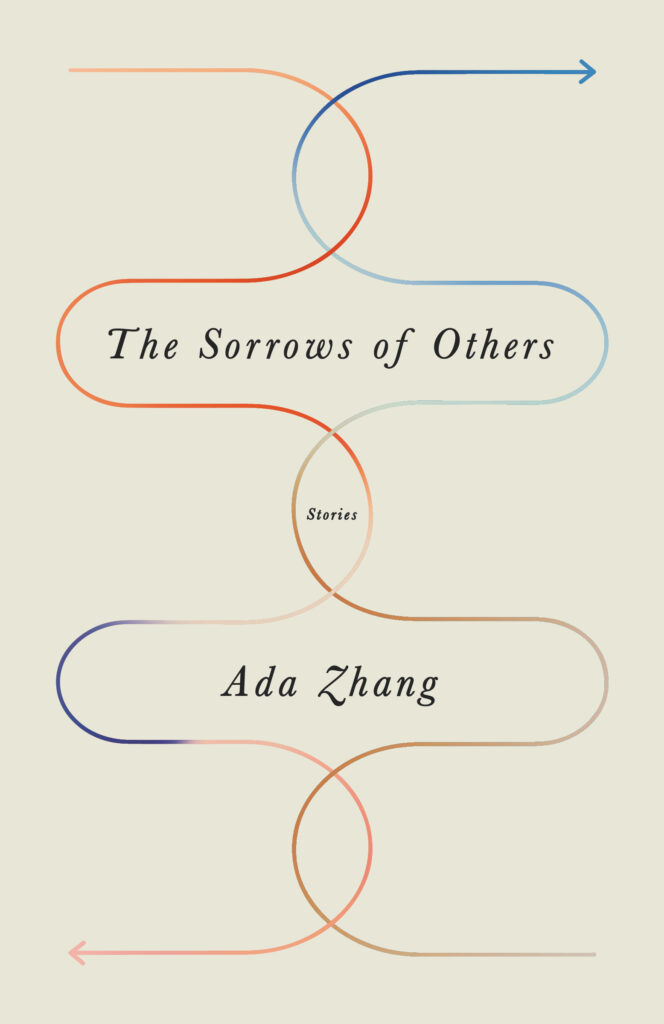 Ada Zhang, The Sorrows of Others (Public Space Books, May 9)
Design by Janet Hansen
In a world of big shouty titles, this cover really stands out. So elegant and understated.
Simple, quiet and beautiful. I love the gradating colors.
The delicately intertwined arrows work as a perfect visual metaphor for these stories—evoking the journeys undertaken by the characters across continents, generations, and deep within their own emotional landscapes. A quiet gem.
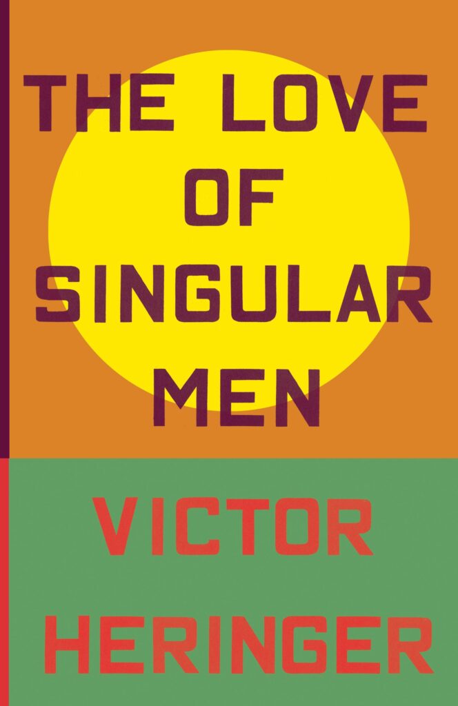 Victor Heringer, The Love of Singular Men (New Directions, September 5)
Design by Pablo Delcan
Eye-catching perfection. I can’t stop staring at the sun. The red type on top of the green creates just the right amount of vibration.
Simple geometric shapes, beautiful colour and Ed Ruscha type on an uncoated paper. Take my money.
The simplicity and confidence of this cover just work!
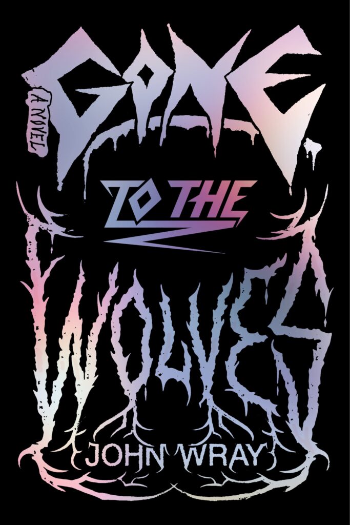 John Wray, Gone to the Wolves (FSG, May 2)
Design by Thomas Colligan
My favorite cover of the year. I’m a huge fan of the metal lettering + foil + pink endpapers.
Exquisitely channeling the heavy-metal-death-cult vibe.
The type! The holographic foil! Just so much fun and visually electrifying.
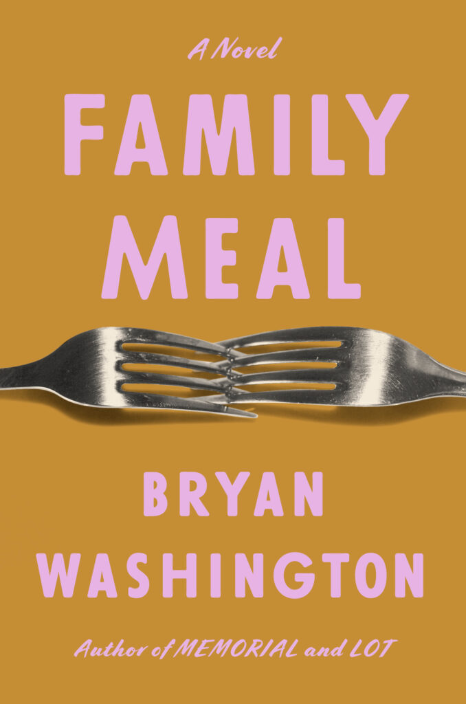 Bryan Washington, Family Meal (Riverhead, October 10)
Design by Grace Han
You can hear these forks scraping! The odd colors add even more tension.
Bryan Washington’s covers have all been so bold and witty, and this most recent one is no exception!
This color combo is so unexpected and strangely appealing. I really love when color can do a lot of the heavy lifting in creating a compelling cover. And this is a great example of color that is not in your face but still eye-catching.
The interlocking forks! This cover feels so fresh.
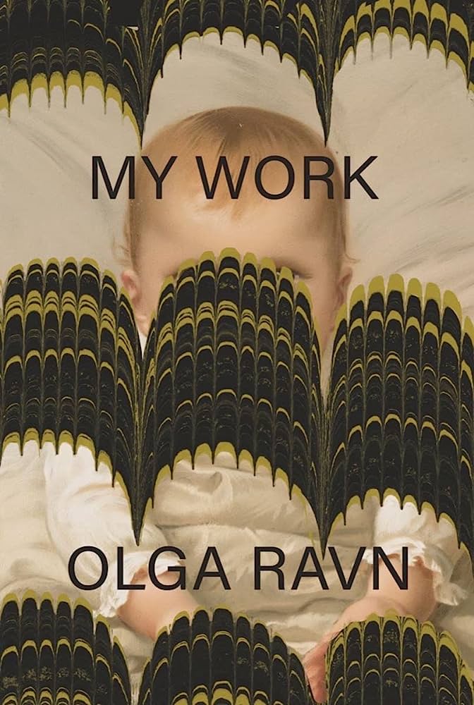 Olga Ravn, tr. Sophia Hersi Smith and Jennifer Russell, My Work (New Directions, October 10)
Design by Joan Wong
I love everything Joan Wong x New Directions. Joan has a beautifully distinctive style, and she continues to do something surprising each and every time. Poster please!
Meltingly good.
Beautiful.
Another bold interruption of a sweet image, this time with a more disturbing feel.
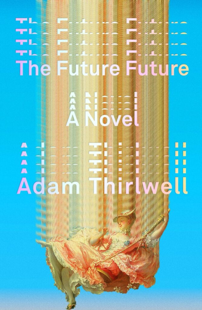 Adam Thirlwell, The Future Future (FSG, October 17)
Design by Alex Merto
A thrilling mash-up of old and modern, brilliantly executed. It’s also hilarious that the lady is plummeting rather violently yet her expression remains unperturbed.
Perfect execution of an exceptional concept. Everything works in concert here to evoke both old and new.
The use of color, texture, and repetition is incredibly engaging. Every choice is so well conceived.
It’s not just the treatment of the artwork, but the way the type echoes it that really makes me love this.
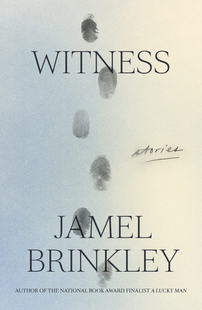 Jamel Brinkley, Witness: Stories (FSG, August 1)
Design by Na Kim
I knew this would be one of my favorites of the year as soon as I saw it. So smart, the kind of simple that is anything but. Really elegant.
Even when you figure out the footprints are thumbprints, your brain still refuses to see it that way. So simple and so brilliant!
This is just beautiful, simple and clean. A lovely idea beautifully executed. The finished book feels nice too.
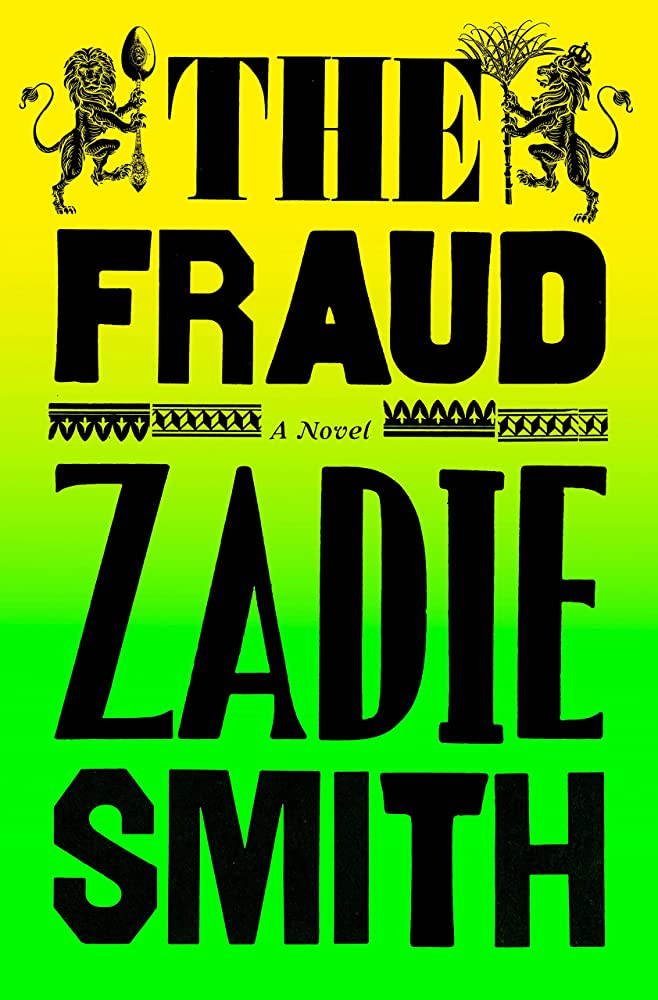 Zadie Smith, The Fraud (Penguin Press, September 5)
Design by Jon Gray
This gradient + type combo kills me. So good.
Jon Gray does it again.
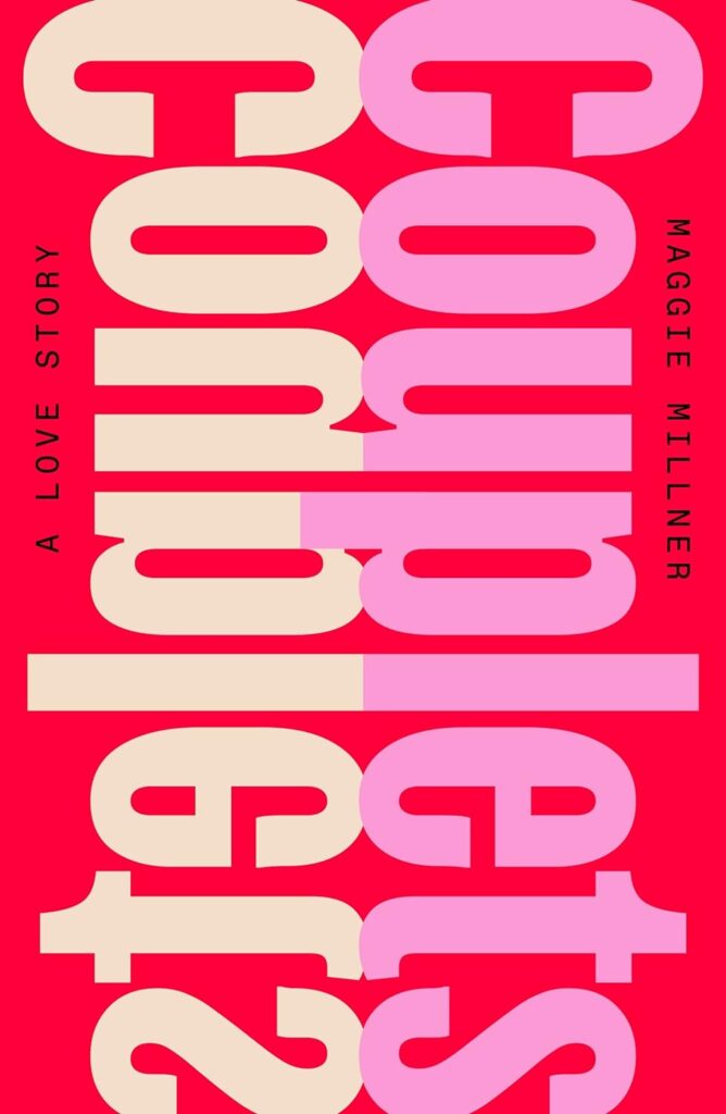 Maggie Millner, Couplets (FSG, February 7)
Design by June Park
I love how mirrored bold type treatment becomes the cover image. Pink and red!
What more can I say? I love clever typographic solutions. I love how the type forms a beautiful abstract shape. I love the red-pink palette. I love the display font.
So simple and so so charming.
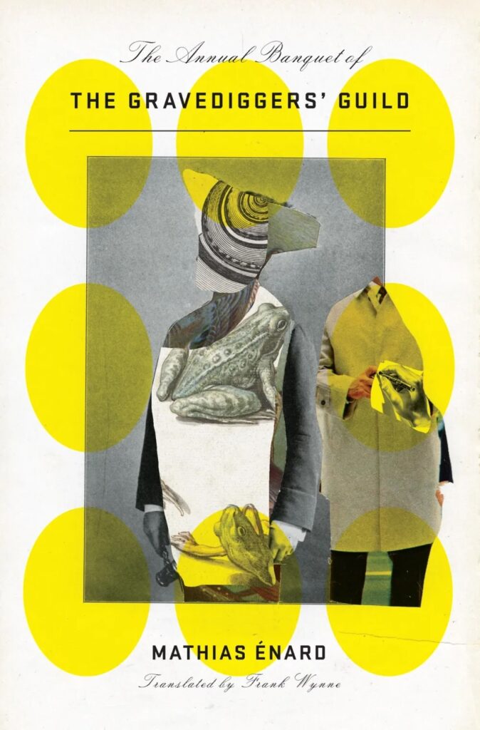 Mathias Énard, tr. Frank Wynne, The Annual Banquet of the Gravediggers’ Guild (New Directions, December 5)
Design by John Gall
I need to blow this up and hang it on my wall.
A collage with a depth and perceived dimensionality not always seen with this art creation technique.
The delicate type juxtaposed with the boldness of the collage, the balance of it all just works for me.
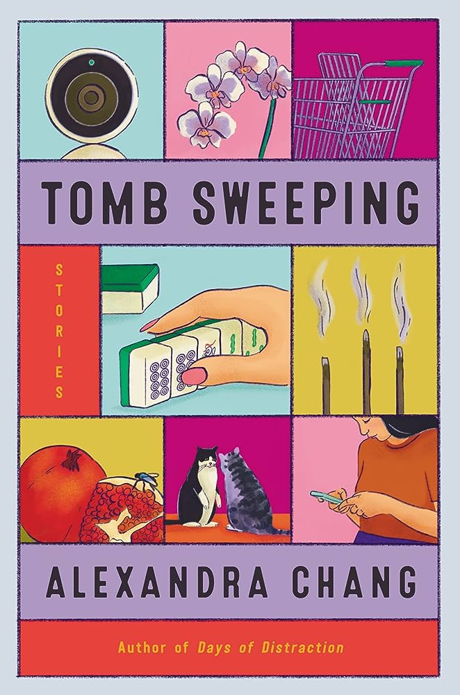 Alexandra Chang, Tomb Sweeping (Ecco, August 8)
Design by Vivian Lopez Rowe
Great use of color, love a grid design especially one with such intriguing and charming illustrations.
This color palette is gorgeous. A lot is going on in this design and yet the whole thing is still soft and moody.
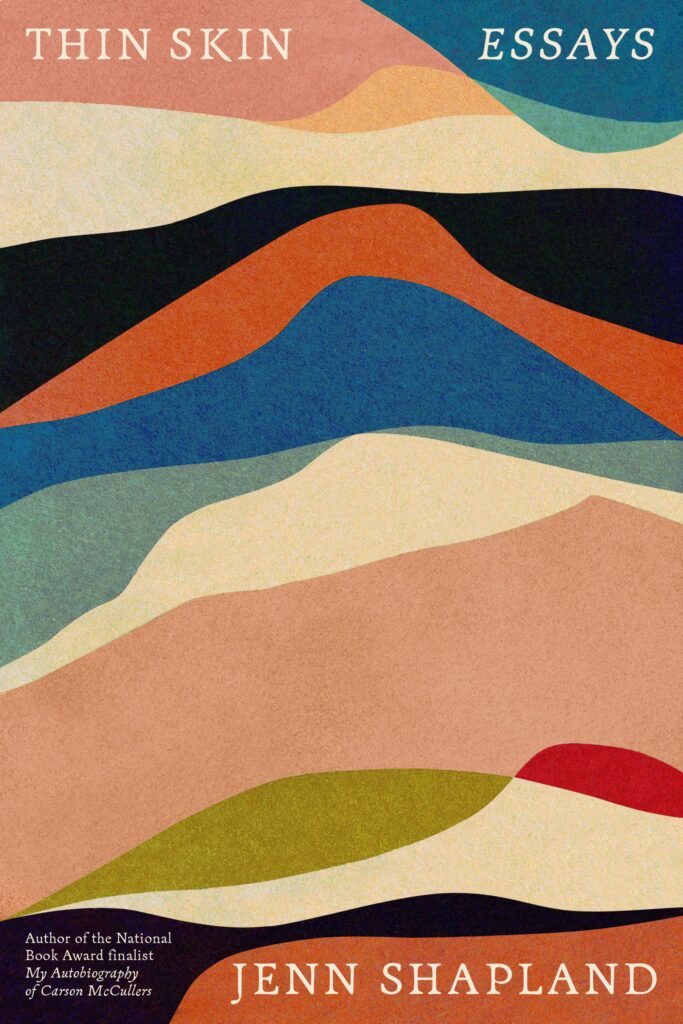 Jenn Shapland, Thin Skin (Pantheon, August 15)
Design by Tom Etherington
A truly gorgeous cover. These soft, ethereal rainbow waves elegantly wrap around to the back of the jacket, organically integrating all of the type in a sophisticated way.
There is a calming feel to this cover. The type is thoughtfully placed, while the undulating shapes move your eyes around the entire space.
I love this by Tom Etherington, so calming and beautiful! It’s a work of art.
Design by June Park
A personal favorite for not only the content of the novel but the brilliant solution of how to place such a long subtitle. I love the bright colors and little stars throughout.
So funky and vibrant, you just want to keep looking at it and get lost in the ribbons.
The spiraling type is SO FUN! The cadence of the ribbon bunching adds dimension and movement; reading the copy was a mini adventure! The sharp drop shadow is an added plus. June is an absolute pro!
 Jean Beagin, Big Swiss (Faber & Faber [UK], February 9)
Design by Kishan RajaniThis cover brings me pure joy. Perfection!
This cover really packs a punch. The crop of the dog’s noses works so well—and that tongue!
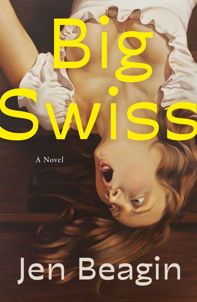 Jen Beagin, Big Swiss (Scribner, February 7)
Design by Jaya Miceli, art by Anna Weyant
Bold image that is victorious in striking so much mystery between title and the ambiguous expression and composition…and gravity!
Bold, sexy—I love it.
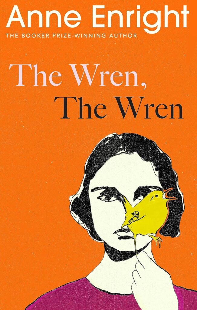 Anne Enright, The Wren, The Wren (Jonathan Cape [UK], August 31)
Design by Suzanne Dean and illustration by Anna MorrisonThis striking cover feels both vintage and contemporary. I love the subtle pink type against the orange. That gaze draws me in completely.
Beautiful colours and such a striking and thoughtful illustration.
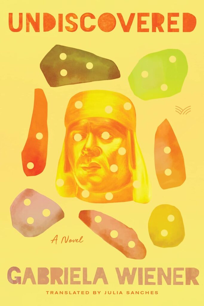 Gabriela Wiener, Undiscovered (HarperVia, September 26)
Design by Kelly Winton
This bright, citrusy palette is so pleasing to look at. That soft green is sublime. The hole punches through the objects add a satisfying layer of mystery.
The shapes around the artifact remind me of rock climbing holds and I love how that implies a solitary and intense struggle with heritage, identity or history. I also like the nostalgic and fading quality of watercolor.
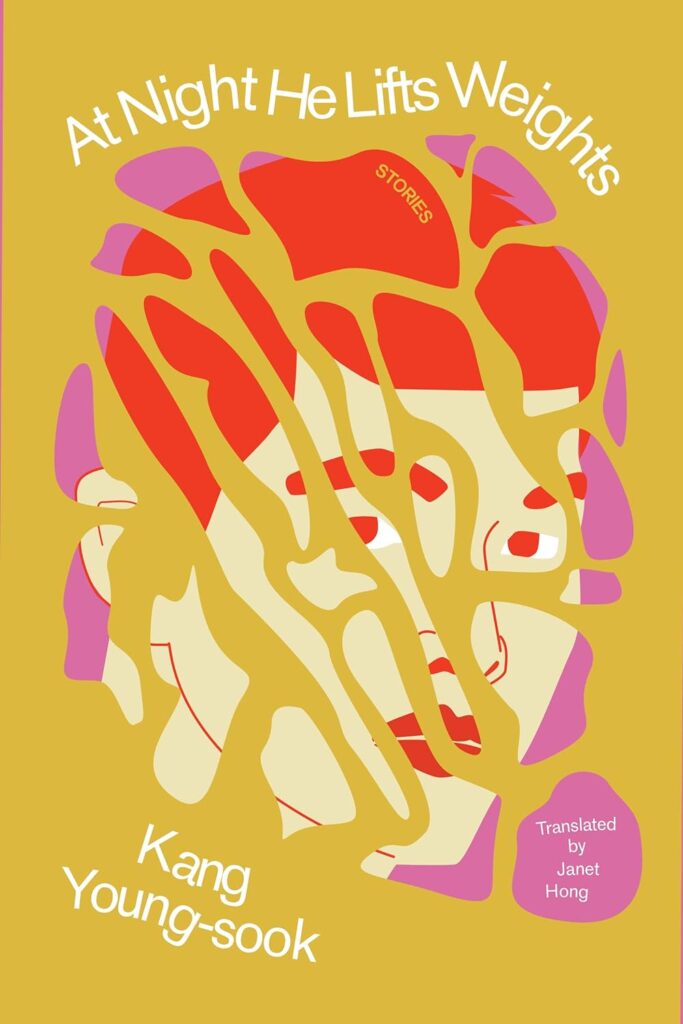 King Young-sook, trans. Janet Hong, At Night He Lifts Weights (Transit Books, November 14)
Design by Justin Carder
I love the energy of this cover. The whimsical type treatment paired with the bubbly illustration, shattered into pieces like a broken plate, is intriguing.
A clever way to depict a character on the cover, without really showing them. The illustration is gorgeous as is the movement of the type.
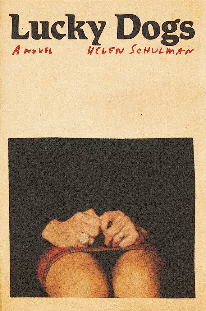 Helen Schulman, Lucky Dogs (Knopf, June 6)
Design by Janet Hansen
Such an evocative photograph and great use of negative space. This cover reminds me of Sofia Coppola (high praise in my book!).
I love how there are so many parts of this cover that are uncomfortable—the empty space, the slightly misshapen square, the fidgeting hands and the handwritten text shoved right up against the title.
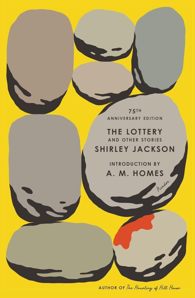 Shirley Jackson, The Lottery and Other Stories (Picador, June 6)
 Design by Alex Merto; illustration by Tim Lahan
I love that the text almost isn’t present (graceful as it is)—the illustration maxes out the visual space and the touch of blood signals the story before you even read the title. Keen and gorgeous.
A redesign of a classic that feels both timeless and yet entirely new. Tim Lahan’s illustration is the perfect nod to the titular story.
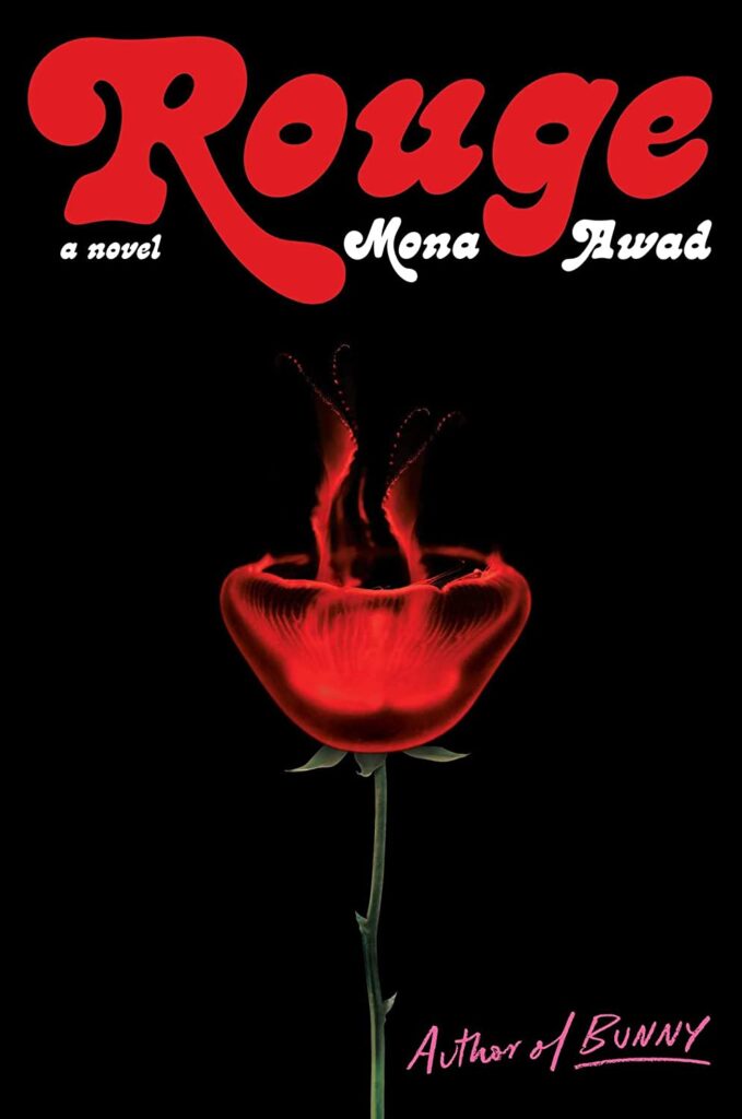 Mona Awad, Rouge (S&S/Marysue Rucci, September 12)
 Design by Oliver Munday
Love the intriguing dream-like head of the rose / jellyfish combination.
The novel itself descends into a frightening yet irresistible world, so fusing a jellyfish with a rose is a stroke of genius. Both are beautiful, yet both can inflict pain—one with its tendrils, the other with its thorns. The lush type treatment furthers the seduction.
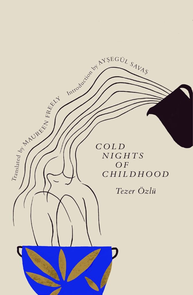 Tezer Özlü, tr. Maureen Freely, Cold Nights of Childhood (Transit Books, May 2)
Design by Sarah Schulte
So original and elegant. I love the flowing placement of the type and how it works with the illustration.
Such a sweet, whimsical illustration with a surprise pop of color in the vessel. Love the unusual composition.
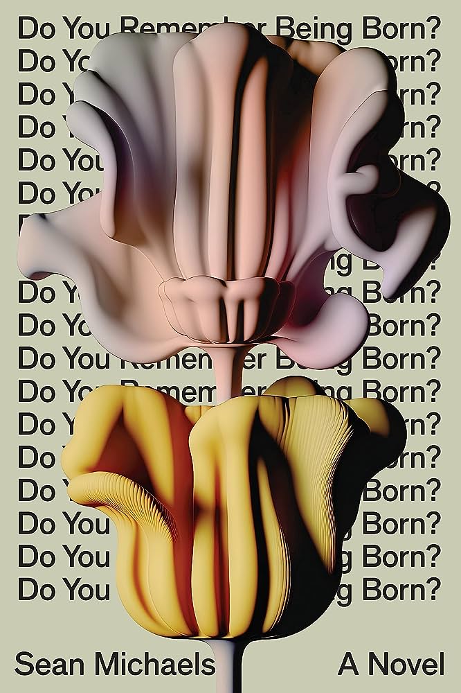 Sean Michaels, Do You Remember Being Born? (Astra House, September 5)
Design by Rodrigo Corral, 3D illustration by Danny Jones
I’ve always been drawn to covers that pose a question to the reader, and this one is quite literally full of them. The insistent repetition of the title question, the unnatural pastel flowers rising to obscure the words from view—gorgeous and unnerving.
A brilliant and beautiful image that seems indeed to be a perfect marriage of poetry, art and tech and that draws the viewer in enough to inspire a win for design and for the team and author who approved this, as the title is parsed slightly more slower than most covers out there today. Refreshing.
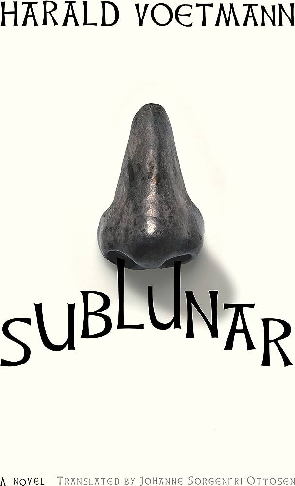 Harald Voetmann, tr. Johanne Sorgenfri Ottosen, Sublunar (New Directions, August 1)
Design by Jamie Keenan
Looks good, smells even better.
The title streaming down from the nostrils is a nice (yet slightly gross) touch—this cover is wacky in the best way.
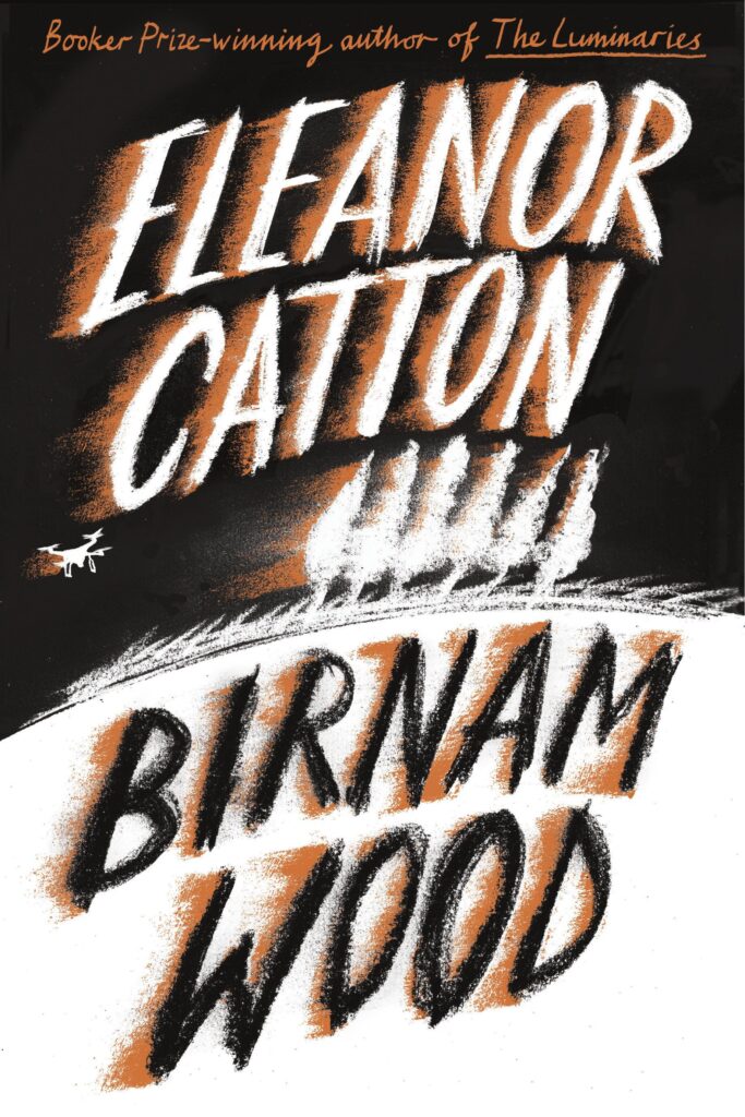 Eleanor Catton, Birnam Wood (FSG, March 7)
Design by Jon Gray
Amazing movement and depth . . . the hand-drawn, edgy quality screams thriller.
This cover has a great sense of movement. It’s easy to imagine the type, trees, and drone on the cusp of being swept away in the wind.
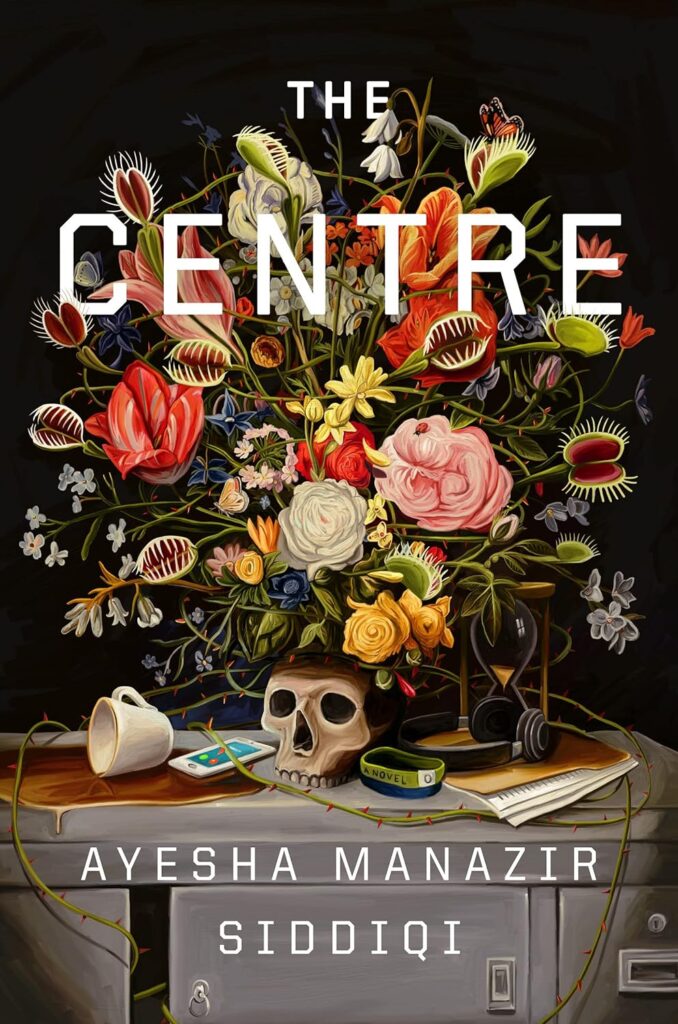 Ayesha Manazir Siddiqi, The Centre (Gillian Flynn Books, July 11)
Design and illustration by Jonathan Bush
The attention to detail in this illustration is astonishing. The entire cover is dangerous and lush.
I love a twisted still life! The venus fly traps, the skull, the spilled coffee—every sinister detail is spot on.
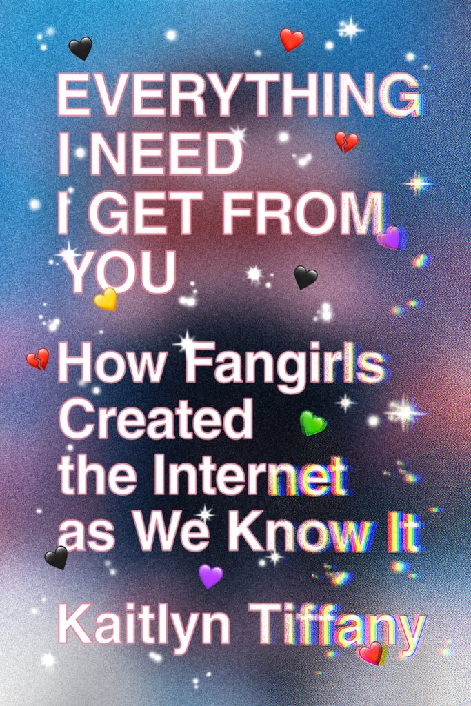 Kaitlyn Tiffany, Everything I Need I Get From You (MCD x FSG Originals, June 14)
Design by Thomas Colligan
It’s just… perfect. I don’t know what else to say. It’s perfect! Makes me want to be a fifteen-year-old girl again.
10/10 perfect execution.
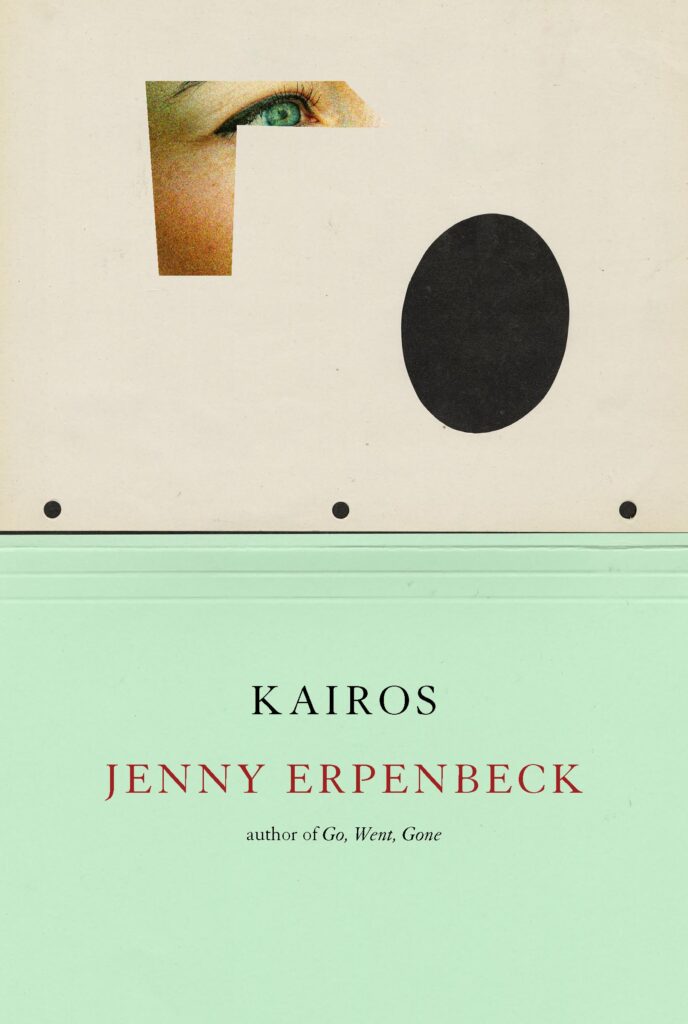 Jenny Erpenbeck, tr. Michael Hofmann, Kairos (New Directions, June 6)
Design by John Gall
This one forces you keep trying to work out what exactly is going on and noticing another new bit.
Beautiful, ominous.
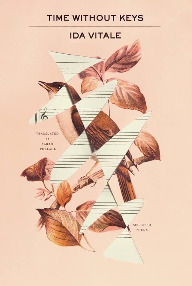 Ida Vitale, tr. Sarah Pollack, Time Without Keys (New Directions, September 4)
Design by Tyler Comrie
So tender and edgy. If Tyler did this in Photoshop, it’s just brilliantly executed.
Sings.
 Robert Plunket, My Search for Warren Harding (New Directions, June 6)
Design by Oliver Munday
Food for thought!
So Monty Python. The way you see just under a half of Harding’s rueful eye peering out at the reader, ?.
![Haruki Murakami, <em><a href="https://bookshop.org/a/132/9780375718946" rel="noopener" target="_blank">A Wild Sheep Chase</a></em> (Vintage Classics [UK], March 8) Design by Suzanne Dean; illustration by Tatsuro Kiuchi](https://s26162.pcdn.co/wp-content/uploads/2023/12/9781784878771-630x1024.jpg) Haruki Murakami, A Wild Sheep Chase (Vintage Classics [UK], March 8)
Haruki Murakami, A Wild Sheep Chase (Vintage Classics [UK], March 8)Design by Suzanne Dean; illustration by Tatsuro Kiuchi
 The full series.
Suzanne Dean’s designs for the reissues of the Murakami series (illustrated by Tatsuro Kiuchi) are so unique, eye catching, and captured the spirit of Murakami’s writing so beautifully.
This design of this series is a celebration of Japanese illustration, reflecting the narrative in a colourful and playful way, and the obi wrap-around is inspired. Any Murakami fan would be ecstatic to receive this series.
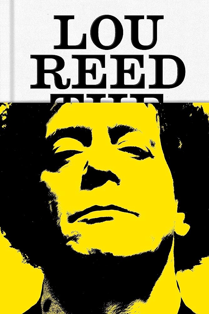 Will Hermes, Lou Reed: The King of New York (FSG, October 3)
Design by No Ideas
My favorite part of this half-jacket, pre-printed case combo is how “Lou Reed” peaks out from behind the jacket, like a crown on top of Lou Reed’s head.
The case for simplicity.
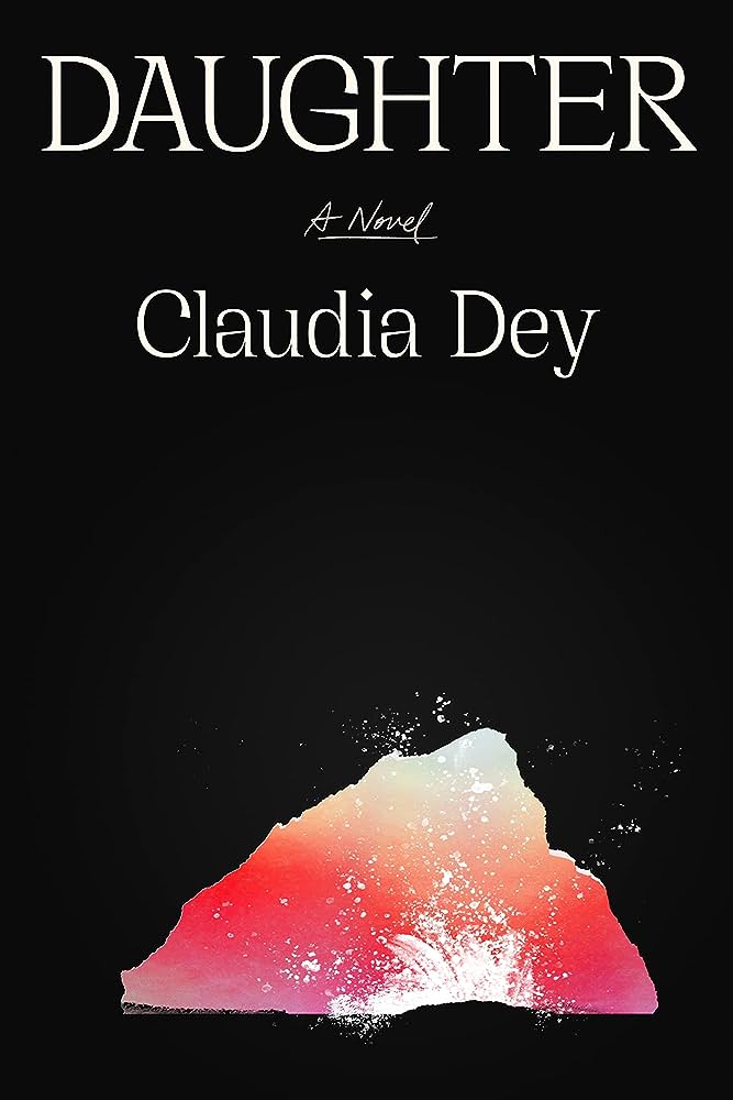 Claudia Dey, Daughter (FSG, September 12)
 Design by June Park
Having this much black and then this loud pop of color is such a bold choice. It feels so much like a movie poster.
The simplicity, contrast, and overall vintage quality of type and design really resonates. It’s one of those simple and effective covers, where you say…why didn’t I think of that??? But I didn’t….June Park did, and it’s stunning!
![Adam Mars-Jones, <em>Caret</em> (Faber & Faber [UK], August 17)<br />Design by Jonathan Pelham](https://s26162.pcdn.co/wp-content/uploads/2023/12/717HTwJ2PkL._AC_UF10001000_QL80_.jpg) Adam Mars-Jones, Caret (Faber & Faber [UK], August 17)
Adam Mars-Jones, Caret (Faber & Faber [UK], August 17)Design by Jonathan Pelham
 The full series.
There’s something about the hierarchy of the type that feels wrong—it took me a moment to distinguish the title from the author, but that’s the type of rule-breaking that makes this so memorable and confident. I didn’t realize that this book was part of a series, which makes it all the more compelling. The sophisticated color combo is also winning.
Not easy to make a typographic series design feel as fresh and as striking as this. There’s retro nod which I love.
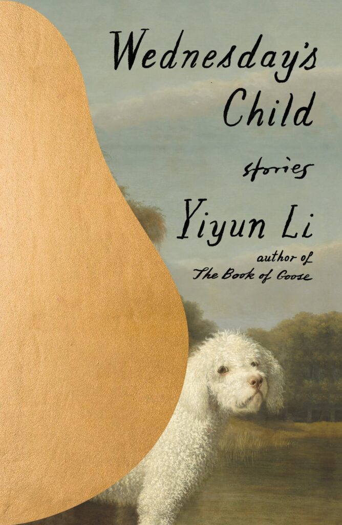 Yiyun Li, Wednesday’s Child (FSG, September 5)
Design by Na Kim
I love Na’s covers for Yiyun Lee. Everything feels so considered.
I love the bold interruption of the pregnant pear shape into that charming dog painting.
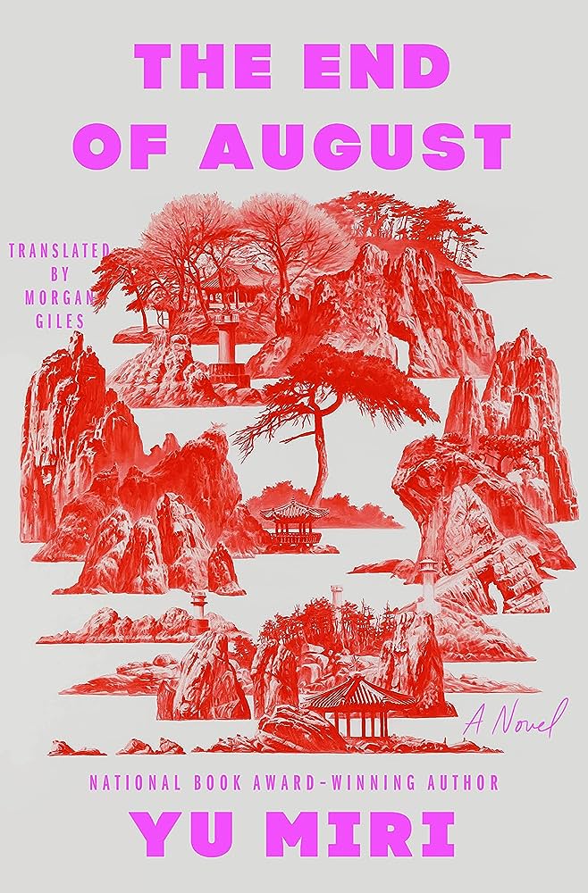 Yu Miri, tr. Morgan Giles, The End of August (Riverhead, August 1)
 Design by Lauren Peters-Collaer; art by Seahyun Lee
I love these colors together. It’s such a contemporary choice and the contrast to the traditional imagery in the painting adds so much depth.
I love that red and pink combo. The combination of traditionalism and modernity is really striking.
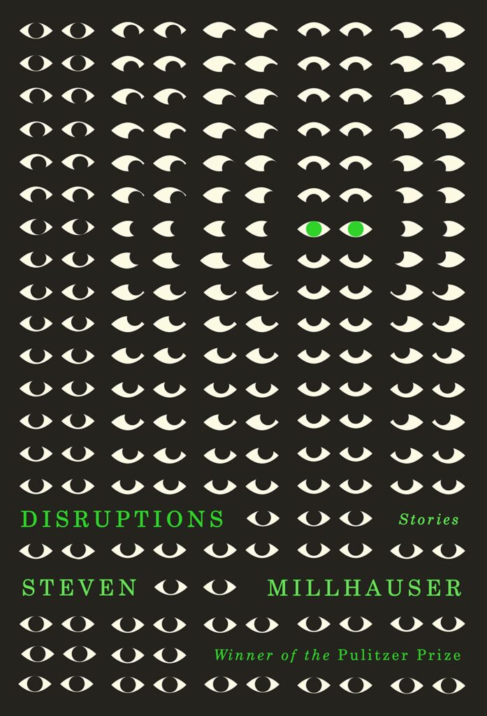 Steven Millhauser, Disruptions (Knopf, August 1)
Design by Janet Hansen; illustration by Dylan C. Lathrop
What’s not to love about this cover? It’s engaging, striking, and uses eyes in a way that’s never been done before (which is no small feat when it comes to book covers).
I mean who couldn’t love all those teeny tiny eyes? She found the perfect piece of art for this!
![Wendy Cope, <em><a href="https://bookshop.org/a/132/9780571389513" rel="noopener" target="_blank">The Orange</a></em> (Faber & Faber [UK], November 9<br />Design by Pete Adlington.](https://s26162.pcdn.co/wp-content/uploads/2023/12/713Ga12SOYL._SL1500_-650x1024.jpg) Wendy Cope, The Orange (Faber & Faber [UK], November 9
Wendy Cope, The Orange (Faber & Faber [UK], November 9
Design by Pete Adlington“At lunchtime I bought a huge orange, the size of it made us all laugh”. The naivety and simplicity of this cover speaks so aptly to the beautiful prose of Wendy’s poem, I love it, I’m glad it exists.
Somehow a perfect blend of nostalgia, wit and design balance. The clashing palette works so well.
![Noreen Masud, <a href="https://bookshop.org/a/132/9781685890247" rel="noopener" target="_blank"><em>A Flat Place</em></a> (Hamish Hamilton [UK], April 27)<br />Design by Josie Stanley Taylor](https://s26162.pcdn.co/wp-content/uploads/2023/12/61WWI0Ki0tL._SL1500_-640x1024.jpg) Noreen Masud, A Flat Place (Hamish Hamilton [UK], April 27)
Noreen Masud, A Flat Place (Hamish Hamilton [UK], April 27)
Design by Josie Stanley Taylor
Again it’s the clever use of space and colour that make this cover so appealing. An unusual colour palette.
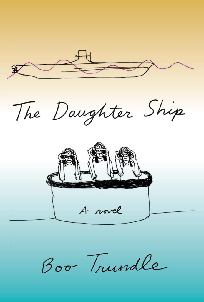 Boo Trundle, The Daughter Ship (Pantheon, June 27)
Design by Jenny Carrow
The illustration and type feel spontaneous and fresh. I’m intrigued by these figures in a hot tub/boat. What are they scoping out?
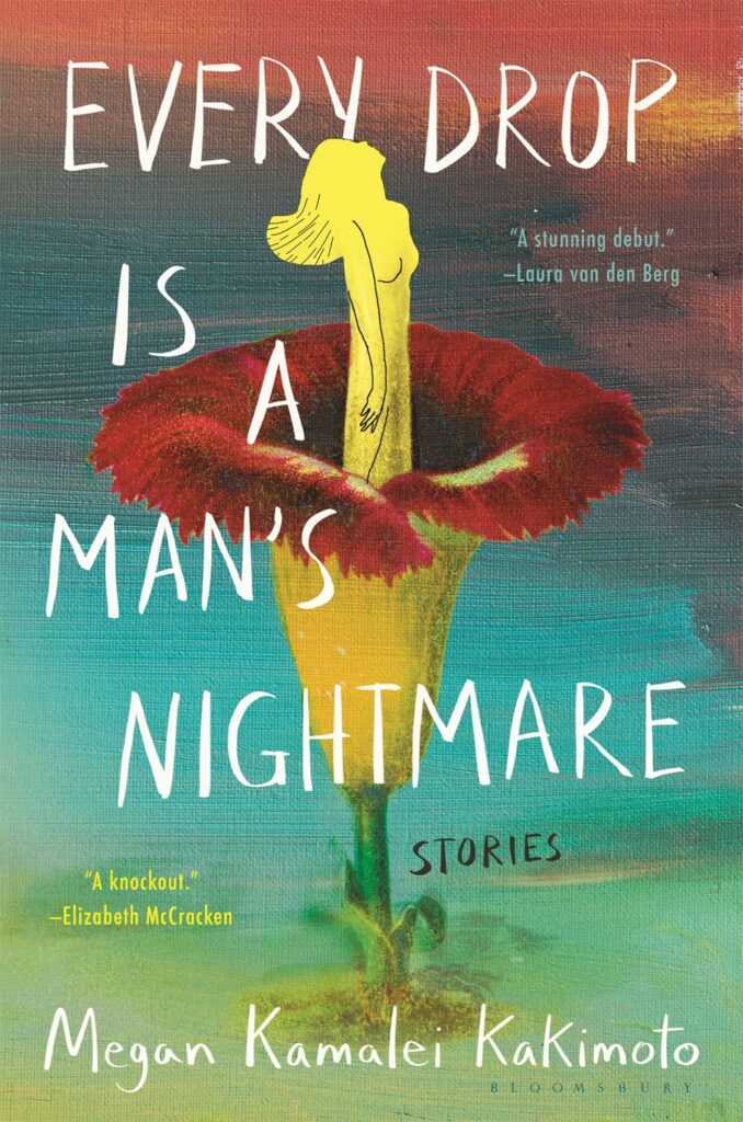 Megan Kamalei, Every Drop is a Man’s Nightmare (Bloomsbury, August 29)
Design by Jaya Miceli
Lush and beautiful. It feels intriguing, raw and emotional. It really draws you in.
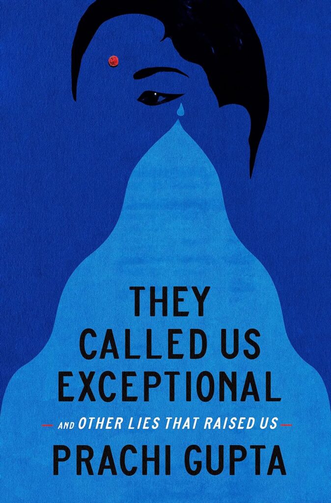 Pratchi Gupta, They Called Us Exceptional (Crown, August 22)
Design by Arsh Raziuddin
This cover speaks to this subject matter so succinctly and emotively—from the perfect placement of the bindi and the sharpness of the Kajal, it speaks to the idea of the ideal Indian woman and wider expectations of the model minority. It’s brilliant.
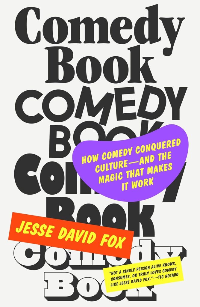 Jesse David Fox, Comedy Book (FSG, November 7)
Design by Thomas Colligan
A charming collection of fonts and shapes.
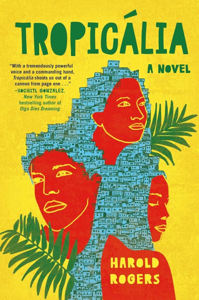 Harold Rogers, Tropicália (Atria, July 18)
Design by Laywan Kwan
The artwork is gorgeous and the color and type work so beautifully together.
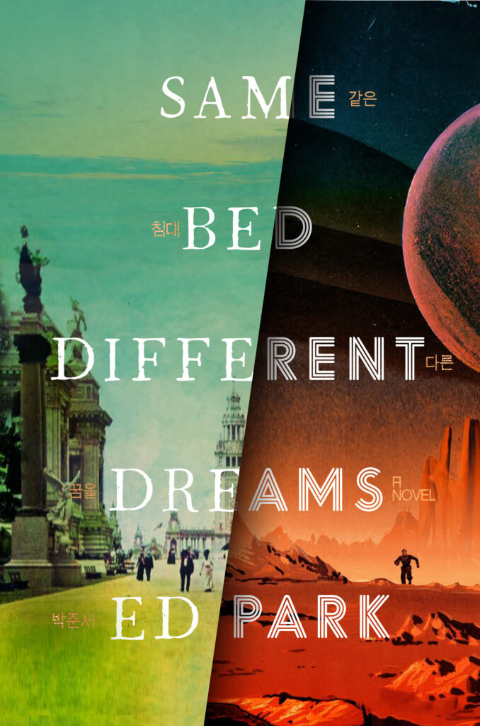 Ed Park, Same Bed Different Dreams (Random House, November 7)
Design by Will Staehle
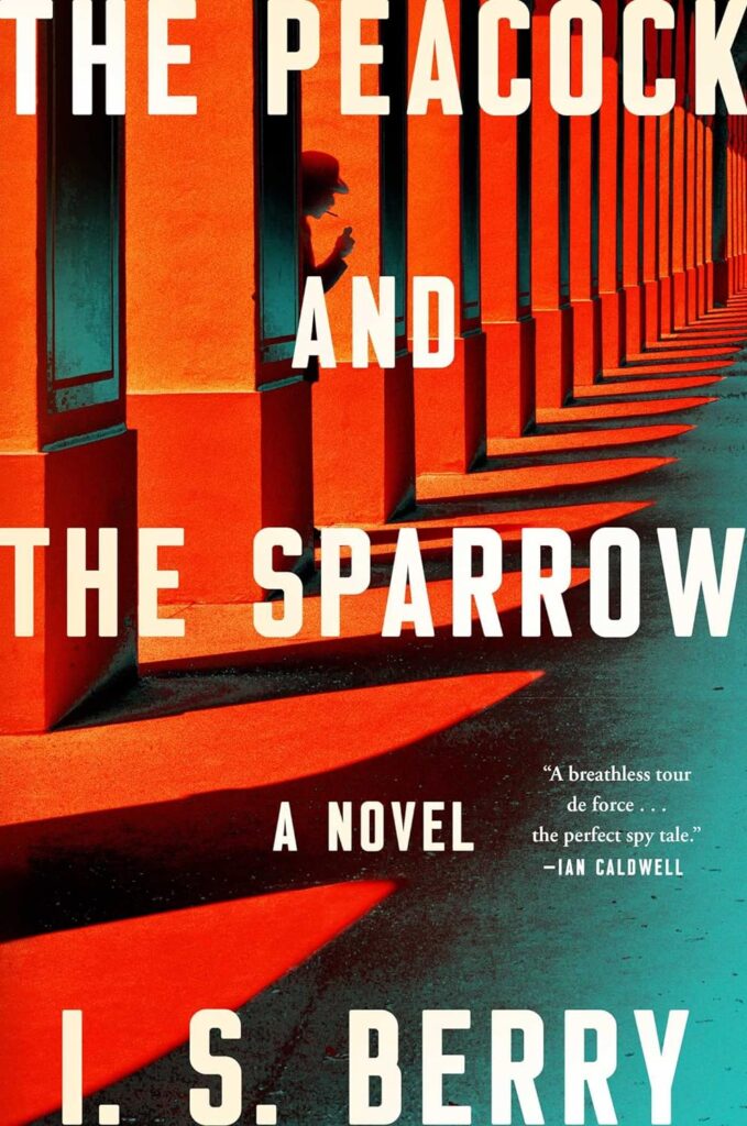 I.S. Barry, The Peacock and the Sparrow (Atria, May 30)
Design by Claire Sullivan
Love me a good spy cover! Type, color, perspective, and figure placement are all spot on.
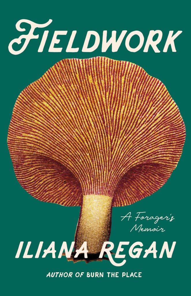 Iliana Regan, Fieldwork: A Forager’s Memoir (Agate, January 24)
Design by Morgan Krehbiel
I just completely lose myself in the gills of this mushroom.
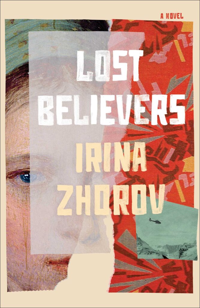 Irina Zhorov, Lost Believers (Scribner, August 1)
Design by Emily Mahon
I love the dimensional collaged overlay with the hand lettered type. Beautifully executed.
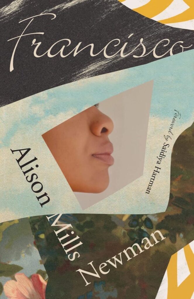 Alison Mills Newman, Francisco (New Directions, March 7)
Design by Joan Wong
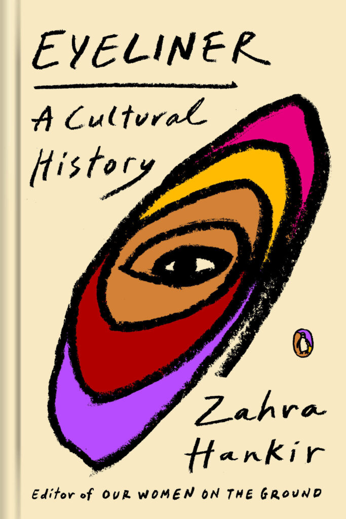 Zahra Hankir, Eyeliner: A Cultural History (Penguin Books, November 14)
Design by Lynn Buckley
This could have easily fallen into a predictable trap, but Lynn took a completely unexpected approach and turned it into a work of art.
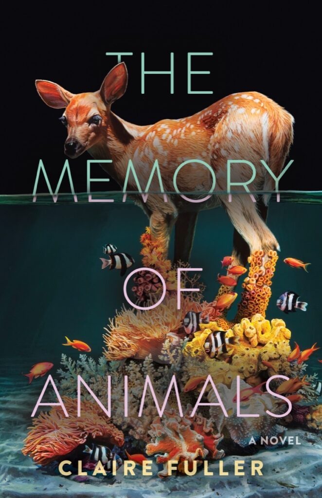 Claire Fuller, The Memory of Animals (Tin House, June 6)
Design by Beth Steidle, art by Lisa Ericson
Absolutely beautiful art by Lisa Ericson and the minimal type with subtle gradient does a great job at toggling between the foreground and background without distracting from the art and its message.
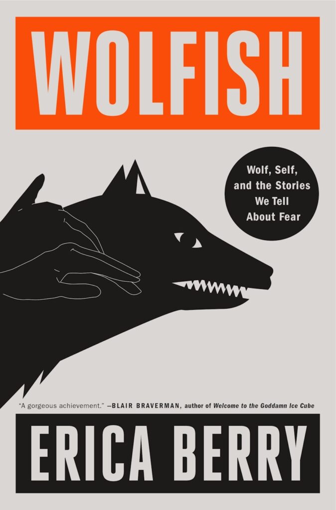 Erica Berry, Wolfish: Wolf, Self, and the Stories We Tell About Fear (Flatiron, February 21)
Design by Keith Hayes; illustration by Rokas Aleliunas
I love how bold, evocative, and graphic this cover is—a real standout in the nonfiction world.
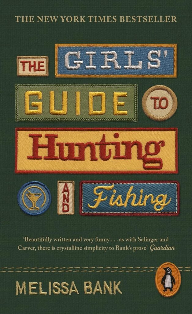 Melissa Bank, The Girls’ Guide to Hunting and Fishing (Viking [UK], May 18)
Design by Annie AtkinsI was super excited to see that Annie Atkins had been commissioned by Saffron Stocker to bring her talents to book covers. Because if you know her work, you know that each of these patches were painstakingly designed and made in real life. Annie’s design process and philosophies are an inspiration in a time of “quick” Photoshop and AI generative art.
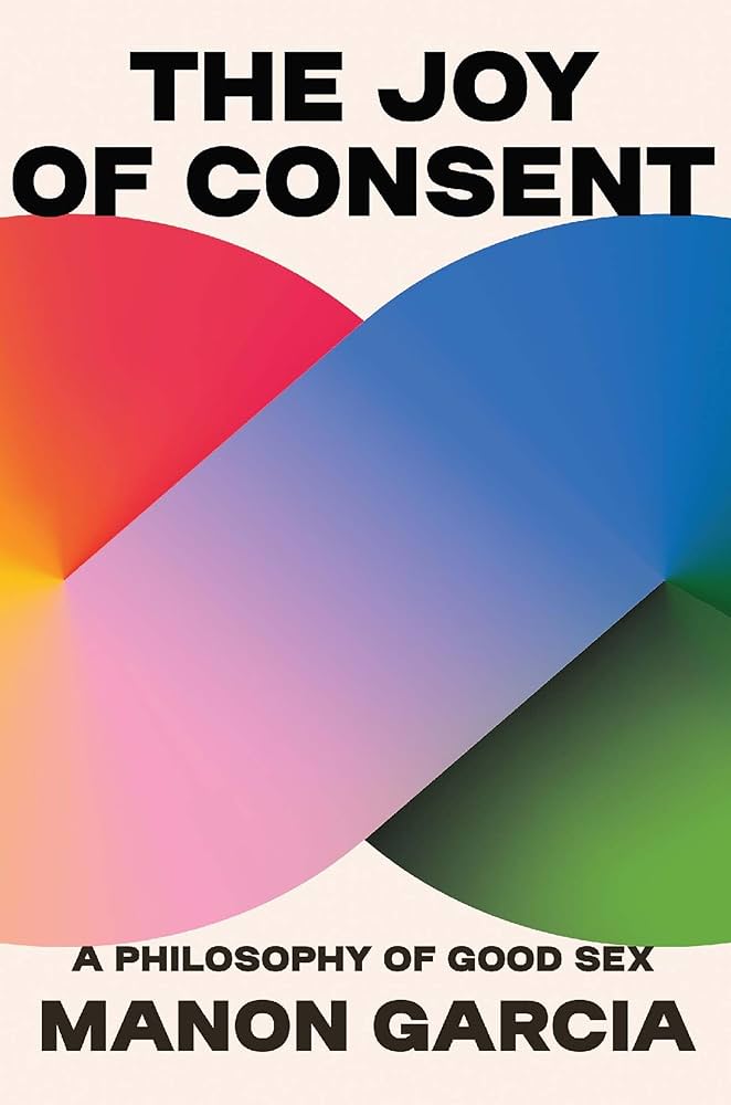 Manon Garcia, The Joy of Consent (Belknap Press, October 3)
Design by Jaya Miceli
Who knew a gradient could be so sexy?! Love how the type just barely touches the shape.
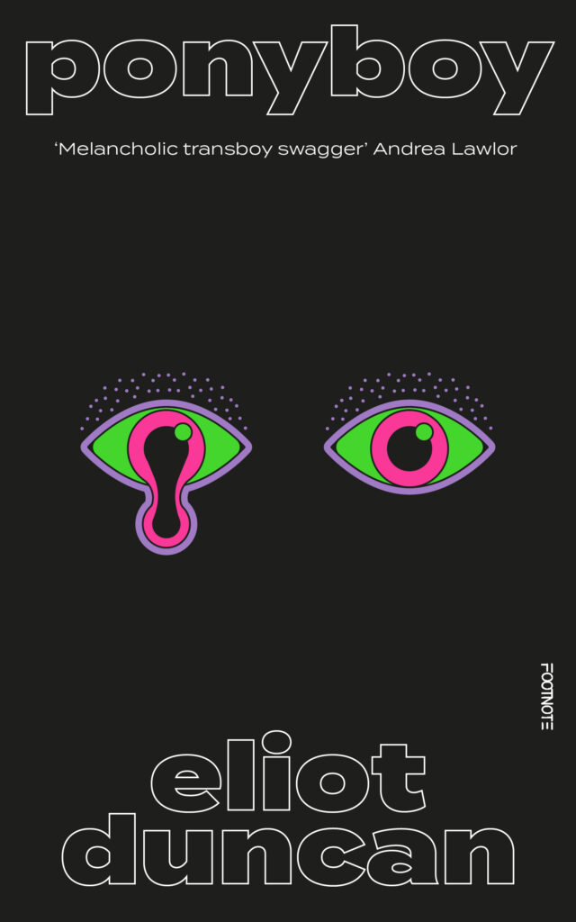 Eliot Duncan, Ponyboy (Footnote Press [UK], June 8)
Design by Luke Bird
It’s possible I am especially vulnerable to the Melty Look.
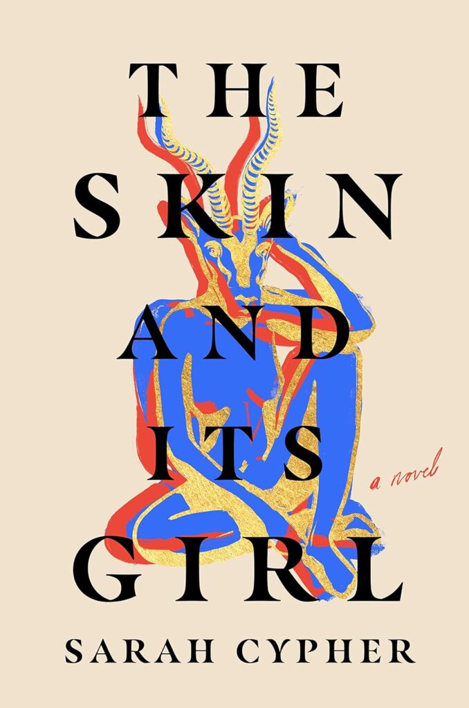 Sarah Cypher, The Skin and Its Girl (Ballantine, April 25)
 Design and illustration by Holly Ovenden
The attitude of this design—the figure itself, yes, but also the scale and interaction with the gorgeous typography—is simply everything.
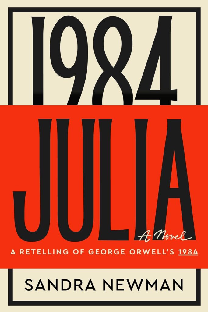 Sandra Newman, Julia (Mariner Books, October 24)
Design by Luke Bird
I love a typographic cover and this one works so well. The way 1984 is almost peering over the title, as a looming presence is so impactful.
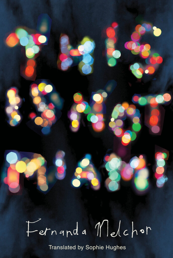 Fernanda Melchor, tr. Sophie Hughes, This is Not Miami (New Directions, April 4)
Design by Jamie Keenan
Jamie is always good at finding new ways of saying things. This captures streets at night and I love the use of colour.
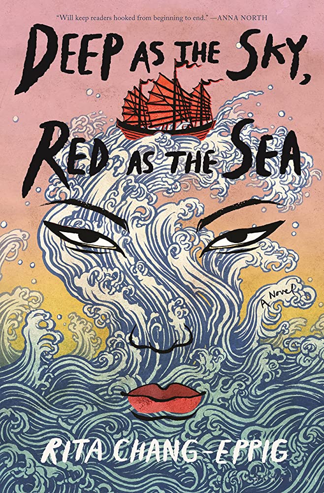 Rita Chang-Eppig, Deep as the Sky, Red as the Sea (Bloomsbury, May 30)
Design by Mia Kwon and Patti Ratchford; illustration by Yuko Shimizu
The illustration is incredible! I love it when there are different levels of information in a design. This works on both a detailed micro level with the waves and the ship, and a macro level with the face.
 Joshua Bennett, Spoken Word (Knopf, March 28)
Design by Tom Etherington
Great texture and craft.
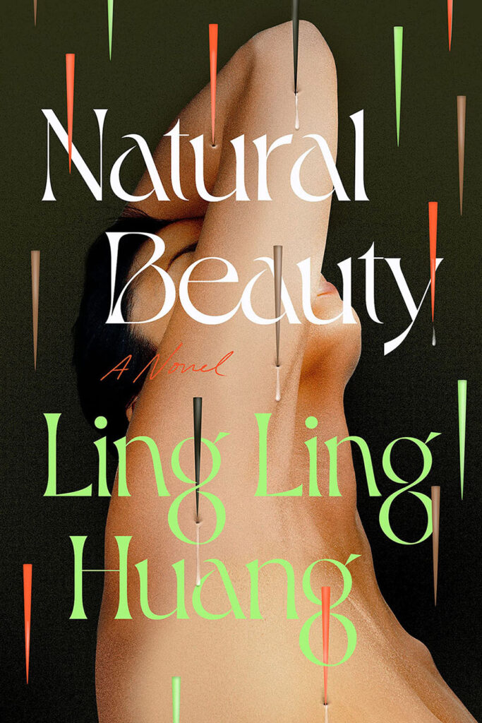 Ling Ling Huang, Natural Beauty (Dutton, April 4)
 Design by Kristin Del Rosario
I think I remember my mouth uncontrollably popping open the first time I saw this one—it’s just so unique. And those pokes!
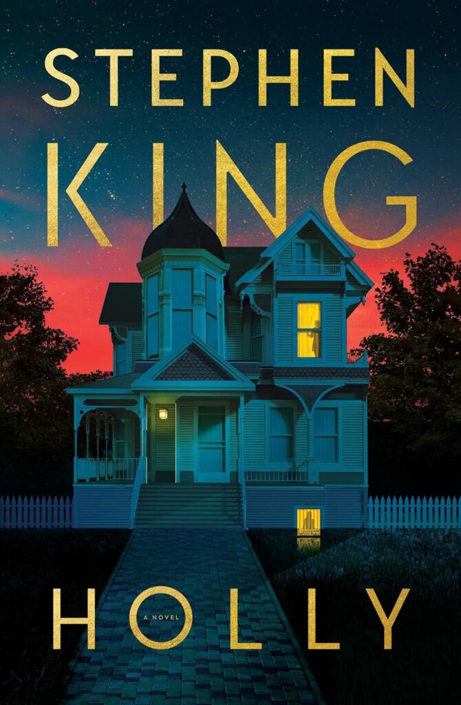 Stephen King, Holly (Scribner, September 5)
Design by Will Staehle
Understated creepiness, with glow in the dark spot gloss. What’s not to love!
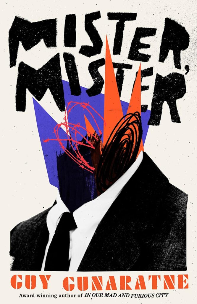 Guy Gunaratne, Mister Mister (Pantheon, October 3)
Design by Jack Smyth
I love the energy and punk rock feel of the type and illustration.
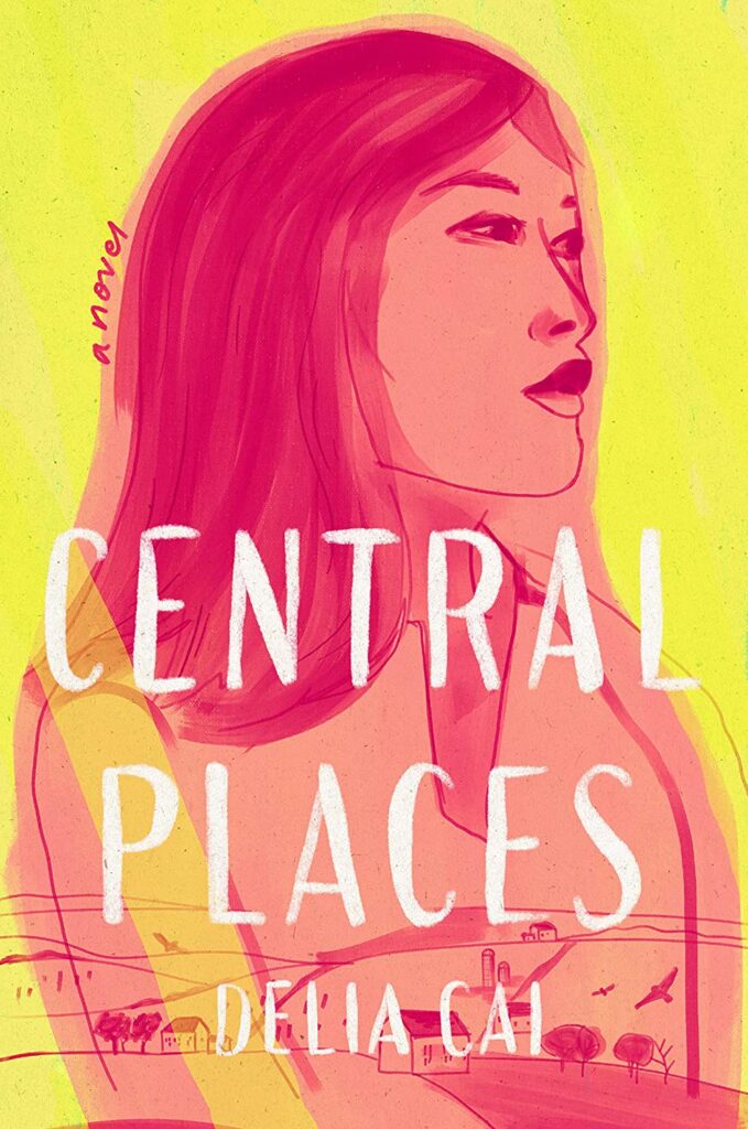 Delia Cai, Central Places (Ballantine, January 31)
Design by Cassie Gonzales
So much warmth and spirit.
 Benjamín Labatut, The MANIAC (Penguin Press, October 3)
Design by Bennett Miller / DALL-E 2
Haunting. Of note, from the back flap: “the image on this jacket was created by Bennett Miller, using OpenAl’s DALL-E 2 software. He arrived at the final product by making extensive edits on variations of an image generated using the following prompt: ‘a vintage photograph of huge plumes of smoke coming from an enormous UFO crashed in the desert.'”
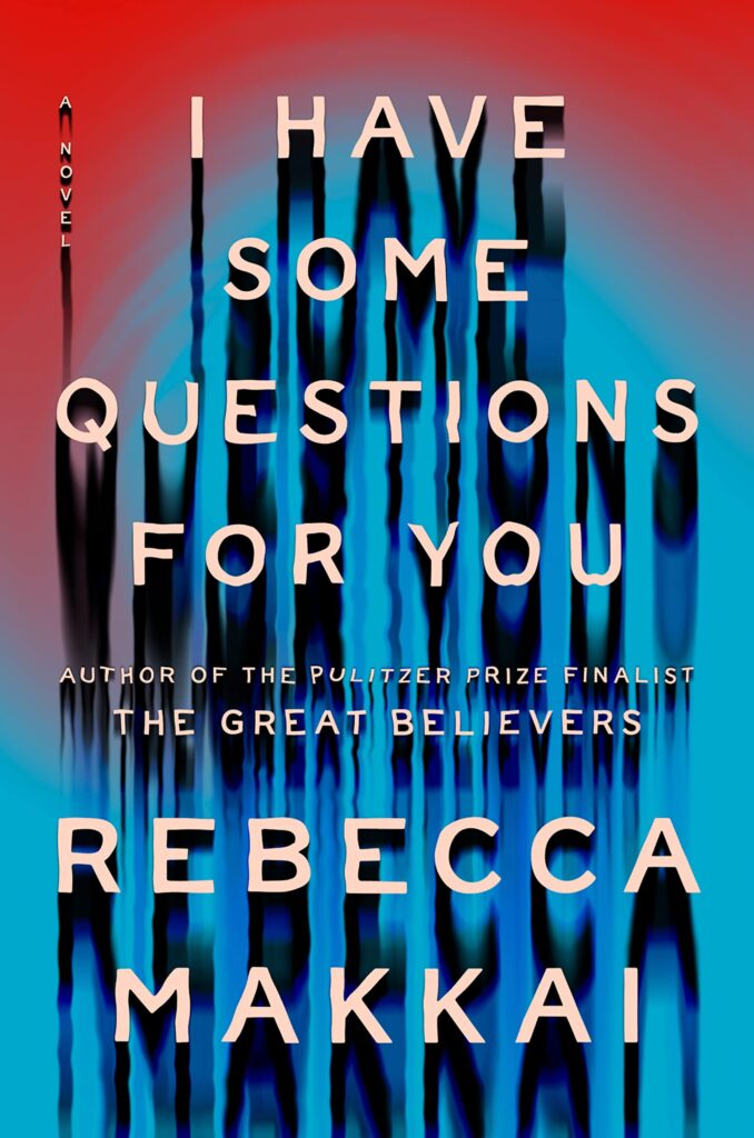 Rebecca Makkai, I Have Some Questions For You (Viking, February 21)
Design by Elizabeth Yaffe
Creative way to turn type into imagery.
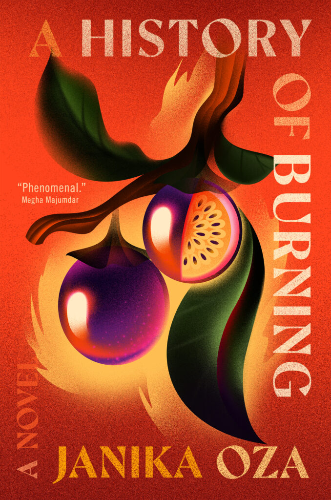 Janika Oza, A History of Burning (Grand Central Publishing, May 2)
Design by Albert Tang; illustration by Simone Noronha
There is something wonderfully magnetic and lush in this illustration. It feels both classic and contemporary. And I love the unconventional framing typography. Looks fantastic in person and on screen.
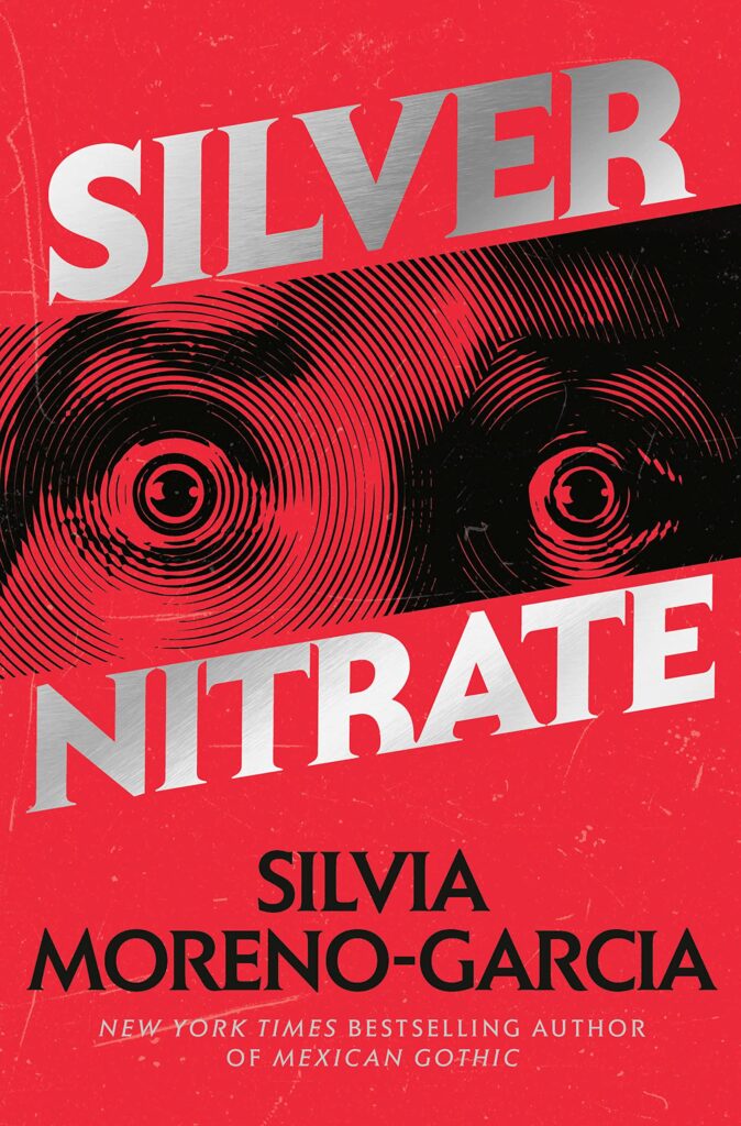 Silvia Moreno-Garcia, Silver Nitrate (Del Rey, July 18)
 Design by Regina Flath
Super commercial and super good! I love the details like the sloping title and the screen on the image.
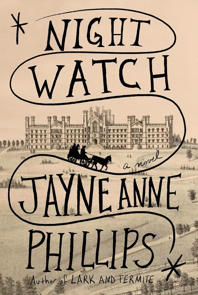 Jayne Anne Phillips, Night Watch (Knopf, September 19)
Designed by Kelly Blair
I love the pairing of this historical illustration with modern hand lettering.
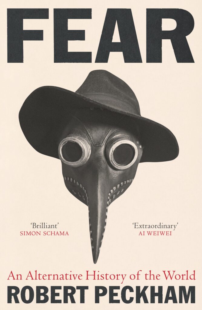 Robert Peckham, Fear (Profile Books [UK], September 7)
design by Tom Etherington
This eerie, funny-creepy design gives me 2024 vibes right now.
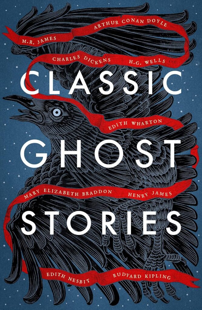 Classic Ghost Stories (Vintage Classics, March 1)
 Design by Andrew Davis
The level of detail that Andrew puts into his covers, blows me away. The way the beautifully illustrated crow fills the cover and the red ribbon that flows through it all, is just perfect.
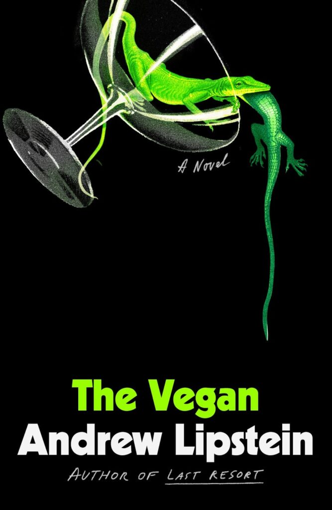 Andrew Lipstein, The Vegan (FSG, July 11)
 Design by Cecilia R. Zhang
I love the humor of the illustration contrasting the title and the simplicity of the composition. It looks vintage yet contemporary, and the neon green is so fun.
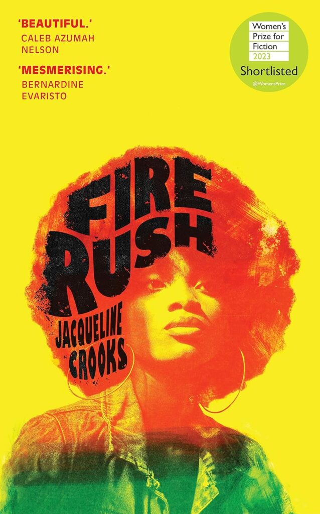 Jacqueline Crooks, Fire Rush (Jonathan Cape [UK], March 2)
Design by Jodi Hunt
This cover is energetic and eye-catching. The integration of 80s inspired typography and image has been executed beautifully and I can’t help but to be drawn to this cover.
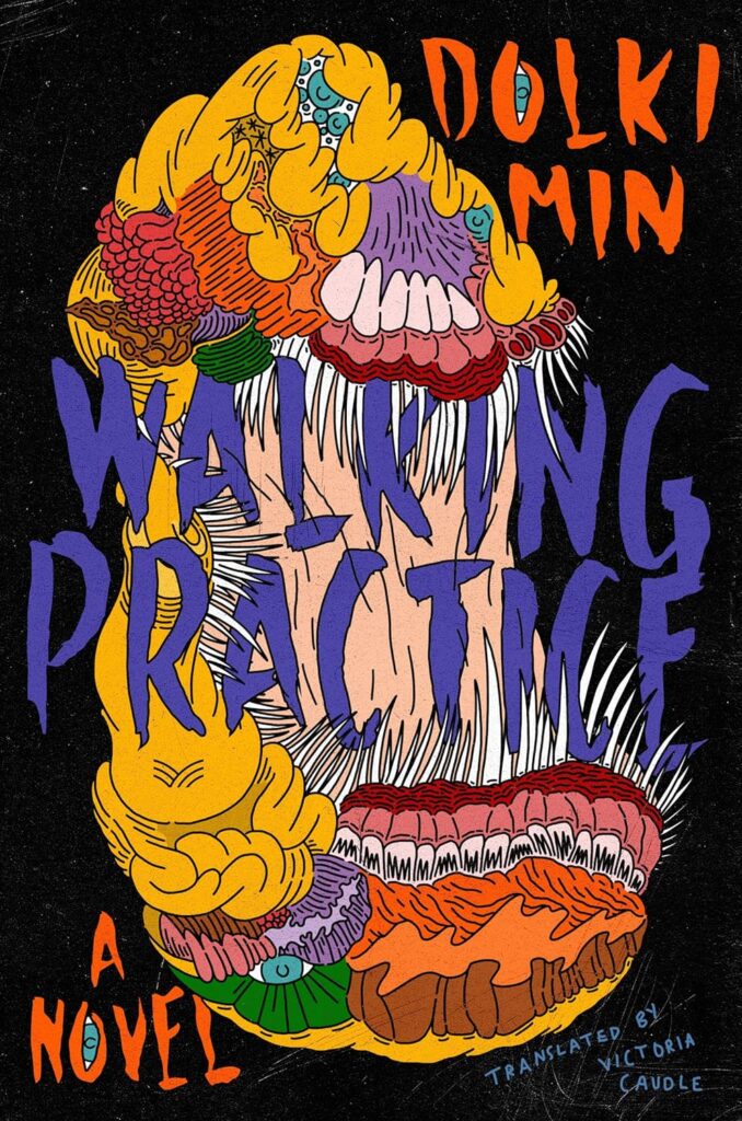 Dolki Min, tr. Victoria Caudle, Walking Practice (HarperVia, March 14)
Cover art by Dolki Min
There’s so many layers to this cover. I love that the art and text come together, making this a unique cover. No idea what’s going on, but I’m intrigued.
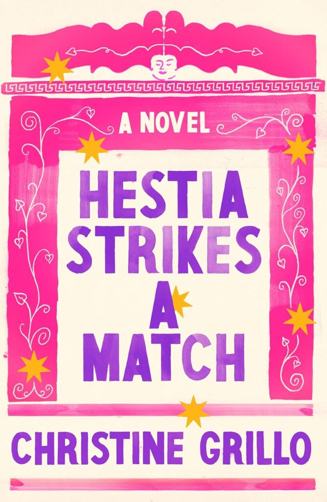 Christine Grillo, Hestia Strikes a Match (FSG, April 18)
Design by Na Kim
I’ve been obsessed with this cover since the moment I saw it.
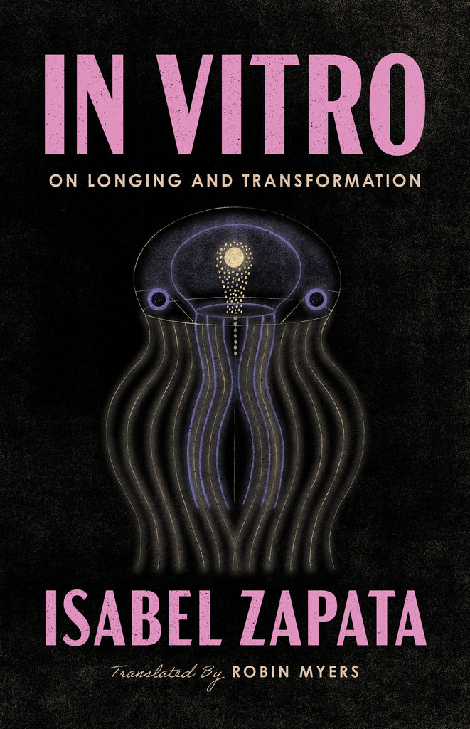 Isabel Zapata, tr. Robin Myers, In Vitro (Coffee House Press, May 9)
Design by Zoe Norvell
I am struck by this cover every time I see it. The color palette and the image so perfectly capture the strangeness, interiority, and otherness of what happens within our own bodies.
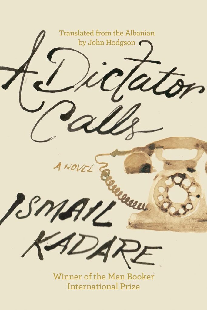 Ismail Kadare, tr. John Hodgson, A Dictator Calls (Counterpoint, September 19)
Design by Farjana Yasmin
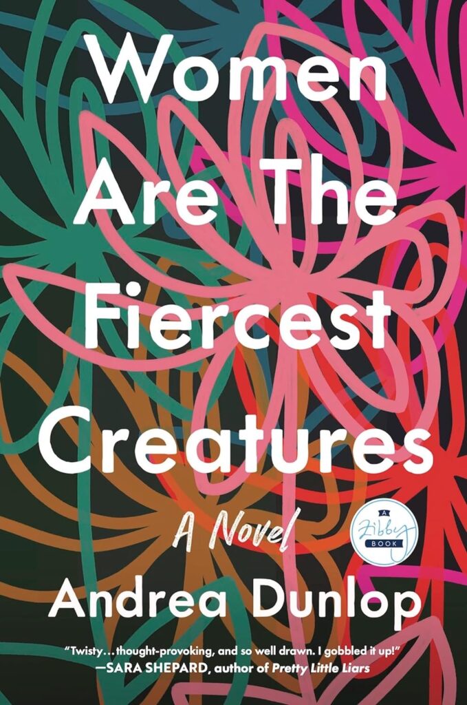 Andrea Dunlop, Women Are The Fiercest Creatures (Zibby Books, March 7)
Design by Olga Grlic
Amazing combination of title and art.
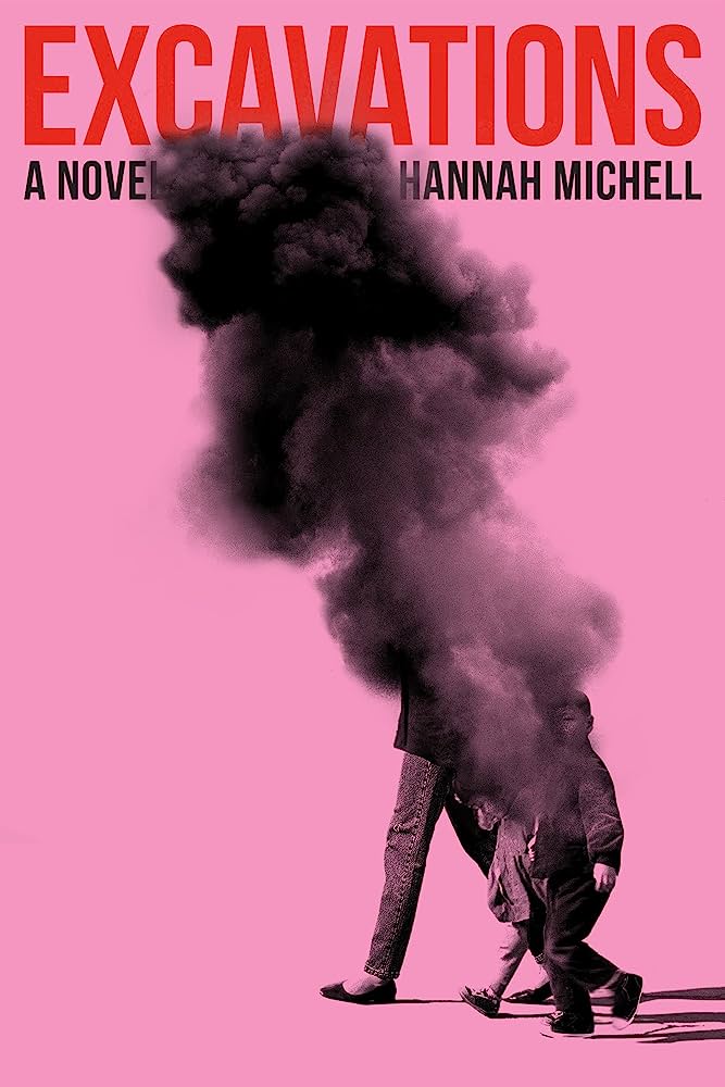 Hannah Michell, Excavations (One World, July 11)
Design by Arsh Raziuddin
When I look at this my eyes just yoyo backwards and forwards between the title and young kids and It’s a great use of empty space.
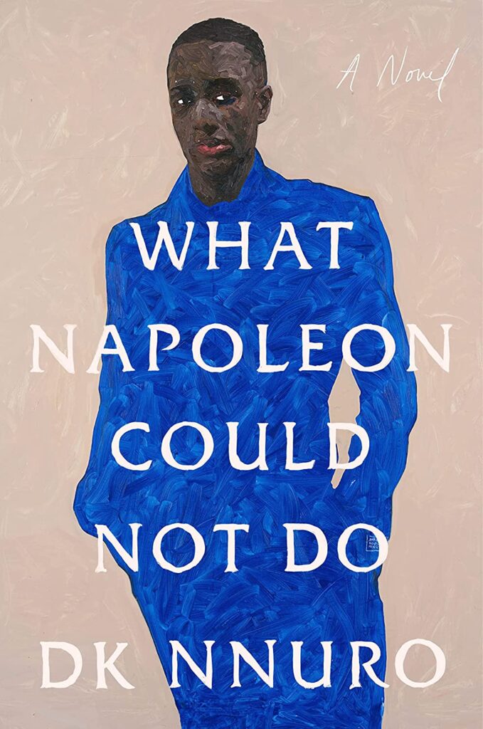 DK Nnuro, What Napoleon Could Not Do (Riverhead, February 7) Design by Lauren Peters-Collaer; art by Amoako Boafo
Lauren’s hand lettering pairs so beautifully with Amoako Boafo’s art.
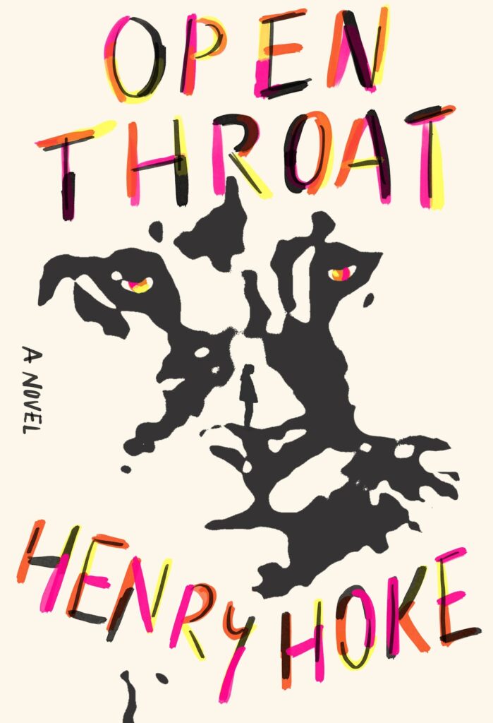 Henry Hoke, Open Throat (MCD, June 6)
Design by Rodrigo Corral
Captivating Rorschach-esque art with hidden elements begs to be picked up.
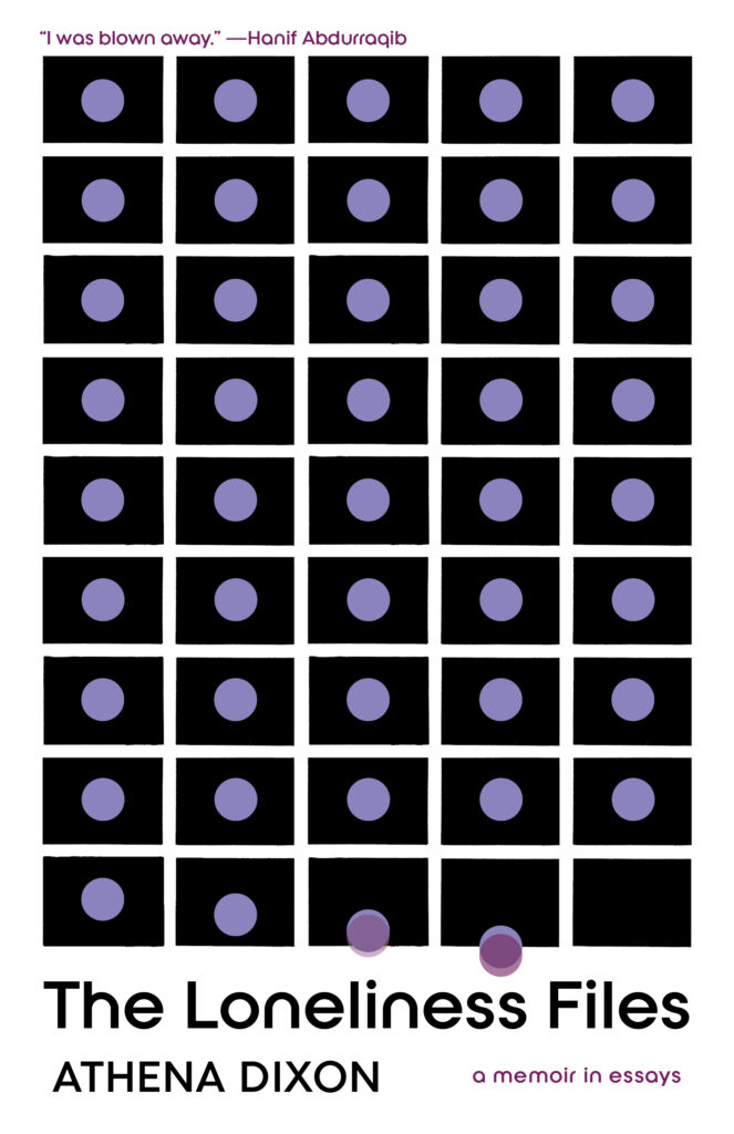 Athena Dixon, The Loneliness Files (Tin House, October 3)
Design by Beth Steidle
This cover perfectly captures the paradox of urban loneliness. Also, the attention to craft on this cover is remarkable—the imperfect rectangles and the slightly off-center circles all come together to give it that midcentury modern flavour…an homage to a time when the Align-Window didn’t exist.
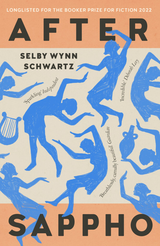 Selby Wynn Schwartz, After Sappho (Galley Beggar Press [UK], July 13)
Design by Holly OvendenSuch a dexterous balance of movement, color, and type. The spilling hinted at is clever and sensuous. I’ve been transfixed by this cover since I first saw it.
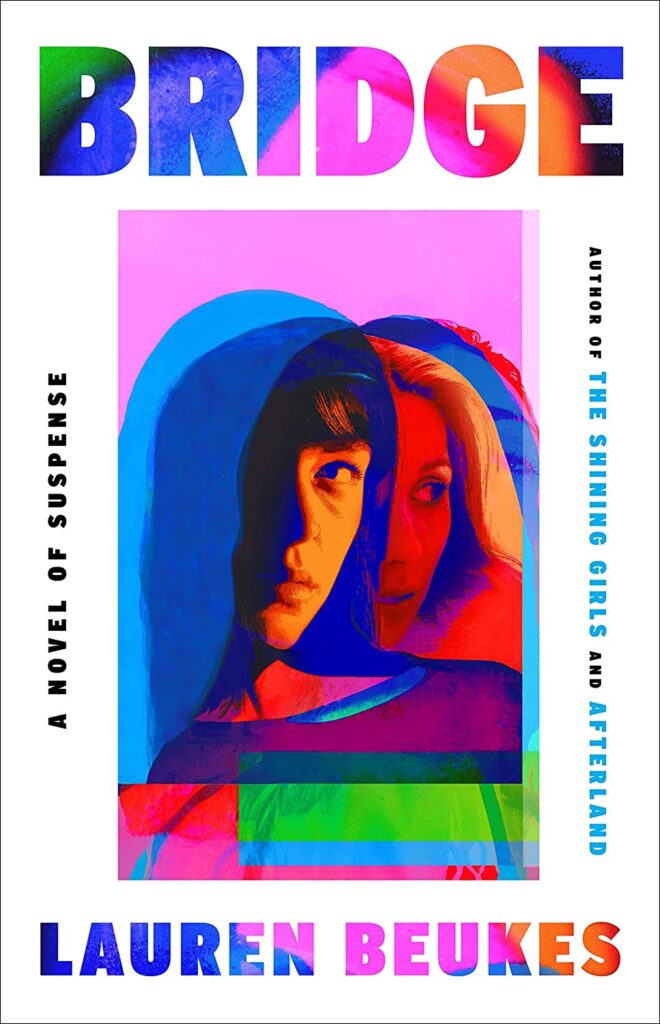 Lauren Beukes, Bridge (Mullholland, August 8)
Design by Kirin Diemont
This edition takes a conventional sci-fi-thriller look and throws it out the window. Love those colors!
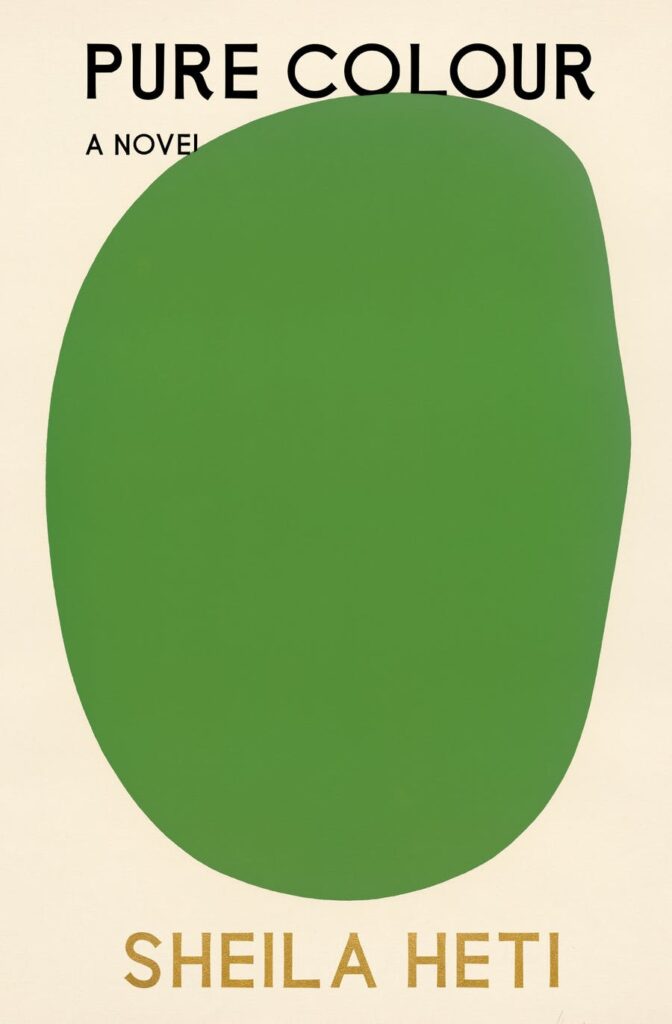 Sheila Heti, Pure Colour (FSG, February 13)
Design by Na Kim
What Na Kim did with this cover was take one of the most direct cover designs possible while still leaving room for ambiguity with a giant Ellsworth Kelly blob.
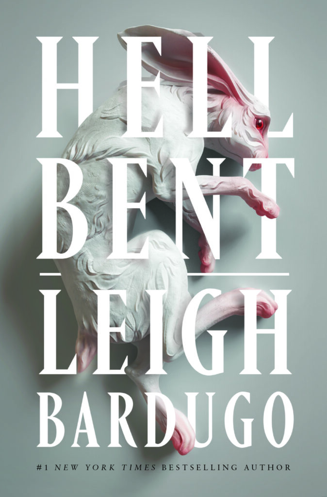 Leigh Bardugo, Hell Bent (Flatiron, January 10)
Design by Keith Hayes; art by Sasha Vinogradova
Love how the art—unsettling and beautiful at the same time—gets to shine here. Seamless type integration, pearl finish, and sculpture emboss make this a really striking package.
![A.K. Blakemore, <em><a href="https://bookshop.org/a/132/9781668030622" rel="noopener" target="_blank">The Glutton</a></em> (Granta Books [UK], September 21)<br />Design by Jo Walker](https://s26162.pcdn.co/wp-content/uploads/2023/12/81KXTIJtnbL._SL1500_-662x1024.jpg) A.K. Blakemore, The Glutton (Granta Books [UK], September 21)
A.K. Blakemore, The Glutton (Granta Books [UK], September 21)
Design by Jo WalkerLove Jo Walker’s design for The Glutton. It’s so fun.
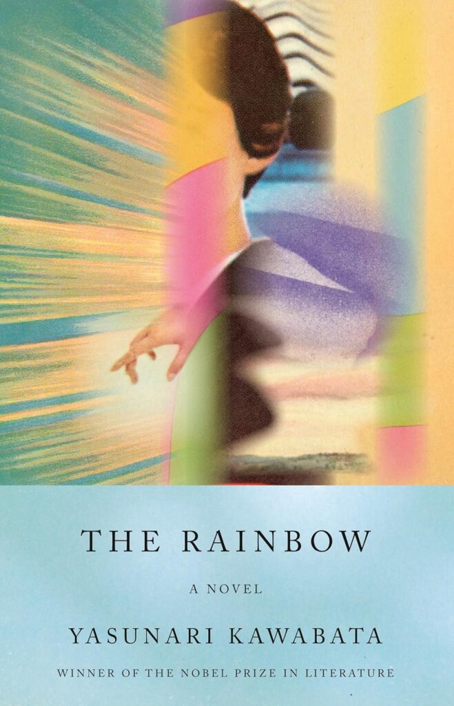 Yasunari Kawabata, The Rainbow (Vintage, November 7)
Design by John Gall
Trippy. What was this guy smokin’ when he made this?
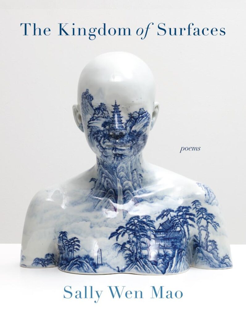 Sally Wen Mao, The Kingdom of Surfaces (Graywolf Press, August 1)
Design by Kapo Ng; art by Ah Xian
I first saw this cover on display in my local bookstore, and literally stopped mid-conversation to run across the room for a closer look. Something about the restraint in the design is just so exciting.
 Jessica Johns, Bad Cree (Doubleday, January 10)
Design by Emily Mahon
What a pairing of type and image! The typography is really fantastic and lends sophistication. Love the simplicity.
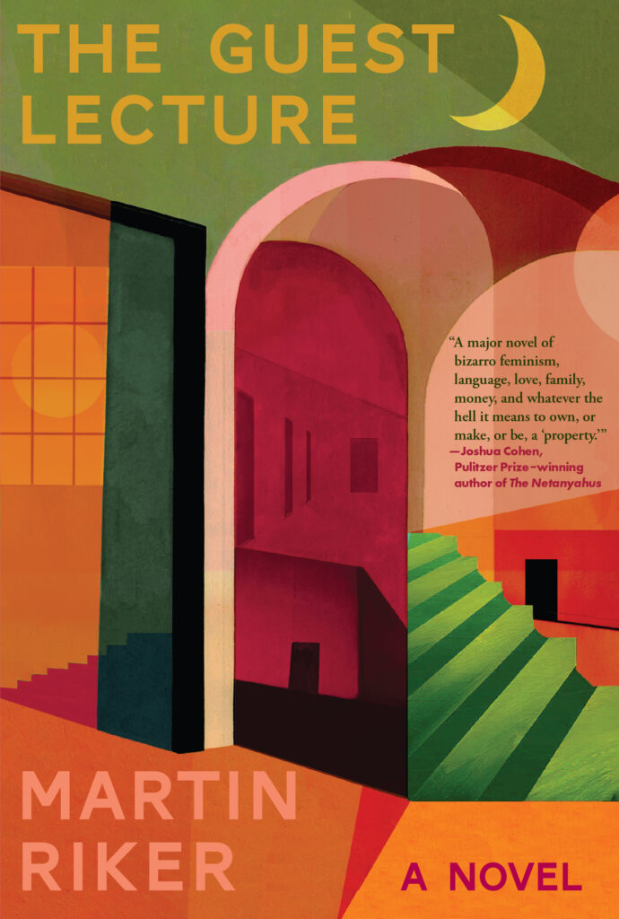 Martin Riker, The Guest Lecture (Black Cat, January 24)
Design by Kelly Winton
The layered views offer a glimpse into a confused world, while the serene color palette and structured type balance out the chaos.
 Reggie Watts, Great Falls, MT: Fast Times, Post-Punk Weirdos, and a Tale of Coming Home Again (Tiny Reparations Press, October 17)
Design by Ben Denzer
This cover is bonkers and brilliant!
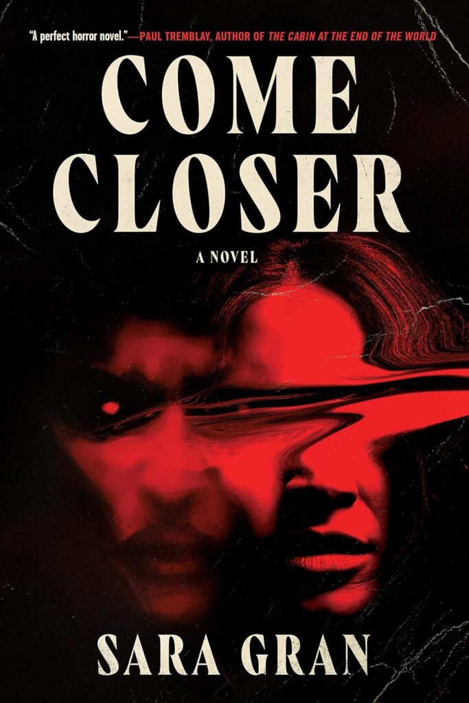 Sara Gran, Come Closer (Soho Press, September 26)
Design by Caroline Johnson
LOVE LOVE LOVE everything about this cover!!
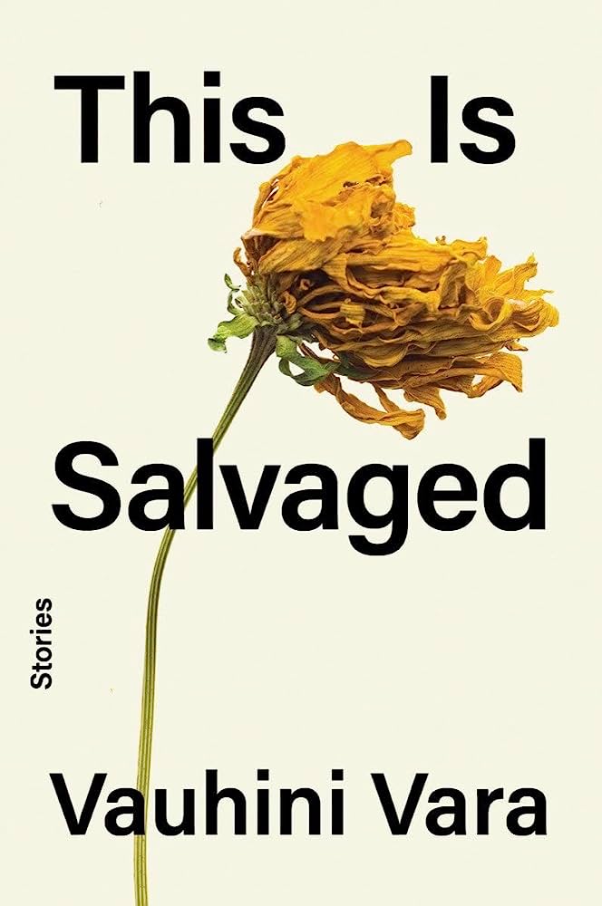 Vauhini Vara, This is Salvaged (W.W. Norton, September 26)
Design by Keith Hayes
A clean and heartbreaking design. I like how the windswept flower appears to force the type further and further apart.
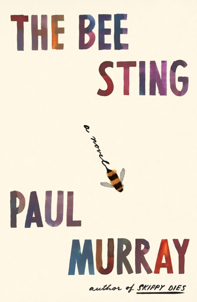 Paul Murray, The Bee Sting (FSG, August 15)
Design by Na Kim
Perfect, as always.
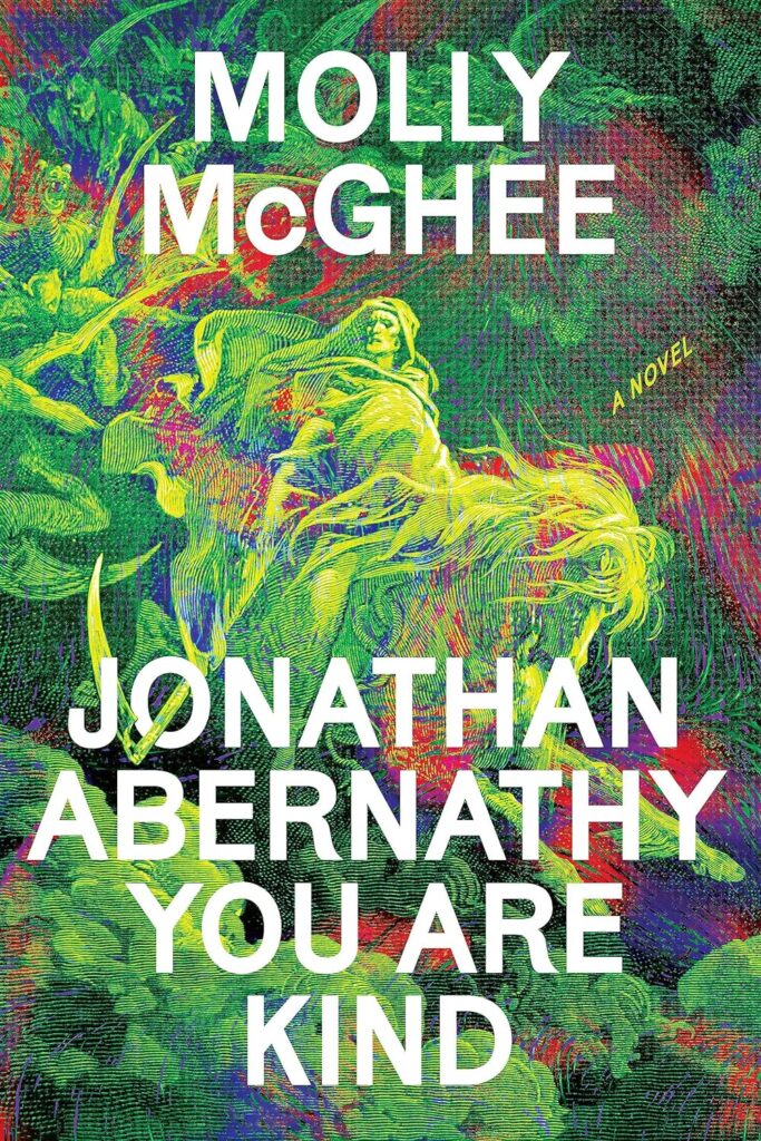 Molly McGhee, Jonathan Abernathy You Are Kind (Astra House, October 17)
Design by Alicia Tatone
I love how this one asks you to look closer.
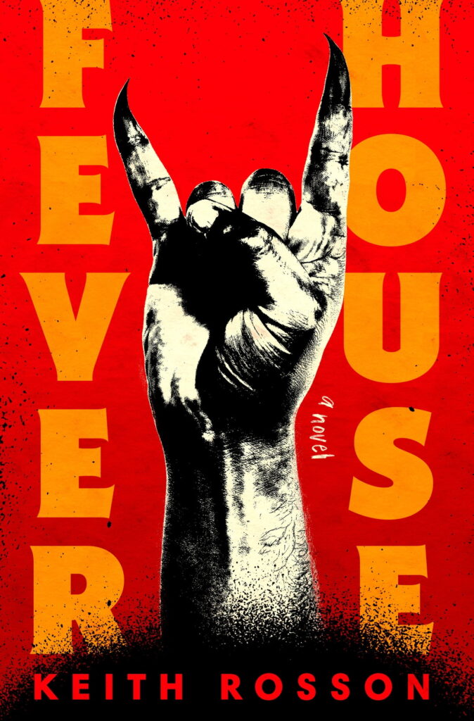 Keith Rosson, Fever House (Random House, August 15)
 Design by Ella Laytham
A perfectly balanced cover that only gets better the closer you look at the textures and details.
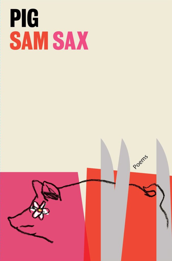 Sam Sax, Pig (Scribner, September 19)
Design by Matt Dorfman
The negative space, the colors, the Paul Rand-esque illustration—Matt can do no wrong.
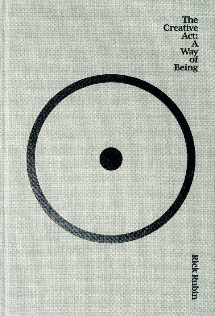 Rick Rubin, The Creative Act (Penguin Press, January 17)
Design by Rick Rubin + Pentagram
Simple, daring, and brave enough to take risks (no quotes, sticker barcode) like Rubin himself.
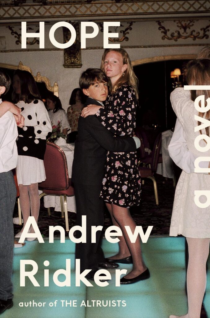 Andrew Ridker, Hope (Viking, July 11)
Design by Tyler Comrie
An excellent photograph that pairs perfectly with the title. Humorous and sentimental.
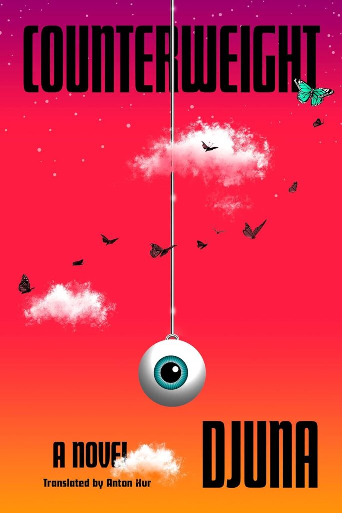 Djuna, tr. Anton Hur, Counterweight (Pantheon, July 11)
Design by Tal Goretsky
Love the colors and surreal quality of this cover. That eyeball!
 Mary Ziegler, Roe: The History of a National Obsession (Yale University Press, January 24)
Design by Alex Camlin
It’s so incredibly hard to create something fresh and unexpected for books like these. I love how this captures the raw energy of one of the most important issues of our time. It feels urgent and unbridled.
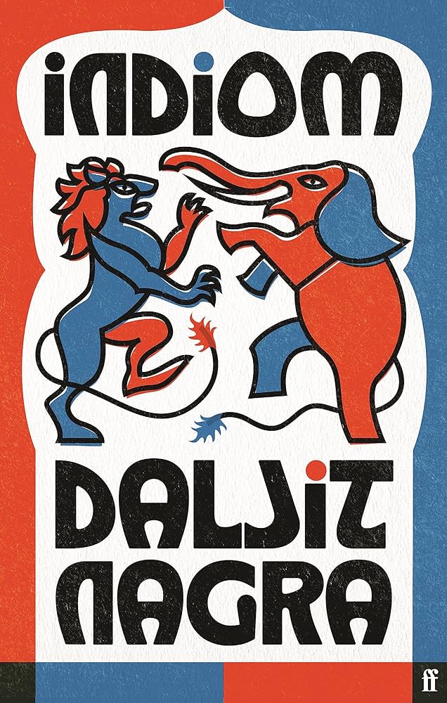 Daljit Nagra, Indiom (Faber & Faber [UK], September 7)
Design by Kishan Rajani
I’m always mesmerized by Rajani’s use of color. Here, everything just snaps with such precision and verve. And the texture lends a real warmth.
 Herman Hesse, tr. Kurt Beals, The Steppenwolf (W.W. Norton, January 3)
Design by Jaya Miceli
Something about the unsettled energy of the illustration and type just grabs me. Plus, it’s a wolf in a suit.
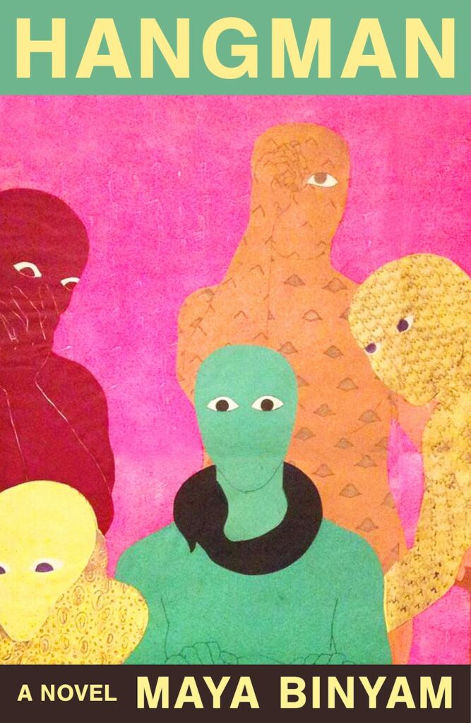 Maya Binyam, Hangman (FSG, August 8)
Design by Alex Merto; art by Belkis Ayón
AMAZING art by Belkis Ayón.
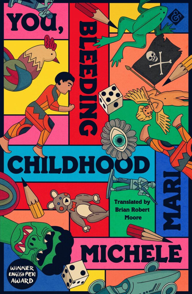 Michele Mari, tr. Brian Robert Moore, You, Bleeding Childhood (And Other Stories, August 8)
Design by Holly Ovenden
Such an imaginative take on a wunderkammer. I love how the illustrated elements are falling playfully against the structured type.
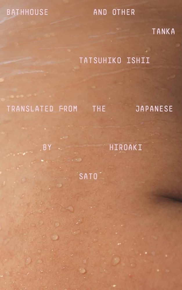 Tatsuhiko Ishii, tr. Hiroaki Sato, Bathhouse and Other Tanka (New Directions, November 7)
Design by Oliver Munday
Love the contrast between the zoomed-in intimate photograph and small-scale digital type.
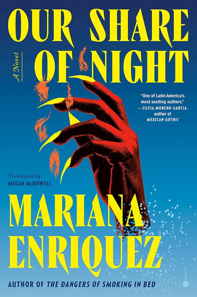 Mariana Enriquez, tr. Megan McDowell, Our Share of Night (Hogarth Press, September 12)
 Design by Donna Cheng
The yellow of the nails and typography pops off this jacket in person.
 Zechen Xu, tr. Eric Abrahamsen and Jeremy Tiang, Beijing Sprawl (Two Lines Press, June 13)
Design by Andrew Walters
I mean, yeah.
 Saba Alemayoh, Tekebash & Saba (Interlink Books, April 4)
The textures and patterns lend such a rich and warm sense of place to this cookbook. Cookbook industry, please take notes.
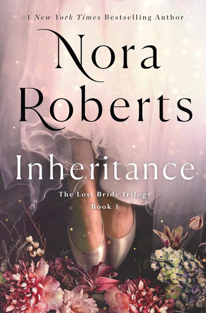 Nora Roberts, Inheritance (St. Martin’s Press, November 21)
Design by Ervin Serrano
Shouting out a category normally not on people’s radar. Love the mood and composition here, not to mention the swash on the N!
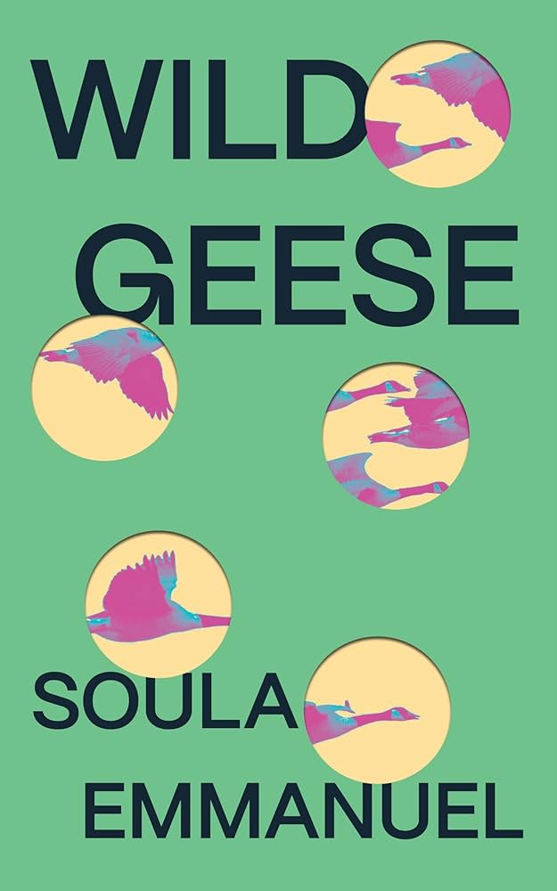 Soula Emmanuel, Wild Geese (Feminist Press, September 12)
Design by Dana Li
The hole punches are such an efficient way of adding a sense of fleeting moments, memories and partially processed feelings to a cover that is essentially just a very simple typeface and an image.
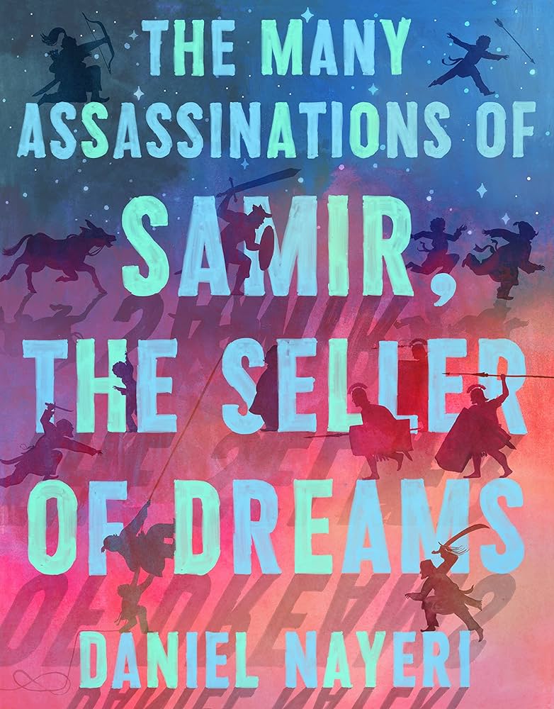 Daniel Nayeri, The Many Assassinations of Samir, the Seller of Dreams (Levine Querido, March 7)
 Design by Stephen Brayda; art by Daniel Miyares
I love every bit of this cover—the brushstrokes in the type, the color palette, the little shadow characters, and the stars at the top.
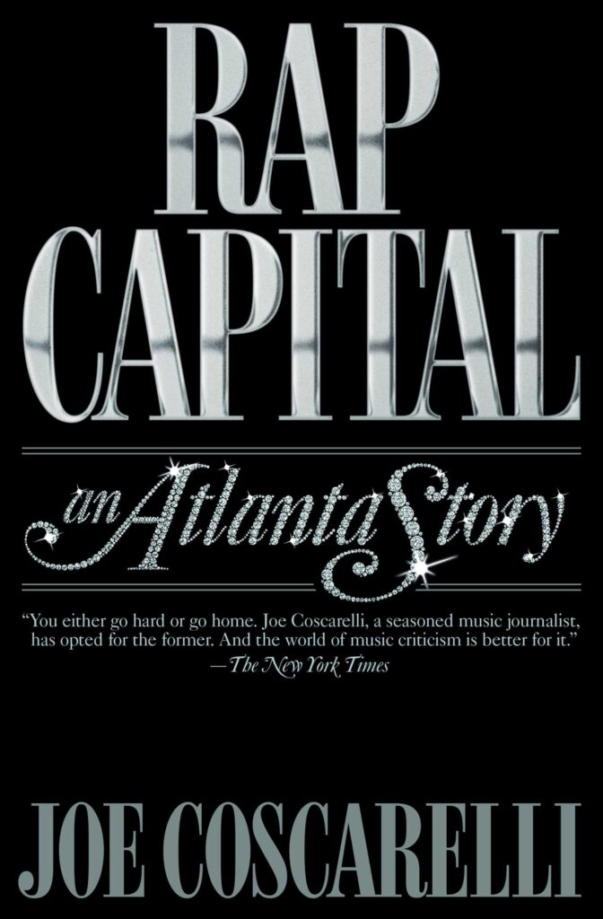 Joe Coscarelli, Rap Capital: an Atlanta Story (Simon & Schuster, October 10)
Design by Chips
mic drop
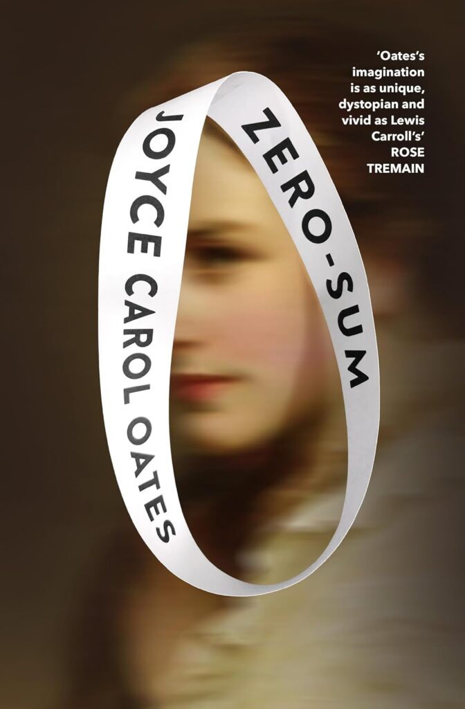 Joyce Carol Oates, Zero-Sum (Fourth Estate [UK], July 20)
Design by Julian HumphriesSo simple and yet so arresting. It infuses the familiarness and distance of the image with a degree of uncanniness and allure. I’m a little jealous, actually.
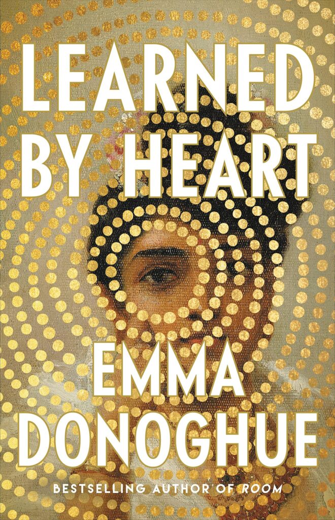 Emma Donoghue, Learned by Heart (Little, Brown, August 29)
Design by Lucy Kim
There is so much texture in this cover! The concentric circles bring my eye right to the center. I also find it refreshing to see a historical fiction cover that doesn’t rely on setting or fashion.
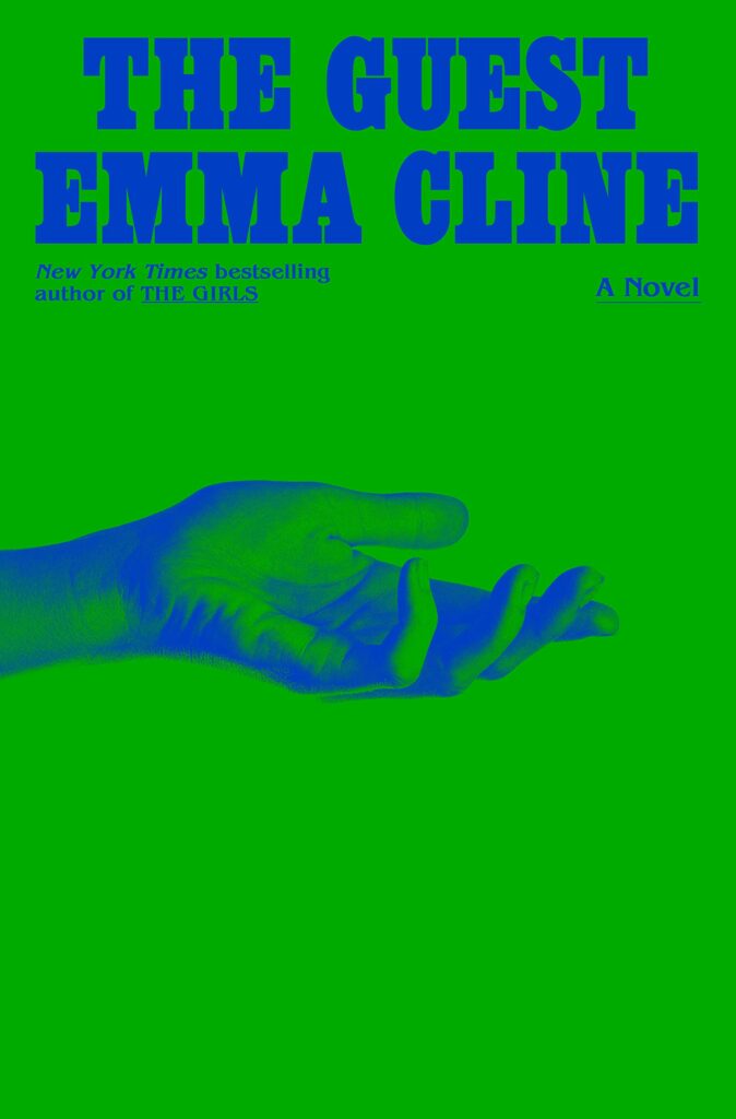 Emma Cline, The Guest (Random House, May 16)
 Design by Oliver Munday
Feels both vintage and entirely modern. Always appreciate Oliver Munday’s designs.
![Anna Metcalfe, <em><a href="https://bookshop.org/a/132/9780593446959" rel="noopener" target="_blank">Chrysalis</a></em> (Granta Books [UK], May 4)<br />Design by Jack Smyth](https://s26162.pcdn.co/wp-content/uploads/2023/12/71xj4M2tqUL._SL1500_-636x1024.jpg) Anna Metcalfe, Chrysalis (Granta Books [UK], May 4)
Anna Metcalfe, Chrysalis (Granta Books [UK], May 4)
Design by Jack Smyth
There is something so loose and appealing about the lines in the illustration.
![Percival Everett, <em><a href="https://bookshop.org/a/132/9781644452080" rel="noopener" target="_blank">Dr. No</a></em> (Influx Press [UK], March 16)<br />Design by Jamie Keenan](https://s26162.pcdn.co/wp-content/uploads/2023/12/71xqijvYWDL._SL1500_-667x1024.jpg) Percival Everett, Dr. No (Influx Press [UK], March 16)
Percival Everett, Dr. No (Influx Press [UK], March 16)
Design by Jamie Keenan
It’s just so strange and fun and intriguing, definitely makes me want to know more about the book.
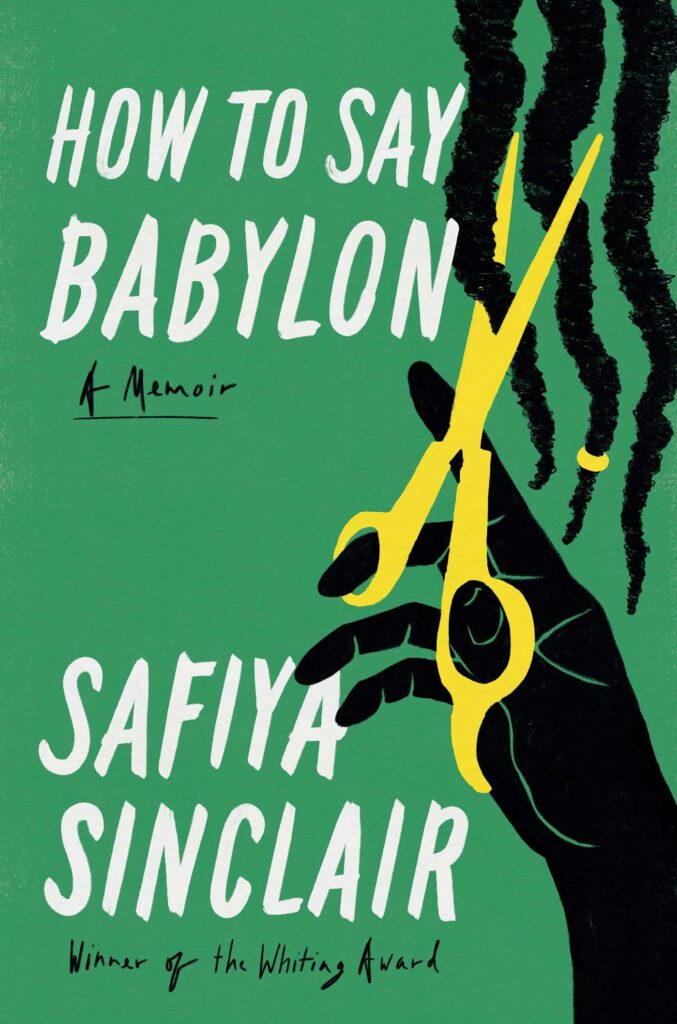 Safiya Sinclair, How to Say Babylon (37 Ink, October 3)
Design by Rex Bonomelli
The lettering and graphic illustration create the perfect tension for this memoir about the author’s strict Rastafarian upbringing.
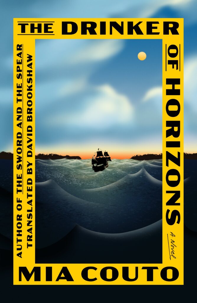 Mia Couto, tr. David Brookshaw, The Drinker of Horizons (FSG, March 14)
Design by June Park
It’s amazing how the ship in the far distance pulls you right in.
 Raja Shehadeh, We Could Have Been Friends, My Father and I (Other Press, March 28)
Main image courtesy of the author; background image Private Collection (credit symbol) Look and Learn/Bridgeman Images
The layering of elements is so beautifully executed here. The push-and-pull between foreground and background ask some questions while drawing me in—to me, the ultimate bar for a memoir cover.
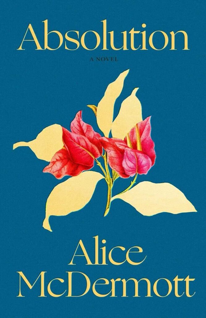 Alice McDermott, Absolution (FSG, October 31)
Design by Alex Merto
This one must be seen in person. The special effects are stunning.
Design by Tom Etherington; illustrations by James Victore
So elegant and also playful. Such a sweet and tender design.
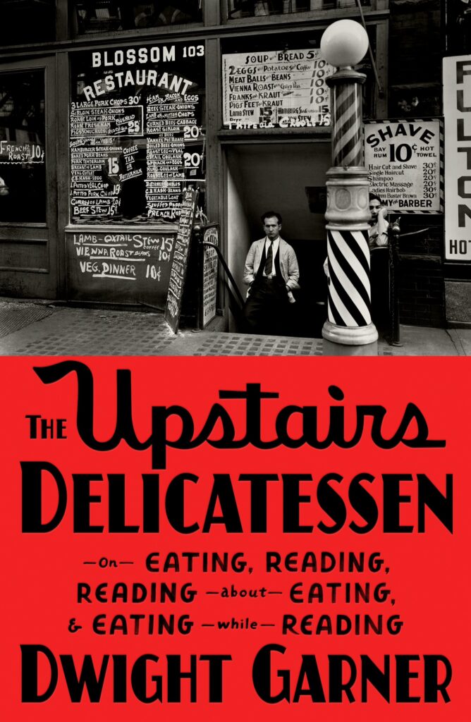 Dwight Garner, The Upstairs Delicatessen (FSG, October 24)
Design by June Park
Park’s type work is always so cozy and considered. And that big field of oversaturated red! The muchness this cover achieves with such economy is nothing short of wizardry.
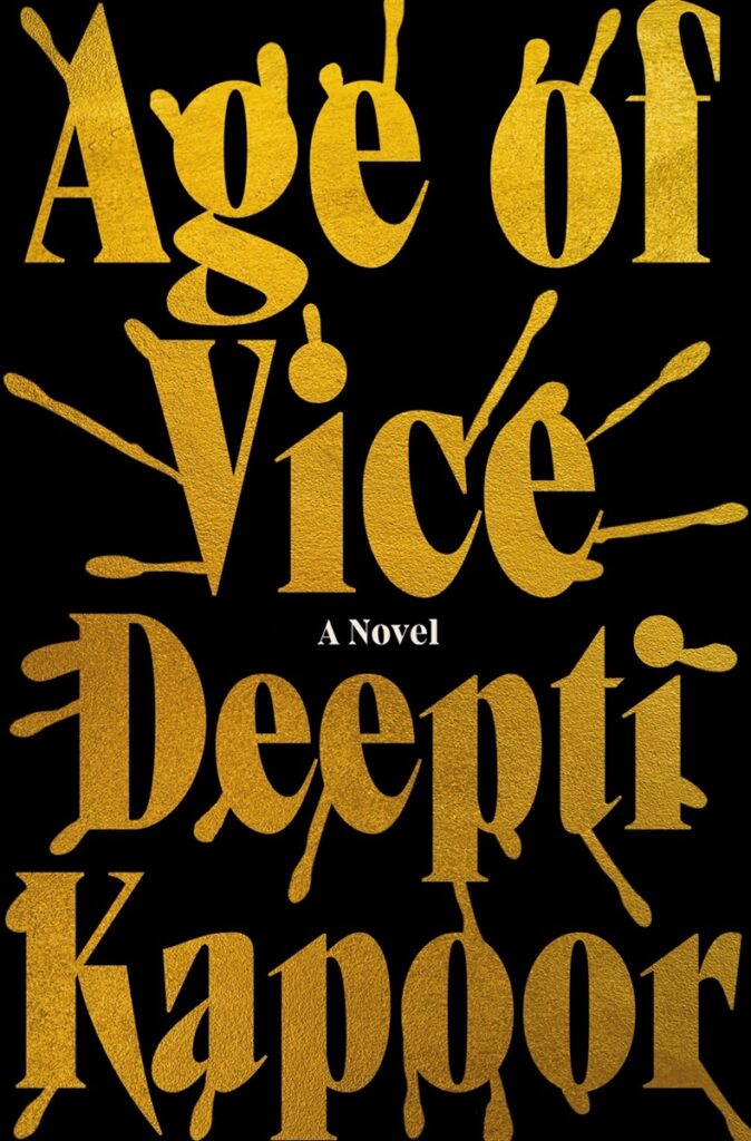 Deepti Kapoor, Age of Vice (Riverhead Books, January 3)
Design by Gregg Kulick
A jolt of energy.
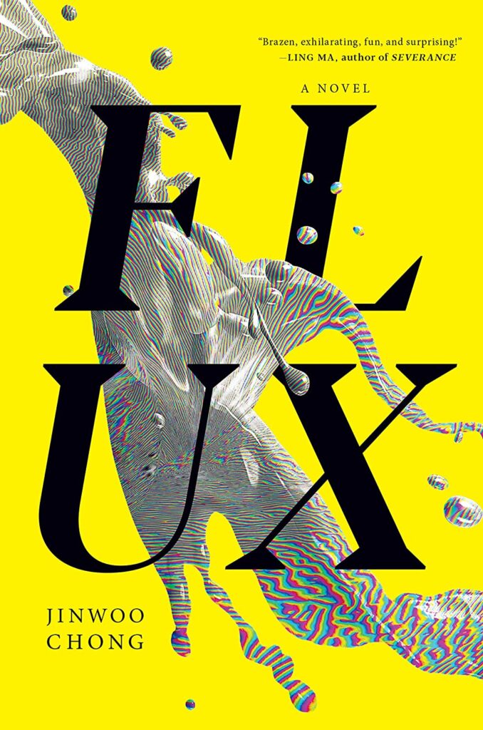 Jinwoo Chong, Flux (Melville House, March 21)
Design by Beste Miray Doğan
Love this. Excellent contrasts with that bright yellow, huge sharp black type, organic/digital liquid splash. Still fresh and eye catching every time I see it. (Also, gotta appreciate a four letter word on two lines.)
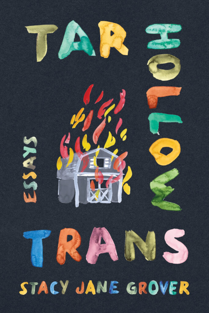 Stacy Jane Grover, Tar Hollow Trans (University Press of Kentucky, June 20)
Design by Jaya Miceli
So impactful. I love how emotive the painterliness is here.
![Marie Ndiaye, <em><a href="https://bookshop.org/a/132/9780593534243" rel="noopener" target="_blank">Vengeance is Mine</a></em> (Quercus Publishing [UK], October 26)<br />Design by Jack Smyth](https://s26162.pcdn.co/wp-content/uploads/2023/12/vengeance-is-mine-design-jack-smyth-1-659x1024.jpg) Marie Ndiaye, Vengeance is Mine (Quercus Publishing [UK], October 26)
Marie Ndiaye, Vengeance is Mine (Quercus Publishing [UK], October 26)
Design by Jack Smyth
The interplay of weird shadowy shapes and the type got me.
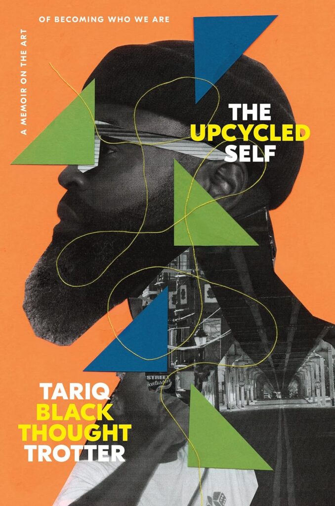 Tariq Trotter, The Upcycled Self (One World, November 14)
Design by Greg Mollica; collage by Najeebah Al-Ghadban
This cover speaks to how prolific Black Thought is, and the depth of his music and his story. The modern and fresh collage is spot-on.
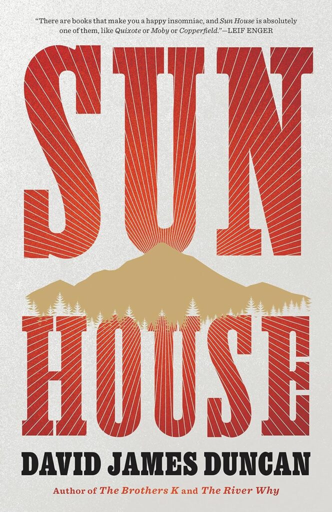 David James Duncan, Sun House (Little, Brown, August 8)
 Design by Lucy Kim
A big deal book with a big look cover. What sets this jacket apart for me is that while there are big graphic elements, there are also really fine details. Simple and striking.
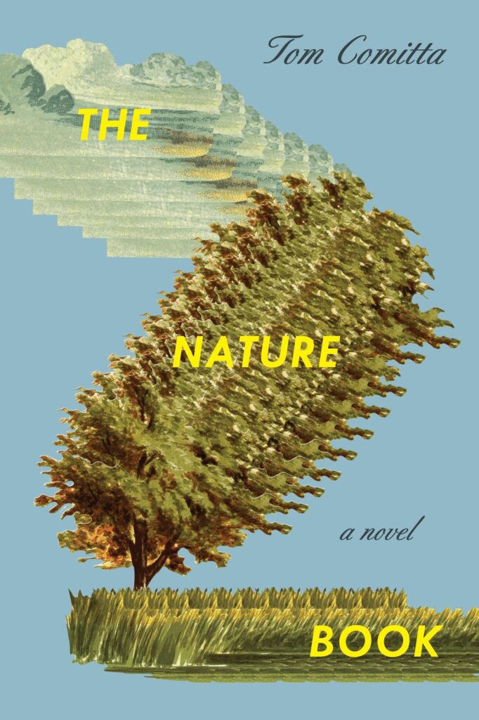 Tom Comitta, The Nature Book (Coffee House Press, March 14)
Design by Tree Abraham
One thing about me? I simply love a collage. And the weirder the better.
Emily Temple
Emily Temple is the managing editor at Lit Hub. Her first novel, The Lightness, was published by William Morrow/HarperCollins in June 2020. You can buy it here.