The 13 Best Book Covers of September
The Eyes Have It
Another month of books, another month of book covers. This month, I’m seeing bold blocks of color, fun with shapes, and a few different takes on pattern and cutouts. (Is it the Amazon effect? Who can say.) Here are a few of my favorite designs for carrying around in a (light) jacket pocket as the nights get cooler—but as always, feel free to add on any I’ve missed in the comments.
 Fleur Jaeggy, tr. Gini Alhadeff, The Water Statues; cover design by Oliver Munday (New Directions, September 7)
The facial elements emerging out of an otherwise flat field—as though coming up from water—would be intriguing enough. But the milky, hyper-realistic water droplets, the minimalist text treatment, and that particular shade of blue send it over the top. This cover is, as the kids say, a mood.
 Mariana Dimópulos, tr. Alice Whitmore, Imminence; cover design by Justin Carder (Transit Books, September 7)
This one makes my list for its beguiling weirdness. The photo of the plants feels almost like a badly-lit snapshot, but the crisp cutout bulls-eye—with its uneven rings and black-and-white portrait—is almost opposite in its precision. The overall effect is a little destabilizing, but fascinating. Like any good bulls-eye, it draws you in.
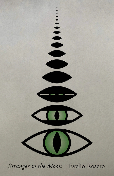 Evelio Rosero, tr. Victor Meadowcroft and Anne McLean, Stranger to the Moon; cover design by Janet Hansen (New Directions, September 7)
You can always get me with a bonkers cover. Take me to the moon, stranger!
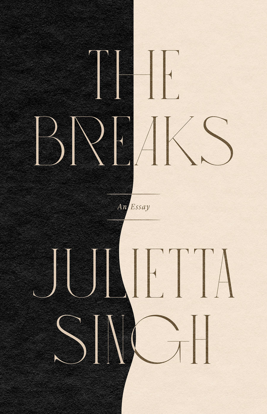 Julietta Singh, The Breaks: An Essay; cover design by June Park (Coffee House, September 7)
The art deco font alone makes me want to keep looking at this cover—but the clean line down the middle that deviates into a wave is simply glorious. Which isn’t even mentioning the subtle texture. Love it.
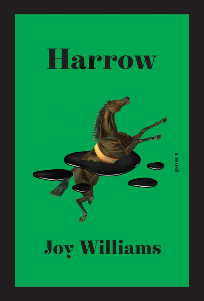 Joy Williams, Harrow; cover design by Kelly Blair (Knopf, September 14)
What a green. And what an image. Whatever it is, it, like this book, is a glorious, elegant, weirdo.
 Mary Roach, Fuzz; cover design by Steve Attardo, illustration by Jared Oriel (W.W. Norton, September 14)
Our third bold color-blocked cover in a row, but it’s another great color choice—and you kind of can’t beat this custom ranger patch.
 Natasha Brown, Assembly; cover design by Lauren Harms (Little, Brown, September 14)
Not only is this cover visually intriguing, it’s perfect for the book—it gives the sense of something orderly, if obscure, that ultimately becomes degraded, and perhaps destroyed. There is a sense of burning. It’s simple, but very effective.
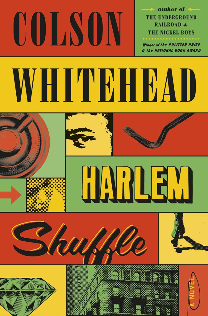 Colson Whitehead, Harlem Shuffle; cover design by Oliver Munday (Doubleday, September 14)
I love how this signals “Big Book” without any of the usual “Big Book” signifiers. Appealing details abound—multiple text treatments (always a risk), the crowbar, the circle around “a novel”! It captures the tone of the novel perfectly, and even besides that, it’s clear Munday is having fun here—it’s hard not to have fun along with him.
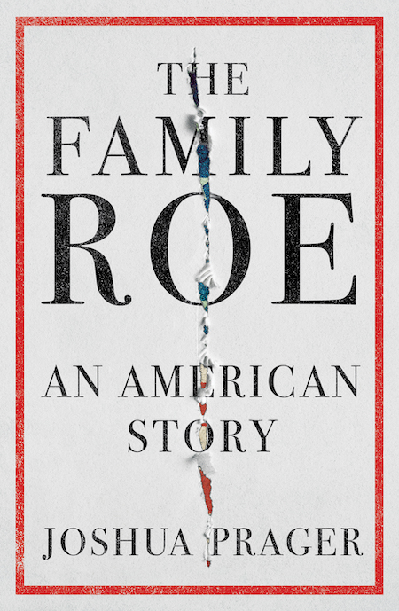 Joshua Prager, The Family Roe; cover design by Sarahmay Wilkinson (W.W. Norton, September 14)
If you look closely, that’s the American flag underneath that jagged rip, which, right in the middle as it is, serves to subtly underscore the divide at hand. It’s a very elegant, and weirdly foreboding, cover.
 Harald Voetmann, tr. Johanne Sorgenfri Ottosen, Awake; cover design by Joan Wong (New Directions, September 21)
Oh, please. It’s such fun. How could anyone not love it?
 Sofi Oksanen, tr. Owen Frederick Witesman, Dog Park; cover design by Jenny Carrow (Knopf, September 21)
Carrow took a very simple image—a pattern of poppies on black—and made it disquieting by slicing it into sections and misaligning the edges. Another simply elegant solution that manages to evoke a strong emotion.
 Kevin Young, Stones; cover design by Kelly Blair (Knopf, September 21)
Well, this is just the visual equivalent of a list. I am duty bound to love it, and even if I wasn’t, it has charm for days.
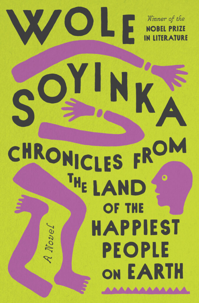 Wole Soyinka, Chronicles from the Land of the Happiest People on Earth; cover design by Linda Huang (Pantheon, September 28)
It would be tempting to go very serious for a new novel by Soyinka, who is by any measure an elder statesman of world literature, so I appreciate the playfulness of this cover, which shines through on every level: the color choices, the expression on the disembodied head, the bendy limbs, the curvy, hand-drawn text. It’s another one that feels just about perfect for the book at hand.
Emily Temple
Emily Temple is the managing editor at Lit Hub. Her first novel, The Lightness, was published by William Morrow/HarperCollins in June 2020. You can buy it here.


