The 12 Best Book Covers of June
For the Continuing Beautification of Your Isolation Bookshelf
Another month of books, another month of book covers. It’s been a hard, productive, eye-opening month for many, but it’s also been a month that has given me, among other things, some hope. And some very good books, with art—and, this month plenty of texture—to match. Here are some of my favorites from the fray.
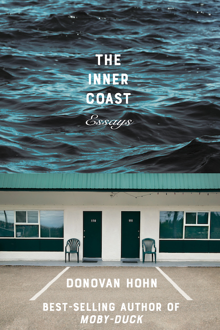 Donovan Hohn, The Inner Coast; cover design by Sarahmay Wilkinson (W. W. Norton, June 2)
Ominous, weird, and claustrophobic: obviously I love it. The text treatment adds so much to the mood here, which seems like more than simple white block text should be able to do, but therein lies the design magic.
 Megha Majumdar, A Burning; cover design by Tyler Comrie (Knopf, June 2)
Simple and evocative; it looks like a vintage travel poster you’d hang on your wall, or maybe a stylized advertisement for a Wes Anderson movie. Either way, it would earn this book a spot on my TBR list—if it weren’t there already.
 Wayétu Moore, The Dragons, The Giant, The Women; cover design by Kimberly Glyder (Graywolf, June 2)
Continuing the trend of fiery book covers (both literally and metaphorically) is this layered take, which seems simple enough, but reveals more the longer you look. Also, I love a good texture on a book cover, and this one is perfection.
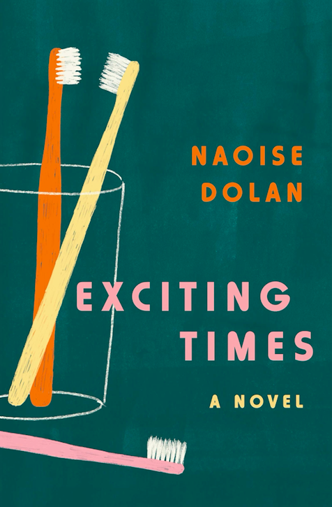 Naoise Dolan, Exciting Times; cover design by Sara Wood (Ecco, June 2)
This is a cover that, simple as it is, tells you exactly how to read the title. I can hear the plink of the falling pink toothbrush now.
 Alexandra Petri, Nothing is Wrong and here’s Why; cover design by Jim Tierney; art direction by Ingsu Liu (W. W. Norton, June 2)
Okay, don’t get me wrong, I hate looking at this cover. But it’s so evocative and horrible and powerful that I couldn’t not put it on this list. If art is that which makes you feel something—whatever that is—this is art, my friend.
 Jean Kyoung Frazier, Pizza Girl; cover design by Emily Mahon; illustration by Tallboy/Night Watch Studios (Doubleday, June 9)
I know it’s only June, but I am ready to declare this the coolest book cover of the year.
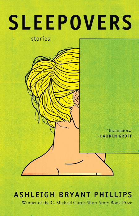 Ashleigh Bryant Phillips, Sleepovers; cover art by George Wylesol (Hub City Press, June 16)
More good texture, and this time in a wild color. Plus, as you may have noticed if you’re a bored person who reads this column regularly, I’m a sucker for obscured faces on book covers. This might be the second coolest book cover of the year.
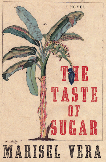 Marisel Vera, The Taste of Sugar; cover design by Sarahmay Wilkinson; art direction by Steve Attardo (W. W. Norton, June 16)
This one is vintage-looking and luxurious—like something you might find under glass at John Derian, the store where I most want to, and most cannot, buy everything.
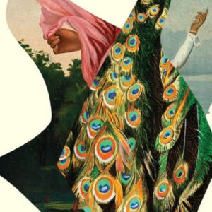
 Emily Temple, The Lightness; cover design by Ploy Siripant, art by Beth Hoeckel (William Morrow, June 16)
Okay. Hi. Yes, I am including my own book cover. I just don’t think there’s any way around it. I wrote most of The Lightness while staring up at a print by the collage artist Beth Hoeckel, and then magically, impossibly, years later, my publisher let me have that very same print as the book cover. It’s perfect for the book, which is itself an exercise in juxtapositions: hard and soft, romantic and terrifying, strange and familiar. Not surprising, considering it was a visual reference point for years. (And this concludes my month of awkwardly promoting my own book at my place of business.)
 Lucie Britsch, Sad Janet; cover design by Na Kim (Riverhead, July 16)
I mean. I really don’t think I have to explain this one.
 Yu Miri, tr. Morgan Giles, Tokyo Ueno Station; cover design by Lauren Peters-Collaer (Riverhead, June 23)
Of course this is all about the colors, but it’s also all about the shapes, and then again, it’s all about the text treatment, and wait, is this, yes, another cover that’s all about the texture. So what else is there? Nothing, probably. I just want to keep looking at this one.
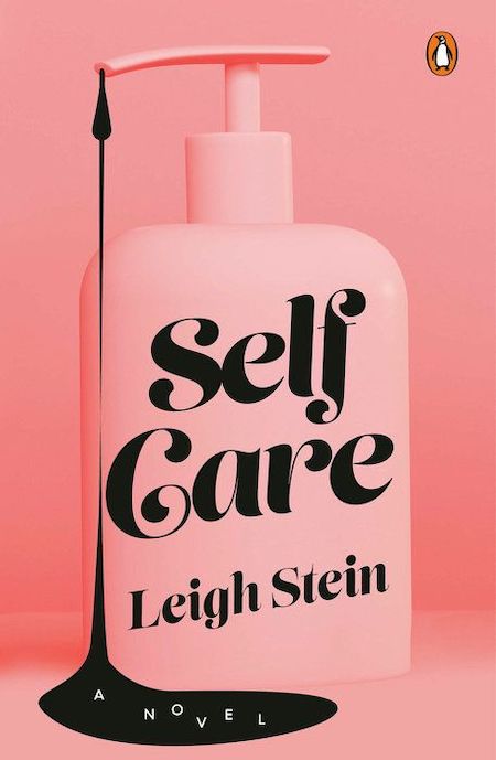 Leigh Stein, Self Care; cover design by Lynn Buckley (Penguin Books, June 30)
What a feat with two colors! It’s so good that I want to lick it. Though I realize I probably shouldn’t.
Emily Temple
Emily Temple is the managing editor at Lit Hub. Her first novel, The Lightness, was published by William Morrow/HarperCollins in June 2020. You can buy it here.


