The 10 Best Book Covers of October
In Praise of Jackets as Sweater-Weather Arrives
Another month of books, another month of book covers. This month, as the leaves turned in the real world, I found myself drawn not only the rich autumnal shades you might expect, but also to restrained black and white, with only a few outliers in between. As always, though, I like it when things get weird. Below, my favorite book covers from October.
 Eugene Lim, Search History (Coffee House Press, October 5)
It’s fun, for one thing, and like all the best book covers it’s also intriguing—but the real genius for me is the inclusion of the shadow created by “a novel” (and no other shadows).
 Claire Vaye Watkins, I Love You But I’ve Chosen Darkness; cover design by Rachel Willey (Riverhead, October 5)
Everything about this cover sings: the hyper-saturation, the vintage collage vibes, the newsprint-esque stippling, the carefully placed flames, the way the text travels across the field, conveying a sense of drama and rhythm.
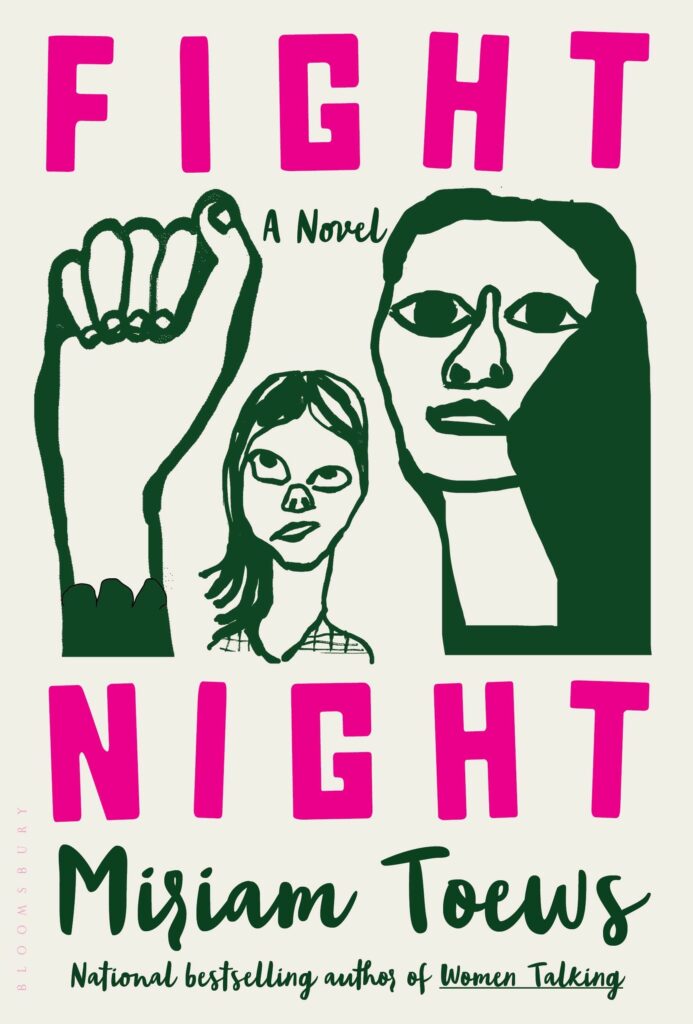 Miriam Toews, Fight Night; cover design by Patti Ratchford, illustration by Christina Zimpel (Bloomsbury, October 5)
The illustration is the centerpiece here, of course, but Ratchford sets it off perfectly (and cheekily) with the color story and text treatment—I love the contrast between the hot pink title (the letters ever-so-slightly askew—chef’s kiss) and the elegant cursive of the author and extra text.
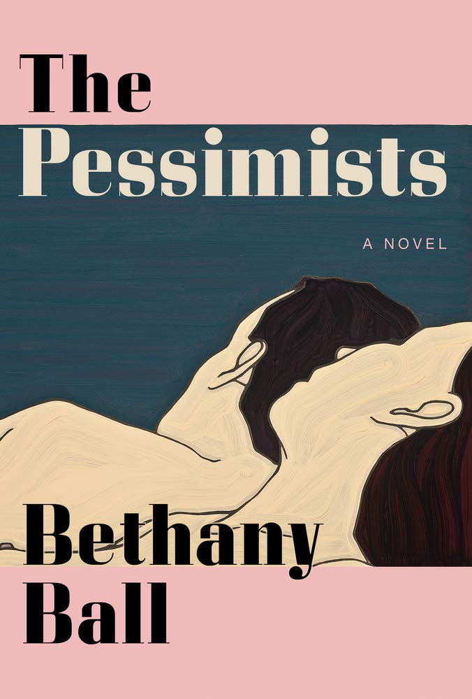 Bethany Ball, The Pessimists; cover design by Gretchen Mergenthaler, art by Jeffrey Palladini (Grove Press, October 12)
This is another cover that frames a piece of art to great effect—the left aligned text balances the weight of the sleeping figures, the pink is expertly chosen, and the pale color of the word “Pessimists” really ties the room together.
 Robert Hellyer, Green with Milk and Sugar: When Japan Filled America’s Tea Cups; cover design by Julia Kushnirsky (Columbia University Press, October 12)
I’m always a sucker for a single-object book cover—especially when the object becomes the cover itself, in a way, as this one does. Plus, you can’t beat that green.
 Margaret Verble, When Two Feathers Fell from the Sky; cover design by Tyler Comrie (Mariner Books, October 12)
This cover is an example of how much you can do with very little—it’s a text-based book cover, with only a small illustration, but it has such a distinct sense of movement and depth, like an exquisite matchbox that you want to hang on your wall. Also, another saturated, vintage autumn-toned color story!
 Ari Banias, A Symmetry; cover design by Sarahmay Wilkinson (W.W. Norton, October 12)
I find this image captivating—something about the intense texture of the clouds, and our distance from them as framed by the window. Wilkinson must agree, because she has given the image center stage, creating a frame for the frame, and adding the elegant, clever mirroring in the text.
 Donald Antrim, One Friday in April; cover design by Alex Merto, art direction by Steve Attardo (W.W. Norton, October 12)
And here’s another mirrored, minimalist cover—less lovely, but engaging all the same, and suggesting, appropriately for the book, a sort of folding of time and space.
 Tamara Shopsin, LaserWriter II (MCD, October 19)
This is an example of a book cover that is truly perfect for its book—what else would you want for a novel about Tekserve than a test print page? If you’re looking for a good time, I also recommend Shopsin’s website.
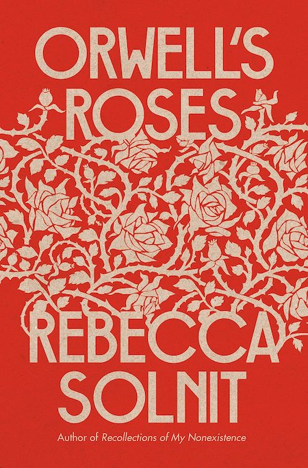 Rebecca Solnit, Orwell’s Roses; cover design by Jon Gray (Viking, October 19)
Honestly, it’s almost subversive, to go this vintage—it looks like some gorgeous wallpaper has grown a title and author. I love it.
Emily Temple
Emily Temple is the managing editor at Lit Hub. Her first novel, The Lightness, was published by William Morrow/HarperCollins in June 2020. You can buy it here.


