Sometimes You Have to Build the Book Cover in Your Living Room
Nicole Caputo on Designing the Cover for Humiliation
Humiliation is a debut collection of nine stories by Paulina Flores. Each story takes place in Chile, in port cities marked by poverty, and all are tied together with the themes of disgrace, pride and shame experienced both publicly and personally by each of the richly described characters.
During my first talk with the editor and publisher we discussed something type driven, minimal, bold and stark. The title is fantastic and next to “stories” becomes so provocative. First we thought that perhaps the cover should be evocative of Chile, of cities, maybe a photo of Chile in the background? But it definitely must feel edgy and bold with impact and a hardness to it. It was during this discussion that I started digitally sketching out some ideas, excited by the first thought of being able to feature the title prominently and perhaps on its side or diagonally—with the honest and welcomed excuse that tilting a long word off its horizontal axis would allow me to size the type up considerably, using the vertical or diagonal trim of the book cover.

I decided to send the project out to a favorite designer and gave the direction to feature the title prominently and to not be afraid of running it across the diagonal. She sent two rounds of amazing work but the team was divided and the editor requested a new round. The publisher requested that the title be small, stark, horizontal and centered.
I was now right up against my deadline and so had to take the project back in house. I finished the manuscript and was overwhelmed with empathy for the characters and was mesmerized by Paulina’s stunning descriptions of how humiliation and the feeling of shame manifest in the physical bodies and emotional realms of each person. Reddening faces, backs that are stooped, a body that is red and hot while tears stream down a cheek and breast—these were all inspiration for representing feelings and emotion typographically. I decided to test out curling letters to represent the body and mind closing in on itself when feeling shame. I printed and then hand cut the letterforms with a scissor and curled them around my fingers. I then placed them in a diagonal so that we would get the size of the letters we were after. I shot them in my living room with a dramatic shadow cast beneath them. A gritty textured blushing background was added digitally.
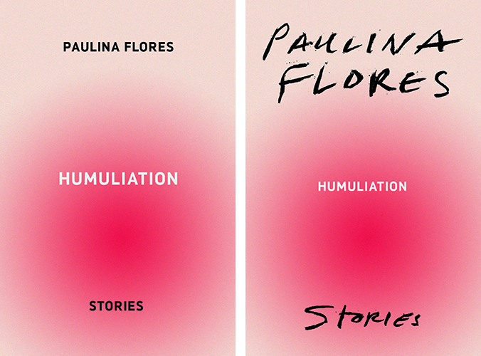
I also sent in two designs as requested showing the title small and stark and horizontal on the flushed surface. Another design featured the title repeated nine times to represent the nine stories, but conceptually this design was not doing much more than that. Another featured the title large, tipped on its side and nearly falling off of the spine edge, and another used the curling letterforms again, this time angled enough to make room for a bigger text size but not too much to affect legibility.
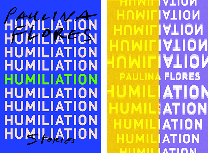
The editor really loved the design with the nine stories and the elegant simplicity of the layout. He also liked very much the curled letters which he felt “gave a sense of a life peeled back.” The publisher and our marketing director loved the curled letterforms which I also found was most effective in achieving all of our original goals and in catching the eye of our viewers with the visual illusion of the cover. The author was not 100% convinced at first and I sat on the edge of my seat while she and the editor discussed over days and time differences. Eventually an enthusiastic approval came in for the curling letter forms.
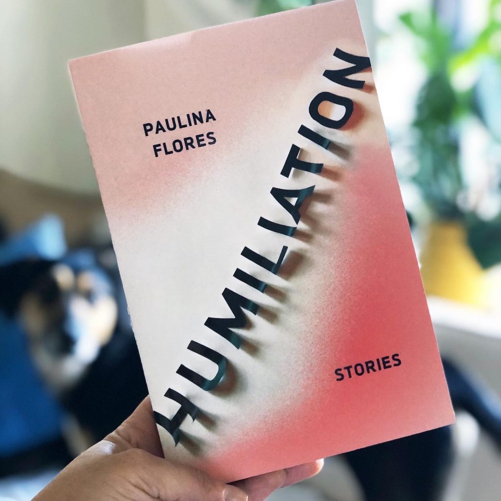
I decided to print this with a raised gloss to enhance the illusion the type and shadow create, and added a soft touch finish which enhanced the saturation of the color. I have since been delighted to receive notes from people who had viewed the digital assets and video asking how we managed to print a cover three dimensionally.
*

Nicole Caputo
Nicole Caputo is an award-winning New York graphic designer who has been specializing in book and book cover design for the past 15 years. She is the Creative Director of Catapult and Counterpoint Press, and is also co-founder of She Designs Books, an organization that celebrates women in book design. She was formerly VP, Creative Director at Hachette Book Group. Awards include the One Show, Communication Arts, Type Directors Club, Art Directors Club, AIGA/NY, HOW International Design, PRINT Regional Design, the New York Book Show, the National Gold Ink Awards, London International Creative Competition, and the Publishing Professionals Network.
