It has been a delight over the years to design covers for Carlo Rovelli’s books. Whenever I start on one, I begin with the intent on using simple shapes of color to conceptually represent the physics that Rovelli is illuminating in the book. For a physics dilettante like me, the thrill is Rovelli breaking down extremely complex and new ideas about areas (like quantum gravity).
As if I can get a an actual glimpse or a little more about the underlying invisible almost magical forces in the world. I then try to do the same with the visual experience of the covers—a deliberate but complex sense of something beyond flatness on paper without collapsing the rectangle into the illusion of three dimensions.
Sometimes I am drawn back to formal relationships that I encountered while teaching the History of Graphic Design for over a decade at Parsons. The ability of the Japanese modernist designer Yusaku Kamekura to create sensations of light in print through flat pieces of color has been a recurring obsessions.

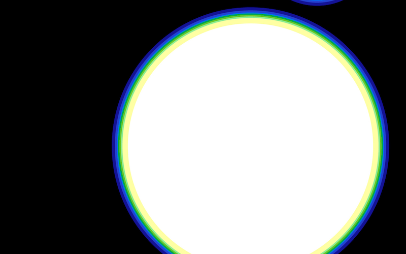
I immediately thought of Kamekura’s transitions between black and white through rings of analogous-adjacent color when I got the new Rovelli manuscript for White Holes. I started making a circular form with bands of color on the computer and arrived at this.
 Initial digital sketch for White Holes jacket
The amazing thing to me about Kamekura’s visual trick is the doubling of the affinity between the colors. The color interaction is activated by edges of where the color bands meet each other because they are both very close in hue and different by steps in darkness. This happens in part through the natural values (darknesses) of yellows, greens, and deep blues. So the successive rings get lighter in value as they move towards white (or visa-versa towards black).
 detail: initial sketch
Overall this creates a tension of flat color versus both a sense of a gradient of value across each color band, and a slight blur between the edges of the adjacent color shifts. The two most important relationships are the yellow hitting the white (one of my favorite color relationships ever), and the deep blue hitting the black.
Now what’s thrilling about the idea of “white holes” is the sort of inverse-to-black-holes way we theoretically experience them (visually and in math). What I wanted to do then was to create a sensation of light, but with a tension of the circle not actually glowing outward like a star. Modifying the color and thicknesses of the bands achieved this contradiction. Without seeming like it is “shining” the thin color banding activates the interior white space in the circle, making our eyes see it as enervated by some force that presses outward. But it doesn’t necessarily emanate light.
At that point I started sketching thumbnails to figure out how a circle or circles would work with the title and author on the cover.
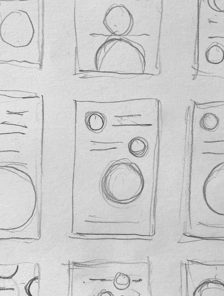 Thumbnail sketches for White Holes jacket.
This is still the best way I can use my eye and hand to find an effective composition. The geometric sans serif typeface came from previous Rovelli covers, but also relates really well to the circles! And that was pretty much it after refining the size and space relationships.
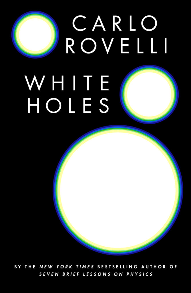
Looking at the jacket again after some months since designing it, I think the thing that excites me most is how, working with the light effect the repeated white hole elements with the size and position shifts create a pressure of flat depth playing with the floating title and author. My eye can’t quite grasp the reality of the space.
_________________________
Carlo Rovelli’s White Holes will be published by Riverhead in October 2023.