
Jeff VanderMeer Talks to the Designers About His Book Covers
Creating Covers that Are Playful, Distinct, and Surreal
My mother is an artist and even once designed psychedelic doors for faculty in Penn State’s biology department. I’ve always been surrounded by art studios and art, which has really influenced my writing. So the covers of my books are really important to me and sometimes even inspire me in future fiction.
From the start with FSG, for the Southern Reach paperback covers I was just so appreciative of how the designers and artists could give the reader an entry point to my work that conveyed the uncanny and mysterious elements, but was also playful and really creative and not your usual thing. It feels like those books set the tone not just for the future MCD/FSG covers, but also for all the foreign language editions.
So, their work on the English-language editions, the art director’s savvy, too, really had this ripple effect. If you look at the foreign language editions, where they don’t adapt the US covers, they are still trying to be true to the wonderful freshness of those covers. Given too that a positive evocation of nature is important to me and the beauty of our world is often the counterpoint to the sometimes dark things happening in the novels, I’ve truly been blessed with these covers. So it was nice to have a conversation to convey my enthusiasm and talk a little bit about the process.
*
Jeff VanderMeer: I loved the covers for both The Ambergris Trilogy and Hummingbird Salamander. The Hummingbird cover especially was a departure from my past cover designs, but a beautiful one. I’m curious how you decide to put a new cover on a set of paperbacks, and how you go about redesigning it—how do you consider the original cover when you’re coming up with the new cover?
Alex Merto: The reason we decided to explore a new cover for the paperback of Hummingbird Salamander is because we wanted to create something bold and graphic that could work as a full series design. I knew that we at least had Hummingbird Salamander and The Ambergris Trilogy to start with, and that’s already 4 books to design (EEK!) so it was important to come up with something that we’d be excited about even beyond that.
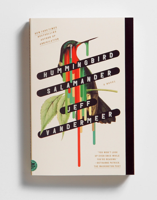
Tyler Comrie: When going from hardcover to paperback there is kind of a balancing act to consider. We wanted to create a fresh and distinct look, but also wanted to maintain some sort of connection to the original. In the case of Hummingbird Salamander, which was the first cover in the series to be designed, we looked back at all of the different editions and saw the hummingbird featured prominently. It was the obvious thing to put on the cover, which as designers we usually try to stray away from, but we felt it lent itself to many visual possibilities so we decided to let that be the focal point on the paperback as well.
JV: Tyler, you did the (amazing) illustration for Borne, which was my first introduction to Rodrigo Corral working on my covers. How did they rope you back into working on my books again? And Alex, was it intentional to bring someone in who had that experience?
AM: The goal was to create a system that connected the books to each other but also left room for exploration and made each book feel new. As a starting point, we looked at some of Jeff’s previous cover designs and both Area X and Borne jumped out to us. And this is where Tyler Comrie steps in. Alongside Rodrigo Corral, he had his hands in creating those iconic covers.
TC: I worked at FSG for several years out of college and had the opportunity to work with Rodrigo first on the hardcover package for The Southern Reach Trilogy, and then later on Borne. That was a very formative time for me in discovering my process as it related to book cover design and I suppose has shown its influence in some of my work since. Alex and I have worked closely over the years since and I suppose he recognized some of that as well when decided to bring me on.
JV: What are the things you felt like you were trying to express or capture in the covers?
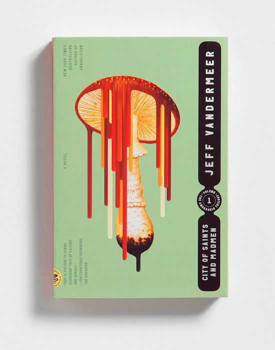
TC: What I took away from the experience of working on some of the earlier books was that there is a unique contrast that exists in your writing, in that there is a great respect for nature, and the beauty that exists there, but there seems to almost always be an underlying tension that puts that beauty in jeopardy in some destructive way. In my mind, focusing on that contrast and tension was essential, and ultimately the solution presented itself clearly.
In Alex’s initial design exploration he had found the source image we used for the hummingbird, which he shared with me. I then started playing with different ways of disrupting or destroying it, and eventually discovered something beautiful in stretching the colors from the gorget.
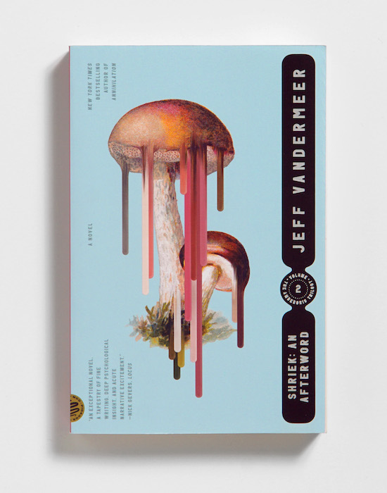
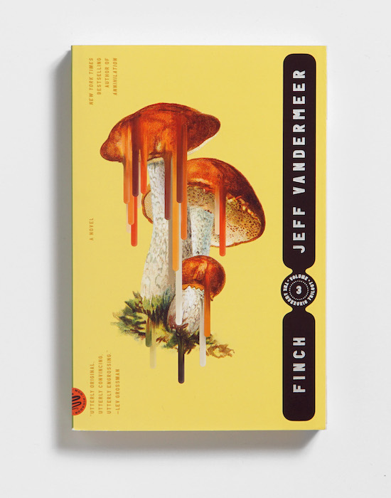
Once we settled on this design, it was clear that the series would be object driven and it set the stage for how we would approach the Ambergris Trilogy covers as well. Again we focused on the tension between beauty and destruction and applied the same visual treatment to the fungal element that exists in the world of Ambergris. In this case we were able to find great base imagery that also coincided numerically with each book in the series.
__________________________________
Finch, Shriek: An Afterword, and City of Saints and Madmen are available via Picador.
Jeff VanderMeer
Jeff VanderMeer is the New York Times bestselling author of more than 20 books including novels and fiction anthologies. He has won the Nebula Award, the British Fantasy Award, and, three times, the World Fantasy Award and has been a finalist for the Hugo Award. He is the cofounder and assistant director of Shared Worlds, a unique fantasy and science fiction writing camp for teenagers. He lives in Tallahassee, Florida.


