







It’s Ok to Judge a Book By Its Cover (It’s Impossible Not To)
Ed Simon on the History of Book Cover Trends
For a coterie of dandyish readers during the Victorian Mauve Nineties, The Yellow Book provided something novel—book cover designs. When the literary quarterly released its first volume in the spring of 1894 it was with a high-quality cloth-bound cover colored a midnight yellow as if by the flickering of a gas lamp, with a stark black caricature of a seventeenth-century bouffanted and beauty-marked lady in a carnival mask laughing while an androgynous second stands behind her. “If I am not grotesque,” said the designer Aubrey Beardsley, “I am nothing.”
Inspired by the poster illustrators of Paris, most infamously Henri de Toulouse-Lautrec, Beardsley, whose face his friend Oscar Wilde described as shaped “like a hatchet” and who was known to visit the publishers in a riffled morning coat with yellow gloves, envisioned the pedestrian book cover, an object largely of pure utility, as rather an occasion for beauty.
Reading a book begins before a book is ever read, and of course the cover images are the most integral part of that process.
Before Beardsley, the cover was a concern of binders; after, it was the domain of artists. During the middle-ages, vellum was encased in intricately carved wooden boards, often with clasps to prevent humidity from curling its pages; by the era of print, books could be bound in leather or stiff cardboard, sometimes with a frontispiece woodcut, but The Yellow Book—deriving its name from the color by which illicit French novels signified their contents—elevated the modest cover to a new level of aesthetic import. In this case maybe even more significant than literature, for despite anthologizing Henry James and W.B. Yeats, the quarterly is best remembered for Beardsley’s covers over its first four issues (he was fired and then died of tuberculosis). In forever changing the nature of the book, Beardsley’s first edition cost five shillings, and the month was accidentally printed as “Aprtl.”
“Advertisement is an absolute necessity of modern life,” Beardsley wrote in an 1894 essay for The New Review. That is the ostensible purpose of a cover, to promote its wares, but also to more mysteriously convey what reading an individual book might feel like. Perhaps that’s why digital books have never appealed to me. What a book feels like so often depends on the literal embodied feel of the book, from the smooth glossiness of a dust-jacketed hardback to the gentle matte covers of a paperback, the tactile raggedness of paper cut deckle edge or the oily sheen of velvet lamination, which is apt to emblazon every fingerprint that touches it. New Critical theorizing be damned, to read the words on the page only to ignore the page itself can feel like not having read at all. Reading a book begins before a book is ever read, and of course the cover images are the most integral part of that process.
Of the books on my (metaphorical) night stand which I’m currently reading through, there is critic Jerry Saltz’s Art is Life: Icons and Iconoclasts, Visionaries and Vigilantes, and Flashes of Hope in the Night, pundit John Ganz’s When the Clock Broke: Con Men, Conspiracists, and How America Cracked Up in the Early 1990s, and editor Emily Eakin’s The Frenchman: Or, My Life in Theory. These covers were respectively created by graphic designer Ben Denzer, freelance artist Patrice Sheridan (after an illustration by Thomas Colligan), and Penguin Associate Art Director Amanda Dewey.
Denzer’s cover arranges the title and author name in warm reds, pinks, and purples overlaid onto simple rectangles, recalling the abstraction of a Magritte or a Rothko painting; the cover which Sheridan made recalls designs from slightly before the time period which Ganz writes about, a minimalist clock in red and blue with stars instead of numbers that seems to spill out of the confines of the timepiece, the title reproduced in the colors of the American flag; Dewey’s puckish and subversive cover features the illustration of a woman in a Gallic black turtleneck with a Gauloises between two fingers, but with the outline of her entire head missing, as if a collagist had excised it from a magazine before posting it beneath the pink letters of the title, which purposefully evoke the soft aesthetic of chick-lit repurposed for a nearly 500-page book about Derrida, Foucault, and Lacan. Spiritual descendants of Beardsley all.
“I determined to do no less than to transform the world with Beauty” wrote William Morris, a crucial member of the British Arts and Crafts Movement which so influenced Beardsley, in his 1896 novel The Well at the World’s End. As a dedicated acolyte, especially as that movement began to develop into the Art Nouveau style with all of its tall palm fronds and slender women, stylized flowers and sleek surfaces, Beardsley understood the cover as a conduit for beauty as much as commercialism. Aesthetes though the Arts and Crafts movement may have been, a kind of democratic ethos inspired the movement (Wilde himself, associated with many of them, was a socialist after all). Figures like Morris (and Beardsley) championed a liberation of the pleasing, an egalitarian dissemination of the aesthetic. Elitists in standards, but not in access. Forks and spoons, tables and chairs, tea-pots and entire houses—books too—were all to be designed towards both practicality and beauty.
Not only is “never judge a book by its cover” a cliché, it is one that lacks seriousness. To pretend that a cover is merely incidental is to ignore how much of literature is extraliterary, as if consciousness can be easily disentangled from the body. “More than a boundary or a sealed border,” writes theorist Gerard Gennett in Paratexts: Thresholds of Interpretation, elements such as book covers are a “threshold.” Genett’s subject includes all of the “other stuff” in a book: dedications and acknowledgements, epigraphs and tables-of-contents, and, of course, covers. According to Genett, the proper interpretation of a work can’t ignore this seemingly incidental material, which is crucial to a book as a book.
A history of literature could be written by analyzing book cover trends.
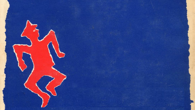
So iconic are some cover designs that even decades later they’re inextricable from how we interpret a book. From the golden age of covers, consider Shirley Smith’s iconic design for Harper Lee’s 1960 To Kill a Mockingbird, with a green-leafed, angular brown tree framed by a blood red background; Paul Bacon’s jumping red figure bathed in blue from Joseph Heller’s 1961 Catch-22; S. Neil Fujita’s instantly memorable cover to Mario Puzo’s 1966 The Godfather with a puppet-master’s hand clutching a control bar that looks, ominously, like a cross. Smith’s cover, with its slightly threatening tree that implies so much about America’s racial history, especially in the south where Lee’s novel is set, is not incidental to the book’s meaning, just as Fujita’s impersonal, abstracted, and unseen hand meddling in affairs Machiavellian tells readers what to expect from the Corleone family.
Covers can affirm ideological commitments, whether the social realism of Elmer Hader’s 1939 cover to John Steinbeck’s The Grapes of Wrath where the Joads, barefoot and in dirty overalls, look over the blasted California hillside or Nick Gaetano’s 25th-anniversary edition in 1982 of Ayn Rand’s Atlas Shrugged with its hard-bodied, futurist titan gleaming in monetary gold. Big Brother may always be watching in George Orwell’s Nineteen Eighty-Four, but how he is watching depends on the cover art, from the simple cursive and green background of the first edition, through the amazingly pulpy 1950 Signet Classics edition in the United States that served to defang much of the dystopian allegory in favor of the vampy tropes of trash literature, and the ever-popular omnipresent eye that’s featured on a multitude of versions, including one from Mariner Books for the 75th anniversary. A 2013 Penguin Classics edition of Orwell’s classic opted to redact the title and author in thick, black lines, which depending on your personal inclination is either appropriately terrifying or too precious by half (future versions, if available, would do well just to feature a photograph of a Flock camera).
A history of literature could be written by analyzing book cover trends. There was the libertine belle epoque, influenced by Beardsley’s example, where designers like Hugh Thompson, Margaret Armstrong, and Sarah Wyman Whitman decorated borders in delicate flowers and peacock feathers; the revolutionary avant-garde of the Russian Constructivists who combined geometrical shapes and photomontages as with Alexander Rodchenko and Varvara Stepanova; the lurid pulp of the United States’ post-war years, where Robert McGinnis or Norman Saunders specialized in pin-up worthy dames, hard-boiled detectives, and alien spaceships.
Multiple fashions have come and gone in the last decade, though the cover designer’s art still endures in an era of cheap artificial intelligence. Recently there has been a mania for classical paintings juxtaposed with vaguely punkish fonts, such as with Darren Haggar’s design for Ottessa Moshfegh’s 2018 My Year of Rest and Relaxation, the simple mid-century elegance of Lynn Buckley’s designs for both Meg Wolitzer’s 2013 The Interestings and Geraldine Brooks’ 2022 Horse, and the punkish, pop art post-modernism of Rachel Wiley seen in her Western-themed feminist collage for Anna North’s 2021 Outlawed (another face that’s been disappeared here, save for a pair of red lips).
In a digital world, analog covers still mean something, whether the Zen simplicity of Fitzcarraldo Edition’s blue-and-white covers (that have supplanted the long-ago supplanted Penguin Classics among the same sorts of readers) or the modernist uniformity of the New York Review of Books Classics. Through it all, the designer designs. Chip Kidd may not be as famous as Michael Crichton or Cormac McCarthy, but his covers for Jurassic Park and The Road are instantly recognizable; Junot Diaz won the 2008 Pulitzer Prize for The Brief Wondrous Life of Oscar Wao, but it was Rodrigo Corral’s evocative and ethereal cover that many people saw before they read a single word. Cover design reminds us how much of the literary art is the sole purview of the author, but rather that it’s intensely collaborative. With apologies to Shelley, maybe designers are the unacknowledged poets of the world.
I’ve been fortunate regarding covers, where so much is personally invested in being able to hold an author copy of my book for the first time, in knowing that this is the cover that will be associated with my words. David Wilson’s abstract design for my 2021 An Alternative History of Pittsburgh, where the black-and-gold (obviously) rendering of the abstracted three rivers looked like the gold leaf in the Japanese art kintsugi (whereby broken pottery is mended to look more beautiful than it did before), is a large part of why I think I’m still signing new copies of that book today. Beste M. Doğan’s design for my 2024 Devil’s Contract: The History of the Faustian Bargain, which featured gothic font arrayed around a collage of modern color and a Renaissance woodcut, reminded me so much of my favorite 1970s horror covers that my pulse quickened when my editor first sent me the JPEG. Writers can be proprietary creatures, but it would be disingenuous for me not to acknowledge that my books are, in part, also our books.
After all, would F. Scott Fitzgerald’s The Great Gatsby read quite the same without Francis Cugat’s cover, now more than a century old, depicting Daisy Buchanan’s otherworldly face rising up from the lights of a Long Island amusement park, her earing sparking in the blue sky like a fire cracker? Can you imagine J.D. Salinger’s The Catcher in the Rye totally divorced from E. Michael Mitchell’s 1951 cover with that urbane and sophisticated drawing in red of the horse on a Central Park carousel, sketches of pre-war Upper West Side apartment high rises jotted down below? And what of the resplendent 1894 illustration by Hugh Thomson, associate of Beardsley, for Jane Austen’s Pride and Prejudice, with a peacock standing atop an urn, every tender resplendent feather of the bird inching out towards the blue border of the novel, a picture so achingly beautiful that 132 years later you can still find on the cover of that book today?

Ed Simon
Ed Simon is the Public Humanities Special Faculty in the English Department of Carnegie Mellon University, a staff writer for Lit Hub, and the editor of Belt Magazine. His most recent book is Devil's Contract: The History of the Faustian Bargain, the first comprehensive, popular account of that subject.