How to Design a Book Cover... Backwards?
Chloe Scheffe on Creating the Cover for Jenny Hval's Paradise Rot
Paradise Rot came to me in an unusual way. I designed it backwards.
At the time I was working on a pocket-sized feminist text called The Xenofeminist Manifesto for Verso Books, the small, academic, radical publishing house with a high tolerance for high-mindedness. The ‘x’ in its title had proven irresistible: a number of my first-round covers were plastered with them. The frontrunner featured a large one obscuring a classically beautiful floral still life that I had manipulated until it went radioactive. Then I got a surprise email from my art director, Andy Pressman, assigning me Paradise Rot and asking if I could, as a quick solution, evolve the Xenofeminist design into a temporary cover for it. A pitch meeting was imminent and he needed something to show. The ‘x’ was wrong, we knew, but Andy thought the design had the right feel otherwise. It was aggressive and feminine and ugly-pretty in the right measures.
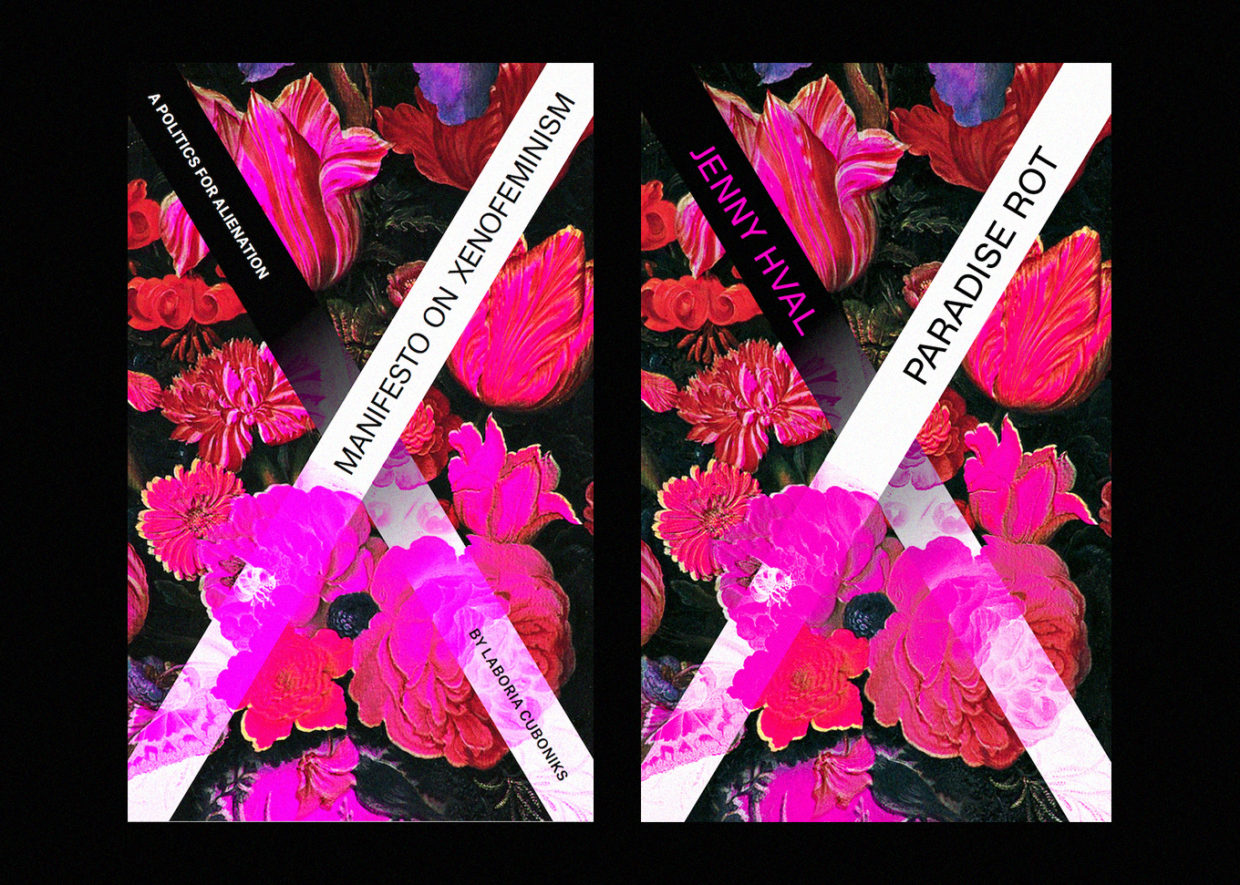 Xenofeminist’s working title at the time was Manifesto on Xenofeminism.
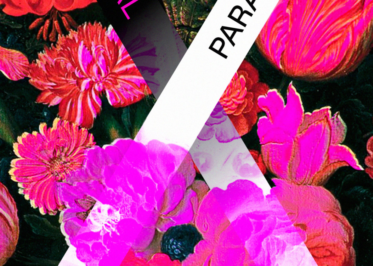
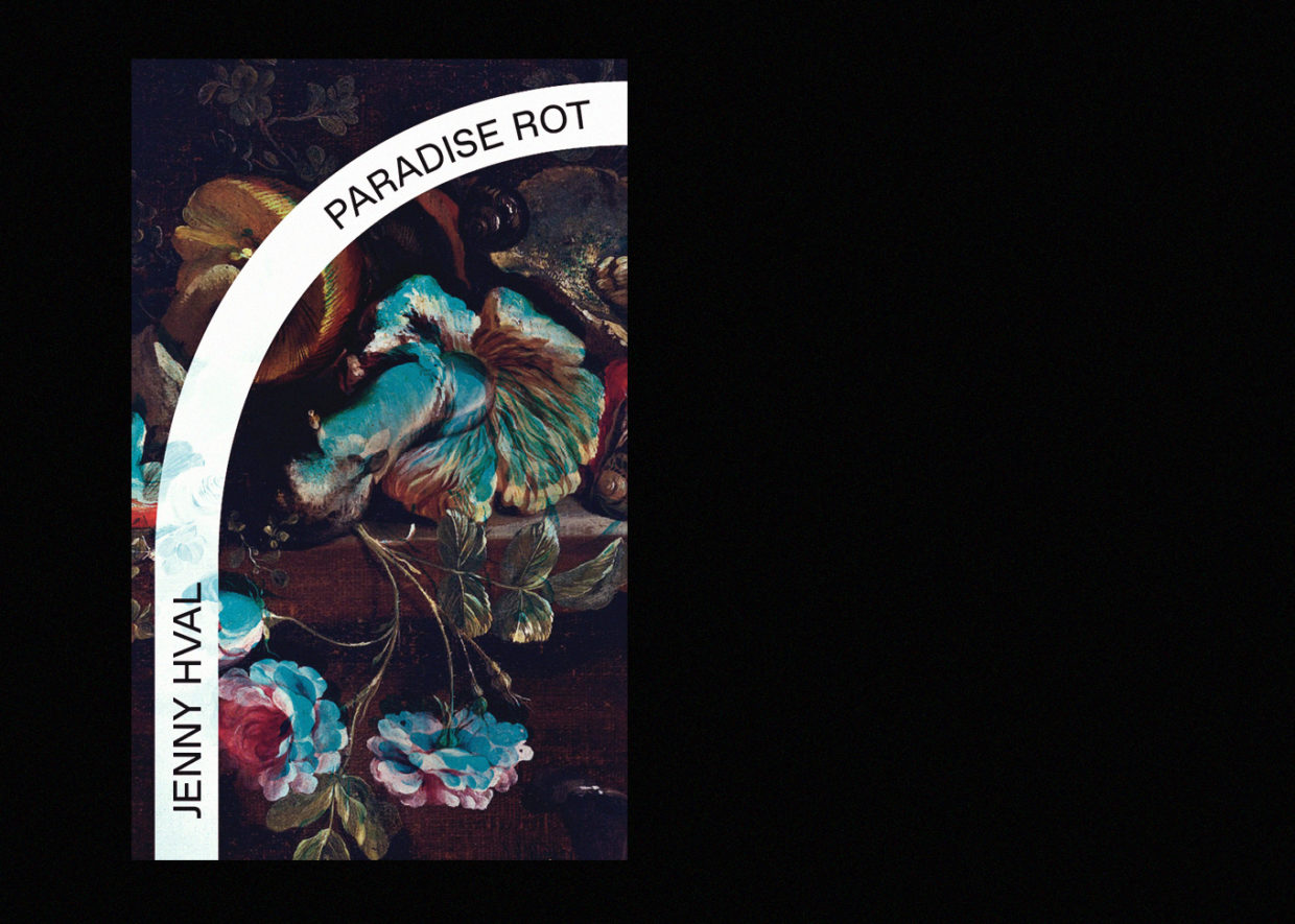
The feedback came back exactly as we expected: Why the ‘x’? Shouldn’t it have mushrooms instead of flowers? (I’ll get to the mushrooms.) But it didn’t need to be killed completely, no; just modified. Its origin considered, this was a victory.
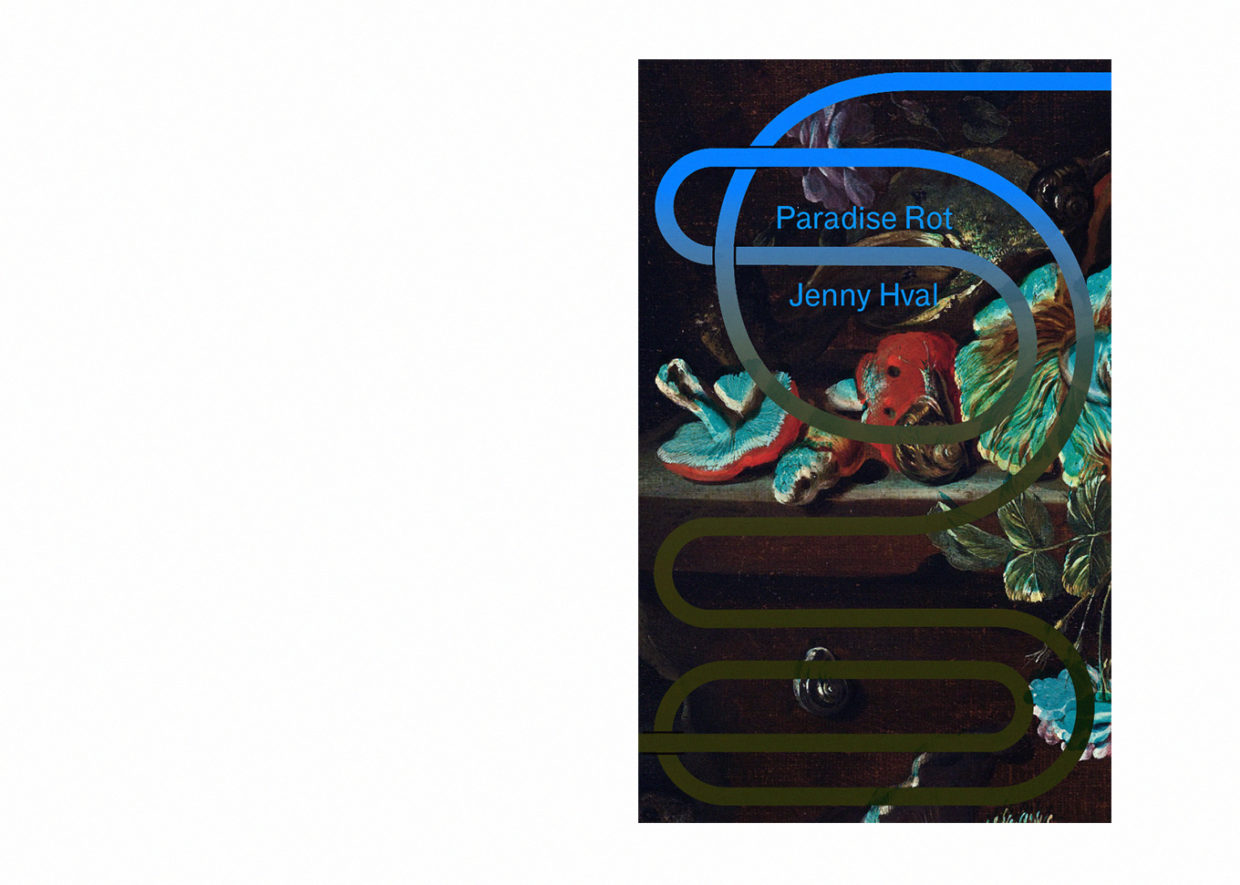
I set to work. After trying and failing to photograph a still life of mushrooms myself, I found a nice public domain painting by a Dutch master to repurpose. I dropped the pink, which the author found too feminine, in favor of teal, a color I normally hate. I began experimenting with new forms for the ‘x’: breaking the richly-rendered painting with a stark graphic overlay, as I had for Xenofeminist, still felt right. I eventually landed on a curvilinear line. It looked intestinal, wormlike, root-ish, subterranean.
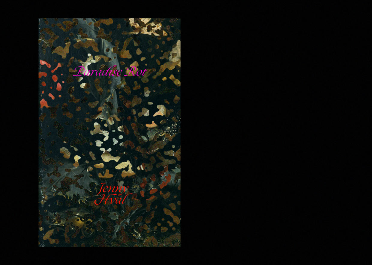
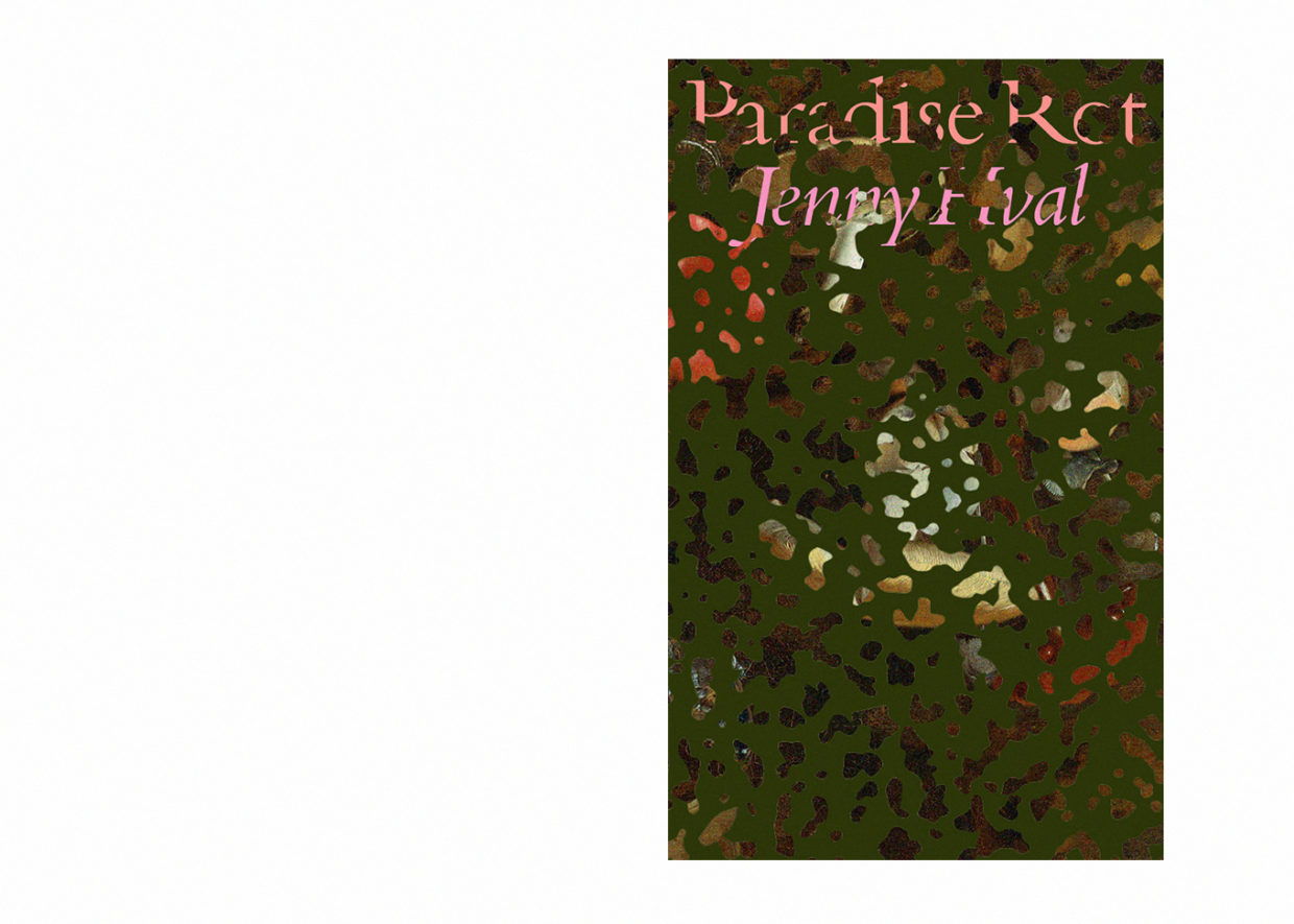
I also turned a composition notebook into a compost pile. In my hands the iconic black and white pattern, normally so intelligible and graphic, mutated into a chaos of layered still lifes, a camouflage, a forest floor. It looked loamy, like it could sustain life. The word ‘Paradise’ had also been nagging at me: evocative as it was, I had managed to overlook it. I added a beautiful fuchsia script that was completely ignorant of (indifferent to) what it was sitting on top of. (I attempted a more rational, modest serif too, placed stoically at the top.) This direction was my literal interpretation of the title, a sort of rebus. I sent the round off.
“It’s not the most legible,” Andy emailed.
“We’ll foil stamp it,” I replied.
These covers went nowhere, and I’ll love them forever.
The linework options went nowhere too. I was told that the author had liked everything, generally, just not for her book. But along with the rejection she sent some promising reference material by way of inspiration, which gave me hope: she wanted something stranger!
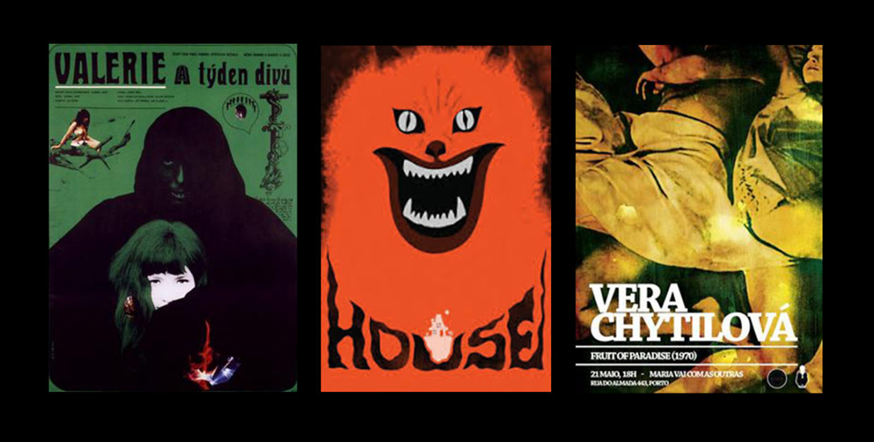
The majority of the time, I’m a magazine designer. Book cover design is a proximal but distinct world, with its immense timelines and complicated approval processes. What I love about both is that I get to see the writing early. Drafts of articles are much less polished than drafts of manuscripts at the moment design becomes a relevant factor—the time needed to edit an article is, of course, starkly less than that for a book—but there’s always a splendid glimpse behind the curtain to be had.
As I had learned to in magazine publishing, I went back and reread.
Paradise Rot follows two female roommates during the year they share a neglected off-campus dorm room. Mushrooms are a kind of third protagonist, literal and metaphoric manifestations of the rise and fall of the girls’ shared dependencies and desires. A male neighbor appears, briefly and abruptly, to complete a doomed love triangle. There’s a memorable scene involving a bathtub drain, and another with a tongue and a fungi. It’s an unusual text, probably the darkest I’ve worked on. It’s also Jenny Hval’s first book to be translated into English.
This time I sketched my ideas out on paper, as I typically do when I’m designing a difficult magazine spread (that is, one that doesn’t have an immediate conceptual conceit or common visual references to utilize). This is how I end up solving all the trickiest problems. There’s something about thinking in front of a piece of paper instead of a screen that just helps me get further. It’s a cliché for a reason.
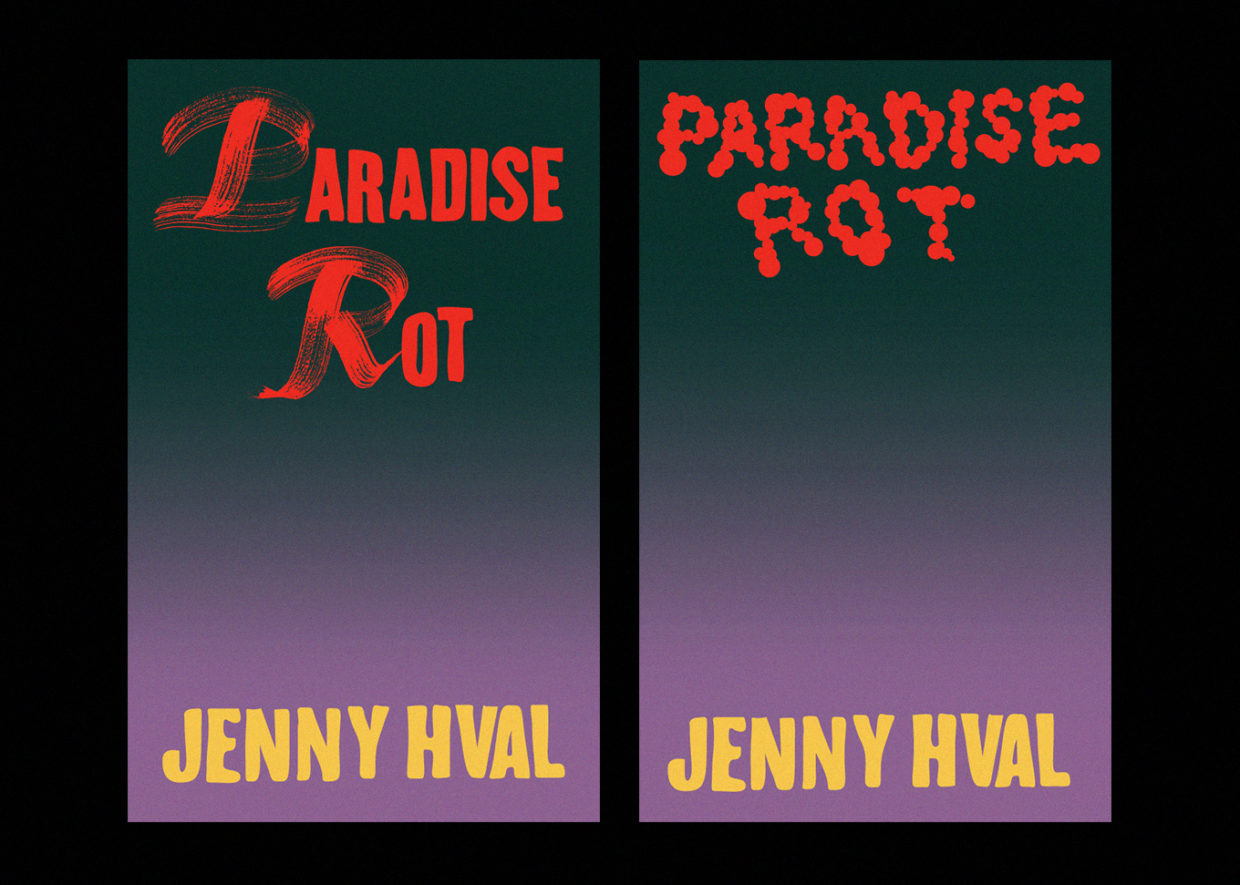
Trying to honor Jenny’s references, I began with pulpy typography. I painted worn-out caps with a brush long past its prime, tried vector globular letterforms, and flooded the background with a gradient I hoped had enough symbolic weight to carry the whole thing. (It didn’t.)
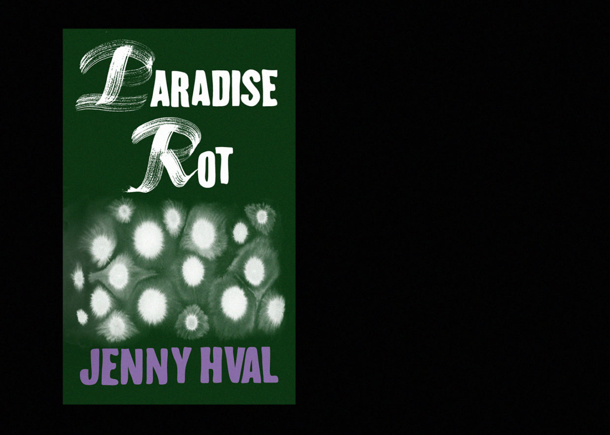
I got out another brush and some India ink, and added spores. (Or cells.)
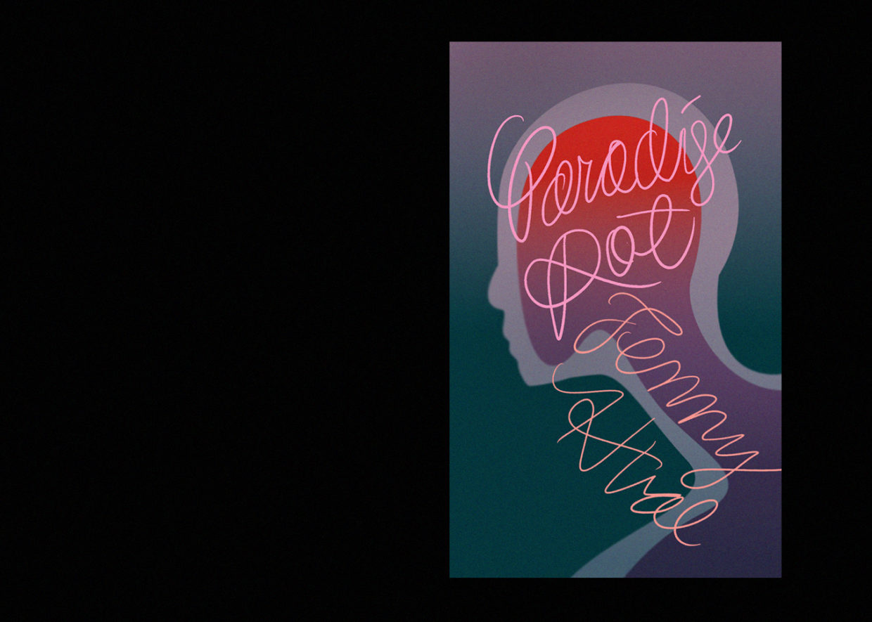
One of the girls starts losing hair and shaves her head: I tried her ghostly, membranic silhouette. I drew her neck slender and long, trying to evoke a mushroom stalk and cap.
And then I landed on liquid, because rotting is ultimately, well, liquidation. It has to do with loss of form, with breakdown, with reduction. I realized liquid could be read as blood, as urine, as saliva, as tears—all bodily, all relevant. It would be enigmatic, but not in the annoying way. I set the title in Helvetica, placing the cover squarely in the sixties, alongside a few of the references. I made it ooze. The result was weird, unlike anything I had done before. It excited me.
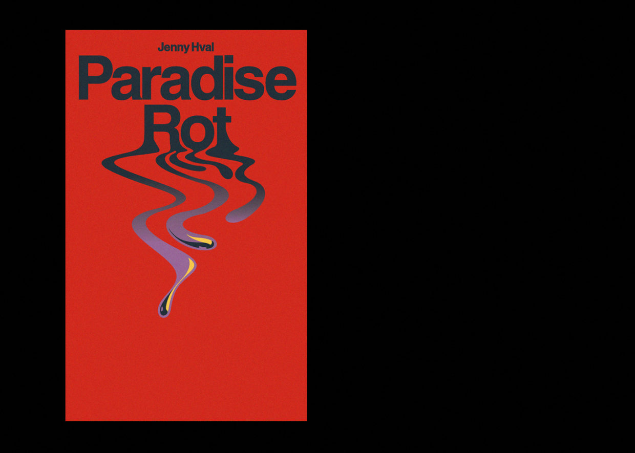
I sent them off. What Andy put in front of the editors was well received, but still no signoff came. I refined the slime, and introduced a meticulously redrawn Victorian gothic script (prim, decorous, evil).
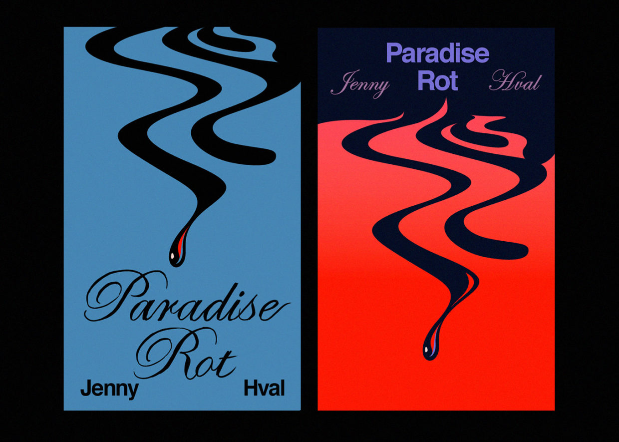
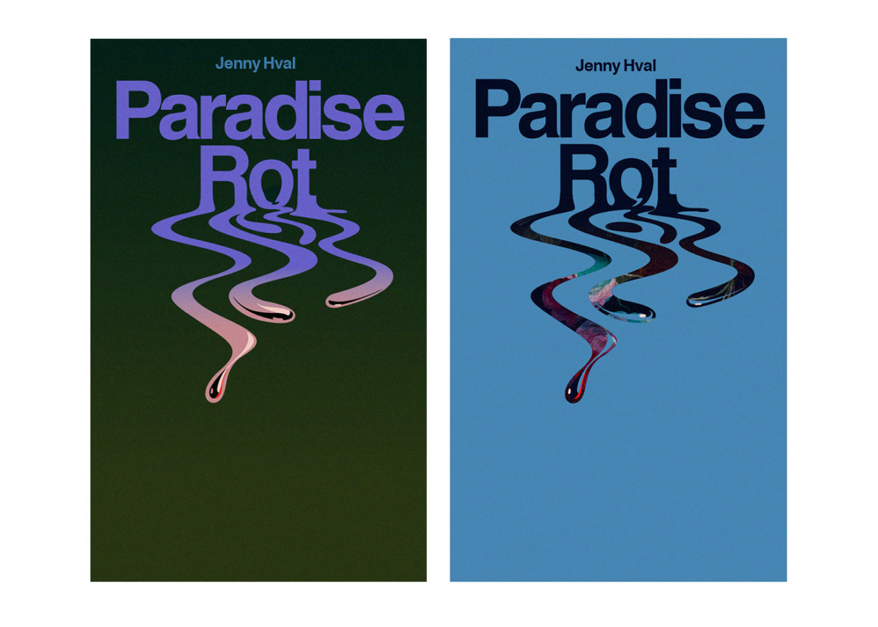
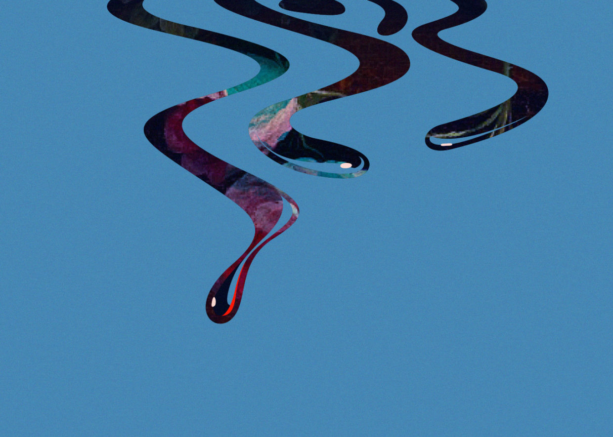
Back they went to Andy, he said he was happy, and then my inbox went quiet. Really quiet. The kind of quiet that portends a kill fee. When I couldn’t take it any longer I nudged him, with some guilt, knowing he was knee-deep. “This cover is a headache, I’ll be honest,” he replied. So I had my first officially sanctioned headache, but nothing else.
I pressed myself to forget it. I finished Xenofeminist, I made a dozen editorial illustrations, I had a birthday.
A month later, the decision finally arrived: I would go back to the beginning, to the Dutch painting with the mushrooms. The typography would be a bold sans serif, set in title case, per direct request from Jenny.
The dictated specificity was somewhat disheartening, but first and foremost I was relieved. The cover just needed to be made. Within the new parameters it would be, by comparison, cake.
I began by looking for better mushroom images; I found three and combined them into a collage that would wrap seamlessly from front flap to back flap—a skin. For the front panel I chose a painting with a butterfly—the right kind of bittersweet, I thought—and rotated it so that the star mushroom was passably phallic and the whole image gained a disorienting gravity-less feel. Everything immediately looked as if it were falling in slow motion. I thought of Alice floating down the rabbit hole.
For the type, I chose Helvetica again. My instincts said it should be featureless. (Or maybe I wanted to honor the dead.) I made it bruise-colored. I got the matte paper I’d asked for. At long last, the cover was approved.
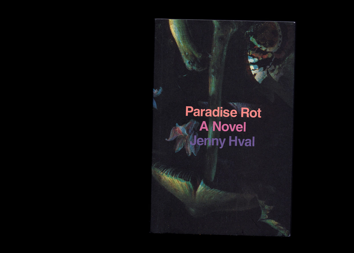
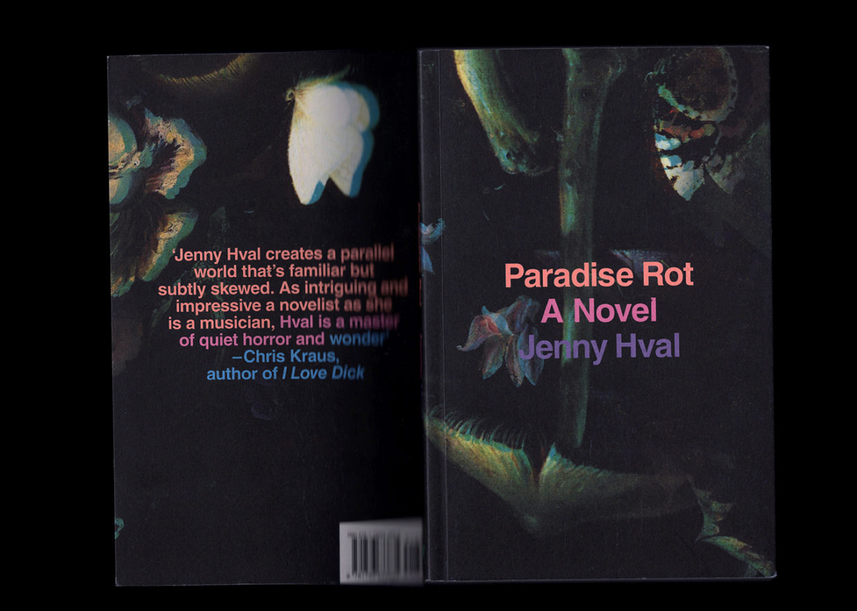
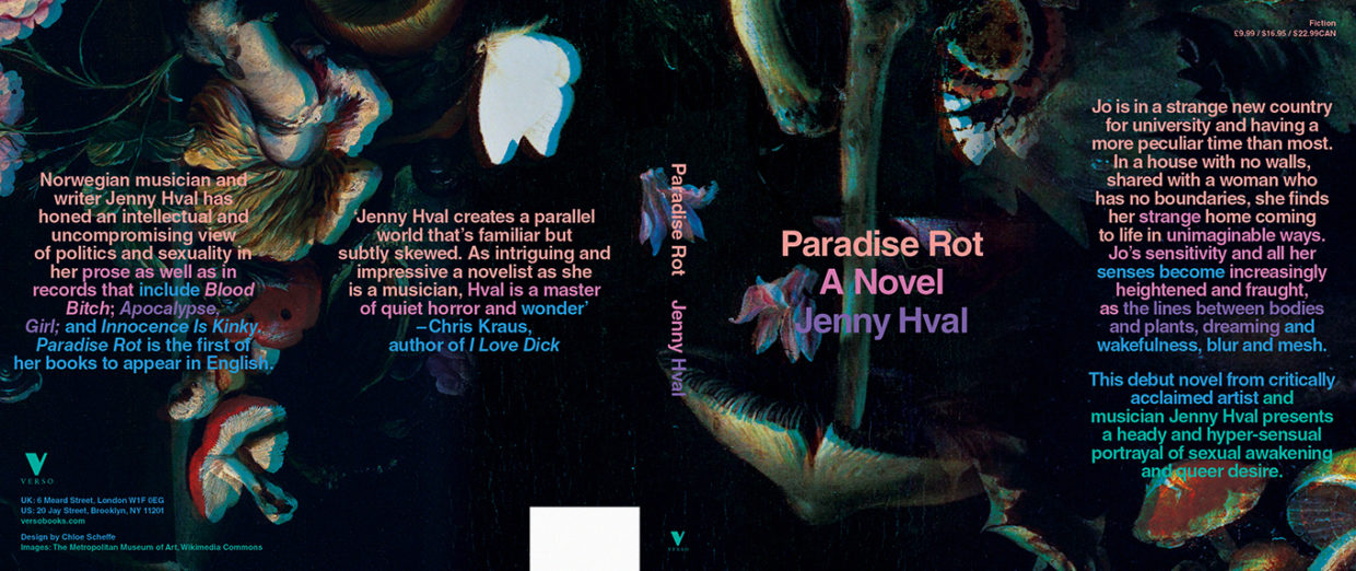
Almost immediately, the book went into a second printing, on gloss. At Verso’s request I readdressed the typographic hierarchy—the nicest solution was to have the title and byline stand away from one another, like an echo.
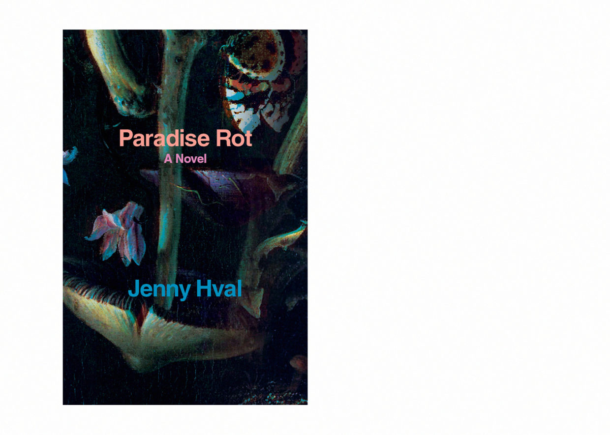
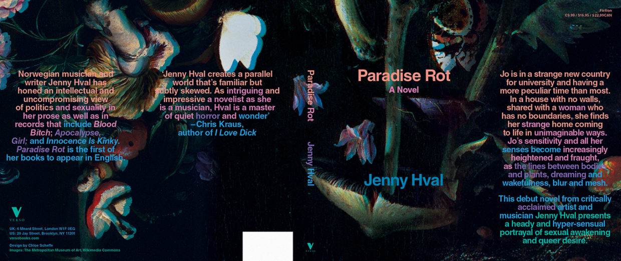
I haven’t seen the second edition in person yet, but I’m eager to. Conceptually, I like that there are two nearly identical covers out there, like spooky serendipitous twins, or—better yet—an original and a doppelganger.
Chloe Scheffe
Chloe Scheffe is the senior designer at Here Magazine, a new travel publication supported by Away, and a freelance designer and illustrator. Her clients include Verso Books, Nike, Wired, GQ, The New York Times, and The New Yorker. Her work has been honored by ADC, TDC, SPD, and D&AD. She's a native of Seattle, currently based in Brooklyn.
