How Rachel Cusk's Outline Trilogy Got Those Iconic Covers
Charlotte Strick on Designing Outline, Transit, and Kudos
In 2014, after fourteen years working as an in-house designer turned art director for the renowned literary publishing house, Farrar, Straus and Giroux, I joined forces with my longtime art school friend and frequent creative collaborator, Claire Williams Martinez. Together we formed our Brooklyn-based, multidisciplinary design studio, Strick&Williams. Claire has also spent many years focused on bookmaking, first as a cover designer at Vintage Books and then as a designer of art books at Studio Blue in Chicago. Many of our clients are in the publishing industry.
While it’s not at all typical for trade cover designers to work in pairs, it’s incredibly refreshing to share both ideas (and files) with someone whose sensibilities I’ve known and trusted for two decades. Once we’ve both read a manuscript, Claire and I will talk about the central themes of the book and the passages that we found most meaningful. Then we hammer out multiple solutions we want to explore, and we each feel comfortable passing the work back and forth, from sketch phase to finish. And while our visual sensibilities have always been mostly aligned, we bring different strengths to our work. So whether it be a book cover, a layout for a publication, or a website page, we’re able to push one another towards a finished product that we’ve each significantly contributed to.
The Paris Review serialized Rachel Cusk’s novel Outline prior to the Farrar, Straus and Giroux hardcover edition, so I’d already had a chance to read it in my role as Art Editor at The Review. For the magazine we’d commissioned lush illustrations from artist Samantha Hahn, and while everyone agreed that they’d been successful, FSG wanted to take an entirely different approach.
Our jacket design solutions for each of the titles in the trilogy attempt to match Cusk’s writing style; spare but evocative. The lined page is a metaphor for the life of the narrator, a writer herself, and the turned corners permit a slice of imagery that hints at the themes from each of the three novels. We searched widely for photographs that would relate to each of the three books; water for stories from the Aegean Sea, an ornamental bird and wallpaper for a meditation on homecoming, and microphones to represent fame.
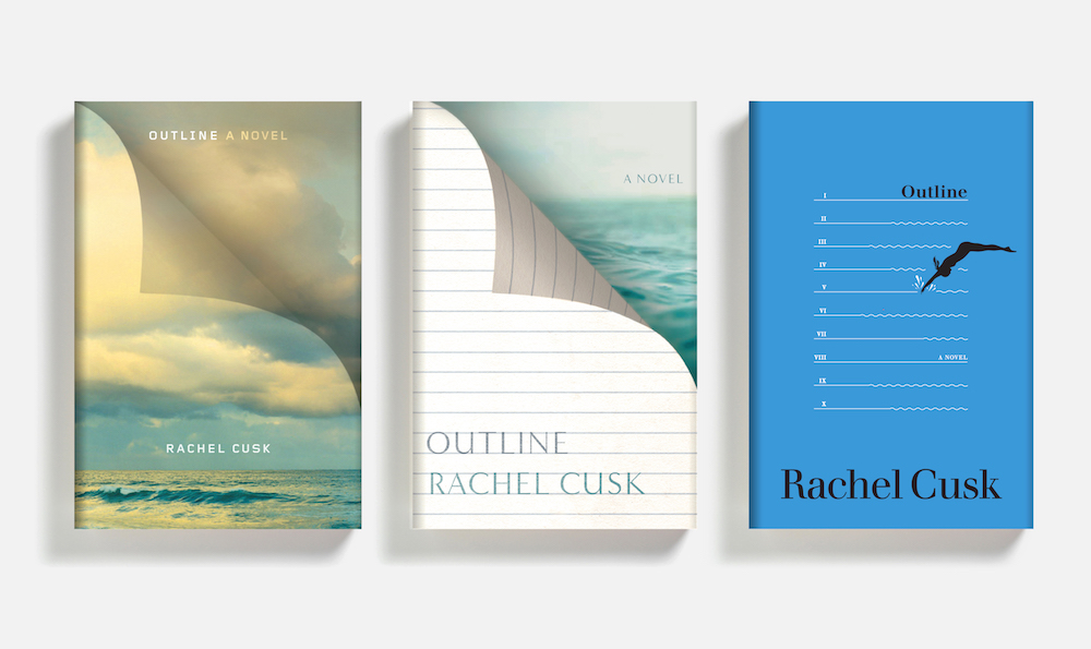
We hoped to capture an abstracted “sense of place” with our jacket design. While photography seemed right for this uniquely stark novel set in Greece, we also explored an illustrated idea that riffed off the book’s table of contents (or “outline”). There are 10 chapters in all, and we drew the narrator diving between Roman numerals. While we liked this idea conceptually, it just didn’t match up with the sophistication of Cusk’s fine, observational voice. Our center layout, here, ultimately inspired the series-look. For the final version of this jacket we were asked to choose a rougher photo of the sea in a shade closer to The Aegean—both good notes from the publisher.
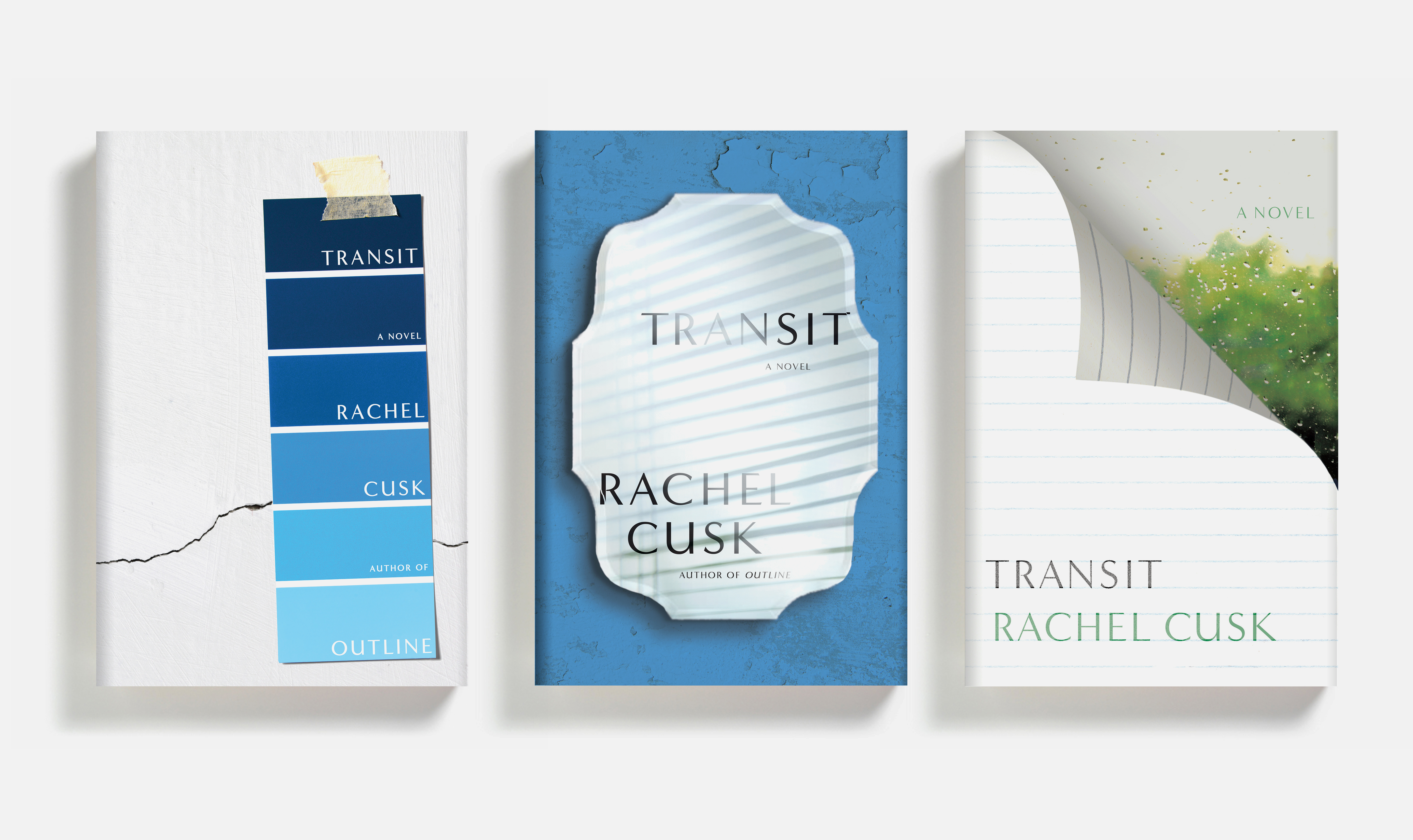
In Transit, the narrator has returned to London where she’s bought a dilapidated council flat that needs major renovations. And unlike the jacket for Outline, which seemed to require an image of the outdoors, Transit wanted quite the opposite. We searched for just the right room interior to express this. When we began working on the jacket for the second book, Farrar, Straus and Giroux hadn’t yet committed to the curled paper motif for the Cusk trilogy. As an alternative, we explored tying all three jackets together through the color blue—and of course the font remained constant throughout.
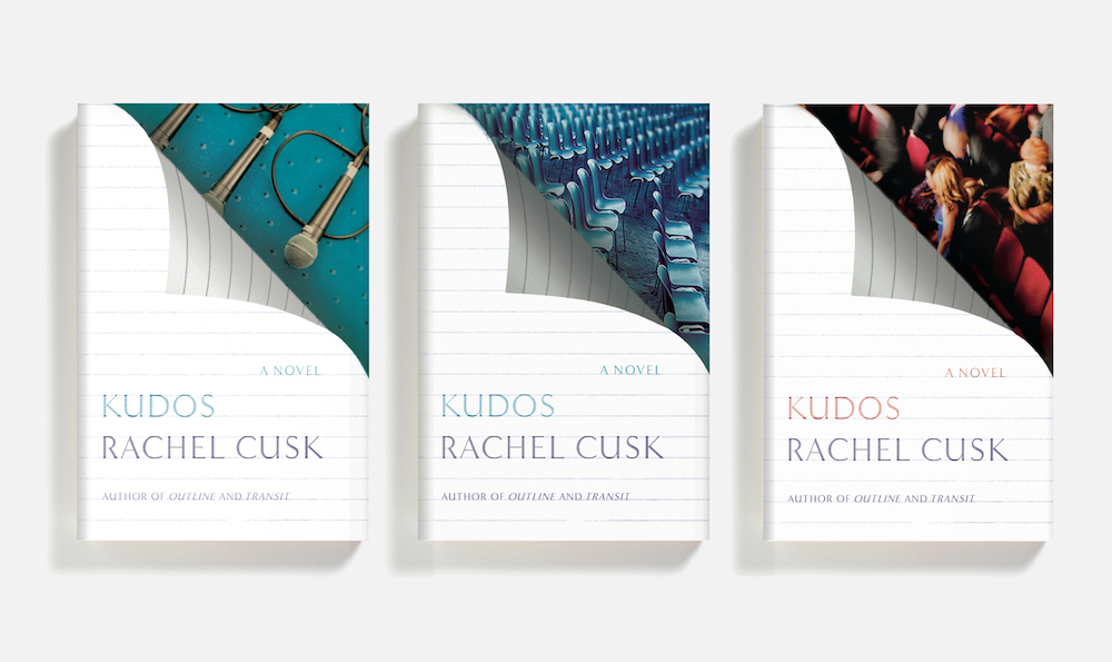
By the time we were given the Kudos manuscript, it was all about finding the perfect final image to tuck behind our curling page. Kudos follows the narrator on her travels abroad to a literary conference, and so we even experimented with a photo that included people. There was a desire by the publisher to move away from shades of blue, so we changed the carpeting behind the final microphone image to a punchier aquamarine. Admittedly, I sort of loved the most abstract layout with the rows of empty chairs; the wavy shapes they made reminded us so much of the choppy sea from Outline.
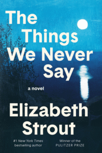
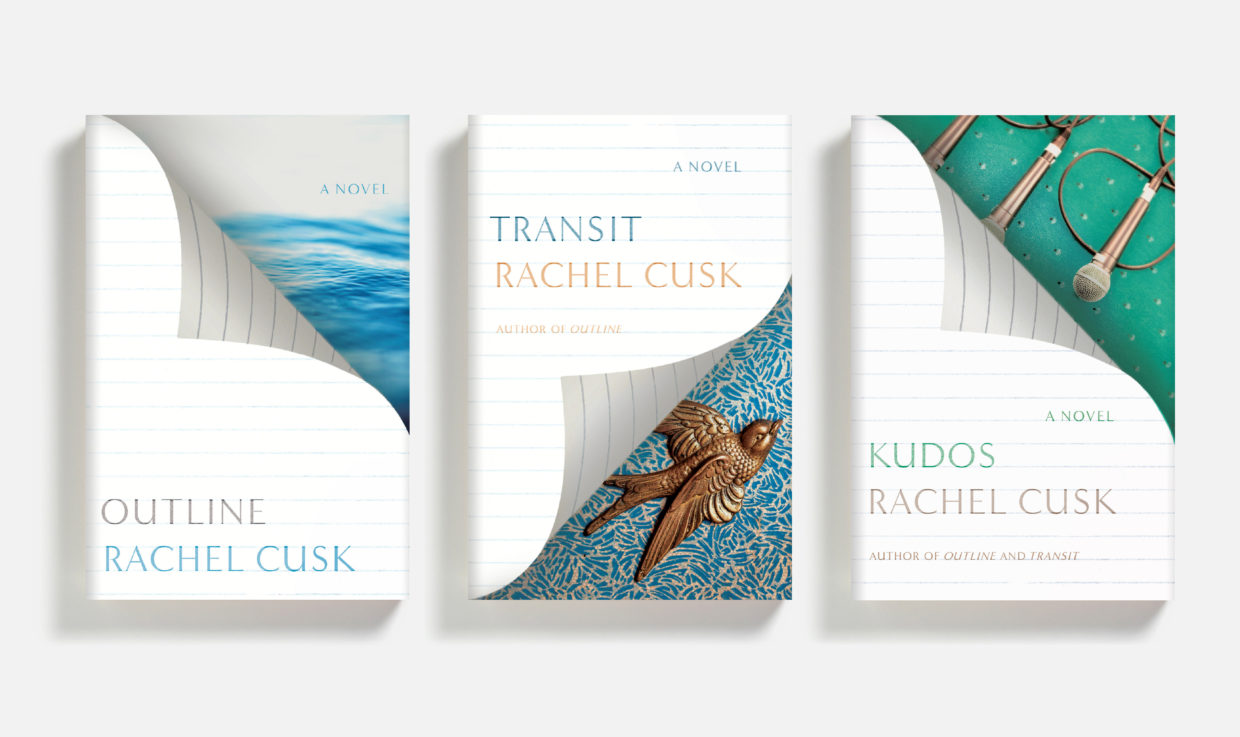 The final covers: Outline (2015), Transit (2017), and Kudos (2018)
Much has been said about the dizzying richness of Cusk’s writing. Reading her work is a joy and designing her covers is a thrill. Claire and I feel intensely lucky to have taken part in the process of bringing these magnificent books to readers.
Charlotte Strick
In March 2014 Charlotte Strick and Claire Williams Martinez formed the multidisciplinary design firm Strick&Williams. The partners bring to the studio eighteen years of experience working for publishers and design agencies, respectively. Strick&Williams collaborates with cultural institutions and clients in the arts, publishing, education, and nonprofits.
